 |
 |
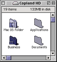
Is Mac OS slowly returning to a Platinum-esque look?
|
|
|
|
|
Addicted to MacNN
Join Date: Apr 2005
Status:
Offline
|
|
I've begun wondering what comes after Aqua, because as we all know, Apple cannot keep adding layers of gloss to the interface as a means of updating the look, and indeed the trends towards glossiness seems to have been reversed in beta versions of Leopard. It is possible that Apple's interface design is going to start seeing some more Platinum influences in the future.
Admittedly, this idea seems tenuous right now, but there are some things which lead me to believe that Apple's designers are, in some areas, removing the glossy look of Aqua and updating it with a visual style not unlike Platinum.
Note how iTunes has replaced the bulbous glossy blue scroll bar with a flat, subdued, grayish blue scrollbar similar to what we had in Platinum. Notice how the windows themselves are a similar shade of gray- a departure from brushed metal and pinstripes, and certainly not translucent or glossy black as you find in Vista.
Apple's new website has a navigational bar at the top whose look reminds me a lot of Platinum's buttons, being a similar shade of gray, and then becoming darker gray when depressed.
Not that any of this indicates a dramatic return to Platinum, but I am beginning to wonder if a Platinum inspired visual style is going to return to Apple's interface design, replacing all the glossiness and striking effects of Aqua.
|
|
|
| |
|
|
|
|
|
|
|
Addicted to MacNN
Join Date: Aug 2004
Location: FFM
Status:
Offline
|
|
Your iTunes is not up to date.
|
|
|
| |
|
|
|
|
|
|
|
Moderator  Join Date: Apr 2000
Location: Gothenburg, Sweden
Status:
Offline
|
|
I wish Apple would add limited theming to the system, like MS did for XP: Just allow the current interface and the one just before it. Would cut down on the complaints every time they modified it slightly.
And yes, Apple is moving towards a metal interface in and attempt to look more professional. They're already cool, so they don't need that boost from Aqua anymore.
|
|
|
| |
|
|
|
|
|
|
|
Fresh-Faced Recruit
Join Date: Mar 2007
Status:
Offline
|
|
I think that is the lates iTunes, it's how mine looks : /
And Apples slight variety in interfaces has been one of the only things that has ever bugged me with the design. How the top bar is glossy, safari has the scratched aluminium look, and iTunes with its clean smooth look.
Although the new safai beta, says it has a new interface, to match itunes, but i've downloaded it and it appears exactly the same. : /
|
|
|
| |
|
|
|
|
|
|
|
Professional Poster
Join Date: Nov 2004
Location: eating kernel
Status:
Offline
|
|
Originally Posted by ashrjordan 
I think that is the lates iTunes, it's how mine looks : /
And Apples slight variety in interfaces has been one of the only things that has ever bugged me with the design. How the top bar is glossy, safari has the scratched aluminium look, and iTunes with its clean smooth look.
Although the new safai beta, says it has a new interface, to match itunes, but i've downloaded it and it appears exactly the same. : /
It will stay brushed metal till Leopard. The win version has the new look tho 
|
|
Signature depreciated.
|
| |
|
|
|
|
|
|
|
Addicted to MacNN
Join Date: May 2001
Status:
Offline
|
|
That's definitely not the latest iTunes (v. 7.3). The buttons are a lighter shade of gray and provide much better contrast from the window itself. A definite improvement IMO. But to address the topic of the OP ... indeed Apple is moving toward a modern but still "platinumesque" look and feel to the UI. I like the scroll bars in iTunes and would like to seem them used throughout the OS. At a minimum the current Aqua scroll bars (and buttons) should be flattened to fit better with the new look.
OAW
|
|
|
| |
|
|
|
|
|
|
|
Forum Regular
Join Date: Jun 2007
Status:
Offline
|
|
I seem to be the only person in the Universe that likes the Aqua Brushed metal look, its pleasing and somewhat different and unique to other operating systems. Think about it, Windows Vista has the overly forward "glass" window look, linux has adopted KDE and Gnome window managers which are almost Windows 98/ME/XP clones.
My 2 cents...
|
|
|
| |
|
|
|
|
|
|
|
|
|
|
|
|
 
|
|
|
Forum Rules
|
|
|
|
You may not post new threads
You may not post replies
You may not post attachments
You may not edit your posts
|
HTML code is Off
|
|
|
|
|
|
|
|
|
|
|
|


