|
 |
Photo Critique Thread - [JPEG] (Page 12)
|
|
|
|
|
Mac Elite
Join Date: Jan 2001
Location: .CL
Status:
Offline
|
|
|
|
|
|
| |
|
|
|
|
|
|
|
Grizzled Veteran
Join Date: Mar 2002
Location: NY
Status:
Offline
|
|
|
|
|
To know your Enemy, you must become your Enemy.”
Sun Tzu
|
| |
|
|
|
|
|
|
|
Grizzled Veteran
Join Date: Mar 2002
Location: NY
Status:
Offline
|
|
Originally Posted by Mastrap 
See, the reality is that you can't be all things to all people.
Every good photographer I know has developed a style of his, or her, own. That style typically helps them to communicate what they feel is important in the images they create. It's fine to experiment, important to experiment, but I would suggest working towards a style that is uniquely yours, a style that you feel comfortable with and that expresses your take on how these images should look like, what they should say and how they should say it.
Just be confident about the YOU, the rest will follow.
...and use GOOD Technique. 
|
|
To know your Enemy, you must become your Enemy.”
Sun Tzu
|
| |
|
|
|
|
|
|
|
Moderator Emeritus
Join Date: Apr 2001
Location: Fort Lauderdale, FL
Status:
Offline
|
|
|
|
|
ice
|
| |
|
|
|
|
|
|
|
Posting Junkie
Join Date: May 2001
Location: Brisbane, Australia
Status:
Offline
|
|
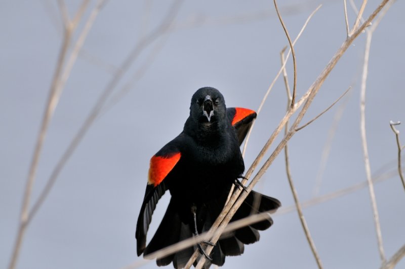
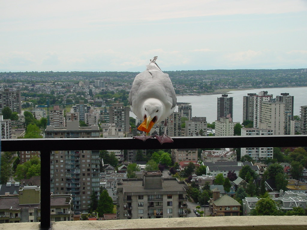
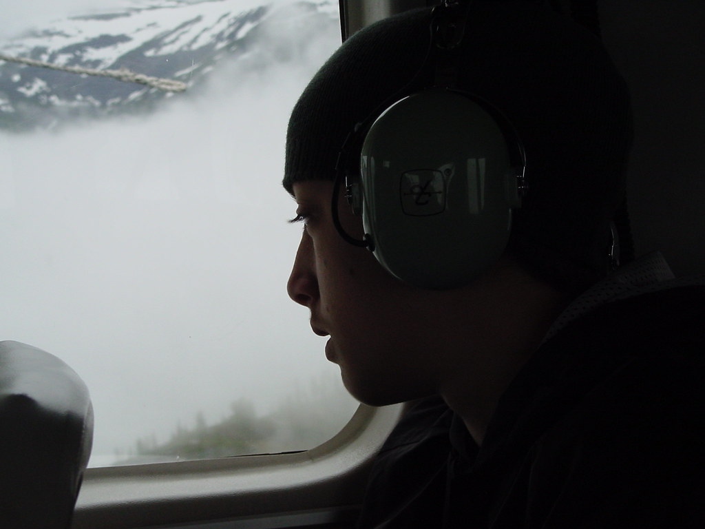
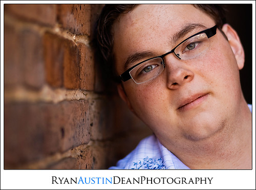
OK, boy8cookie. Here's my belated critiques.
Originally Posted by boy8cookie
This is a great shot that could use some more separation of subject and background. Ideally the background should have been out of focus. A creative treatment of this would be to desaturate the background as it is already very grey and dull and turn up the contrast and saturation on the seagull. You can achieve this with layers and masks in photoshop. I'd crop out the bottom ledge too, and probably the left edge there too. If you don't want to do it yourself, let me know and I'll do a quick mockup for you.
Originally Posted by boy8cookie
This is already pretty good. I'd take of some of the dark edge behind his head for a better composition and up the exposure a bit. I'd also shop out the seat in front of him as cropping it out would ruin the composition and diminish the "story".
Originally Posted by boy8cookie
Crop (no surprise here?) away the left side so the front chair leg frames the subject. You have a tendency (as with most budding photographers) to put the subject very close to the centre. See how he is looking towards the right? You want to give him much more space in the subject's line of sight. Everything behind him is irrelevant.
As I said you are on the right track, (interesting) photos should (mostly) tell a story and you are well on your way to achieving this!
|
|
|
| |
|
|
|
|
|
|
|
Posting Junkie
Join Date: May 2001
Location: Brisbane, Australia
Status:
Offline
|
|
Originally Posted by ARENA
Needs more lensflare 
Seriously, is there any point in critiquing your photos? You are way above and beyond most of us already 
|
|
|
| |
|
|
|
|
|
|
|
Posting Junkie
Join Date: May 2001
Location: Brisbane, Australia
Status:
Offline
|
|
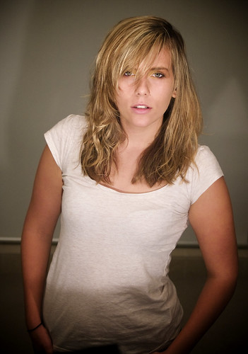
OK guys. Have at my girlfriend again
|
|
|
| |
|
|
|
|
|
|
|
Posting Junkie
Join Date: May 2001
Location: Brisbane, Australia
Status:
Offline
|
|
Originally Posted by Tesselator
Here's another one from me... 

I see what you are going for here (the handcoloured look), but this isn't working for me. Too "touristy"? I don't know. That's just my subjective opinion though.
Objectively it is framed fine, minus the distracting bits at the bottom that either needs to be more in frame or cropped away. You can also see that there has been some chromatic aberration around the trees from a blown out sky. It's also apparent at the edge of the hill, although that might just be hard edges from the colouring.
|
|
|
| |
|
|
|
|
|
|
|
Posting Junkie
Join Date: May 2001
Location: Brisbane, Australia
Status:
Offline
|
|
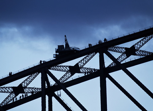
Originally Posted by glideslope
Great capture, but the composition is a bit off. Shame the lens wasn't pointed slightly more downwards
|
|
|
| |
|
|
|
|
|
|
|
Posting Junkie
Join Date: May 2001
Location: Brisbane, Australia
Status:
Offline
|
|
Originally Posted by Jawbone54
The blur needs to be cropped away where it starts to get too distracting on the left there.
Cue the anti-cropping mob
|
|
|
| |
|
|
|
|
|
|
|
Posting Junkie
Join Date: May 2001
Location: Brisbane, Australia
Status:
Offline
|
|
That would be her makeup - and was done purely for the "shoot". The shoot being us playing around with makeup and lights after the "real model" shoot had finished.
|
|
|
| |
|
|
|
|
|
|
|
Addicted to MacNN
Join Date: Sep 2001
Location: Toronto
Status:
Offline
|
|
Originally Posted by ARENA
One of the few images of yours I am not feeling the love for. Probably because a: I see what you did there and b: because that lead to the shot loking artificial. Just, for me, not in a way I like.
|
|
|
| |
|
|
|
|
|
|
|
Addicted to MacNN
Join Date: Sep 2001
Location: Toronto
Status:
Offline
|
|
Originally Posted by glideslope
Nice shot. Composition is a bit off, but I suspect that you only had a second or so to get it into the camera. Also, the blacks are cold, at least on my screen. If you have the RAW file then you might be able to rescue some detail there.
|
|
|
| |
|
|
|
|
|
|
|
Addicted to MacNN
Join Date: Sep 2001
Location: Toronto
Status:
Offline
|
|
Originally Posted by - - e r i k - -
OK guys. Have at my girlfriend again
Too many distractions for me in what needs to be a very simple shot. I'd personally either crop far tighter or would chose a different background. I know you were just playing about, but for a fashion or beauty shot the hair would need serious attention and the t-shirt needs proper fitting.
|
|
|
| |
|
|
|
|
|
|
|
Addicted to MacNN
Join Date: Sep 2001
Location: Toronto
Status:
Offline
|
|
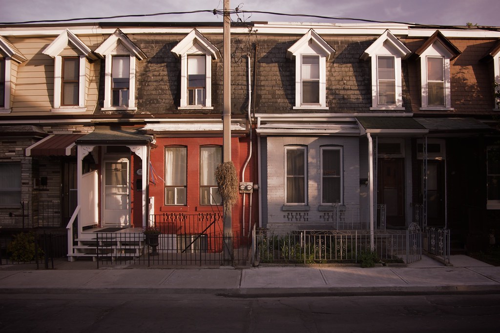
Little Portugal, Toronto
Desaturated, with a 50% dark red layer.
|
|
|
| |
|
|
|
|
|
|
|
Posting Junkie
Join Date: May 2001
Location: Brisbane, Australia
Status:
Offline
|
|
Originally Posted by Mastrap
Too many distractions for me in what needs to be a very simple shot. I'd personally either crop far tighter or would chose a different background. I know you were just playing about, but for a fashion or beauty shot the hair would need serious attention and the t-shirt needs proper fitting.
Very true. That bar going through her is absolutely disgusting
But yes, this was simply playing about. The loose top even stemming from being dressed for study while coming down to the shoot as it finished. Only the makeup and lighting were arranged here. No fashion, no direction - just playing around.
I reckon this shot is better (from about 10 taken in less than thirty seconds as we were packing up), but I decided to post the medium shot instead as this is far to similar in composition and pose to the earlier ones I posted:
If neither falls in taste there are more experimental ones to be found on my photostream.
|
|
|
| |
|
|
|
|
|
|
|
Addicted to MacNN
Join Date: Sep 2001
Location: Toronto
Status:
Offline
|
|
^^ Yeah, that's much more like it. Hair still lanky, but I can see how and why you took that shot.
|
|
|
| |
|
|
|
|
|
|
|
Administrator  Join Date: Apr 2001
Location: San Antonio TX USA
Status:
Offline
|
|
Originally Posted by Mastrap
^^ Yeah, that's much more like it. Hair still lanky, but I can see how and why you took that shot.
I agree. This picture tells a much clearer story than the longer shot. And it's a cool story too.
|
 Glenn -----OTR/L, MOT, Tx
|
| |
|
|
|
|
|
|
|
Posting Junkie
Join Date: May 2001
Location: Brisbane, Australia
Status:
Offline
|
|
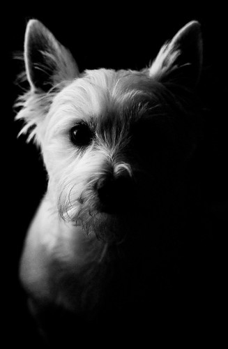
Custard? 
|
|
|
| |
|
|
|
|
|
|
|
Posting Junkie
Join Date: May 2001
Location: Brisbane, Australia
Status:
Offline
|
|
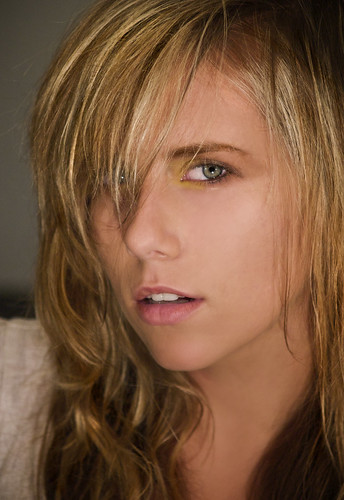
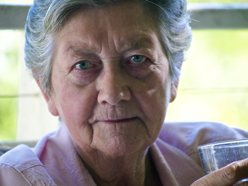
Young and Old:
|
|
|
| |
|
|
|
|
|
|
|
Addicted to MacNN
Join Date: Sep 2001
Location: Toronto
Status:
Offline
|
|
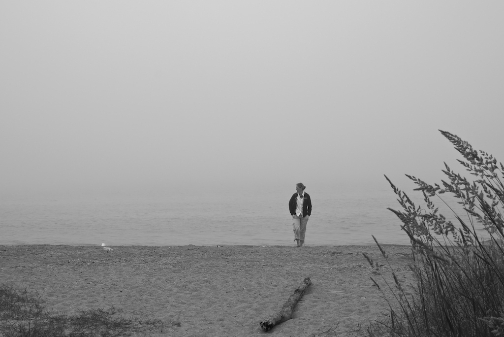
Lake Huron, again.
|
|
|
| |
|
|
|
|
|
|
|
Addicted to MacNN
Join Date: Sep 2001
Location: Toronto
Status:
Offline
|
|
Originally Posted by - - e r i k - -
Young and Old:
Really like the tonality in this. Great skin tones, great eyes.
|
|
|
| |
|
|
|
|
|
|
|
Posting Junkie
Join Date: May 2001
Location: Brisbane, Australia
Status:
Offline
|
|
Thank you. It's amazing what curves can do to an image, the original for this was very dull and grey.
|
|
|
| |
|
|
|
|
|
|
|
Posting Junkie
Join Date: May 2001
Location: Brisbane, Australia
Status:
Offline
|
|
Originally Posted by Mastrap
Lake Huron, again.
Not liking this as much as the first one. Whereas the grey sky contributed to a mysterious foggy quality of the first one and was excellent use of negative space, here it's more of a grey mass that doesn't do much for me. Also I find the log distracting. If it were shopped out it would have been a better composition. I love the reeds in the corner though. Very classic. The grass in the other corner provides a nice balance too.
|
|
|
| |
|
|
|
|
|
|
|
Addicted to MacNN
Join Date: Sep 2001
Location: Toronto
Status:
Offline
|
|
Yeah, I know. The fog was pretty nondescript. I took a look at the RAW file, to see if there was anything in there, but it was just dull.
|
|
|
| |
|
|
|
|
|
|
|
Moderator Emeritus
Join Date: Mar 2004
Location: Copenhagen
Status:
Offline
|
|
Originally Posted by Mastrap
Really like the tonality in this. Great skin tones, great eyes.
And … interesting hair tones. Does she dye her hair blue, or is that the curves playing in?
|
|
|
| |
|
|
|
|
|
|
|
Mac Elite
Join Date: Aug 2003
Status:
Offline
|
|
Originally Posted by Mastrap
Really like the tonality in this. Great skin tones, great eyes.
Weird. I was going to say that I liked the young photo, but the eyes in the old one where messed up.
The beauty of art!
|
|
|
| |
|
|
|
|
|
|
|
Banned
Join Date: Apr 2002
Location: -
Status:
Offline
|
|
|
|
|
|
| |
|
|
|
|
|
|
|
Posting Junkie
Join Date: May 2001
Location: Brisbane, Australia
Status:
Offline
|
|
Originally Posted by James L
Weird. I was going to say that I liked the young photo, but the eyes in the old one where messed up.
The beauty of art!
Hey! Her eyes are really like that. Extremely minimal post production in her eyes. And certainly no colouring/saturation.
So blame it on nature if you must
As for the blueness of the hair I believe that to be the outdoor light mostly. Gray hair can also take on a blueish shine in bright light.
|
|
|
| |
|
|
|
|
|
|
|
Mac Elite
Join Date: Aug 2003
Status:
Offline
|
|
Originally Posted by - - e r i k - -
Hey! Her eyes are really like that. Extremely minimal post production in her eyes. And certainly no colouring/saturation.
So blame it on nature if you must
Sure. It's gotta be somebody's fault.

|
|
|
| |
|
|
|
|
|
|
|
Professional Poster
Join Date: Nov 2004
Location: Belgium
Status:
Offline
|
|
My grandmother

|

iMac 20" C2D 2.16 | Acer Aspire One | Flickr
|
| |
|
|
|
|
|
|
|
Addicted to MacNN
Join Date: Sep 2001
Location: Toronto
Status:
Offline
|
|
Originally Posted by Goldfinger
My grandmother
Excellent tonality and dynamic range. I would have moved grandmother to the left though.
A few cold areas, but it looks that might have been caused by the adding of a vignette?
|
|
|
| |
|
|
|
|
|
|
|
Professional Poster
Join Date: Nov 2004
Location: Belgium
Status:
Offline
|
|
Originally Posted by Tesselator
That! is an awesome shot! It looks painted almost! Very kewl!
Thx, the painted look was somewhat the look I was somewhat going for.
|
iMac 20" C2D 2.16 | Acer Aspire One | Flickr
|
| |
|
|
|
|
|
|
|
Moderator  Join Date: May 2001
Location: Hilbert space
Status:
Offline
|
|
I agree, Goldfinger, it's a great shot. Looks like it was shot during late afternoon?
|
|
I don't suffer from insanity, I enjoy every minute of it.
|
| |
|
|
|
|
|
|
|
Professional Poster
Join Date: Nov 2004
Location: Belgium
Status:
Offline
|
|
Originally Posted by Tesselator
Add some painterly affects and a little editing and you could sell lithograph
"reproductions" of it as a rare but important work from an unnamed famous
painter.
lol
Actually, Oreo, It was shot at 10 in the evening. Lit by a speedlight on the right shot through a white translucent umbrella + one speedlight on the left shot straight up, into the ceiling with a CTO filter to give an orange cast + the normal lights were on for added orange-ness. Whitebalance was set on flash (to match the speedlight on the right).
+ some aperture+photoshop wizardry obviously.
|
iMac 20" C2D 2.16 | Acer Aspire One | Flickr
|
| |
|
|
|
|
|
|
|
Posting Junkie
Join Date: Mar 2005
Location: Louisiana
Status:
Offline
|
|
Originally Posted by Goldfinger
My grandmother
I really, really love the atmosphere you captured here. It really pulled me in and made me wonder what she's thinking at the moment you shot this. Really beautiful. 
|
|
|
| |
|
|
|
|
|
|
|
Addicted to MacNN
Join Date: Sep 2001
Location: Toronto
Status:
Offline
|
|
And see, no obvious post production.
|
|
|
| |
|
|
|
|
|
|
|
Posting Junkie
Join Date: Mar 2005
Location: Louisiana
Status:
Offline
|
|
Originally Posted by Mastrap
And see, no obvious post production.
Eeeeooowwww...
Heh...
I'll have more for you in a bit.
|
|
|
| |
|
|
|
|
|
|
|
Moderator Emeritus
Join Date: Mar 2004
Location: Copenhagen
Status:
Offline
|
|
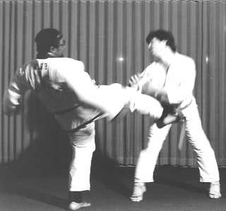
Originally Posted by Jawbone54
I like the action you’ve managed to capture here, but those lights shining through the curtain are distracting. The whites of the gis are outblown, which obscures some detail, especially around the feet of the guy on the right.
But overall, I like it.
|
|
|
| |
|
|
|
|
|
|
|
Posting Junkie
Join Date: Mar 2005
Location: Louisiana
Status:
Offline
|
|
Originally Posted by Railroader
Please stop derailing the thread.
...or I'll cuff you.
Just kidding. I felt compelled, and don't know why.
Additionally, I'm currently editing/uploading a few more pictures from a shoot on Monday. Less evident editing, Mastrap.
(
Last edited by Jawbone54; May 8, 2008 at 07:05 PM.
)
|
|
|
| |
|
|
|
|
|
|
|
Addicted to MacNN
Join Date: Sep 2001
Location: Toronto
Status:
Offline
|
|
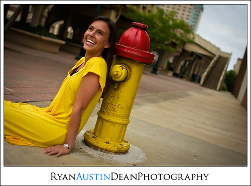
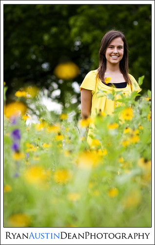
That standing in a field of flowers scenario works better for chicks than for guys.
|
|
|
| |
|
|
|
|
|
|
|
Moderator Emeritus
Join Date: Mar 2004
Location: Copenhagen
Status:
Offline
|
|
The thing that stands out the most in both those pictures?
Her teeth. They’re too white. She ends up looking too much like Colgate ad material. Especially the first one, it almost looks like she has dentures in that one.
Apart from that, they’re both good. If you make her head a bit lighter in the first one, so it doesn’t ‘blend’ into the dark shadows behind her, you’re home safe.
|
|
|
| |
|
|
|
|
|
|
|
Posting Junkie
Join Date: May 2001
Location: Brisbane, Australia
Status:
Offline
|
|
I'm off portraits for a bit:
 Hey! Rule of thirds!
(
Last edited by - - e r i k - -; May 9, 2008 at 02:36 AM.
)
|
|
|
| |
|
|
|
|
|
|
|
Posting Junkie
Join Date: Mar 2005
Location: Louisiana
Status:
Offline
|
|
Originally Posted by Oisín
Her teeth. They’re too white. She ends up looking too much like Colgate ad material. Especially the first one, it almost looks like she has dentures in that one.
What's crazy about that is that she's probably the only subject whose teeth I didn't whiten. She's had incredibly bright teeth the whole time I've known her, and it's also a possibility that she's been using the infamous Crest white strips since her senior session has been coming up.
The rest of her set is in this collection on my Flickr.
|
|
|
| |
|
|
|
|
|
|
|
Professional Poster
Join Date: Nov 2004
Location: Belgium
Status:
Offline
|
|
Originally Posted by Tesselator
What do you do in Aperture? Is it capable of doing anything significant or
unique? I have it as a gift from the Apple center here but I never installed
it - thinking it was just a browser and cataloger.
Well Aperture is a RAW convertor as well. For this picture I used it to change the whitebalance (this pic was made out of 2 conversions with a different white balance), definition and especially the vignette. The vignette feature in Aperture (2.1 not 1.5) is really awesome.
For most pictures I don't even touch Photoshop anymore.
|
iMac 20" C2D 2.16 | Acer Aspire One | Flickr
|
| |
|
|
|
|
|
|
|
Posting Junkie
Join Date: May 2001
Location: Brisbane, Australia
Status:
Offline
|
|
Sharpening, curves and touch-ups is what I use Photoshop for still. Everything else Aperture handles like a charm.
|
|
|
| |
|
|
|
|
|
|
|
Moderator Join Date: May 2001
Location: Hilbert space
Status:
Offline
|
|
Aperture is the second-best app on the Mac in my opinion, second only to iTunes. It's that revolutionary. The way I work with it has nothing to do how I used to work with iView Media Pro (which is a cataloging app, nothing more).
For the wedding album I've prepared for a friend of mine, I've had to use Pixelmator only on three pictures to photoshop them: I had to flip one (took three seconds), photoshop out someone's acne (took an hour) and make a complex color correction with layers. For all others (about 200 good ones), I used Aperture. It revolutionizes the way you work with pictures if you let it to its job. It takes care of backups, it doesn't waste space with its non-destructive editing and Aperture 2 is very fast on my humble ProBook.
A friend of mine took this great shot during a trip in Tôkyô:

Now a few of my own. All of them were taken on a two-week trip to Kyôto.
At a yakitori place downtown. Yummy!

Temple after the hike through the red tori

At the Imperial Palace in the middle of Kyôto.

(
Last edited by OreoCookie; May 9, 2008 at 05:03 AM.
)
|
|
I don't suffer from insanity, I enjoy every minute of it.
|
| |
|
|
|
|
|
|
|
Addicted to MacNN
Join Date: Sep 2001
Location: Toronto
Status:
Offline
|
|
Originally Posted by OreoCookie
Temple after the hike through the red tori
Lovely shot. Evocative as anything.
|
|
|
| |
|
|
|
|
|
|
|
Posting Junkie
Join Date: Mar 2005
Location: Louisiana
Status:
Offline
|
|
Originally Posted by Mastrap
Lovely shot. Evocative as anything.
Seconded. Love that one.
|
|
|
| |
|
|
|
|
|
|
|
Posting Junkie
Join Date: Mar 2005
Location: Louisiana
Status:
Offline
|
|
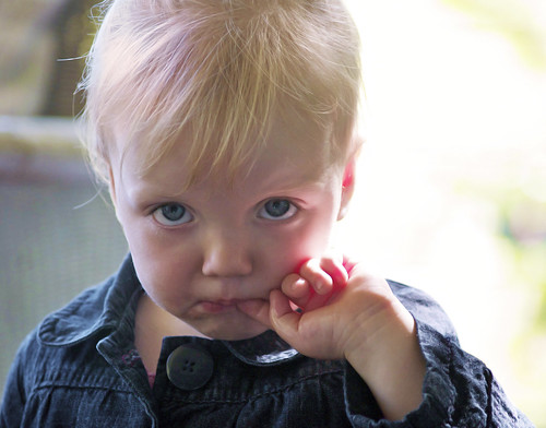
Taken two days ago: my little girl.
|
|
|
| |
|
|
|
|
|
|
|
|
|
|
|
|
 
|
|
|
Forum Rules
|
|
|
|
You may not post new threads
You may not post replies
You may not post attachments
You may not edit your posts
|
HTML code is Off
|
|
|
|
|
|
|
|
|
|
|
|