|
 |
Photo Critique Thread - [JPEG] (Page 21)
|
|
|
|
|
Banned
Join Date: Jun 2005
Location: Indy.
Status:
Offline
|
|
I have OCD and ADD. It's deadly for a photographer.
|
|
|
| |
|
|
|
|
|
|
|
Banned
Join Date: Jun 2005
Location: Indy.
Status:
Offline
|
|
|
|
|
|
| |
|
|
|
|
|
|
|
Banned
Join Date: Jun 2005
Location: Indy.
Status:
Offline
|
|
Oh, and the chromatic aberration on the left side of the butterfly bugs me too.
|
|
|
| |
|
|
|
|
|
|
|
Moderator Emeritus
Join Date: Mar 2004
Location: Copenhagen
Status:
Offline
|
|
I want their DOFs to merge a bit, somehow. I’d love a narrower DOF on the butterfly shot, having even parts of the plant partly blurred; and in the second one, I want to have more of the stream of water in focus and a smaller part of it blurred.
I also want to add a touch of blue to the water pic, but if you look through my flickr photostream, you’ll soon find that that’s a general character flaw of mine.
Apart from that, I like them. (And don’t see any chromatic aberration that I wouldn’t just have taken to be ‘the other side’ of the ‘flare’.)
|
|
|
| |
|
|
|
|
|
|
|
Banned
Join Date: Jun 2005
Location: Indy.
Status:
Offline
|
|
I am a DOF and bokeh junky. I also like green as you can tell in the two shots.
I probably should have stopped down the aperture in the water shot a stop or two. You don't want to see how many shots I took of that particular water spout.
|
|
|
| |
|
|
|
|
|
|
|
Banned
Join Date: Jun 2005
Location: Indy.
Status:
Offline
|
|
Ummm... oops.
I actually take that shot you are asking for. But the focus point is different, and from a different angle.
This one at 1/180s f/16.0

The other shot was 1/4000s f/2.8
|
|
|
| |
|
|
|
|
|
|
|
Moderator Emeritus
Join Date: Mar 2004
Location: Copenhagen
Status:
Offline
|
|
That’s a completely different picture to my eyes. In the first one, I thought you were talking about one of those little birdie fountains and the stream of water was maybe a foot or two all in all. In the second one, I can see it’s a much larger fountain, which utterly alters the way I see the picture.
A combination of the two (DOF of the second one with focus, zoom, and angle of the first) would be an absolute winner. Especially if you still managed to get that one drop (well, big drop, blob or whatever you’d call it) with the sun reflection in perfect focus, as in the first one.
|
|
|
| |
|
|
|
|
|
|
|
Banned
Join Date: Jun 2005
Location: Indy.
Status:
Offline
|
|
Unfortunately, that shot wasn't taken.
Here are two shots of the fountain. I was playing with some shots that demonstrated shutter speed. the first was at 1/4000s f/4.5 and the second at 1/10s and f/32


|
|
|
| |
|
|
|
|
|
|
|
Posting Junkie
Join Date: May 2001
Location: Brisbane, Australia
Status:
Offline
|
|
I like water too

|
|
|
| |
|
|
|
|
|
|
|
Mac Elite
Join Date: Nov 2006
Location: Pittsburgh, PA
Status:
Offline
|
|
Some quick shots of my car and one with my friends using his DSLR (my first time using one), and a shot in the dark at an HDR
comments?
suggestions?
|
|
|
| |
|
|
|
|
|
|
|
Moderator Emeritus
Join Date: Mar 2004
Location: Copenhagen
Status:
Offline
|
|
Last one doesn’t speak to me. The composition isn’t really anything at all, and the HDR is doing nothing for the shot.
I like the composition in the first one, though I’d like some more horizontal space somewhere (not sure where, though); and I don’t like the HDR on the earthy-orange colours. It makes parts of the cars appear unnaturally dark and disappear completely, and it makes the sky look like it’s made from sand paper (not, generally, an attractive trait in skies).
I love both the composition and the HDR effect in the second and third pictures. Could both use a bit less darkness (not necessarily more light, just less darkness/obscurity), though. Otherwise very nice shots.
|
|
|
| |
|
|
|
|
|
|
|
Mac Elite
Join Date: Nov 2006
Location: Pittsburgh, PA
Status:
Offline
|
|
thanks for the feedback! the third shot is by far my favorite
|
|
|
| |
|
|
|
|
|
|
|
Posting Junkie
Join Date: Mar 2005
Location: Louisiana
Status:
Offline
|
|
I like the second one the best. I do wish the lampposts were removed though. The lighting is very dramatic in that shot.
I like the third as well.
|
|
|
| |
|
|
|
|
|
|
|
Posting Junkie
Join Date: Mar 2005
Location: Louisiana
Status:
Offline
|
|
Most all I've had time for lately is portrait work...
|
|
|
| |
|
|
|
|
|
|
|
Moderator Emeritus
Join Date: Mar 2004
Location: Copenhagen
Status:
Offline
|
|
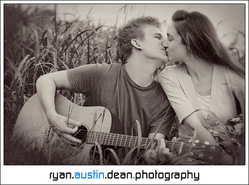
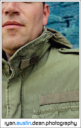
^ Is that last one Matthew Fox?
I like the first one, despite the fact that it’s classic(al) almost to the point of being clichéd.
I’m not crazy about the crop in the second one. Either show me more of his eyes or cut them out altogether. Seeing vague hints of something where the eyes are supposed to be is kind of creepy. I do love how you can almost feel the texture of the jacket, and I like the blue thingamajig (whatever it actually is) in the background.
Not directly relevant, since this is a photo critique thread, but the new logo. No. No, no, no. I loved the old one. Classic, elegant, yet simplistic and timelessly contemporary, too. This new one looks jagged, too rough for the pictures (your pictures tend to be rather ‘gentle’, for lack of a better word), too in-your-face, takes too much attention away from the picture. And also, I just plain don’t like that font for this kind of purpose. If you’re by any chance a Tori Amos fan, you can see it being used well in the sleeve for To Venus and Back: futuristic, surreal, and deliberately so. For this logo, it’s all wrong.
|
|
|
| |
|
|
|
|
|
|
|
Posting Junkie
Join Date: Feb 2005
Location: 888500128
Status:
Offline
|
|
^ I don't know much about photography, but what he said is exactly what I thought (except the Tori Amos reference, as I don't know that particular album - I stopped following her after "Boys for Pele").
|
|
|
| |
|
|
|
|
|
|
|
Posting Junkie
Join Date: Mar 2005
Location: Louisiana
Status:
Offline
|
|
Originally Posted by Oisín 
^ Is that last one Matthew Fox?
Ha...my wife wishes that was Matthew Fox. It's my cousin, who's putting out a new independent CD soon and needed new promotional materials and cover art.
I like the first one, despite the fact that it’s classic(al) almost to the point of being clichéd.
Not almost. It is clichéd. 
Clients dig clichés when they're the ones in the shot, becoming a living, breathing cliché.
I’m not crazy about the crop in the second one. Either show me more of his eyes or cut them out altogether. Seeing vague hints of something where the eyes are supposed to be is kind of creepy. I do love how you can almost feel the texture of the jacket, and I like the blue thingamajig (whatever it actually is) in the background.
You know, I nearly cropped the under-eye circles before I posted, but that would've required going back to the original file, cropping, resizing, adding to logo templates, and re-uploading. Definitely going to do it for the final before I deliver the photo. You're totally right on this one (and I expect others to agree very soon).
Not directly relevant, since this is a photo critique thread, but the new logo. No. No, no, no. I loved the old one. Classic, elegant, yet simplistic and timelessly contemporary, too. This new one looks jagged, too rough for the pictures (your pictures tend to be rather ‘gentle’, for lack of a better word), too in-your-face, takes too much attention away from the picture. And also, I just plain don’t like that font for this kind of purpose. If you’re by any chance a Tori Amos fan, you can see it being used well in the sleeve for To Venus and Back: futuristic, surreal, and deliberately so. For this logo, it’s all wrong.
Perfectly relevant, as far as I'm concerned. I'm more than willing to listen to others about this. I want a bit more feedback on it before I consider changing anything, but I'm looking to change my style, and the new logo was kind of part of that. I'm hoping to get out of the portraits business by the middle of next year (I've already declined a few weddings).
I want to get back to what I was doing beforehand: a lot more scenic urban and experimental work. I might get into stock photography in order to afford more equipment. I just don't know how much longer I can do portraits.
|
|
|
| |
|
|
|
|
|
|
|
Posting Junkie
Join Date: Mar 2005
Location: Louisiana
Status:
Offline
|
|
Originally Posted by analogika
^ I don't know much about photography, but what he said is exactly what I thought (except the Tori Amos reference, as I don't know that particular album - I stopped following her after "Boys for Pele").
The logo, the eyes, or both?
|
|
|
| |
|
|
|
|
|
|
|
Moderator Emeritus
Join Date: Apr 2001
Location: Fort Lauderdale, FL
Status:
Offline
|
|
On the beach during T.S. Fay

|
|
ice
|
| |
|
|
|
|
|
|
|
Banned
Join Date: Jun 2005
Location: Indy.
Status:
Offline
|
|
Uhhh... good use of flash?
|
|
|
| |
|
|
|
|
|
|
|
Moderator Emeritus
Join Date: Apr 2001
Location: Fort Lauderdale, FL
Status:
Offline
|
|
I'm not tryin to force a favorable critique out of anyone. I like her hair and the open mouth.
|
|
ice
|
| |
|
|
|
|
|
|
|
Administrator  Join Date: Mar 2000
Location: Land of the Easily Amused
Status:
Offline
|
|
it's a great expression. the hair in the way gives it a nice sense of motion.
|
|
|
| |
|
|
|
|
|
|
|
Posting Junkie
Join Date: Feb 2005
Location: 888500128
Status:
Offline
|
|
Originally Posted by Jawbone54
The logo, the eyes, or both?
Both.
Originally Posted by IceEnclosure
On the beach during T.S. Fay
I *really* like this one.
|
|
|
| |
|
|
|
|
|
|
|
Moderator  Join Date: May 2001
Location: Hilbert space
Status:
Offline
|
|
@Ice
That's one sexy shot 
|
|
I don't suffer from insanity, I enjoy every minute of it.
|
| |
|
|
|
|
|
|
|
Moderator Emeritus
Join Date: Apr 2001
Location: Fort Lauderdale, FL
Status:
Offline
|
|
|
|
|
ice
|
| |
|
|
|
|
|
|
|
Addicted to MacNN
Join Date: Sep 2001
Location: Toronto
Status:
Offline
|
|
Originally Posted by Jawbone54
Clients dig clichés when they're the ones in the shot, becoming a living, breathing cliché.
I am going to put on my Creative Director/teacher hat here.
I am not sure if you're aware of this, but that sentence put you, as a person, as an artist and as a photographer at a crossroads. And it's a serious decision, so think about this carefully. The questions is simply:
What kind of photographer do you want to be/become?
1. You can do what the clients expect. Photograph the cliché. Make it cute, take the money, go home and then concentrate on the creation of the stuff that makes you tick, that fulfils you - always assuming that you won't be too tired, too busy creating stuff that's essentially fluff. If you're lucky you'll make a decent living as a wedding and portrait photographer, and if you're really lucky you'll even take a picture ever now and then that you'll be proud of.
2. You can start looking for the truth. You can start creating portraits that show who and what your clients really are. You can start looking for the soul behind the face, for the important stuff. You can start giving your clients what they need, not what they expect. You can start being somebody who creates a vision, a personal way of looking at the world.
The choice is entirely yours.
|
|
|
| |
|
|
|
|
|
|
|
Addicted to MacNN
Join Date: Sep 2001
Location: Toronto
Status:
Offline
|
|
Originally Posted by IceEnclosure
Great shot. See my post above.
|
|
|
| |
|
|
|
|
|
|
|
Moderator Emeritus
Join Date: Apr 2001
Location: Fort Lauderdale, FL
Status:
Offline
|
|
Originally Posted by Mastrap
I am going to put on my Creative Director/teacher hat here.
I am not sure if you're aware of this, but that sentence put you, as a person, as an artist and as a photographer at a crossroads. And it's a serious decision, so think about this carefully. The questions is simply:
What kind of photographer do you want to be/become?
1. You can do what the clients expect. Photograph the cliché. Make it cute, take the money, go home and then concentrate on the creation of the stuff that makes you tick, that fulfils you - always assuming that you won't be too tired, too busy creating stuff that's essentially fluff. If you're lucky you'll make a decent living as a wedding and portrait photographer, and if you're really lucky you'll even take a picture ever now and then that you'll be proud of.
2. You can start looking for the truth. You can start creating portraits that show who and what your clients really are. You can start looking for the soul behind the face, for the important stuff. You can start giving your clients what they need, not what they expect. You can start being somebody who creates a vision, a personal way of looking at the world.
The choice is entirely yours.
Thoughtful post.
Mas, do you do photo work for money? I'd imagine you might sell some prints of your work. I know you have a different source of main income, just wondering if you take up photo jobs or sell your vision at all. I've been selling a few prints to friends lately. I keep the price low, just considering ink, paper, and a bit of my time. It's nice to know they like my work!
I wrote out a giant post, but it lacked any semblance of cohesion.
|
|
ice
|
| |
|
|
|
|
|
|
|
Addicted to MacNN
Join Date: Sep 2001
Location: Toronto
Status:
Offline
|
|
Originally Posted by IceEnclosure
Mas, do you do photo work for money? I'd imagine you might sell some prints of your work. I know you have a different source of main income, just wondering if you take up photo jobs or sell your vision at all. I've been selling a few prints to friends lately. I keep the price low, just considering ink, paper, and a bit of my time. It's nice to know they like my work!
.
I've just got invited to take part in a group show. There's a gallery here in Toronto specializing in photographic art and they are interested in showing some of my work.
I don't think I'd like to move into the realm of commercial photography. I had the chance to do that some time ago, and decided against it. I am having more fun being the guy commissioning the photographer, so that we can bring my vision to life together.
Having said that, I had some flattering feedback from photographers I very much admire recently, so that's all good. The images I'll be showing in the group show are these two:
Theme of the show is: To have and to have not.
|
|
|
| |
|
|
|
|
|
|
|
Banned
Join Date: Jun 2005
Location: Indy.
Status:
Offline
|
|
Originally Posted by IceEnclosure
I'm not tryin to force a favorable critique out of anyone. I like her hair and the open mouth.
It is a good shot. A teeny bit more of her in the shot, I mean a not so tight crop, and it would be an excellent photo.
Oh, and don't get me wrong, I was just avoiding any direct discussion of the obvious erotic overtones in the shot. Oops.
|
|
|
| |
|
|
|
|
|
|
|
Moderator Emeritus
Join Date: Apr 2001
Location: Fort Lauderdale, FL
Status:
Offline
|
|
Mas, that's what I pictured you doing. Love the second shot there.
Thanks for clarifying RR!
|
|
ice
|
| |
|
|
|
|
|
|
|
Clinically Insane
Join Date: Apr 2007
Location: Iowa, how long can this be? Does it really ruin the left column spacing?
Status:
Offline
|
|
|
|
|
|
| |
|
|
|
|
|
|
|
Grizzled Veteran
Join Date: Jan 2003
Location: The midwest...
Status:
Offline
|
|
|
|
|
Joe
|
| |
|
|
|
|
|
|
|
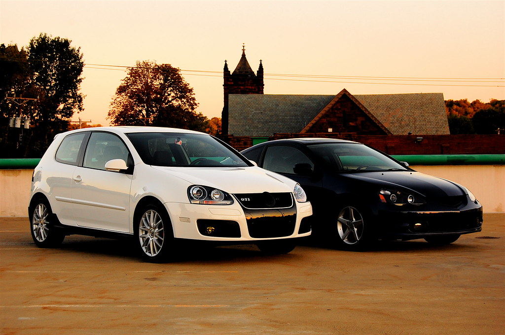
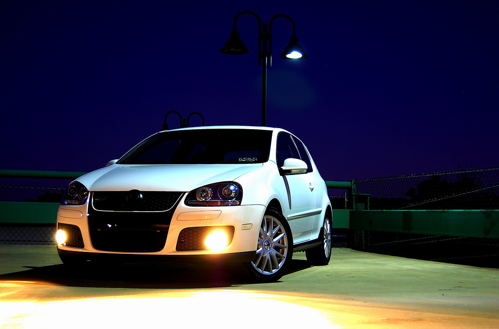
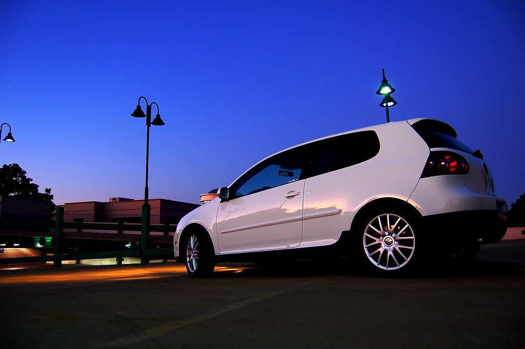
Banned
Join Date: Jun 2005
Location: Indy.
Status:
Offline
|
|
Originally Posted by Laminar
Okay, how about these three?
Much better.
1. I like the perspective. The color and saturation is well done. A wider perspective on the crop would enhance it quite a bit. The yellow line is distracting, but you could easily PS it out.
2. A little bit more of the car in the shot would make this a very good shot. It does look a little crooked too. Perhaps turn the front wheels a little more to the right and show more of the wheels.
3. Not doing anything for me.
1 & 2. the front license plate is distracting. I'd PS it out, as well as the readability of the numbers, make it look more like a car ad.
|
|
|
| |
|
|
|
|
|
|
|
Banned
Join Date: Jun 2005
Location: Indy.
Status:
Offline
|
|
Originally Posted by powerbook867
Airshow pics from a couple of weeks back..
[IMG]http://www.josefstuartphotography.com/08_airshow/IMG_1228.jpg[/I MG]
[IMG]http://www.josefstuartphotography.com/08_airshow/IMG_1707.jpg[/I MG]
[IMG]http://www.josefstuartphotography.com/08_airshow/IMG_1810.jpg[/I MG]
[IMG]http://www.josefstuartphotography.com/08_airshow/IMG_1949.jpg[/I MG]
[IMG]http://www.josefstuartphotography.com/08_airshow/IMG_1969.jpg[/I MG]
Please don't dump so many pictures here. This is a thread asking people to critique photos, not a gallery for your work.
EDIT: and buy a polarizer
|
|
|
| |
|
|
|
|
|
|
|
Clinically Insane
Join Date: Apr 2007
Location: Iowa, how long can this be? Does it really ruin the left column spacing?
Status:
Offline
|
|
Originally Posted by Railroader
Much better.
1. I like the perspective. The color and saturation is well done. A wider perspective on the crop would enhance it quite a bit. The yellow line is distracting, but you could easily PS it out.
2. A little bit more of the car in the shot would make this a very good shot. It does look a little crooked too. Perhaps turn the front wheels a little more to the right and show more of the wheels.
3. Not doing anything for me.
1 & 2. the front license plate is distracting. I'd PS it out, as well as the readability of the numbers, make it look more like a car ad.
Thanks for the suggestions. I looked into pulling the front license plate off, but I think I have to go at it from behind the bumper, so I decided it'd just be easier to photoshop it after the fact.
|
|
|
| |
|
|
|
|
|
|
|
Moderator Emeritus
Join Date: Mar 2004
Location: Copenhagen
Status:
Offline
|
|
Originally Posted by Laminar
Thanks for the suggestions. I looked into pulling the front license plate off, but I think I have to go at it from behind the bumper, so I decided it'd just be easier to photoshop it after the fact.
Completely off-topic, but when I was walking home from my team’s team-building day-activity-thingy last night (at about 1:45 AM), I passed two police officers pulling the licence plate off a car parked almost right outside where I live (no sign of an owner anywhere). Odd time to be doing that.
|
|
|
| |
|
|
|
|
|
|
|
Clinically Insane
Join Date: Apr 2007
Location: Iowa, how long can this be? Does it really ruin the left column spacing?
Status:
Offline
|
|
Originally Posted by Oisín
my team’s team-building day-activity-thingy last night (at about 1:45 AM)
I believe that belongs here.
|
|
|
| |
|
|
|
|
|
|
|
Moderator Emeritus
Join Date: Mar 2004
Location: Copenhagen
Status:
Offline
|
|
Originally Posted by Laminar
I believe that belongs here.
Oh, come on. There were only 20 of us, that hardly counts as ‘kinky’.
(
Last edited by Oisín; Sep 12, 2008 at 10:18 PM.
Reason: Fumblefingers)
|
|
|
| |
|
|
|
|
|
|
|
Clinically Insane
Join Date: Apr 2007
Location: Iowa, how long can this be? Does it really ruin the left column spacing?
Status:
Offline
|
|
Originally Posted by Oisín
Oh, come one. There were only 20 of us, that hardly counts as ‘kinky’.
Did I just catch two mistakes? Are you drunk?
|
|
|
| |
|
|
|
|
|
|
|
Moderator Emeritus
Join Date: Mar 2004
Location: Copenhagen
Status:
Offline
|
|
Originally Posted by Laminar
Did I just catch two mistakes? Are you drunk?
Two? I see only one …
(It’s 4:15 AM. I’m using that as my excuse for my typo. Bugger.)
|
|
|
| |
|
|
|
|
|
|
|
Clinically Insane
Join Date: Apr 2007
Location: Iowa, how long can this be? Does it really ruin the left column spacing?
Status:
Offline
|
|
Originally Posted by Oisín
Two? I see only one …
(It’s 4:15 AM. I’m using that as my excuse for my typo. Bugger.)
1. "one"
2. I thought it should be "'kinky.'"
|
|
|
| |
|
|
|
|
|
|
|
Moderator Emeritus
Join Date: Mar 2004
Location: Copenhagen
Status:
Offline
|
|
Ah, well, no—not in British English. 
This thread needs more photos. Sadly, I don’t really have any at the moment. Too much work, too little snapping.
|
|
|
| |
|
|
|
|
|
|
|
Clinically Insane
Join Date: Apr 2007
Location: Iowa, how long can this be? Does it really ruin the left column spacing?
Status:
Offline
|
|
Here are a couple more from that same set:


|
|
|
| |
|
|
|
|
|
|
|
Banned
Join Date: Jun 2005
Location: Indy.
Status:
Offline
|
|
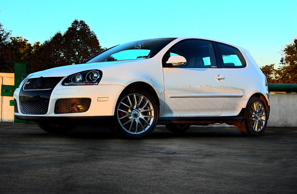
#1. There's a pole sticking out of the sunroof. Sign is distracting.
#2. Much better, but slightly crooked and cropped too much off the bottom.
#1 & #2. I think the depth of field is too great. There's too much in focus distracting from the object of interest.
|
|
|
| |
|
|
|
|
|
|
|
Clinically Insane
Join Date: Apr 2007
Location: Iowa, how long can this be? Does it really ruin the left column spacing?
Status:
Offline
|
|
Originally Posted by Railroader
#1. There's a pole sticking out of the sunroof. Sign is distracting.
#2. Much better, but slightly crooked and cropped too much off the bottom.
#1 & #2. I think the depth of field is too great. There's too much in focus distracting from the object of interest.
Okay, I un-cropped it and straighted it.

|
|
|
| |
|
|
|
|
|
|
|
Banned
Join Date: Jun 2005
Location: Indy.
Status:
Offline
|
|
Originally Posted by Laminar
Okay, I un-cropped it and straighted it.
MUCH better.
|
|
|
| |
|
|
|
|
|
|
|
Posting Junkie
Join Date: Feb 2005
Location: 888500128
Status:
Offline
|
|
Originally Posted by Oisín
Oh, come on. There were only 20 of us, that hardly counts as ‘kinky’.
You're missing a semicolon, laddie.
|
|
|
| |
|
|
|
|
|
|
|
Moderator Emeritus
Join Date: Mar 2004
Location: Copenhagen
Status:
Offline
|
|
Originally Posted by analogika
You're missing a semicolon, laddie.
Semicolons tend to go missing in the night ’round these parts.
|
|
|
| |
|
|
|
|
|
|
|
Posting Junkie
Join Date: Feb 2005
Location: 888500128
Status:
Offline
|
|
No way I'm gonna make the joke about you going off and finding colons in the middle of the night.
No way.
Nope.
|
|
|
| |
|
|
|
|
|
|
|
|
|
|
|
|
 
|
|
|
Forum Rules
|
|
|
|
You may not post new threads
You may not post replies
You may not post attachments
You may not edit your posts
|
HTML code is Off
|
|
|
|
|
|
|
|
|
|
|
|