|
 |
Blast from the Aqua past... what were they thinking?
|
|
|
|
|
Mac Elite
Join Date: Sep 2006
Location: Back in the Good Ole US of A
Status:
Offline
|
|
I just went to download the latest version of Xcode and was presented with this sign in page:

Check out that early Aqua style button. I remember when I thought that look was cool. In retrospect it's rather garish.
Where you an early Aqua fan?
|
|
|
| |
|
|
|
|
|
|
|
Clinically Insane
Join Date: Oct 2001
Location: San Diego, CA, USA
Status:
Offline
|
|
Yes, but those buttons always looked weird and smudgy to me.
|
|
Chuck
___
"Instead of either 'multi-talented' or 'multitalented' use 'bisexual'."
|
| |
|
|
|
|
|
|
|
Mac Elite
Join Date: Sep 2006
Location: Back in the Good Ole US of A
Status:
Offline
|
|
Originally Posted by Chuckit 
Yes, but those buttons always looked weird and smudgy to me.
Most definitely. The shadows on the letters was WAY over the top.
|
|
|
| |
|
|
|
|
|
|
|
Professional Poster
Join Date: Jun 2007
Status:
Offline
|
|
Migrating from platinum to aqua, yes they looked "cool" but I agree that they do look garish
|
|
|
| |
|
|
|
|
|
|
|
Posting Junkie
Join Date: Mar 2001
Location: Salamanca, España
Status:
Offline
|
|
I'd like to see Apple do away with those pill buttons and use something like is in the iPhone interface.

|
|
I could take Sean Connery in a fight... I could definitely take him.
|
| |
|
|
|
|
|
|
|
Posting Junkie
Join Date: May 2001
Location: Brisbane, Australia
Status:
Offline
|
|
Was there ever a drop shadow on the text on actual system buttons or was this a web thing? There was always huge discrepancies between "web-aqua" and system aqua.

DP4

Public Beta

Cheetah (10.0)
(
Last edited by - - e r i k - -; Apr 17, 2008 at 08:14 PM.
)
|
|
|
| |
|
|
|
|
|
|
|
Mac Elite
Join Date: Jan 2003
Location: San Diego
Status:
Offline
|
|
Part of me kind of misses the stripes from Jaguar.
|
|
|
| |
|
|
|
|
|
|
|
Professional Poster
Join Date: May 2007
Status:
Offline
|
|
Originally Posted by - - e r i k - -
Was there ever a drop shadow on the text on actual system buttons or was this a web thing? There was always huge discrepancies between "web-aqua" and system aqua.]
Cheetah (10.0)
How do you not see the drop shadow there?
|
|
|
| |
|
|
|
|
|
|
|
Posting Junkie
Join Date: Feb 2005
Location: 888500128
Status:
Offline
|
|
Originally Posted by adamfishercox
How do you not see the drop shadow there?
In the actual buttons of the Public Beta? I'm having trouble seeing what you're seeing.
|
|
|
| |
|
|
|
|
|
|
|
Professional Poster
Join Date: May 2007
Status:
Offline
|
|
There's drop shadows on the DP4 buttons, on the Public Beta Menu bar, but there are no pill buttons seen in the public beta screenshot.
|
|
|
| |
|
|
|
|
|
|
|
Posting Junkie
Join Date: Feb 2005
Location: 888500128
Status:
Offline
|
|
Originally Posted by adamfishercox
There's drop shadows on the DP4 buttons, on the Public Beta Menu bar, but there are no pill buttons seen in the public beta screenshot.
There's two in the "Mac Help" window, and the text in them has no drop shadows.
|
|
|
| |
|
|
|
|
|
|
|
Mac Elite
Join Date: Mar 2001
Location: München, Deutschland
Status:
Offline
|
|
Originally Posted by Atheist
Were you an early Aqua fan?
No, never. I didn't like the GUI and the technical presentation layer (full scale anti-alias) from the first moment. I've always been a fan of the classical OS7, OS8, OS9 pixel-for-pixel style, that's much better for 2D graphic work, DTP etc. I wished they would have brought that sort of GUI into the 21st century... 
Regards,
PB.
|
|
Aut Caesar aut nihil.
|
| |
|
|
|
|
|
|
|
Mac Elite
Join Date: Aug 2007
Status:
Offline
|
|
|
|
|
MacBook Pro 13" 2.8GHz Core i7/8GB RAM/750GB Hard Drive - Mac OS X 10.7.3
|
| |
|
|
|
|
|
|
|
Posting Junkie
Join Date: Feb 2005
Location: 888500128
Status:
Offline
|
|
I have to admit: I've always really like Aqua. Although I've been very pleased with the way they've toned it down over the years.
|
|
|
| |
|
|
|
|
|
|
|
Mac Elite
Join Date: Dec 2000
Location: Netherlands
Status:
Offline
|
|
I'm getting fed up with the aqua buttons. i've seen it too much on other people's websites as well.
|
|
{Animated sigs are not allowed.}
|
| |
|
|
|
|
|
|
|
Addicted to MacNN
Join Date: Jan 2000
Location: Stoneham, MA, USA
Status:
Offline
|
|
What we need are some images of graphical widgets from OS 9, System 7, and Windows 95. Lets put things in perspective, and those OS X 10.0 buttons will again look badass :-)
|
|
|
| |
|
|
|
|
|
|
|
Mac Elite
Join Date: Aug 2007
Status:
Offline
|
|
OS 9:
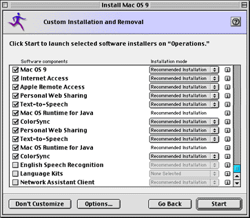
|
|
MacBook Pro 13" 2.8GHz Core i7/8GB RAM/750GB Hard Drive - Mac OS X 10.7.3
|
| |
|
|
|
|
|
|
|
Senior User
Join Date: Jun 2007
Location: Aberdeen, UK
Status:
Offline
|
|
Originally Posted by analogika
I have to admit: I've always really like Aqua. Although I've been very pleased with the way they've toned it down over the years.
Same here. My one big disappointment was brushed metal in Tiger. I loved the ‘Unified’ theme that was predominant in Preview, Mail, System Preferences and such (a good example of it can be found here). Now, if they’d used that theme system-wide, including Finder and Safari, I would have been a very happy man. I thought it was nigh-on perfect (perhaps because I love pinstripes).
That said, I do like Leopard’s new homogenous interface—whilst it’s less ground-breaking than Aqua was/is, it’s nice to finally have something approaching consistency throughout OSX.
Loathe as I am to agree with John Siracusa, he was pretty much spot on when he said:
Originally Posted by John Siracusa
That's not to say that it was perfect—far from it. Some judged it too bright; the pinstripes were a bit too pronounced; translucency hindered legibility in some areas; the list went on. These flaws were slowly corrected with each subsequent revision of Mac OS X. But while these corrections improved the usability and (usually) the look of the OS, they also compromised the overall aesthetic design. What started as a (flawed) work of genius was patched and filled and tweaked by a committee of pragmatists, rendering it much improved, but considerably less inspired. ( Source.)
I think it’s important not to judge Aqua too harshly. Whilst it’s very easy to look back with almost eight years of experience and modification and denounce it as terrible, one has to remember just how incredibly different it was when it was released. I remember seeing it around about the time (still being a Windows ’95 user then) and thinking how incredible it was. Now, I likely wouldn’t be so easily impressed, but then I was blown-away.
|
|
|
| |
|
|
|
|
|
|
|
Posting Junkie
Join Date: Jan 2006
Location: Colorado
Status:
Offline
|
|
I like Panther's Aqua the best. Very refined I think. In fact, I like it so much I use it everyday.

|
|
|
| |
|
|
|
|
|
|
|
Posting Junkie
Join Date: Mar 2001
Location: Salamanca, España
Status:
Offline
|
|
Originally Posted by 64stang06
OS 9:
Looks pretty good, considering. I prefer OS X unified look, but that's way better than the atrocity that was Aqua.
Aqua dared to be different, but so did punks.

|
|
I could take Sean Connery in a fight... I could definitely take him.
|
| |
|
|
|
|
|
|
|
Mac Elite
Join Date: Aug 2007
Status:
Offline
|
|
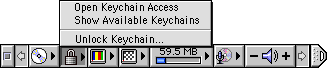
System 7:

|
|
MacBook Pro 13" 2.8GHz Core i7/8GB RAM/750GB Hard Drive - Mac OS X 10.7.3
|
| |
|
|
|
|
|
|
|
Addicted to MacNN
Join Date: Jul 2004
Location: Toronto
Status:
Offline
|
|
I always felt Aqua was too bright. Leopard has finally solved that problem. Before Leopard, I used a hack that changed all windows to Unified, and before that was available I used a hack to make all windows brushed metal. Pin-stripped windows were just too damn bright.
|
|
|
| |
|
|
|
|
|
|
|
Senior User
Join Date: Jun 2007
Location: Aberdeen, UK
Status:
Offline
|
|
Originally Posted by lpkmckenna
Before Leopard, I used a hack that changed all windows to Unified, and before that was available I used a hack to make all windows brushed metal. Pin-stripped windows were just too damn bright.
What hack did you use? And where can I find it? I'd really love to get a fully-unified Tiger on the go on my iBook...
|
|
|
| |
|
|
|
|
|
|
|
Posting Junkie
Join Date: Jan 2006
Location: Colorado
Status:
Offline
|
|
I'm guessing he used Uno.
|
|
|
| |
|
|
|
|
|
|
|
Addicted to MacNN
Join Date: Jul 2004
Location: Toronto
Status:
Offline
|
|
|
|
|
|
| |
|
|
|
|
|
|
|
Moderator Emeritus
Join Date: Mar 2004
Location: Copenhagen
Status:
Offline
|
|
I keep expecting this thread to be about Barbie Girl.
|
|
|
| |
|
|
|
|
|
|
|
Addicted to MacNN
Join Date: Jan 2000
Location: Stoneham, MA, USA
Status:
Offline
|
|
Originally Posted by Oisín
I keep expecting this thread to be about Barbie Girl.
UGH
|
|
|
| |
|
|
|
|
|
|
|
Moderator Emeritus
Join Date: Mar 2004
Location: Copenhagen
Status:
Offline
|
|
^ Exactly. Hence the, “What were they thinking?” part.
|
|
|
| |
|
|
|
|
|
|
|
Addicted to MacNN
Join Date: Jan 2001
Location: The Sar Chasm
Status:
Offline
|
|
Originally Posted by lpkmckenna
Uno has made 10.4 quite tolerable. The first thing I did when I got 10.1 (skipped 10.0) was theme away the stripes. Not a big brushed-metal fan, either.
I haven't bought 10.5 yet, but I had a look at it yesterday -- the Finder seems nicely done, interface-wise, though the coverflow bit kind of seems superfluous. It's nice having the alternating bands in list view. Very subtle, but helpful.
|
 When a true genius appears in the world you may know him by this sign, that the dunces are all in confederacy against him.
 -- Jonathan Swift.
|
| |
|
|
|
|
|
|
|
Addicted to MacNN
Join Date: Nov 2007
Location: In the hearts and minds of MacNNers
Status:
Offline
|
|
Originally Posted by Oisín
I keep expecting this thread to be about Barbie Girl.
That song makes me smile.
Also the dutch version from the Simpsons.
|
|
|
| |
|
|
|
|
|
|
|
Senior User
Join Date: Jun 2007
Location: Aberdeen, UK
Status:
Offline
|
|
Originally Posted by lpkmckenna
Damn—I already tried Uno, and I wasn’t too impressed. I thought it was a theme that used Apple’s old ‘Unified’ (really pale with pinstripes) system-wide. Thanks anyway.
|
|
|
| |
|
|
|
|
|
|
|
Posting Junkie
Join Date: Jan 2006
Location: Colorado
Status:
Offline
|
|
There is a Japanese version of Barbie Girl floating around. It is awesome.
|
|
|
| |
|
|
|
|
|
|
|
Posting Junkie
Join Date: May 2001
Location: Brisbane, Australia
Status:
Offline
|
|
Originally Posted by Koralatov
Damn—I already tried Uno, and I wasn’t too impressed. I thought it was a theme that used Apple’s old ‘Unified’ (really pale with pinstripes) system-wide. Thanks anyway.
Uno lets you choose between standard (light) Unified and dark Unified (iLife and Leopard).
|
|
|
| |
|
|
|
|
|
|
|
Posting Junkie
Join Date: Dec 2000
Status:
Offline
|
|
I'd kind of have to think that the dark Unified would have to be the "standard" theme, since it's the actual system-wide skin and the light Unified isn't.
|
|
|
| |
|
|
|
|
|
|
|
Posting Junkie
Join Date: May 2001
Location: Brisbane, Australia
Status:
Offline
|
|
Originally Posted by CharlesS
I'd kind of have to think that the dark Unified would have to be the "standard" theme, since it's the actual system-wide skin and the light Unified isn't.
Uno = Tiger, not Leopard.
There were no system wide skin back then and Dark Unified is not the same as the Leopard skin.
|
|
|
| |
|
|
|
|
|
|
|
Registered User
Join Date: Apr 2000
Status:
Offline
|
|
It was always pretty damn awful.
Platinum ftw.
|
|
|
| |
|
|
|
|
|
|
|
Mac Elite
Join Date: Aug 2007
Status:
Offline
|
|
Originally Posted by Cipher13
It was always pretty damn awful.
Platinum ftw.
I loved platinum. For awhile, I used a Platinum theme for OS X until 10.4 I believe. Gershwix I think?
|
|
MacBook Pro 13" 2.8GHz Core i7/8GB RAM/750GB Hard Drive - Mac OS X 10.7.3
|
| |
|
|
|
|
|
|
|
Grizzled Veteran
Join Date: May 2001
Location: Ca
Status:
Offline
|
|
wow taken back thanks for the ride.
|
With some loud music + a friend to chat nearby you can get alot done. - but jezz, I'd avoid it if I had the choice---- If only real people came with Alpha Channels.......:)
AIM:xflaer
deinterlaced.com
|
| |
|
|
|
|
|
|
|
Professional Poster
Join Date: Dec 2000
Location: UK
Status:
Offline
|
|
Ahhhh, Control Strip!!! 
|

It'll be much easier if you just comply.
|
| |
|
|
|
|
|
|
|
Addicted to MacNN
Join Date: Nov 2007
Location: In the hearts and minds of MacNNers
Status:
Offline
|
|
God, I hated the aesthetics of that thing.
Of course, the menubar suffers from the same overloading nowadays.
|
|
|
| |
|
|
|
|
|
|
|
Posting Junkie
Join Date: Dec 2000
Status:
Offline
|
|
Originally Posted by - - e r i k - -
Uno = Tiger, not Leopard.
There were no system wide skin back then and Dark Unified is not the same as the Leopard skin.
Tiger didn't have a dark unified skin though, did it?
I don't remember one, at least.
|
|
|
| |
|
|
|
|
|
|
|
Addicted to MacNN
Join Date: Jul 2004
Location: Toronto
Status:
Offline
|
|
Originally Posted by CharlesS
Tiger didn't have a dark unified skin though, did it?
I don't remember one, at least.
The latest iLife release was darker than standard unified apps.
|
|
|
| |
|
|
|
|
|
|
|
Posting Junkie
Join Date: Feb 2005
Location: 888500128
Status:
Offline
|
|
Originally Posted by Cipher13
It was always pretty damn awful.
Platinum ftw.
I always like the slightly lighter tone of System 7 a lot better.
And I always hated the resizable window-borders. Annoying to no end, the goddamn ****ers.
And the Control Strip was just clunky. Always. Somewhat useful, but clunky.
|
|
|
| |
|
|
|
|
|
|
|
Clinically Insane
Join Date: Oct 2001
Location: San Diego, CA, USA
Status:
Offline
|
|
Originally Posted by analogika
I always like the slightly lighter tone of System 7 a lot better.
And I always hated the resizable window-borders. Annoying to no end, the goddamn ****ers.
And the Control Strip was just clunky. Always. Somewhat useful, but clunky.
Resizable window borders? How did you change their size?
|
|
Chuck
___
"Instead of either 'multi-talented' or 'multitalented' use 'bisexual'."
|
| |
|
|
|
|
|
|
|
Posting Junkie
Join Date: Feb 2005
Location: 888500128
Status:
Offline
|
|
Sorry - meant "grabbable".
|
|
|
| |
|
|
|
|
|
|
|
|
|
|
|
|
 
|
|
|
Forum Rules
|
|
|
|
You may not post new threads
You may not post replies
You may not post attachments
You may not edit your posts
|
HTML code is Off
|
|
|
|
|
|
|
|
|
|
|
|