 |
 |
Photo Critique Thread - [JPEG] (Page 17)
|
|
|
|
|
Moderator Emeritus
Join Date: Apr 2001
Location: Fort Lauderdale, FL
Status:
Offline
|
|
AK your photos there look icey cold and uncomfortable. And desolate. The last crop is probably the best.
Now let's get around the fire because we're having beef tenderloin!

and this guy's not getting any!!!
 Flickr: android in florida's Photostream
(
Last edited by IceEnclosure; Jun 4, 2008 at 02:36 AM.
)
|
|
ice
|
| |
|
|
|
|
|
|
|
Banned
Join Date: Jun 2005
Location: Indy.
Status:
Offline
|
|
Originally Posted by AKcrab 
Crop adjusted a tad.

You're right. The bigger ice chunk looked strange when cropped that far. I think the 'happy medium' is best.
I have some glacier shots that I'm tempted to post, but the photos just don't portray the actual subject. It's hard when there is nothing in the frame to give you some sense of scale, and since I don't have a SLR, the colors don't seem to come out quite right. Maybe I'll post some just to see if there are some suggestions on how to make them better. It sucks when you have a fabulous subject, but can't seem to capture it.
We sell Canon cameras where I work, but I just can't squeeze a SLR into my budget right now.
That crop is much better. Looking at the larger size (I was trying to peek at the details in the mist) I noticed a bit of noise in the shot. Were you on a boat and had to use high ISO?
I know what you mean about losing scale on massive sized natural wonders.
Here's a image I captured while on my Sleeping Bear Dunes shot. The dunes are so massive. That is a person in the lower right side. That small black speck. When I straighten the image the crop cuts out the person and all scale is lost. Actually, I think the picture looks better slightly crooked. what od you think?

|
|
|
| |
|
|
|
|
|
|
|
Banned
Join Date: Jun 2005
Location: Indy.
Status:
Offline
|
|
Originally Posted by IceEnclosure
AK your photos there look icey cold and uncomfortable. And desolate. The last crop is probably the best.
Now let's get around the fire because we're having beef tenderloin!
and this guy's not getting any!!!
Flickr: android in florida's Photostream
Both are excellent shots. Very good composition.
The top one could use a little boost in the dark areas. A little too much detail is obscured. Makes the fire dramatic, but dulls the overall picture. The color balance is very good.
The bottom one certainly captures a mood. A look of longing or guilt. Could use a little straightening.
|
|
|
| |
|
|
|
|
|
|
|
Professional Poster
Join Date: Nov 2004
Location: Belgium
Status:
Offline
|
|
Let's add another one. One from the archives.

|

iMac 20" C2D 2.16 | Acer Aspire One | Flickr
|
| |
|
|
|
|
|
|
|
Moderator  Join Date: May 2001
Location: Hilbert space
Status:
Offline
|
|
Originally Posted by IceEnclosure
and this guy's not getting any!!!
I don't like the shadows on this one: way too pronounced and `pointing in the wrong direction. If there was a shadow only on the person, it would look better, but the kitchen equipment casts very heavy shadows, too.
The composition is great, really great.
I might try to add grain and soften the image and see how that works. Right now, it's too cold and analytical.
Hmmm, on second thought, I don't understand the mood of this picture completely. I cannot complete the story: he doesn't seem like he's in a hurry to `get out,' but he doesn't seem to want to stay there either.
Idea: 7/10
Technique: 4/10
Composition: 8.5/10
Edit: I'm complaining on a very high level here 
|
|
I don't suffer from insanity, I enjoy every minute of it.
|
| |
|
|
|
|
|
|
|
Banned
Join Date: Jun 2005
Location: Indy.
Status:
Offline
|
|
Originally Posted by Goldfinger
Let's add another one. One from the archives.
Very good shot.
Awesome example of a prefect opportunity to bust the rule of thirds! A small improvement would have been to have the perspective of the dock lines even in the middle of the left side of frame. The fog making the dock disappear is surreal.
Could use a little more contrast, but possibly not.
|
|
|
| |
|
|
|
|
|
|
|
Addicted to MacNN
Join Date: Sep 2001
Location: Toronto
Status:
Offline
|
|
Originally Posted by Railroader
Very good shot.
Awesome example of a prefect opportunity to bust the rule of thirds! A small improvement would have been to have the perspective of the dock lines even in the middle of the left side of frame. The fog making the dock disappear is surreal.
Could use a little more contrast, but possibly not.
Interesting that you say 'bust'. I'd say quite the opposite, this image uses the rule of thirds almost textbook perfect. The water fades on the bottom third, the bridge fades on the left third. The only thing that could be done to make is adher even stricter (not that this would make it a better photograph) is to raise the crop a little.

|
|
|
| |
|
|
|
|
|
|
|
Moderator Join Date: May 2001
Location: Hilbert space
Status:
Offline
|
|
Yes, agreed, the proportions, the angle, everything is perfectly done. Ditto for the fog: the bridge is pretty much lost in the middle of the pic! 
|
|
I don't suffer from insanity, I enjoy every minute of it.
|
| |
|
|
|
|
|
|
|
Banned
Join Date: Jun 2005
Location: Indy.
Status:
Offline
|
|
Originally Posted by Mastrap
Interesting that you say 'bust'. I'd say quite the opposite, this image uses the rule of thirds almost textbook perfect. The water fades on the bottom third, the bridge fades on the left third. The only thing that could be done to make is adher even stricter (not that this would make it a better photograph) is to raise the crop a little.
I completely disagree.
I'm glad you put that grid on there. Almost nothing of interest in that photo falls in the "thirds". The dock fades before the line, the gradient of the water is even so it doesn't fall on a line either.
If anything, crop the top a bit to move the dock higher. A tighter crop on the dock would put it in the thirds rule, but would not made the photo look better.
|
|
|
| |
|
|
|
|
|
|
|
Mac Enthusiast
Join Date: Nov 2002
Location: More Cowbell...
Status:
Offline
|
|
Originally Posted by Railroader
Here's a image I captured while on my Sleeping Bear Dunes shot. The dunes are so massive. That is a person in the lower right side. That small black speck. When I straighten the image the crop cuts out the person and all scale is lost. Actually, I think the picture looks better slightly crooked. what od you think?
I can appreciate the scale, but that shot is somewhat disorienting to me. Maybe that is what you were going for, but I dont take in the "massive dune" feel, but rather a crooked, off balance feel. Almost like I am about to take a tumble down the dune. I really do like the contrast in color between the deep blue of the ocean, and the sand.
Here is one to fire away at- formation flying high over Minnesota. Taken with the cockpit of the T-6 open, facing backwards. Lots of vibration, and LOTS of wind make for a challenge when lining up/holding a shot, but this is one of the keepers:

|
|
|
| |
|
|
|
|
|
|
|
Moderator Emeritus
Join Date: Apr 2001
Location: Fort Lauderdale, FL
Status:
Offline
|
|
That's a nice photo especially with all the challenges you were facing. I also like the wing coming into the foreground and out of the frame. Dunno if everyone will. For fun, I will imagine the second plane as being very small, and just sitting directly above the larger plane. : |
|
|
ice
|
| |
|
|
|
|
|
|
|
Administrator  Join Date: Apr 2001
Location: San Antonio TX USA
Status:
Offline
|
|
Railroader, the dunes shot defies critique. If I hadn't seen them myself, I would simply be unable to appreciate the immensity of what you photographed. Maybe make it less representational, and not worry about the guy (I believe you that the dot is a guy) "providing scale" since he's hard to see at all?
My hat's off to you on that in-air picture. T-6s (the Texan) are notorious for being unsmooth in about 9 directions (one for every cylinder in the engine). I've seen a lot of aerial photography in my day (worked with a few of the USAF's official photographers, even) and that's right up there. My hat's off to you on getting that shot at all, let alone as clean and crisp as it is.
Now, my picture:
Aside from red eye work, any suggestions?
|
 Glenn -----OTR/L, MOT, Tx
|
| |
|
|
|
|
|
|
|
Mac Enthusiast
Join Date: Nov 2002
Location: More Cowbell...
Status:
Offline
|
|
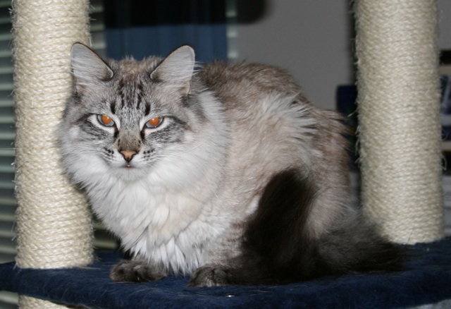
Originally Posted by ghporter
My hat's off to you on that in-air picture. T-6s (the Texan) are notorious for being unsmooth in about 9 directions (one for every cylinder in the engine). I've seen a lot of aerial photography in my day (worked with a few of the USAF's official photographers, even) and that's right up there. My hat's off to you on getting that shot at all, let alone as clean and crisp as it is.
Thank you very much Glenn! I'm glad you enjoyed the image. Its hard to describe how bumpy/windy it is in a T-6, and that coupled with the adrenaline of formation flying (its quite a rush!) makes its hard to hold a camera steady. My secret is to take hundreds of shots.. an your bound to get a couple of keepers  , also I get up and flying with my uncle (he is the one flying the #42 plane) and his friends at every opportunity, to get practice (the first time I went up with them, I had no keepers at all- everything was just blurry as can be). There is a small gallery of shots from that day here if you want to see more: T-6 Flying with Uncle Bruce (7/3/06) (there are a few shots of a P-51D that joined us that day as well.. ).
Now, my picture:
Aside from red eye work, any suggestions?
I like the texture you brought out in the kitty- its almost as if you could reach out and pet him (and he looks oh so soft). And the look on his face is so very feline. I think what detracts from the image is the background. Cat condo's aren't the most exciting backdrop, and he kind of blends in with the grey and blue hues. When it comes to pets, I always find that my best shots of my guy (a dog) is in natural light- catching him either while he is outside, or when he's intently staring out the window at something. The natural light just seems to bring more out, and makes the subject pop a bit more.
|
|
|
| |
|
|
|
|
|
|
|
Addicted to MacNN
Join Date: Sep 2001
Location: Toronto
Status:
Offline
|
|
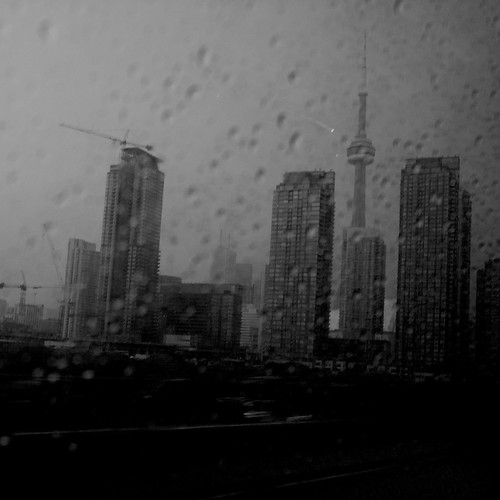
Downtown Toronto in the rain. Shot from the Gardiner Highway, out of a car.
|
|
|
| |
|
|
|
|
|
|
|
Banned
Join Date: Jun 2005
Location: Indy.
Status:
Offline
|
|
Originally Posted by ghporter
Now, my picture:
Aside from red eye work, any suggestions?
your depth of field is too great. The background is very distracting. this site explains depth of filed and aperture quite well; Photographic examples of aperture and depth of field | DigicamGuides.com
To sum it up, you need to open up your aperture, the f-stop on your camera. It's it opposite what you think, you actually make the f-stop/aperture number smaller to open up the aperture. a f-stop of 1.8 or lower would really make your cat "pop" in that pic and blur the background. Buy a 50mm f/1.8 lens for your camera. they are only about $80 and allow you to take some amazing pictures. Very good for portrait work.
Also, you could crop it a little to remove the outer edges of the cat-condo towers and frame the cat between them. It would reduce some distractions as well.
|
|
|
| |
|
|
|
|
|
|
|
Banned
Join Date: Jun 2005
Location: Indy.
Status:
Offline
|
|
I took the time to show you what I mean. If you want me to, I will remove this image from the post.

|
|
|
| |
|
|
|
|
|
|
|
Addicted to MacNN
Join Date: Sep 2001
Location: Toronto
Status:
Offline
|
|
Also, whenever possible try and shoot without a direct flash. Hitting your subject with a lot of light straight from the front makes an image flat. Try and either bounce the flash off the wall or ceiling, invest in a diffuser (Railroader has posted a number of useful links there) or ideally use available light.
|
|
|
| |
|
|
|
|
|
|
|
Moderator Emeritus
Join Date: Apr 2001
Location: Fort Lauderdale, FL
Status:
Offline
|
|
Well I think there were new rules, something about 1 photo per post, and I think I already broke that at the top of this page, but yo:
*snip*
Thanks for the feedback guys, I'm taking notes..
(
Last edited by IceEnclosure; Jul 10, 2008 at 02:10 AM.
Reason: well,)
|
|
ice
|
| |
|
|
|
|
|
|
|
Moderator  Join Date: Jan 2001
Location: Polwaristan
Status:
Offline
|
|
Originally Posted by IceEnclosure
Well I think there were new rules, something about 1 photo per post, and I think I already broke that at the top of this page
It's three per post.
|
|
|
| |
|
|
|
|
|
|
|
Moderator Emeritus
Join Date: Apr 2001
Location: Fort Lauderdale, FL
Status:
Offline
|
|
Originally Posted by Cold Warrior
It's three per post.
Thank you! It's quite late here and I had just finished editing about 40 photos!
Mastrap, your rainy photo looks very cold and sad.
|
|
ice
|
| |
|
|
|
|
|
|
|
Administrator Join Date: Apr 2001
Location: San Antonio TX USA
Status:
Offline
|
|
Originally Posted by Railroader
I took the time to show you what I mean. If you want me to, I will remove this image from the post.
That really does make her pop out of the picture. What tool did you use for red eye? My Canon tools don't do the correction that well.
This was taken on fully automatic mode. I hadn't really thought much about depth of field when I took the picture, so the camera made the decision for me. It does have an aperture priority mode, which would probably work better for this sort of thing—if I'd thought to use it. I'll start playing with that.
At the moment all I have is the built-in flash and a VERY old Vivitar with a Canon adapter on it, so I'll have to start looking into more flexible flash lighting. Maybe that spherical flash that's been discussed in the wedding photo thread would be a good idea for more diffuse light. Now, if I could wind up with some natural light that isn't all gray and rain-threatening, I might get some sunlit pictures... Darn weather!
Thanks for the feedback.
|
Glenn -----OTR/L, MOT, Tx
|
| |
|
|
|
|
|
|
|
Moderator Emeritus
Join Date: Apr 2001
Location: Fort Lauderdale, FL
Status:
Offline
|
|
Glenn, I abhor using my built-in flash since getting an external. Although they even have diffusers for the pop-up flashes.
|
|
ice
|
| |
|
|
|
|
|
|
|
Administrator Join Date: Apr 2001
Location: San Antonio TX USA
Status:
Offline
|
|
Originally Posted by IceEnclosure
Glenn, I abhor using my built-in flash since getting an external. Although they even have diffusers for the pop-up flashes.
Well if nothing else I can use a coffee filter to diffuse the flash (yes that works, but I hadn't tried it on my XTi's built in yet), but what kind of distance from the lens works for an external flash for this sort of "portrait" shot?
|
Glenn -----OTR/L, MOT, Tx
|
| |
|
|
|
|
|
|
|
Photo Architect
Join Date: Jun 2003
Location: Bamberg, Germany
Status:
Offline
|
|
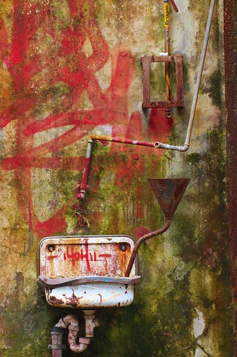
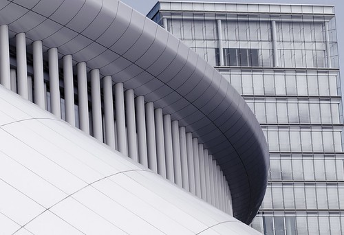
A friend showed me a really cool location - an abandoned industrial buidling:
(
Last edited by cszar2001; Jun 8, 2008 at 04:43 AM.
)
|
"Microsoft is a cross between the Borg and the Ferengi. Unfortunately, they use Borg to do their marketing and Ferengi to do their programming." Simon Slavin
Me on Flickr.
|
| |
|
|
|
|
|
|
|
Moderator Join Date: May 2001
Location: Hilbert space
Status:
Offline
|
|
Great shot. Do you have a higher/full-res version?
I'm interested in the texture which you cannot fully make out in the resized version.
|
|
I don't suffer from insanity, I enjoy every minute of it.
|
| |
|
|
|
|
|
|
|
Photo Architect
Join Date: Jun 2003
Location: Bamberg, Germany
Status:
Offline
|
|
Originally Posted by OreoCookie
Great shot. Do you have a higher/full-res version?
I'm interested in the texture which you cannot fully make out in the resized version.
Sure - check out the large version on Flickr.
|
"Microsoft is a cross between the Borg and the Ferengi. Unfortunately, they use Borg to do their marketing and Ferengi to do their programming." Simon Slavin
Me on Flickr.
|
| |
|
|
|
|
|
|
|
Moderator Join Date: May 2001
Location: Hilbert space
Status:
Offline
|
|
Cool, thanks
As I thought, I really like the grain. The EXIF data was lost, what was the ISO setting? Or have you added the grain by hand?
|
|
I don't suffer from insanity, I enjoy every minute of it.
|
| |
|
|
|
|
|
|
|
Addicted to MacNN
Join Date: Sep 2001
Location: Toronto
Status:
Offline
|
|
Decay, it it now?
|
|
|
| |
|
|
|
|
|
|
|
Addicted to MacNN
Join Date: Sep 2001
Location: Toronto
Status:
Offline
|
|
Originally Posted by cszar2001
Sure - check out the large version on Flickr.
I love the textures in that shot. I might have tried to do something more with the composition, but overall I really like it.
|
|
|
| |
|
|
|
|
|
|
|
Professional Poster
Join Date: Nov 2004
Location: Belgium
Status:
Offline
|
|

One of the images that I used for my last jury test this year.
|
iMac 20" C2D 2.16 | Acer Aspire One | Flickr
|
| |
|
|
|
|
|
|
|
Posting Junkie
Join Date: Apr 2007
Location: Iowa, how long can this be? Does it really ruin the left column spacing?
Status:
Offline
|
|
A picture taken last night.

|
|
|
| |
|
|
|
|
|
|
|
Photo Architect
Join Date: Jun 2003
Location: Bamberg, Germany
Status:
Offline
|
|
Originally Posted by OreoCookie
Cool, thanks
As I thought, I really like the grain. The EXIF data was lost, what was the ISO setting? Or have you added the grain by hand?
The EXIF is on the right under "More properties". Maybe only visible when you are logged in.
ISO was 1250.
I love the textures in that shot. I might have tried to do something more with the composition, but overall I really like it.
I have over 40 shots of that thing. This one is one of my favorites. More coming soon.
|
"Microsoft is a cross between the Borg and the Ferengi. Unfortunately, they use Borg to do their marketing and Ferengi to do their programming." Simon Slavin
Me on Flickr.
|
| |
|
|
|
|
|
|
|
Photo Architect
Join Date: Jun 2003
Location: Bamberg, Germany
Status:
Offline
|
|
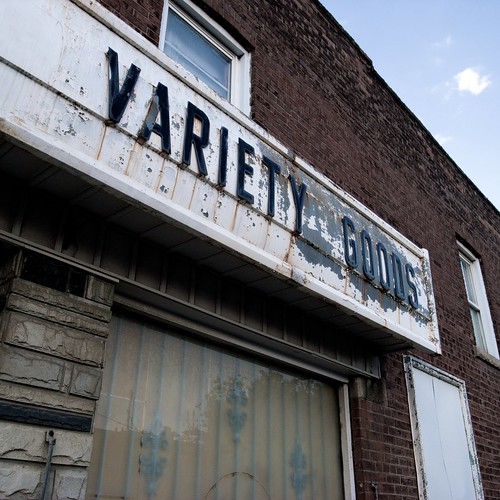
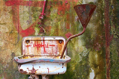
Here's another one:

|
"Microsoft is a cross between the Borg and the Ferengi. Unfortunately, they use Borg to do their marketing and Ferengi to do their programming." Simon Slavin
Me on Flickr.
|
| |
|
|
|
|
|
|
|
Addicted to MacNN
Join Date: Oct 2002
Location: England | San Francisco
Status:
Offline
|
|
|
|
|
we don't have time to stop for gas
|
| |
|
|
|
|
|
|
|
Banned
Join Date: Jun 2005
Location: Indy.
Status:
Offline
|
|
Originally Posted by cszar2001
Here's another one:
I like this one a lot better actually. The first seemed like a study of the sink, this shot gives an overall feel of the room. The colors seem a teeny tiny touch over saturated, but I like the. The contrast is outrageous (in a good way).
The only way I could think to improve the shot would be to lower the frame a touch. A little more of the floor and a little less of the empty space above. But as it is, I think it could be a highly sellable shot.
And here's one for the more brutal critiquers (sp?) here. It is amazingly hard to get a lightning shot. Amazingly hard. This was my only successful shot out of about 100 one night. If you look closely, you'll see that the lightning bolt drops behind the cloud to reemerge lower in the frame.
Anyone have any lightning photography tips? I used the "bulb" setting and a narrow aperture.

|
|
|
| |
|
|
|
|
|
|
|
Posting Junkie
Join Date: Apr 2007
Location: Iowa, how long can this be? Does it really ruin the left column spacing?
Status:
Offline
|
|
Three more I took today:


There's something I don't like about the third. I'm not sure if it's because the white bricks appear washed out.
|
|
|
| |
|
|
|
|
|
|
|
Moderator Emeritus
Join Date: Apr 2001
Location: Fort Lauderdale, FL
Status:
Offline
|
|
cszar, are those multiple exposures recombined? Regardless, what was the lightning situation there? Cool shots.
Peter, love the softness of your shot, looks like a nice spot.
Railroader, I look forward to some nice storms this summer with my new camera and tripod. I know nothing of settings for lightning, but your technique sounds like a good start. You just close the shutter after you've seen lightning in the frame I suppose?
|
|
ice
|
| |
|
|
|
|
|
|
|
Banned
Join Date: Jun 2005
Location: Indy.
Status:
Offline
|
|
Originally Posted by IceEnclosure
Railroader, I look forward to some nice storms this summer with my new camera and tripod. I know nothing of settings for lightning, but your technique sounds like a good start. *You just close the shutter after you've seen lightning in the frame I suppose?
* Exactly. That's what I did.
|
|
|
| |
|
|
|
|
|
|
|
Banned
Join Date: Jun 2005
Location: Indy.
Status:
Offline
|
|
Originally Posted by Laminar
Three more I took today:
I think there's too much going on here. Perhaps moving closer and just framing one of those sets of windows. Also, the image seems a little washed out. Maybe increase the angle with which you shot the building as well.
Originally Posted by Laminar
It may not be, but the image appears crooked. Again, move closer. There's too much in the frame. Not to insult, but it looks like a real estate picture.
Originally Posted by Laminar
There's something I don't like about the third. I'm not sure if it's because the white bricks appear washed out.
I like the third image the most. That's not to say I really like it, but I guess I don't like it the least. Washed out it looks OK, actually, it makes the building interesting. MOVE CLOSER!!! The power line is distracting as are the more modern buildings in the frame. This could be a cool building for a black and white high contrast shot. Also, it's crooked.
I may have been harsh in these critiques, but you do have an eye for shots and I think you can really improve. The beer glass shot was creative. I liked it. It could have been used as an ad for the brewery.
|
|
|
| |
|
|
|
|
|
|
|
Banned
Join Date: Jun 2005
Location: Indy.
Status:
Offline
|
|
Originally Posted by Peter
Great composition, except for the fence. It is highly distracting and out of focus. The colors are soothing, but could be bumped up a little bit. The way the path curves and leads the eye up to the door is well done.
|
|
|
| |
|
|
|
|
|
|
|
Posting Junkie
Join Date: Apr 2007
Location: Iowa, how long can this be? Does it really ruin the left column spacing?
Status:
Offline
|
|
Originally Posted by Railroader
I may have been harsh in these critiques, but you do have an eye for shots and I think you can really improve. The beer glass shot was creative. I liked it. It could have been used as an ad for the brewery.
Not harsh at all, exactly what I was looking for. I was bored today so I went out and took pictures of houses I found interesting, usually from my car, mostly because I was afraid to get out of my car in the neighborhoods I was going through.
Making the second image appear straight is difficult because both roads are hills going opposite directions. For kicks, I just used iPhoto's straighten feature and aligned the three vertical strips on the tower with the horizontal lines, and it appeared to be off by about 1 degree.
|
|
|
| |
|
|
|
|
|
|
|
Banned
Join Date: Jun 2005
Location: Indy.
Status:
Offline
|
|
Originally Posted by Laminar
For kicks, I just used iPhoto's straighten feature and aligned the three vertical strips on the tower with the horizontal lines, and it appeared to be off by about 1 degree.
One of my OCDs isn't all bad.
|
|
|
| |
|
|
|
|
|
|
|
Photo Architect
Join Date: Jun 2003
Location: Bamberg, Germany
Status:
Offline
|
|
Originally Posted by IceEnclosure
cszar, are those multiple exposures recombined? Regardless, what was the lightning situation there? Cool shots.
Nope - one exposure only.
I shoot in RAW and use Capture One 4 for post-processing.
I maxed the saturation, recovered the shadows a bit, made it warmer.
Lighting was - even for me - the best I have ever seen.
Sunny day with scattered clouds. We were there around midday. Light coming through what is left of the roof.
An architectural shot from Luxembourg:
|
"Microsoft is a cross between the Borg and the Ferengi. Unfortunately, they use Borg to do their marketing and Ferengi to do their programming." Simon Slavin
Me on Flickr.
|
| |
|
|
|
|
|
|
|
Moderator Join Date: May 2001
Location: Hilbert space
Status:
Offline
|
|
Originally Posted by cszar2001
Here's another one:
I very much prefer the first one.
I like it when you emphasize the texture by taking a `flat' photograph. Perhaps because it reminds me of a few shots I've taken myself.
|
|
I don't suffer from insanity, I enjoy every minute of it.
|
| |
|
|
|
|
|
|
|
Moderator Join Date: May 2001
Location: Hilbert space
Status:
Offline
|
|
Originally Posted by Peter
Not a good shot.
Way too noisy and even if there are hints of a good composition, it just doesn't work out. Without the annoying fence, I'd still find the shot noisy with the tree branches covering the top third of the house.
|
|
I don't suffer from insanity, I enjoy every minute of it.
|
| |
|
|
|
|
|
|
|
Photo Architect
Join Date: Jun 2003
Location: Bamberg, Germany
Status:
Offline
|
|
I don't want to bore you to death - but here is yet another one:
Like I said - I have over 40 different shots of that location and even I can't decide which one I like best.
Every angle brings something new and fresh to it.
Going back there next month - we'll see what I can come up with then.
|
"Microsoft is a cross between the Borg and the Ferengi. Unfortunately, they use Borg to do their marketing and Ferengi to do their programming." Simon Slavin
Me on Flickr.
|
| |
|
|
|
|
|
|
|
Professional Poster
Join Date: Jun 2005
Location: Yamanashi, Japan
Status:
Offline
|
|
|
|
|
|
| |
|
|
|
|
|
|
|
Moderator Emeritus
Join Date: Apr 2001
Location: Fort Lauderdale, FL
Status:
Offline
|
|
|
|
|
ice
|
| |
|
|
|
|
|
|
|
Administrator Join Date: Apr 2001
Location: San Antonio TX USA
Status:
Offline
|
|
Ice, I like the design in your composition. The two sailboats unevenly bracketing the hotel(?) in the background make it an interesting image, and once you look, you see the rather amazing clouds. I like the color version better than the B&W, but that's just a personal thing.
|
Glenn -----OTR/L, MOT, Tx
|
| |
|
|
|
|
|
|
|
Moderator Emeritus
Join Date: Mar 2004
Location: Copenhagen
Status:
Offline
|
|
They both look very dark on my screen (intentional, perhaps? Though it seems a bit out of tune with the image itself), but apart from that, I like both the colour version and the B/W version equally. They evoke very different feelings, but none is ‘better’ than the other.
|
|
|
| |
|
|
|
|
|
|
|
|
|
|
|
|
 
|
|
|
Forum Rules
|
|
|
|
You may not post new threads
You may not post replies
You may not post attachments
You may not edit your posts
|
HTML code is Off
|
|
|
|
|
|
|
|
|
|
|
|


