|
 |
Photo Critique Thread - [JPEG] (Page 26)
|
|
|
|
|
Moderator Emeritus
Join Date: Mar 2004
Location: Copenhagen
Status:
Offline
|
|
Nice tracks. I don’t think the portrait format suits it, though. When I first saw it, only the top 40 or so per cent were visible, and that was actually a better shot, I’d say. More harmonious.
And if you could just sort of go back out there and straighten the part at the end where the tracks seem to turn left, that would be neat too. Just keep it going straight ahead for another half mile or so. 
|
|
|
| |
|
|
|
|
|
|
|
Moderator  Join Date: May 2001
Location: Hilbert space
Status:
Offline
|
|
Originally Posted by ThinkInsane 
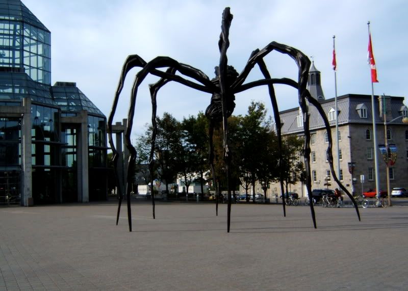
I've seen one of those spider thingies elsewhere. I can't remeber where but I know I have pictures.
I've seen a few in Roppongi, Tōkyō, for instance.
|
|
I don't suffer from insanity, I enjoy every minute of it.
|
| |
|
|
|
|
|
|
|
Addicted to MacNN
Join Date: Feb 2008
Location: Standing on the shoulders of giants
Status:
Offline
|
|
Originally Posted by ThinkInsane
I've seen one of those spider thingies elsewhere. I can't remeber where but I know I have pictures.
The Tate Modern in London? Same artist.
|
|
|
| |
|
|
|
|
|
|
|
Moderator Emeritus  Join Date: Feb 2000
Location: Night's Plutonian shore...
Status:
Offline
|
|
Found it! The National Gallery of Canadia in Ottawa. I knew I had a picture.
|
|
Nemo me impune lacesset
|
| |
|
|
|
|
|
|
|
Administrator  Join Date: Apr 2001
Location: San Antonio TX USA
Status:
Offline
|
|
Originally Posted by Jawbone54
Can't wait to see the dog, too. 
Unfortunately, we're having yet another crappy weather day. Any suggestions for getting pictures of a gracefully moving dog on a crappy, ugly-overcast day? 
|
 Glenn -----OTR/L, MOT, Tx
|
| |
|
|
|
|
|
|
|
Moderator Emeritus
Join Date: Mar 2004
Location: Copenhagen
Status:
Offline
|
|
Originally Posted by ghporter
Unfortunately, we're having yet another crappy weather day. Any suggestions for getting pictures of a gracefully moving dog on a crappy, ugly-overcast day?
Flash + gel.
Originally Posted by strobist.blogspot.com
Q: How did they get that overcast sky so neon blue?
A: Set the camera balance to tungsten, which renders the formerly neutral clouds blue. Underexpose the sky (to, say, a stop below medium grey) for more of an effect. Then, CTO-gel the flash lighting your subject to render the light hitting it as white and you have the effect.
|
|
|
| |
|
|
|
|
|
|
|
Administrator Join Date: Apr 2001
Location: San Antonio TX USA
Status:
Offline
|
|
Originally Posted by Oisín
Flash + gel.
I need a better flash then. No way to gel the one I've got.
|
Glenn -----OTR/L, MOT, Tx
|
| |
|
|
|
|
|
|
|
Moderator Emeritus
Join Date: Mar 2004
Location: Copenhagen
Status:
Offline
|
|
This is the perfect excuse for some tech-lust appeasement, then!
|
|
|
| |
|
|
|
|
|
|
|
Mac Enthusiast
Join Date: Jan 2008
Location: In a constant state of panic...
Status:
Offline
|
|
Originally Posted by Oisín
Nice tracks. I don’t think the portrait format suits it, though. When I first saw it, only the top 40 or so per cent were visible, and that was actually a better shot, I’d say. More harmonious.
And if you could just sort of go back out there and straighten the part at the end where the tracks seem to turn left, that would be neat too. Just keep it going straight ahead for another half mile or so.
I see what you're saying about the top portion of that photo. I, too, wished the tracks kept going straight when I was taking that photo. I actually didn't shoot any landscape-oriented photos of those tracks, sadly.
|
|
|
| |
|
|
|
|
|
|
|
Banned
Join Date: Jun 2005
Location: Indy.
Status:
Offline
|
|
Originally Posted by ghporter
I need a better flash then. No way to gel the one I've got.
Rubber bands and a gel sample pack from Roscolux. Fits just about any normal flash unit.
|
|
|
| |
|
|
|
|
|
|
|
Administrator Join Date: Apr 2001
Location: San Antonio TX USA
Status:
Offline
|
|
Wow, that's creative! I am at the point where I need a flash that's up to working wellwith my Rebel XTi. I have a VERY old flash that I got when I first got into 35mm photography, and while it will "work" with the camera, it doesn't do everything it should because it doesn't seem to communicate effectively with the camera. More stuff to spend money I don't have on...
|
Glenn -----OTR/L, MOT, Tx
|
| |
|
|
|
|
|
|
|
Moderator Emeritus
Join Date: Mar 2004
Location: Copenhagen
Status:
Offline
|
|
Get a Lumopro LB120. It’s good, reliable, and—most importantly—cheap ($130).
|
|
|
| |
|
|
|
|
|
|
|
Mac Enthusiast
Join Date: Jan 2008
Location: In a constant state of panic...
Status:
Offline
|
|
|
|
|
|
| |
|
|
|
|
|
|
|
Addicted to MacNN
Join Date: Feb 2008
Location: Standing on the shoulders of giants
Status:
Offline
|
|
Nice harbinger75, something about the colour though, can't describe it.
Noticed from your Flickr photos that you've used a Sony, a Canon SX10 and the Rebel - do you change camera alot or do you have loads of cameras? I'm very very tempted to trade in my recently purchased SX10 for a dSLR - really want to fool around with some prime lenses in low-light situations (the SX10 is NOT the camera for low-light).
|
|
|
| |
|
|
|
|
|
|
|
Posting Junkie
Join Date: May 2001
Location: Brisbane, Australia
Status:
Offline
|
|
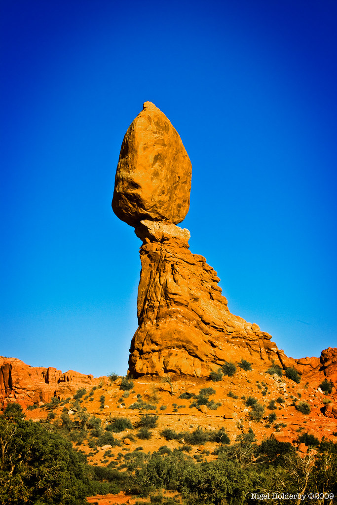
Yeah, it seems to be a bit wishy-washy in the mid part. I'd go over with the burn tool to fix up those mid tones and maybe add some punch to the shadows just on the mid-right section of the rocks.
|
|
|
| |
|
|
|
|
|
|
|
Mac Enthusiast
Join Date: Jan 2008
Location: In a constant state of panic...
Status:
Offline
|
|
mattyb-
I've just upgraded cameras a lot here lately, and will actually do so again in a couple weeks. I'll end up using the Rebel as a backup camera when I go back to Nikon with the D3 (if things work out as currently planned).
mattyb and - - e r i k - -
Thank you for the critique about the shadows and color. I knew it didn't look totally correct to me, either, but until you mentioned burning the right side, it didn't click. I'm going to mess with this one a bit later to see if I can improve the contrast on that right side.
I've got a ton of photos from a recent Colorado/Utah trip, so I'm sure several will need the "treatment."
|
|
|
| |
|
|
|
|
|
|
|
Addicted to MacNN
Join Date: Feb 2008
Location: Standing on the shoulders of giants
Status:
Offline
|
|
Photos removed by mattyb 26 Dec 2009
Even though I'd sell both of my kids for a really good SLR with a nice fast lens, I've got to admit to really liking the movable screen on the SX10. SO easy to take low shots or shots over a fence when you can see what you're shooting.
(
Last edited by mattyb; Dec 26, 2009 at 09:49 AM.
)
|
|
|
| |
|
|
|
|
|
|
|
Senior User
Join Date: Sep 2001
Location: California
Status:
Offline
|
|
San Jose flea market
|
not all who wander are lost.
|
| |
|
|
|
|
|
|
|
Posting Junkie
Join Date: Mar 2005
Location: Louisiana
Status:
Offline
|
|
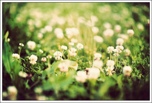
Originally Posted by mr. burns
San Jose flea market
You've tapped into my love for monochromatic candid photography. 
I finally got a chance to edit some non-work-related photos...
Yes, clover is boring (and ugly), but it always feels cold between your toes, even in the summer, and that gets a thumbs up from me.
|
|
|
| |
|
|
|
|
|
|
|
Moderator Emeritus
Join Date: Apr 2001
Location: Fort Lauderdale, FL
Status:
Offline
|
|
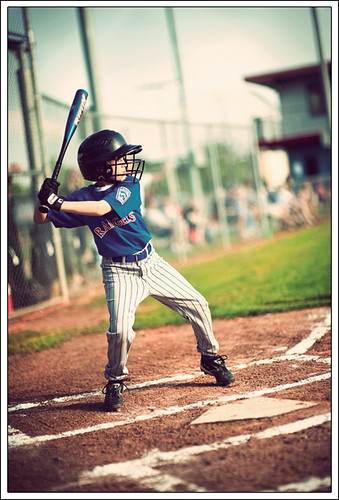
love that baseball kid shot!
|
|
ice
|
| |
|
|
|
|
|
|
|
Moderator Emeritus
Join Date: Mar 2004
Location: Copenhagen
Status:
Offline
|
|
Originally Posted by Jawbone54
Yes, clover is boring (and ugly)
The plant itself may be (I wouldn’t know, I’m a faunistic analphabet that wouldn’t recognise clover if it drove past me in a bathtub on wheels), but your picture of it certainly ain’t.
Baseball kid is pure 1950s postcard material. Gorgeous.
|
|
|
| |
|
|
|
|
|
|
|
Senior User
Join Date: Sep 2001
Location: California
Status:
Offline
|
|
Originally Posted by Jawbone54
You've tapped into my love for monochromatic candid photography.
]
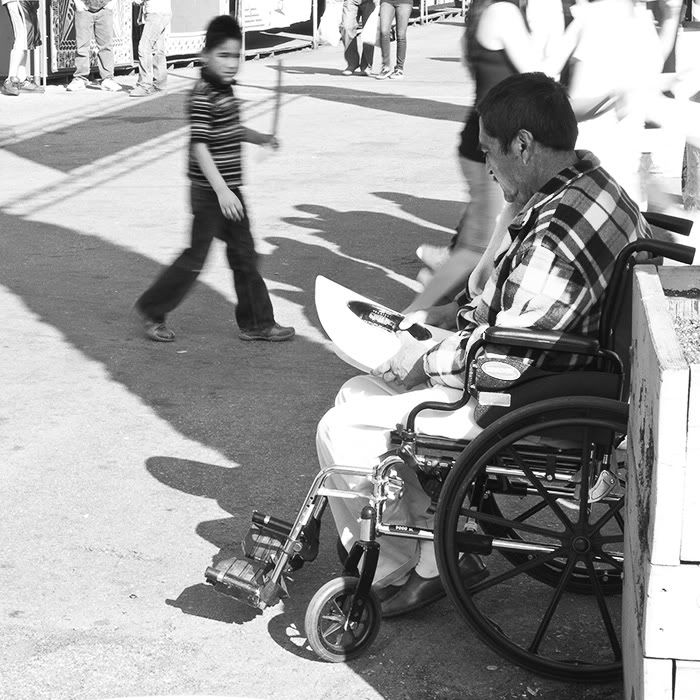
thanks, i'm working on a 10-image series. here's another. and yea that baseball shot has a very nice warm, nostalgic feel to it and the tilt of the camera really works well.
|
not all who wander are lost.
|
| |
|
|
|
|
|
|
|
Moderator Emeritus
Join Date: Mar 2004
Location: Copenhagen
Status:
Offline
|
|
^ I have a feeling I’ve seen that last one before. Is it an old one you’re (re?)posting now, or is it perhaps just very similar to another picture I must have seen somewhere? I’m sure I’ve seen that thing with the guy in the wheelchair in the foreground and a kid, semi-blurred, walking past him left-to-right in the background.
|
|
|
| |
|
|
|
|
|
|
|
Moderator Join Date: May 2001
Location: Hilbert space
Status:
Offline
|
|
Great shot of the little baseballer, Jawbone, how much did you have to tweak the colors?
|
|
I don't suffer from insanity, I enjoy every minute of it.
|
| |
|
|
|
|
|
|
|
Banned
Join Date: Jun 2005
Location: Indy.
Status:
Offline
|
|
Originally Posted by Jawbone54
Absolutely perfect shot. I can't think of a single criticism. I can feel what that kid is feeling. I normally am not too fond of your color processing work, but I really like this one.
I have been taking shots at my daughter's YMCA soccer games. This week I took my new 10-22mm and captured this shot. I really wish I wouldn't have cut off the feet. I have done zero post processing on it.

|
|
|
| |
|
|
|
|
|
|
|
Addicted to MacNN
Join Date: Feb 2003
Location: NY²
Status:
Offline
|
|
Originally Posted by Jawbone54
I have to agree with everyone and say that this shot is brilliant. Love it.
|
|
|
| |
|
|
|
|
|
|
|
Posting Junkie
Join Date: May 2001
Location: Brisbane, Australia
Status:
Offline
|
|
You have certainly captured that Americana Nostalgia in that baseball shot perfectly.
If I were to bring any criticism to the table it would be that it's tilted just a tad too much to the left for my liking.
|
|
|
| |
|
|
|
|
|
|
|
Mac Enthusiast
Join Date: Jan 2008
Location: In a constant state of panic...
Status:
Offline
|
|
The baseball player is gorgeous. I really like the angle, color and sense of pre-action.
Here's another:
|
|
|
| |
|
|
|
|
|
|
|
Posting Junkie
Join Date: Mar 2005
Location: Louisiana
Status:
Offline
|
|
Thanks, everyone. Here's my delayed response...
Originally Posted by OreoCookie
Great shot of the little baseballer, Jawbone, how much did you have to tweak the colors?
Thank you much. I did very little in Lightroom, but did pull up the contrast a bit, warmed it up ever-so-slightly, then exported to Photoshop and used a vintage action, adjusted some of the opacities on several layers, then pulled the overall opacity down to 65%. In all, the process took about 2 minutes.
Originally Posted by Railroader
Absolutely perfect shot. I can't think of a single criticism. I can feel what that kid is feeling. I normally am not too fond of your color processing work, but I really like this one.
Thank you, sir.
Originally Posted by mr. burns
thanks, i'm working on a 10-image series. here's another. and yea that baseball shot has a very nice warm, nostalgic feel to it and the tilt of the camera really works well.
Yeah, I like that shot of yours a lot. Did I see it on Flickr or something before?
Originally Posted by Oisín
The plant itself may be (I wouldn’t know, I’m a faunistic analphabet that wouldn’t recognise clover if it drove past me in a bathtub on wheels), but your picture of it certainly ain’t.
Baseball kid is pure 1950s postcard material. Gorgeous.
You should really walk in some clover.
Thanks. I wanted that vintage look simply because every single time I watch my nephews play baseball, go to an MLB game, or even play catch with someone, it feels like I've stepped back into time. Any of you guys feel that same way?
Originally Posted by IceEnclosure
love that baseball kid shot!
Originally Posted by mdc
I have to agree with everyone and say that this shot is brilliant. Love it.
Gracias.
Originally Posted by - - e r i k - -
You have certainly captured that Americana Nostalgia in that baseball shot perfectly.
If I were to bring any criticism to the table it would be that it's tilted just a tad too much to the left for my liking.
I'd agree with you that 99% of the time, this is a bit too much tilt. I took maybe ten others from this angle, and while one in particular had the perfect composition I was looking for, the moment wasn't quite as nice, so I went with the tipsy one.
Originally Posted by harbinger75
The baseball player is gorgeous. I really like the angle, color and sense of pre-action.
Thank ya.
|
|
|
| |
|
|
|
|
|
|
|
Senior User
Join Date: Sep 2001
Location: California
Status:
Offline
|
|
Originally Posted by Oisín
^ I have a feeling I’ve seen that last one before. Is it an old one you’re (re?)posting now, or is it perhaps just very similar to another picture I must have seen somewhere? I’m sure I’ve seen that thing with the guy in the wheelchair in the foreground and a kid, semi-blurred, walking past him left-to-right in the background.
yea i may have put it up before. i just wanted to show another from the series.
|
not all who wander are lost.
|
| |
|
|
|
|
|
|
|
Forum Regular
Join Date: Jun 2004
Location: San Diego, California
Status:
Offline
|
|
|
|
|
Scott
|
| |
|
|
|
|
|
|
|
Grizzled Veteran
Join Date: Mar 2002
Location: NY
Status:
Offline
|
|
|
|
|
To know your Enemy, you must become your Enemy.”
Sun Tzu
|
| |
|
|
|
|
|
|
|
Senior User
Join Date: Nov 2003
Status:
Offline
|
|
|
|
|
"The road to success is dotted with the most tempting parking spaces."
|
| |
|
|
|
|
|
|
|
Senior User
Join Date: Sep 2001
Location: California
Status:
Offline
|
|
|
|
not all who wander are lost.
|
| |
|
|
|
|
|
|
|
Posting Junkie
Join Date: Mar 2005
Location: Louisiana
Status:
Offline
|
|
Originally Posted by moep
I dig.
|
|
|
| |
|
|
|
|
|
|
|
Banned
Join Date: Jun 2005
Location: Indy.
Status:
Offline
|
|
Originally Posted by moep
Since this is a critique thread, and not a gallery thread (which it seems to be turing into), I decided to pick this image. The other two are fine, but I think this one could have been much better with a lower composition angle. Also, I am not really picking up on a focal point of the image. Is it the car? Is it a part of the car? Is it the window? I think the depth of field is a little to large. And the color saturation could be a little bit more as well.
Please don't think I am picking on you, I am just doing what I set the thread up for. Critiquing and improving our art. And on that note... have at this image of mine I too today.

|
|
|
| |
|
|
|
|
|
|
|
Posting Junkie
Join Date: May 2001
Location: Brisbane, Australia
Status:
Offline
|
|
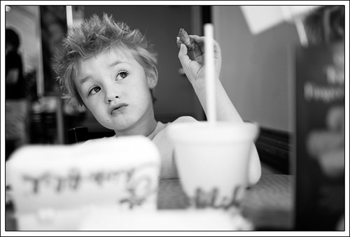
It's very cute, but could do with a tiny bit of exposure boost.
|
|
|
| |
|
|
|
|
|
|
|
Moderator Emeritus
Join Date: Apr 2001
Location: Fort Lauderdale, FL
Status:
Offline
|
|
and a napkin to clean up the drool.
|
|
ice
|
| |
|
|
|
|
|
|
|
Posting Junkie
Join Date: May 2001
Location: Brisbane, Australia
Status:
Offline
|
|
Skin tones also lean a bit towards the green side on my monitors.
|
|
|
| |
|
|
|
|
|
|
|
Senior User
Join Date: Nov 2003
Status:
Offline
|
|
Originally Posted by Railroader
Since this is a critique thread, and not a gallery thread (which it seems to be turing into), I decided to pick this image. The other two are fine, but I think this one could have been much better with a lower composition angle. Also, I am not really picking up on a focal point of the image. Is it the car? Is it a part of the car? Is it the window? I think the depth of field is a little to large. And the color saturation could be a little bit more as well.
Please don't think I am picking on you, I am just doing what I set the thread up for. Critiquing and improving our art. And on that note... have at this image of mine I too today.
I just wrote a lengthy post and the forum logged me out after submitting (yay) — here’s the condensed version:
I’m grateful for any critique of course. I have a lot to learn when it comes to photography and appreciate any feedback, good or bad. I’ll also refrain from posting more than 1 picture at a time to avoid turning the thread into a gallery.
As for composition, from my understanding it is an art that’s hard to learn. When I shoot photos I usually go by my gut feeling and what might look good in the end. You either have the talent or you don’t. Or are there fixed rules that apply all pictures and can be learned from a book? If so, I’d be really thankful if you could point out some standard literature or good websites on the topic.
And that picture in particular… I sometimes feel like I’m overusing DOF after I have bought two decent Canon f/2.8 glasses. They produce gorgeous bokeh but in some pictures it just feels inappropriate. I thought that the window in the back looks interesting as a background for example.
Also, that particular picture was taken with the EF-S 17-55 kit lens at ~25mm and I believe the lens was wide open (have to check the EXIF when I’m at home). Stepping futher back was no option either because of a wall behind me.
Is there a third trick (besides aperture and focal length) I’m missing to produce the DOF effect?
|
|
"The road to success is dotted with the most tempting parking spaces."
|
| |
|
|
|
|
|
|
|
Banned
Join Date: Jun 2005
Location: Indy.
Status:
Offline
|
|
Originally Posted by - - e r i k - -
It's very cute, but could do with a tiny bit of exposure boost.
Just over all exposure, or just brighten the lighter colors?
Originally Posted by IceEnclosure
and a napkin to clean up the drool.
Awww man, that's part of the whole appeal!
Originally Posted by - - e r i k - -
Skin tones also lean a bit towards the green side on my monitors.
THAT, is what had been bugging me about this image. I couldn't pin point it, but the skin is just not right.
|
|
|
| |
|
|
|
|
|
|
|
Posting Junkie
Join Date: May 2001
Location: Brisbane, Australia
Status:
Offline
|
|
Just the lighter colours. I'd also shave a bit on the top, left and bottom as there's a lot of empty space and compositionally move the eyes towards the upper third.
Here's an example of a crop and warming:

|
|
|
| |
|
|
|
|
|
|
|
Posting Junkie
Join Date: May 2001
Location: Brisbane, Australia
Status:
Offline
|
|
Compositional tip: There should be more space in the direction the subject is looking, and less behind them.
|
|
|
| |
|
|
|
|
|
|
|
Addicted to MacNN
Join Date: Feb 2008
Location: Standing on the shoulders of giants
Status:
Offline
|
|
I found it very difficult to shoot the airplanes as they were flying, hardly got any non-blurry photos. Here is one of them.

|
|
|
| |
|
|
|
|
|
|
|
Banned
Join Date: Jun 2005
Location: Indy.
Status:
Offline
|
|
Originally Posted by - - e r i k - -
Just the lighter colours. I'd also shave a bit on the top, left and bottom as there's a lot of empty space and compositionally move the eyes towards the upper third.
Here's an example of a crop and warming:
I posted the image in the original format. This was a picture from a photo shoot for some customers. The picture goes to its final crop when the customer decides what size image they want. An 8x10 will have the top and bottom closer to the subject and a 4x6 will be tightened up all around. I compose all of my portraits this way.
Originally Posted by - - e r i k - -
Compositional tip: There should be more space in the direction the subject is looking, and less behind them.
Not "tip", but opinion or suggestion.
|
|
|
| |
|
|
|
|
|
|
|
Mac Enthusiast
Join Date: Jan 2008
Location: In a constant state of panic...
Status:
Offline
|
|
Originally Posted by Railroader
I posted the image in the original format. This was a picture from a photo shoot for some customers. The picture goes to its final crop when the customer decides what size image they want. An 8x10 will have the top and bottom closer to the subject and a 4x6 will be tightened up all around. I compose all of my portraits this way.
Not "tip", but opinion or suggestion.
/agreed.
|
|
|
| |
|
|
|
|
|
|
|
Posting Junkie
Join Date: May 2001
Location: Brisbane, Australia
Status:
Offline
|
|
Originally Posted by Railroader
Not "tip", but opinion or suggestion.
WTF is a tip then? 
|
|
|
| |
|
|
|
|
|
|
|
Banned
Join Date: Jun 2005
Location: Indy.
Status:
Offline
|
|
Originally Posted by - - e r i k - -
WTF is a tip then?
A "tip" is a piece of advice. And your "There should be more space in the direction the subject is looking, and less behind them." is an opinion.
You can use that empty space however you want. I chose to center the subject in my picture to focus on the subject.
|
|
|
| |
|
|
|
|
|
|
|
Posting Junkie
Join Date: May 2001
Location: Brisbane, Australia
Status:
Offline
|
|
So are you saying that composition is purely subjective?
|
|
|
| |
|
|
|
|
|
|
|
Posting Junkie
Join Date: Mar 2005
Location: Louisiana
Status:
Offline
|
|
Originally Posted by Railroader
A "tip" is a piece of advice. And your "There should be more space in the direction the subject is looking, and less behind them." is an opinion.
A pretty good one though, to be honest. The rule of thirds and leading lines are so popular for a very good reason. This particular picture could benefit from their application.
(
Last edited by Jawbone54; Jun 1, 2009 at 02:22 AM.
)
|
|
|
| |
|
|
|
|
|
|
|
|
|
|
|
|
 
|
|
|
Forum Rules
|
|
|
|
You may not post new threads
You may not post replies
You may not post attachments
You may not edit your posts
|
HTML code is Off
|
|
|
|
|
|
|
|
|
|
|
|