|
 |
Portfolio help
|
|
|
|
|
Forum Regular
Join Date: Aug 2006
Location: United Kingdom, North London
Status:
Offline
|
|
|
|
|
|
| |
|
|
|
|
|
|
|
Moderator  Join Date: Aug 2001
Location: Nobletucky
Status:
Offline
|
|
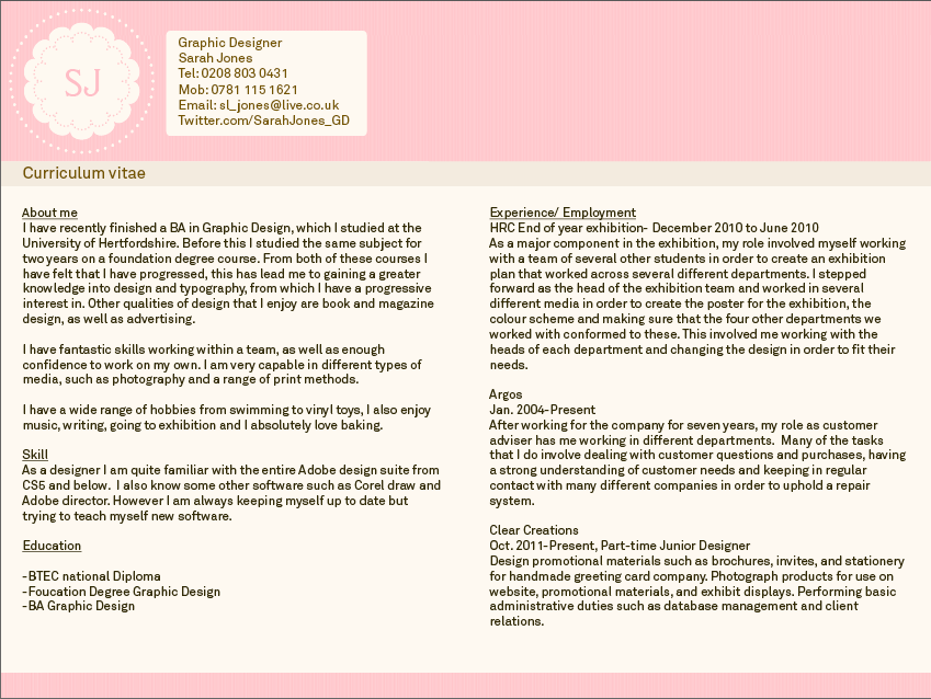
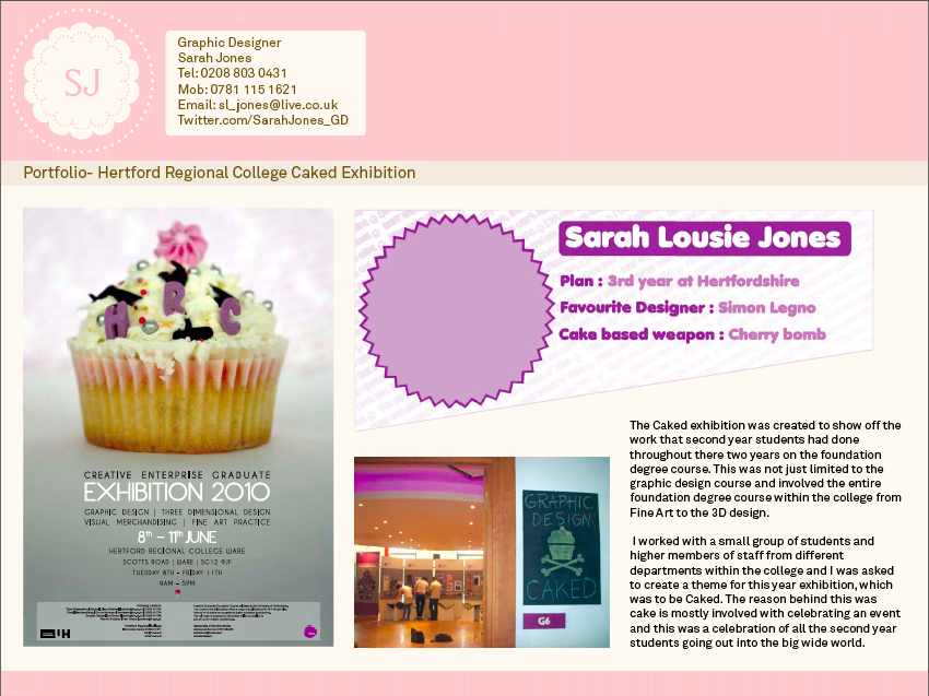
Girly? Well...it is pink, and I can definitely see it working against you with the more neanderthal art directors.
One thing that really jumps out at me is how pasted-on your contact info looks in the header. It almost makes it look like a ready-made template that anyone can add their info to. I'd suggest ditching the white box and see how you can better integrate your contact info in a more...headline/splashy way. Maybe with a bit of added color that works to tone-down the "girly" effect? I'd also ditch the Twitter link. Your tweets aren't exactly uniformly design-oriented, and the most innocuous tweet might turn-off a potential client. Best not to expose yourself like that.
I would also suggest shrinking the height of the header in order to get your images up as large as possible. In this horizontal format, your header is taking up a quarter of the page.
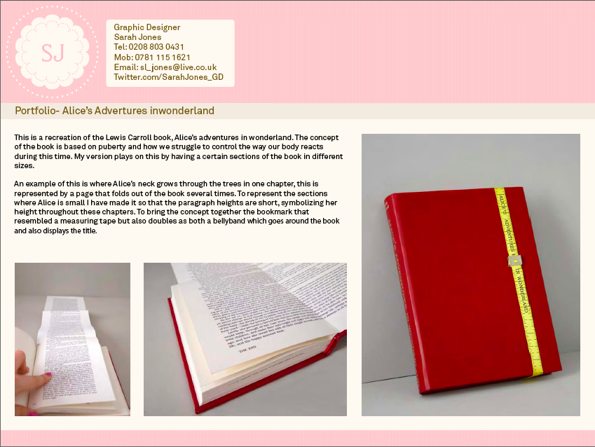
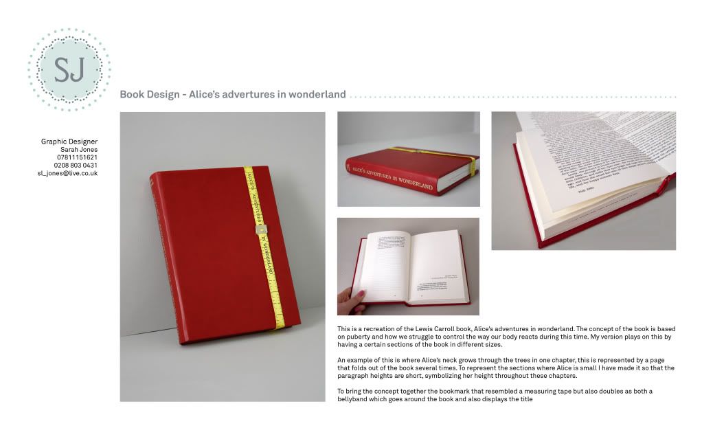
I also see some typos that might stick-out to anyone evaluating your portfolio. It should be "Alice's Adventures in Wonderland" not "Alice's adventures in wonderland" or "Alice's Adventures inwonderland".
|
|
|
| |
|
|
|
|
|
|
|
Moderator Join Date: Jun 2000
Location: inside 128, north of 90
Status:
Offline
|
|
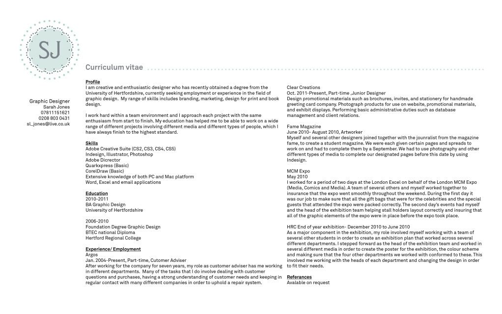
CorelDraw, Adobe Director, capital D.
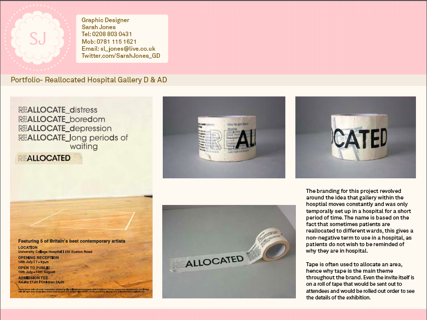
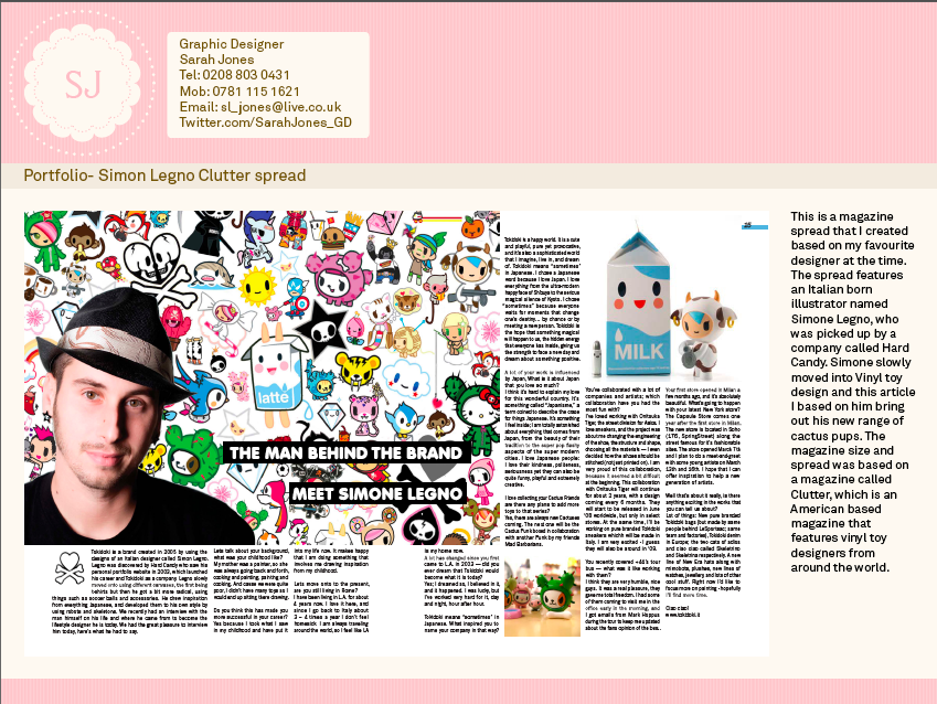
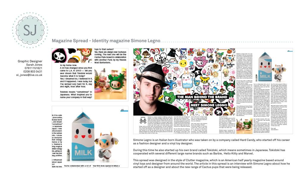
I think the resume is much improved but it's hard to evaluate the design pieces surrounded by the pink frame. The last two are very cluttered feeling.
It's designed like a website, but a website should have more space between header etc. You could try adding some grey to neutralize the pink. To solve Thorzdad's suggestion with the height of the header, perhaps you develop more of a page 2 template with a narrow header that gives the portfolio elements more room.
|
|
|
| |
|
|
|
|
|
|
|
Forum Regular
Join Date: Aug 2006
Location: United Kingdom, North London
Status:
Offline
|
|
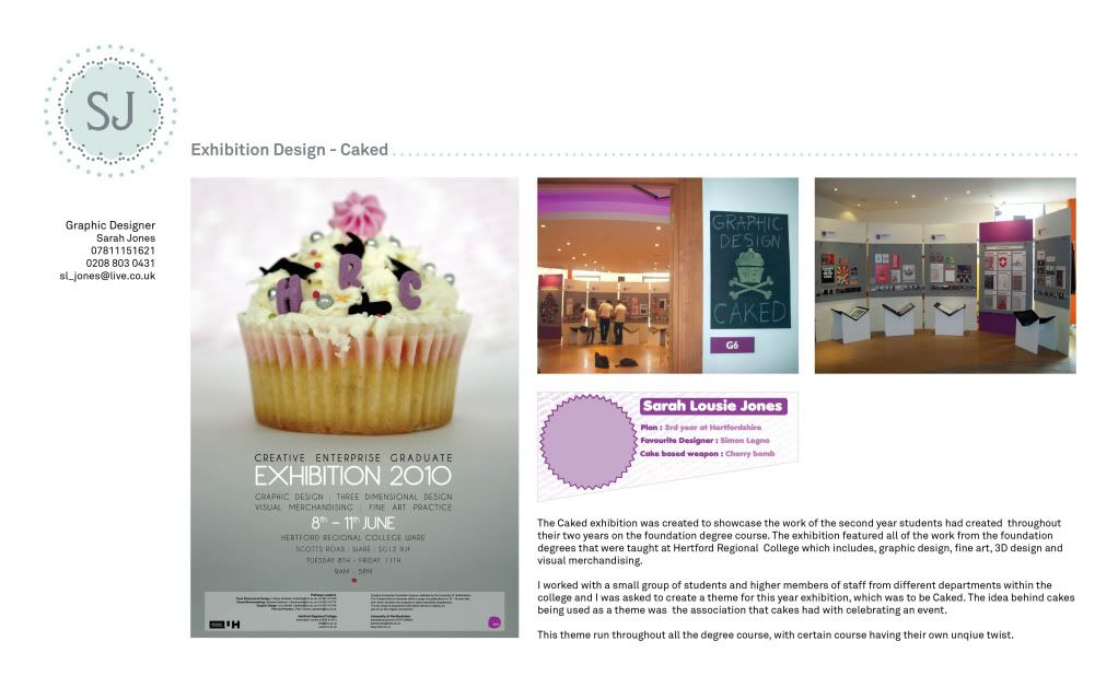
How's this for colour scheme, also changed the the layout to allow more space for work and information and such. Will work on a page that work previewed on it.
|
|
|
| |
|
|
|
|
|
|
|
Moderator Join Date: Jun 2000
Location: inside 128, north of 90
Status:
Offline
|
|
It looks a bit better to me, colorwise... I think the green is a good complement to the blue. I would perhaps make use of it in the flower, and perhaps brighten the green up a bit.
Also, text is now very long readability wise, you may want to put it back into columns. Think of your grid that you will use for the portfolio pages.
Still with the capitalization.
Does your design program have an advisor?
|
|
|
| |
|
|
|
|
|
|
|
Forum Regular
Join Date: Aug 2006
Location: United Kingdom, North London
Status:
Offline
|
|
|
|
|
|
| |
|
|
|
|
|
|
|
Moderator Join Date: Jun 2000
Location: inside 128, north of 90
Status:
Offline
|
|
Much better. I wouldn't put too much stock in getting responses in a week... it might not be the design but other factors (number of applicants, position already filled, typos on your cover page). Just keep trying.
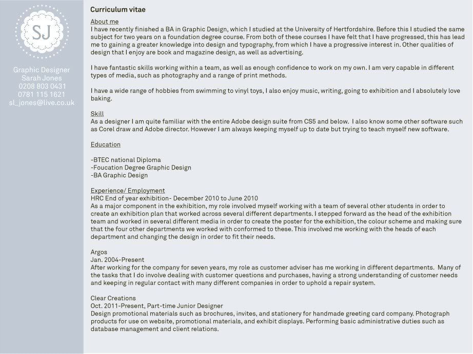
You are one person, not Graphic Designers. (cover page)
The two-column approach for the resume looks much better. However, more space between address and content areas, and more gutter between columns.
Watch your verb tenses, spelling, capitalization. Be consisent. For jobs you are not doing now, in the present, it is "designed and produced." For jobs you are doing now, "design and produce". Don't use "ing" as an active verb.
Spell software names correctly. Spell your job titles correctly. Cutomer Adviser?
|
|
|
| |
|
|
|
|
|
|
|
|
|
|
|
|
 
|
|
|
Forum Rules
|
|
|
|
You may not post new threads
You may not post replies
You may not post attachments
You may not edit your posts
|
HTML code is Off
|
|
|
|
|
|
|
|
|
|
|
|