|
 |
Photo Critique Thread - [JPEG] (Page 15)
|
|
|
|
|
Clinically Insane
Join Date: Jun 2001
Location: planning a comeback !
Status:
Offline
|
|
Originally Posted by Goldfinger 
This would be much better if he was wearing shoes 
WTF ?
-t
|
|
|
| |
|
|
|
|
|
|
|
Administrator  Join Date: Apr 2001
Location: San Antonio TX USA
Status:
Offline
|
|
Originally Posted by Goldfinger
Originally Posted by turtle777
This would be much better if he was wearing shoes
WTF ?
-t
And the angle of the camera makes the pictures on the wall look like they're at an angle, but if they are then the wallpaper is too... It's a jarring image-is that intentional, or was it merely supposed to be eccentric and I'm being dense?
|
 Glenn -----OTR/L, MOT, Tx
|
| |
|
|
|
|
|
|
|
Clinically Insane
Join Date: Jun 2001
Location: planning a comeback !
Status:
Offline
|
|
subtle fish-eye lense effect ?
-t
|
|
|
| |
|
|
|
|
|
|
|
Addicted to MacNN
Join Date: Sep 2001
Location: Toronto
Status:
Offline
|
|
Old stuff.

|
|
|
| |
|
|
|
|
|
|
|
Addicted to MacNN
Join Date: Sep 2001
Location: Toronto
Status:
Offline
|
|
Originally Posted by Goldfinger
I never know what to make of these kind of shots. What's the story behind it?
On the technical side, I can see from the reflection on the floor that the lamp is lit. But because it is also lit from your main light, it actually looks unlit. Confusing.
|
|
|
| |
|
|
|
|
|
|
|
Moderator  Join Date: May 2001
Location: Hilbert space
Status:
Offline
|
|
Originally Posted by Tesselator
You say "Every picture should have a message" but I say every picture does have a
message weather you or I understand it or whether we agree on what it is a matter of intellect and life experience.
We don't understand your pictures, because of a lack of intellect and life experience?
If you aim your pictures at a broader audience, an audience of strangers, then they should be able to understand the picture. If your intention is to communicate something with your pictures, whatever that may be, but your audience `doesn't get it,' then you've failed in your effort as a photographer.
Of course, people here will take quite a few pictures which some groups of people may not get. Pictures of friends, for example, might be hard to understand for strangers, because you don't know these persons yourself and you cannot judge what makes this picture special. Or people might not get a picture, because they cannot decipher the context (e. g. some pictures I took in Japan can be hard to understand for people who have not been there).
Concerning your pictures, they are still way too oversaturated, although it's less intense than before. I'm not sure what's wrong with your screens, but you should have them replaced and/or calibrated.
But other than that, I cannot see any difference. What was your intention when you took those pictures? Are the pigeons on the first pic accidental or an integral part of what you want to say? What about the second one? It reminds me of a `private' picture I've taken when I arrived in Nagoya: a long, long strip of a clean sidewalk. But if you don't know that it was fall and the leaves were falling constantly, but ojii-san were picking up every single leaf, you won't know how to interpret it.
The one that comes closest to a message is the picture of your son, although I don't think the moment was ideal for a pic. You also write that it was taken in your bathroom, but there is no indication of that on the picture. It's not focussed on your son (not in the technical sense, but focussed on the subject), the `background' (mostly the towel stand on the left and the window on the right) is distracting. Your son doesn't look like he's relaxing, it looks to me as if he pretends to drive (his hands at the steering wheel). The lighting looks somewhat promising for an intimate shot, though, his face and body are lit rather nicely. Another basic mistake is that you photograph your son top-down. When you take pictures of children in particular, you should go down to about eye-level. (Unless you want to use this as an effect, but then it doesn't look like an intimate shot anymore.) In essence, your description doesn't fit with my impression.
|
|
I don't suffer from insanity, I enjoy every minute of it.
|
| |
|
|
|
|
|
|
|
Moderator Join Date: May 2001
Location: Hilbert space
Status:
Offline
|
|
Originally Posted by ghporter
And the angle of the camera makes the pictures on the wall look like they're at an angle, but if they are then the wallpaper is too... It's a jarring image-is that intentional, or was it merely supposed to be eccentric and I'm being dense?
It's intentional. It gives the picture a more dynamical edge, plus hat and head are tilted so that they are approximately straight. Gives the whole thing a comic edge (`no straight lines'), like in a house of illusion with these strange rooms that challenge your perception of depth.
Technically, I agree that the reflection of the light is distracting. I also don't like the way the lamp has been cut off.
Originally Posted by ghporter
I am incapable of looking at this picture and not thinking of Jayne in Firefly. That makes it very hard to think of anything else to say about it... 
So I'm not the only one who has seen the resemblance … the hat, I say, the hat! 
|
|
I don't suffer from insanity, I enjoy every minute of it.
|
| |
|
|
|
|
|
|
|
Moderator Join Date: May 2001
Location: Hilbert space
Status:
Offline
|
|
Originally Posted by ARENA
Nice chair. Looks like a Bofinger chair mixed caught up in the 90s. Who designed it?
|
|
I don't suffer from insanity, I enjoy every minute of it.
|
| |
|
|
|
|
|
|
|
Moderator Emeritus
Join Date: Mar 2004
Location: Copenhagen
Status:
Offline
|
|
Originally Posted by OreoCookie
Nice chair. Looks like a Bofinger chair mixed caught up in the 90s. Who designed it?
I already said who designed it on the previous page: Panton!
(It’s from 1967, actually)
|
|
|
| |
|
|
|
|
|
|
|
Moderator Join Date: May 2001
Location: Hilbert space
Status:
Offline
|
|
Oh, I missed that, sorry. So it's from pretty much the same era (Bofinger chairs were designed in '66, I think). 
It's quite convenient when you have the same taste as your parents (Bauhaus) and they move to smaller apartments
|
|
I don't suffer from insanity, I enjoy every minute of it.
|
| |
|
|
|
|
|
|
|
Professional Poster
Join Date: Nov 2004
Location: Belgium
Status:
Offline
|
|
Originally Posted by turtle777
This would be much better if he was wearing shoes
WTF ?
-t
Hehe, you're not the first one to comment on that. It was a bad decision. But I don't have the time to re-shoot the picture. Let's just say that the guy is at home and isn't wearing his shoes. But I agree that he should've been wearing them.
Originally Posted by ghporter
And the angle of the camera makes the pictures on the wall look like they're at an angle, but if they are then the wallpaper is too... It's a jarring image-is that intentional, or was it merely supposed to be eccentric and I'm being dense?
You're being dense . No seriously it's supposed to be somewhat eccentric. But I think that her head being somewhat straight compensates the crookedness of everything else. Like Oreo commented.
The whole picture is supposed to be somewhat "kitsch", don't know a good translation for that word. Wikipedia to the rescue: Kitsch - Wikipedia, the free encyclopedia .
Don't know about the lighting yet, nothing that photoshop can't fix
|

iMac 20" C2D 2.16 | Acer Aspire One | Flickr
|
| |
|
|
|
|
|
|
|
Moderator Emeritus
Join Date: Apr 2001
Location: Fort Lauderdale, FL
Status:
Offline
|
|
|
(
Last edited by IceEnclosure; May 22, 2008 at 01:38 AM.
Reason: twas a sunrise)
|
|
ice
|
| |
|
|
|
|
|
|
|
Moderator Join Date: May 2001
Location: Hilbert space
Status:
Offline
|
|
Very nice, IceEnclosure. 
I think it'd look better if you decrease the detail on your ballerina (something which you can do in a matter of seconds with Aperture or Photoshop, for example).
On the second one, which I prefer in terms of dynamics and everything, it looks like she is `peeing sunlight'. (No offense.) But the dynamics is great, the hair is flying, her body is obviously well-trained, she looks very elegant.
|
|
I don't suffer from insanity, I enjoy every minute of it.
|
| |
|
|
|
|
|
|
|
Moderator Emeritus
Join Date: Apr 2001
Location: Fort Lauderdale, FL
Status:
Offline
|
|
haha, yeah I've heard that phrase twice today already! (peeing sunlight)
the reshoot will provide a fix
also, on these I thought about making more of a silhouette(in PP) but I liked seeing her, even as dimly lit as she is. Had I just upped the flash power just a bit I wouldn't be making excuses!
|
|
ice
|
| |
|
|
|
|
|
|
|
Posting Junkie
Join Date: Feb 2005
Location: 888500128
Status:
Offline
|
|
Originally Posted by OreoCookie
Very nice, IceEnclosure.
I think it'd look better if you decrease the detail on your ballerina (something which you can do in a matter of seconds with Aperture or Photoshop, for example).
...or decrease the clothing (done in a matter of seconds before your next-weekend shoot).
|
|
|
| |
|
|
|
|
|
|
|
Moderator Emeritus
Join Date: Apr 2001
Location: Fort Lauderdale, FL
Status:
Offline
|
|
Originally Posted by Tesselator
a lot of stuff
I want to see pictures in this thread, not a flood of text. I wanted to show people my photos and now there's a 50-foot post right under them.
Can we all quit explaining ourselves and re-explaining ourselves and whining and apologizing?
Mastrap, always enjoy your pics, ARENA you too..
Tess, I get a distinct lack of feeling and interestingness in "the pigeons on a building with bushes in front" photo.
I've always been less than smooth in critiquing. But who cares.
Photos people.
|
|
ice
|
| |
|
|
|
|
|
|
|
Addicted to MacNN
Join Date: Sep 2001
Location: Toronto
Status:
Offline
|
|
An attempt to emulate the stylistic language of 1960's Soviet postcards.
|
|
|
| |
|
|
|
|
|
|
|
Moderator Emeritus
Join Date: Apr 2001
Location: Fort Lauderdale, FL
Status:
Offline
|
|
|
|
|
ice
|
| |
|
|
|
|
|
|
|
Addicted to MacNN
Join Date: Sep 2001
Location: Toronto
Status:
Offline
|
|
Ice, I like that. Desaturation is the new black.
|
|
|
| |
|
|
|
|
|
|
|
Addicted to MacNN
Join Date: Sep 2001
Location: Toronto
Status:
Offline
|
|
Originally Posted by Tesselator
I don't know what 1960's Soviet postcards are. But I like this shot. I won't ask you if you were having trouble finding a level place to stand though. It's very very dark but I think that adds to the tone of the sky and the phallic tower. In all, nice shot! What city is that BTW?
That's Toronto. The darkness is intentional, to set off the sky. It's at an angle because it was shot from the hip as I was walking along, however in the language of photographic composition it is also called a Dutch Tilt. I like the effect, it makes the towers look overbearing and somewhat brooding.
The original was then post processed to look like an aged photo, to emulate 1960's Eastern Bloc film. Then I added a vignette to make it look like it had been shot with a less than perfect lens. All good fun.
(
Last edited by Mastrap; May 21, 2008 at 06:47 PM.
)
|
|
|
| |
|
|
|
|
|
|
|
Mac Elite
Join Date: May 2001
Location: Up north
Status:
Offline
|
|

Lost a lot of detail in the foreground during the export, apparently. Lots of distortion at the wide-angle on this camera/lens. The faint shadow is from a ship over the horizon.


Here are some sunsets 
It's frustrating, my laptop seems to be losing its color, on my external LCD these images seem properly exposed.
Over-saturated? Underexposed?
(
Last edited by 11011001; May 21, 2008 at 11:47 PM.
Reason: img_0116 comment)
|
|
|
| |
|
|
|
|
|
|
|
Posting Junkie
Join Date: May 2001
Location: Brisbane, Australia
Status:
Offline
|
|
Underexposed definitely. Have a look at your histograms if you can't trust your monitor.
|
|
|
| |
|
|
|
|
|
|
|
Moderator Join Date: May 2001
Location: Hilbert space
Status:
Offline
|
|
I like the exposure, the silhouettes come out great.
I particularly like the first two, the last one's motives is not as interesting, it's a bit too noisy, although the sky's texture is very interesting. The third one is too dark, there is too little detail.
|
|
I don't suffer from insanity, I enjoy every minute of it.
|
| |
|
|
|
|
|
|
|
Mac Elite
Join Date: May 2001
Location: Up north
Status:
Offline
|
|
Originally Posted by OreoCookie
I like the exposure, the silhouettes come out great.
I particularly like the first two, the last one's motives is not as interesting, it's a bit too noisy, although the sky's texture is very interesting. The third one is too dark, there is too little detail.
Thanks
The third was really the best my camera can do. It was way past sunset, and too dark, but the scene had a lot of mood, so I tried anyways. The full version is incredibly noisy, not much I can do. Last one is kind of busy isn't it? Bleh
I'm looking to get a new camera, my options are:
Canon 40d with 24-70 f2.8 or the 24-105 f4.0, or a 5D with a 24-105. Given these pictures, what seems most reasonable for a travel 'photographer' (though, i really am not good yet). I'm leaning towards the 5D, as the burst mode wouldn't be that useful for the things I take pictures of, and I prefer the wider angle of full frame without having to carry around something like a 17-40.
Here's a slight modification of 2 now that I'm back on the external:

^ over-saturated? I think less saturation may be better, gives more focus to the tree, and gives it more mood:

For comparison:
(
Last edited by 11011001; May 22, 2008 at 06:50 AM.
Reason: can't stop.. oh god)
|
|
|
| |
|
|
|
|
|
|
|
Moderator Join Date: May 2001
Location: Hilbert space
Status:
Offline
|
|
Concerning your shot, I prefer the second one (`more mood'), the first one is too intense and artificial. Reminds me of the postcards you can buy with ultra-intense artificial colors.
Regarding your next camera, the 2.8/24-70 is not really lighter than the 17-40. I don't think the 24-70 is such a good choice for a travel lens, especially for landscapes. 24 mm corresponds to almost 40 mm on Canon's crop sensors. I'd rather suggest you have a look at the 17-40 which has a very good reputation. I think people should rather invest in glass than bodies. The 40D is a very capable camera which has quite a few features the 5D has not (better weather sealing, etc.). IMO one of the biggest advantages of the 5D is the viewfinder. Getting a 5D with a relatively mediocre lens (24-105) is pointless. Also, you might want to get a Tokina 2.8/16-50 instead, Tokina makes great lenses and has a built quality which comes very close to L glass/pro glass.
|
|
I don't suffer from insanity, I enjoy every minute of it.
|
| |
|
|
|
|
|
|
|
Mac Elite
Join Date: May 2001
Location: Up north
Status:
Offline
|
|
Originally Posted by OreoCookie
Concerning your shot, I prefer the second one (`more mood'), the first one is too intense and artificial. Reminds me of the postcards you can buy with ultra-intense artificial colors.
Regarding your next camera, the 2.8/24-70 is not really lighter than the 17-40. I don't think the 24-70 is such a good choice for a travel lens, especially for landscapes. 24 mm corresponds to almost 40 mm on Canon's crop sensors. I'd rather suggest you have a look at the 17-40 which has a very good reputation. I think people should rather invest in glass than bodies. The 40D is a very capable camera which has quite a few features the 5D has not (better weather sealing, etc.). IMO one of the biggest advantages of the 5D is the viewfinder. Getting a 5D with a relatively mediocre lens (24-105) is pointless. Also, you might want to get a Tokina 2.8/16-50 instead, Tokina makes great lenses and has a built quality which comes very close to L glass/pro glass.
Sorry, I was misleading. For the amount I have to spend I was thinking:
40D + 17-40 + (24-70 or 24-105) -> whole combination is heavy, with 2 lenses
or
5D + 24-105 -> light with only one lens
I'll check out the Tokina!
(
Last edited by 11011001; May 22, 2008 at 08:42 PM.
)
|
|
|
| |
|
|
|
|
|
|
|
Moderator Emeritus
Join Date: Mar 2004
Location: Copenhagen
Status:
Offline
|
|
So, I guess I'll leaf you all alone to crit as you will
*groan*
That was a really terrible pun—but the photo is the first picture you’ve posted in this thread that caught my eye and seemed more than just a random snapshot. I’d up the contrasts somewhat and fiddle about with various other tools (I’m not pro enough to know which ones) to make the greens more vivid and vibrant, but I like the shot itself.
The Sun picture is technically impressive, but not much of a photo in the artistic sense; looks more like something you’d find in a scientific thingamajig.
|
|
|
| |
|
|
|
|
|
|
|
Addicted to MacNN
Join Date: Sep 2001
Location: Toronto
Status:
Offline
|
|
Tess, there's flickr, there's Picasa, there's smugmug, there's a million photo sharing sites all doing a decent job and you're choosing the one with the sleazy a secret crush in Toronto wants to get in touch with you ads that wants to open full page pop ups and sends Firefox's ad control tools into overdrive. Why, oh why?
I like the structure of the moss you've photographed, but you could have made more out of that shot by getting closer, by selecting your focus and by changing your composition. The main reason I find your images lacking is that the way you shoot looks to me like this: You see something you find of interest, you point the camera towards it and you take a picture. You don't seem to think about composition and how the image you're shooting could be improved by changing the way you look at it.
As a result your images look like snapshots. They capture what is there, but they don't make an effort to capture the subject in the most pleasing, the most interesting way possible. As far as I am concerned, they lack soul.
Here's what I would do: I'd find myself something simple, like a stone, a pebble. I'd ask myself, how can I photograph this pebble 100 times, in different ways. Change the light, change the perspective, change the lens. From close up, from far away, at day, at night. I'd try and find out what this pebble really is all about and how my portrait could express this.
(
Last edited by Mastrap; May 23, 2008 at 06:23 AM.
)
|
|
|
| |
|
|
|
|
|
|
|
Moderator Join Date: May 2001
Location: Hilbert space
Status:
Offline
|
|
Originally Posted by 11011001
Sorry, I was misleading. For the amount I have to spend I was thinking:
40D + 17-40 + (24-70 or 24-105) -> whole combination is heavy, with 2 lenses
or
5D + 24-105 -> light with only one lens
I'll check out the Tokina!
Ah, I see.
In my opinion, you'd be better off with good glass. At the end of the day, you would like to cover a certain viewing angle range.
I think you should have a look at the 2.8/16/17-50 + 2.8/50-135/150 zooms. This corresponds to 2.8/24-80 + 2.8/80-200 on full frame, but is a lot lighter. Tokina's and Sigma's 2.8/50-135/150 zooms weigh half (!) of what my 80-200 bazooka weighs. Plus, the focal length range and minimum focussing distance is much more appealing. (120 mm equivalent is very long for portraits in my opinion).
And at least in case of the Tokina, it's light without being flimsy, feels as sturdy as my Nikkor.
Do you plan on getting a flash?
|
|
I don't suffer from insanity, I enjoy every minute of it.
|
| |
|
|
|
|
|
|
|
Moderator Join Date: May 2001
Location: Hilbert space
Status:
Offline
|
|
The sun is great, as a physicist, I can get excited about these things
The moss is meh, like the previous pics you've posted.
The leaf is the first one that catches my eye, although it looks photoshopped and artificial (the rest of the image is almost pitch black).
|
|
I don't suffer from insanity, I enjoy every minute of it.
|
| |
|
|
|
|
|
|
|
Posting Junkie
Join Date: Feb 2005
Location: 888500128
Status:
Offline
|
|
Originally Posted by Mastrap
Tess, there's flickr, there's Picasa, there's smugmug, there's a million photo sharing sites all doing a decent job and you're choosing the one with the sleazy a secret crush in Toronto wants to get in touch with you ads that wants to open full page pop ups and sends Firefox's ad control tools into overdrive. Why, oh why?
I think the trick is not to click on the sleazy ads.
FWIW, I'm on Safari, and all I'm seeing is the "girls in Hamburg want to meet you" ads - no pop-ups, no weird behavior.
|
|
|
| |
|
|
|
|
|
|
|
Posting Junkie
Join Date: Feb 2005
Location: 888500128
Status:
Offline
|
|
Originally Posted by Mastrap
I like the structure of the moss you've photographed, but you could have made more out of that shot by getting closer, by selecting your focus and by changing your composition. The main reason I find your images lacking is that the way you shoot looks to me like this: You see something you find of interest, you point the camera towards it and you take a picture. You don't seem to think about composition and how the image you're shooting could be improved by changing the way you look at it.
As a result your images look like snapshots. They capture what is there, but they don't make an effort to capture the subject in the most pleasing, the most interesting way possible. As far as I am concerned, they lack soul.
I have to agree.
With a couple of exceptions, they're very much limited to "oh, yeah, that's what it looks like there." The only connection I have with them is that they make me wax nostalgic about Japan.
It's like in that picture of the building with the bamboo and the two pigeons:
What struck you about the moment that made you take the picture?
Was it the way the bamboo framed the building? If so, why is the building interesting?
Or was the image about the pigeons? If so, why does it take me thirty seconds of looking at the image and thinking "Yeah, definitely Japanese building, but why?" until I notice the pigeons and think "is there something about those birds I'm maybe not getting?"
How can you utilize composition, cropping, and post-processing to really make it clear what your picture is about and what the moment was that you wanted to capture? (The title shouldn't be necessary to achieve this effect. E.g. if you title your image "Rays of Light" and I go back and think, "oh, yeah, *that*'s what he wanted to capture - nice moment!" the image has failed. It needs to convey that without explanation.)
I'm by no means a photographer (I get lucky every once in a while), so take it as coming from a relatively inept layman.
Originally Posted by Mastrap
Here's what I would do: I'd find myself something simple, like a stone, a pebble. I'd ask myself, how can I photograph this pebble 100 times, in different ways. Change the light, change the perspective, change the lens. From close up, from far away, at day, at night. I'd try and find out what this pebble really is all about and how my portrait could express this.
That's a great exercise.
|
|
|
| |
|
|
|
|
|
|
|
Addicted to MacNN
Join Date: Sep 2001
Location: Toronto
Status:
Offline
|
|
|
|
|
|
| |
|
|
|
|
|
|
|
Moderator Emeritus
Join Date: Apr 2001
Location: Fort Lauderdale, FL
Status:
Offline
|
|
Tess you say hehe and kewl way too much for an adult. Also it's not that cool to be saying something sucks like that. But you knew that.
|
|
ice
|
| |
|
|
|
|
|
|
|
Moderator Emeritus
Join Date: Apr 2001
Location: Fort Lauderdale, FL
Status:
Offline
|
|
drive to work yesterday:

playing with my flash off camera, just got the SC-29 cable for Nikon:

cool blue:

|
|
ice
|
| |
|
|
|
|
|
|
|
Mac Elite
Join Date: May 2001
Location: Up north
Status:
Offline
|
|
Originally Posted by OreoCookie
Ah, I see.
In my opinion, you'd be better off with good glass. At the end of the day, you would like to cover a certain viewing angle range.
I think you should have a look at the 2.8/16/17-50 + 2.8/50-135/150 zooms. This corresponds to 2.8/24-80 + 2.8/80-200 on full frame, but is a lot lighter. Tokina's and Sigma's 2.8/50-135/150 zooms weigh half (!) of what my 80-200 bazooka weighs. Plus, the focal length range and minimum focussing distance is much more appealing. (120 mm equivalent is very long for portraits in my opinion).
And at least in case of the Tokina, it's light without being flimsy, feels as sturdy as my Nikkor.
Do you plan on getting a flash?
Hmmm. I was thinking about a flash with the 5D. Any recommendations? I was sort of looking at the Canon 430EX.
Mastrap, I like the texture that the grain in that photo gives.
|
|
|
| |
|
|
|
|
|
|
|
Moderator Join Date: May 2001
Location: Hilbert space
Status:
Offline
|
|
You should get a flash even if you opt for the 40D. An external flash will have a much bigger impact on the way you take pictures. It's unfortunate that Canon doesn't offer the equivalent of Nikon's SB-400 -- which is very compact, much more powerful than built-in flashes and you can bounce it. I've heard good things about the 430EX, but since I'm a Nikon guy, I don't speak from personal experience.
|
|
I don't suffer from insanity, I enjoy every minute of it.
|
| |
|
|
|
|
|
|
|
Addicted to MacNN
Join Date: Sep 2001
Location: Toronto
Status:
Offline
|
|
Originally Posted by Tesselator
Ooo, that one sucks... Oops, can I say that? Oh well. No offense but it's
just that it contains every element in a photograph that I hate all in one:
grain, high contrast, specular glare, washed out detail, lost detail to the
dark side, color noise, and food.
Tess, there's a difference between I don't like this and this sucks. The image would suck were it technically faulty. It would suck were it out of focus, were the composition off, were the subject banal. None of this is the case.
You're perfectly entitled to dislike an image, you're entitled to dislike grain or the look created by the post processing. That's fine, that's your opinion. But that doesn't make an image suck, it just means that you don't like the way it it looks. Big difference.
Anyway, this was shot at 1600 ASA. Street photography is my thing and the I like the way grain creates a feeling of immediacy, of urgency. I had this initially processed in b/w, but I liked the colours of the food well enough to go for a bleach bypass look. What happens there is that silver is retained in a colour image, effectively creating a photo where a black and white and a colour image are overlaid. This leads to high contrast, low colour saturation images.
Just for comparison, here is the b/w image:

(
Last edited by Mastrap; May 24, 2008 at 08:40 AM.
)
|
|
|
| |
|
|
|
|
|
|
|
Addicted to MacNN
Join Date: Sep 2001
Location: Toronto
Status:
Offline
|
|
Originally Posted by IceEnclosure
playing with my flash off camera, just got the SC-29 cable for Nikon:
Good shot. Getting flash photography to look natural isn't easy and this shot accomplishes it.
|
|
|
| |
|
|
|
|
|
|
|
Administrator Join Date: Apr 2001
Location: San Antonio TX USA
Status:
Offline
|
|
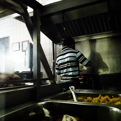
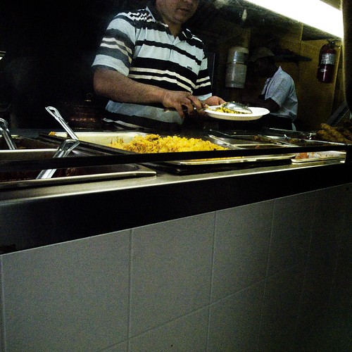
The grain in the kitchen shot makes it look like the kind of place you'd stop by and pick up something at—but not if you saw the kitchen. The feeling I get is that it's not a bad place...just not a "great" place. I find it interesting the way the guy's shirt shows up. Everything else is hazy and soft, but those stripes are sharp and bold. He sort of doesn't go with the rest of the picture, but that may be one interesting part of the whole thing. It's not a shot I'd put up on my wall, but it is interesting. More in a technical "interesting" way than an artistic way, at least to me. I'd use that technique for something less "gritty"; a dance hall, a jazz band, maybe a bar with sunlight coming in...not a kitchen.
|
Glenn -----OTR/L, MOT, Tx
|
| |
|
|
|
|
|
|
|
Addicted to MacNN
Join Date: Sep 2001
Location: Toronto
Status:
Offline
|
|
It's actually not a bad little place. A Bangladeshi curry house, across the street from work. They make all of their food from scratch, every morning the entire street smells of spices and fried garlic. The place is a hole in the wall, but it's clean and the food is good. They're nice people, the entire family works there. There's always cricket on the TV and something hot and spicy to eat.
The softness comes from shooting through glass, but the high contrast in the guy's shirt make up for that. The remainder gets softened.
|
|
|
| |
|
|
|
|
|
|
|
Administrator Join Date: Apr 2001
Location: San Antonio TX USA
Status:
Offline
|
|
Originally Posted by Mastrap
It's actually not a bad little place. A Bangladeshi curry house, across the street from work. They make all of their food from scratch, every morning the entire street smells of spices and fried garlic. The place is a hole in the wall, but it's clean and the food is good. They're nice people, the entire family works there. There's always cricket on the TV and something hot and spicy to eat.
The softness comes from shooting through glass, but the high contrast in the guy's shirt make up for that. The remainder gets softened.
This picture gives an entirely different spin on the place. It looks clean in this one, rather than "just clean enough" in the other one. Those hole in the wall restaurants often have the very best in their specialty's cuisine. It still seems like the place is not one you'd hang out in, but it is more inviting in this picture than the earlier one.
|
Glenn -----OTR/L, MOT, Tx
|
| |
|
|
|
|
|
|
|
Posting Junkie
Join Date: Feb 2005
Location: 888500128
Status:
Offline
|
|
Originally Posted by Tesselator
The pigeons batting each other back and forth which caused me to stop and watch them for a bit. Then i noticed the colors of the environment they had chosen for a home. The bamboo, below them, the red wood-stained house, the reflecting glass, etc. The people I was with were walking on so i looked for the optimal frame and angle and took a bracket. Actually two sets, The one you saw and one zoomed up on them in hopes they would start beating each other senselessly again for the camera.
So as it was, you portrayed the incidentals, but the actual bit that caught your attention (the pigeon action) was missing?
That fits pretty exactly with what I'm seeing (and how I described my reaction, or rather, lack thereof).
Originally Posted by Tesselator
Interesting that (if I'm getting you right) is exactly what I was hoping to invoke (or expecting that it would invoke) to a 1st time on-looker. In sequence maybe something like:
- Oh, look... pretty colors...
- What the hell is it? A building, factory? wood-shed?
- Looks like Japan or some Asian place,
- Ooo pigeons.. (look at all that poop)
- Oh, this is THEIR home...
- Or uh? What?
or close to that.
What about art and images that evoke question, wonder, confusion, and etc.? I was in a meeting with the producer of a film (the 1st Final Fantasy CG film) and he was showing me some art not related to the film. It was his but I didn't know it. I looked at one of them and said: "I absolutely HATE that!" and then immediately thought to myself OMG it's his wife's or something and I just blew the relationship.. He looked at me and said you're the first person to get that painting - it's exactly the response I want to elicit from this piece. I felt saved. I'm not saying my pigeon pic is of some similar greatness but seriously this idea that an image needs an understandable and clear "story" or message is very beginnerish to me.
But evoking a visceral response of absolute dislike is the complete opposite of a ho-hum yes-building-yes-bamboo-yes-pigeons-and-so? reaction like you're getting.
That's a very strong response to what must have been a very strong statement.
|
|
|
| |
|
|
|
|
|
|
|
Posting Junkie
Join Date: Feb 2005
Location: 888500128
Status:
Offline
|
|
|
|
|
|
| |
|
|
|
|
|
|
|
Moderator Emeritus
Join Date: Apr 2001
Location: Fort Lauderdale, FL
Status:
Offline
|
|
Originally Posted by Tesselator
I like these allot. I think it's the three together that adds to the overall feeling
of each one individually. First shot is like a 7 if we do numbers - kewl clouds!
You might even have a whole'nother picture maybe better than the original by
cropping out both trees, and the forefront shore. Second one is like, a 7.5 or
so (shinny-happy-people) and the third one is like a strong 8 and makes the
whole sequence! I really like #3 !!!
You work in a bar? And, I can't figure it perfectly is that slightly nothern west
coast or east coast - I'm going with west coast but above San Diego for sure.
Right?
EDIT: Oh, just read your location... Florida huh? Hehe you guys have to serve
prison time now for speeding I hear?
Oh you've developed a numbering system now. I'll have to retire from this community though if you keep saying kewl.
South Florida, Photo 2, is there anywhere on the west coast above San Diego where there's no cliffs and such? I've got palm trees and oceans in the background, sea level. I don't know anything about your prison speak. Photos only.
EDIT: oh, and thanks for the comments. I'm also not really going to leave the community if you continue to say kewl.
(
Last edited by IceEnclosure; May 24, 2008 at 11:47 AM.
)
|
|
ice
|
| |
|
|
|
|
|
|
|
Moderator Emeritus
Join Date: Apr 2001
Location: Fort Lauderdale, FL
Status:
Offline
|
|
Originally Posted by Tesselator
Yeah, new florida state legislation passed a few weeks ago. You can do five years for
five miles over now. 
5 years huh? nevermind. Photos.
|
|
ice
|
| |
|
|
|
|
|
|
|
Moderator Emeritus
Join Date: Apr 2001
Location: Wasilla, Alaska
Status:
Offline
|
|
Summer in Alaska:
Click for larger. The full detail is interesting.

|
|
|
| |
|
|
|
|
|
|
|
Administrator Join Date: Apr 2001
Location: San Antonio TX USA
Status:
Offline
|
|
Those ARE the Alaskan mosquitoes that are reputed to carry off small animals and to darken the skies like a whole fleet of B52, right? DANG! They are much bigger than I thought...
|
Glenn -----OTR/L, MOT, Tx
|
| |
|
|
|
|
|
|
|
Posting Junkie
Join Date: Mar 2005
Location: Louisiana
Status:
Offline
|
|
Those are mosquitoes? Dear god...
|
|
|
| |
|
|
|
|
|
|
|
Posting Junkie
Join Date: Mar 2005
Location: Louisiana
Status:
Offline
|
|
Thank ya...
I took the picture from the back seat of my in-law's Honda Pilot through a tinted window while roaming around Destin, FL.
I spent most of the day romping around storefront parking lots, taking pictures of textures while the wife shopped. I got a lot of weird stares from people wondering why I was walking really slowly with my head down, randomly taking pictures of nasty bits of cement and alley walls.
I overlaid the texture atop the old man bike shot, and it came out semi-decent. I've been building up a collections of textures I hope to sell one day once I've gathered about 100.
|
|
|
| |
|
|
|
|
|
|
|
|
|
|
|
|
 
|
|
|
Forum Rules
|
|
|
|
You may not post new threads
You may not post replies
You may not post attachments
You may not edit your posts
|
HTML code is Off
|
|
|
|
|
|
|
|
|
|
|
|