|
 |
SS Studio Pro (Page 5)
|
|
|
|
|
Junior Member
Join Date: Mar 2003
Status:
Offline
|
|
Swiz,
I just checked some of my apps and e.g. Safari looks awesome, but there are two things i would like to say:
1. iTunes4: The main window is still the same. The only thing is that the scrollbar changed to the one from the theme and all other windows are looking like they should (like the theme). So everything is working, but there is no change in the iTunes main windowstyle.
2. Maybe you can make the grey lines a bit darker. Just take a look at the System Preferences. The divider are a bit too loght.
This theme rocks!!!!
|
|
|
| |
|
|
|
|
|
|
|
Grizzled Veteran
Join Date: May 2002
Location: USA
Status:
Offline
|
|
iTunes and Quicktime are hard-coded for a consistant brushed look. Themes do not change them.
|
|
|
| |
|
|
|
|
|
|
|
Junior Member
Join Date: Mar 2003
Status:
Offline
|
|
Thanks, I didn't know that.
|
|
|
| |
|
|
|
|
|
|
|
Mac Elite
Join Date: Dec 2002
Location: Trapped in the depths of my mind
Status:
Offline
|
|
swiz:
THANK YOU SO MUCH FOR MAKING THIS!
SIMPLY GORGEOUS.
I really like how the buttons look and how the widgets look, esp. the "x - +". You got them PERFECT! 
|
|
|
| |
|
|
|
|
|
|
|
Senior User
Join Date: Jan 2001
Location: Southern CA
Status:
Offline
|
|
Thanks swiz, looks great. I've noticed some problems with the large progress bars, the fills seem too tall for the bars (if that makes any sense).
I actually like the brushed metal in Safari, is there any way to get that back*.
(*edit: nevermind, I found it)
(
Last edited by I'mDaMac; May 18, 2003 at 06:27 PM.
)
|
|
Who'sDaMac?
|
| |
|
|
|
|
|
|
|
Grizzled Veteran
Join Date: May 2002
Location: USA
Status:
Offline
|
|
I really love it... now I need to switch around all my icons and what have you 
One thing I just noticed... this is the first theme I have ever used to change the color of the dots under miss-spelled words in cocoa (omniweb) apps! (there're green)
Here is my new screenshot with a wallpaper of dvdSP2 elements.

|
|
|
| |
|
|
|
|
|
|
|
Forum Regular
Join Date: Jul 2002
Status:
Offline
|
|
wow, thank you for this theme....
two things i noticed:
there is a glitch in transmit�s preview drawer (on the buttom, there is a transparent line which shouldn�t be there)
for me, inactive scrollbars don�t look right compared to the active ones....
|
|
|
| |
|
|
|
|
|
|
|
Mac Elite
Join Date: Jan 2003
Location: Evansville, IN
Status:
Offline
|
|
Is there a good Candybar container that would match this theme? Having aqua folders, etc doesn't seem to match too well 
|
|
|
| |
|
|
|
|
|
|
|
Grizzled Veteran
Join Date: May 2002
Location: USA
Status:
Offline
|
|
SNOW.E 2 Graphite looks alright... or basically any graphite icontainer.
There is also a good MM icon set called Quicksilver 2 which will match pretty well.
|
|
|
| |
|
|
|
|
|
|
|
Mac Elite
Join Date: Nov 2002
Status:
Offline
|
|
*Drools on keyboard* I just wish it were darker... lol jk that's just me.
Hay I might be able to host a mirror of it for you if you've got bandwith problems.
|
|
|
| |
|
|
|
|
|
|
|
Junior Member
Join Date: Mar 2003
Status:
Offline
|
|
Originally posted by tikki:
Is there a good Candybar container that would match this theme? Having aqua folders, etc doesn't seem to match too well
Snow.E2 Lime is a nice match for this theme
|
|
|
| |
|
|
|
|
|
|
|
Mac Elite
Join Date: Apr 2003
Location: SoCal
Status:
Offline
|
|
Wow! Looks great, swiz! 
Granted, there are still a number of changes though that I hope make it into your variant.
BTW, are you going to make a Safaricon theme for it? Also, I think it would absolutely kiss *** if you made the Safari progressbar match this theme's progress bars (you can see examples of that here). That would totally make my day.
|
|
|
| |
|
|
|
|
|
|
|
Mac Elite
Join Date: Nov 2002
Status:
Offline
|
|
Not sure if this is a bug from running Shinobi right before, but it's really stange looking:

I'm going to run AquaFix and apply it again, I hope that helps.
|
|
|
| |
|
|
|
|
|
|
|
Mac Elite
Join Date: Apr 2003
Location: SoCal
Status:
Offline
|
|
Originally posted by NetworkShadow:
Not sure if this is a bug from running Shinobi right before, but it's really stange looking:
I'm going to run AquaFix and apply it again, I hope that helps.
Do you have the IZA Aqua Restore package that came with Shinobi? I don't know about other people, but I always have to use it after using any of Izawaa's themes to keep things from messing up. AquaFix works too, but I use the one that Izawaa supplies just in case.
Oh, one more suggestion, swiz: The scrollbars are really blurry... they kinda remind me of the puma buttons.
|
|
|
| |
|
|
|
|
|
|
|
Grizzled Veteran
Join Date: May 2002
Location: USA
Status:
Offline
|
|
dum de dum. Why can't I delete this?
(
Last edited by SwarmyCurve; May 18, 2003 at 09:10 PM.
)
|
|
|
| |
|
|
|
|
|
|
|
Professional Poster
Join Date: Aug 2002
Location: Floreeda
Status:
Offline
|
|
menu bar is waayy to light. it definatly does not match the other darkness of the theme.
|
|
|
| |
|
|
|
|
|
|
|
Mac Elite
Join Date: Apr 2003
Location: SoCal
Status:
Offline
|
|
Originally posted by SwarmyCurve:
I editted the Safari resources to compliment this theme, if you want to try it, download this. It has the new resources and a backup of Apple's default. I might still change it around, and it doesn't look perfect or anything but its a start  . .
I'm using it right now, and it's pretty nice! The only thing that'd need work is the progress bar. Actually, that brings me up to another point: In the SSSP theme, I was expecting the progress bar "bars" to be fairly widely spaced apart, like in the very first preview in the first post of this thread, but they've been "squished together" per se... I'd like to see the return of actual bars.
|
|
|
| |
|
|
|
|
|
|
|
Dedicated MacNNer
Join Date: May 2002
Location: U.S.
Status:
Offline
|
|
Great work Swiz! Makes for a nice working environment.
|
|
|
| |
|
|
|
|
|
|
|
Mac Elite
Join Date: Nov 2002
Status:
Offline
|
|
|
|
|
|
| |
|
|
|
|
|
|
|
Grizzled Veteran
Join Date: May 2002
Location: USA
Status:
Offline
|
|
Originally posted by Sage:
I'm using it right now, and it's pretty nice! The only thing that'd need work is the progress bar. Actually, that brings me up to another point: In the SSSP theme, I was expecting the progress bar "bars" to be fairly widely spaced apart, like in the very first preview in the first post of this thread, but they've been "squished together" per se... I'd like to see the return of actual bars.
I guess Apple changed them.
(
Last edited by SwarmyCurve; May 18, 2003 at 09:11 PM.
)
|
|
|
| |
|
|
|
|
|
|
|
Grizzled Veteran
Join Date: May 2002
Location: USA
Status:
Offline
|
|
We can't get to your pic. Damn SpyMac! Time for a rant... I love how they take themselves SO seriously in their news posts. They have this in the lead story "Spymac is the largest recognized online Macintosh User Group." lol!
da ba dee daba diiiiii - Link us to your member gallery.
|
|
|
| |
|
|
|
|
|
|
|
Mac Elite
Join Date: Apr 2003
Location: SoCal
Status:
Offline
|
|
Originally posted by SwarmyCurve:
Yes, I was also wondering what happened to the progress bars (the green bars are now very close together).
Yeah... this is the progress bar style that I was expecting:

Also, is there any way to keep the progress bar from doing the right-to-left scrolling thing? That makes it even more blurred together. 
|
|
|
| |
|
|
|
|
|
|
|
Grizzled Veteran
Join Date: May 2002
Location: USA
Status:
Offline
|
|
dum de dum. Why can't I delete this?
(
Last edited by SwarmyCurve; May 18, 2003 at 09:10 PM.
)
|
|
|
| |
|
|
|
|
|
|
|
Mac Elite
Join Date: Jan 2003
Location: Evansville, IN
Status:
Offline
|
|
Download his spymac image to disk. Works fine.
|
|
|
| |
|
|
|
|
|
|
|
Mac Elite
Join Date: Apr 2003
Location: SoCal
Status:
Offline
|
|
Originally posted by SwarmyCurve:
Does this look better Sage?
Hmmm... seems like the green is the wrong shade...? It looks like it has a bit too much blue in it.
After thinking about it for a while, I decided to make a mockup of the kind of progress bars that I had in mind all this time... (Note that my graphics arts skills are really bad, but I think you can get the general jist from this image that I modified)...

|
|
|
| |
|
|
|
|
|
|
|
GUI Punk
Join Date: Jan 2002
Location: S.E. Mitten
Status:
Offline
|
|
Yeah, the progress bars in the theme now are the ones which match Apple's. They are supposed to be that tight without the soft edge. The previous progress bars are the style which will be in my variant of the theme.
And please dont make available any Safari kits or anything, I will be releasing the official version this evening.
Keep all the suggestions coming to be considered for my version.
|
 24" AlumiMac 2.4ghz C2D, 4g Ram, 300g HD, 750g USBHD • 80g iPod • 160g ATV • iPhone 3g
|
| |
|
|
|
|
|
|
|
Grizzled Veteran
Join Date: May 2002
Location: USA
Status:
Offline
|
|
Opps! I didn't know you had one in store so soon.
|
|
|
| |
|
|
|
|
|
|
|
Mac Elite
Join Date: Apr 2003
Location: SoCal
Status:
Offline
|
|
swiz - Just curious (as always )... what do you think of the little mockup of the progress bars that I did? My main point was that I'd like to see "white space" in between the "bars", so that they look like separate little units and give it a sci-techie sort of look. I dunno, call me weird.
And as always, just go with whatever you want.
(
Last edited by Sage; May 18, 2003 at 09:26 PM.
)
|
|
|
| |
|
|
|
|
|
|
|
Posting Junkie
Join Date: Sep 2001
Status:
Offline
|
|
Fine work, Swiz. Don't forget, there's no point in trying to please everyone. Fine job.
|
|
|
| |
|
|
|
|
|
|
|
Mac Elite
Join Date: Nov 2002
Status:
Offline
|
|
Originally posted by SwarmyCurve:
We can't get to your pic. Damn SpyMac! Time for a rant... I love how they take themselves SO seriously in their news posts. They have this in the lead story "Spymac is the largest recognized online Macintosh User Group." lol!
da ba dee daba diiiiii - Link us to your member gallery.
Oh I didn't think they did that with links now too.... Copy it into the address bar, it'll work. If not here's the link: http://www.spymac.com/gallery/showph...t=1&thecat=500
|
|
|
| |
|
|
|
|
|
|
|
Dedicated MacNNer
Join Date: May 2001
Location: Midwest, USA
Status:
Offline
|
|
Originally posted by Sage:
After thinking about it for a while, I decided to make a mockup of the kind of progress bars that I had in mind all this time... (Note that my graphics arts skills are really bad, but I think you can get the general jist from this image that I modified)...
[/B]
Sage, I do like your progress bars. Swiz, love this theme and I look forward to your variant. But is it just me or do the scrollbars feel like they are clipped off on the right or bottom for horizontal bars?
|
|
|
| |
|
|
|
|
|
|
|
GUI Punk
Join Date: Jan 2002
Location: S.E. Mitten
Status:
Offline
|
|
Originally posted by IronPen:
Sage, I do like your progress bars. Swiz, love this theme and I look forward to your variant. But is it just me or do the scrollbars feel like they are clipped off on the right or bottom for horizontal bars?
Never really occurred to me but I see what you mean now. That is one of the few elements I am sure I got just like Apple's UI. I'll look into tightening that up for my version though.
|
24" AlumiMac 2.4ghz C2D, 4g Ram, 300g HD, 750g USBHD • 80g iPod • 160g ATV • iPhone 3g
|
| |
|
|
|
|
|
|
|
Mac Elite
Join Date: Dec 2002
Location: Trapped in the depths of my mind
Status:
Offline
|
|
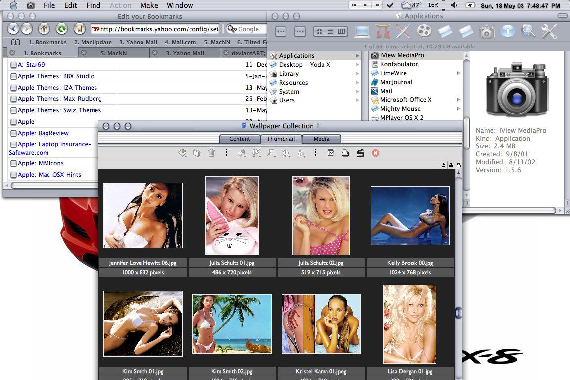
swiz:
Just thought you might want to know. There is a "dot" sometimes there are 2 dots next to the checkboxes. I have posted a screenshot to show you.
Look under the "1.Bookmarks" of the Safari window and you'll see that all the checkboxes have a "dot" next to them.

Computer: Apple PowerBook G4
OS: Mac OSX 10.2.4
Theme: SS Studio Pro by Swizcore [link]
Windows opened (clockwise from upper left):
1) Safari browser w/ SafarIcon theme toolbars
2) Finder window showing Applications. Snow E.2 Icons by Rad-e8
3) iViewMedia Pro
Menubar icons (from lf. to rt.):
Synergy, CheckOff, WeatherPop Advance, MenuMeter, Volume, Battery, wClock
All of these can be found at www.macupdate.com
(
Last edited by TheIceMan; May 19, 2003 at 12:35 AM.
)
|
|
|
| |
|
|
|
|
|
|
|
Mac Elite
Join Date: Nov 2002
Status:
Offline
|
|
Not sure if it's the theme for CandyBar, but the progress bars look really bad in CandyBar when you load an iContainer or change sets. You might want to look into that.
TheIceMan: what app is that you are using to brows you're photos?
|
|
|
| |
|
|
|
|
|
|
|
Mac Elite
Join Date: Jan 2003
Location: Evansville, IN
Status:
Offline
|
|
Originally posted by NetworkShadow:
TheIceMan: what app is that you are using to brows you're photos?
iView Media Pro.
|
|
|
| |
|
|
|
|
|
|
|
Mac Elite
Join Date: Dec 2002
Location: Trapped in the depths of my mind
Status:
Offline
|
|
NetworkShadow:
iView MediaPro. I like it sooooo much better than iPhoto 2.
[EDIT:] Man, Tikki beat me to it.
|
|
|
| |
|
|
|
|
|
|
|
Professional Poster
Join Date: Apr 2002
Location: New York City
Status:
Offline
|
|
Originally posted by swiz:
That being said, please let me know anything that is inconsistent or any suggestions to be iimplemented into my variant.
I'm not sure about DVD SP 2.0, but the menu bar in FCP 4 is more of a brushed metal thing. Not pinstripes.
|
|
|
| |
|
|
|
|
|
|
|
GUI Punk
Join Date: Jan 2002
Location: S.E. Mitten
Status:
Offline
|
|
Regarding the mis appearance of progress bars in certain apps:
Im still looking into this. Its quite odd since they look fine in most instances but in Candybar, Themechanger and some other apps they look wrong. I'll be sure to figure out what it is and rectify it.
|
24" AlumiMac 2.4ghz C2D, 4g Ram, 300g HD, 750g USBHD • 80g iPod • 160g ATV • iPhone 3g
|
| |
|
|
|
|
|
|
|
Addicted to Themes
Join Date: Oct 2001
Location: Sweden
Status:
Offline
|
|
Originally posted by swiz:
Regarding the mis appearance of progress bars in certain apps:
Im still looking into this. Its quite odd since they look fine in most instances but in Candybar, Themechanger and some other apps they look wrong. I'll be sure to figure out what it is and rectify it.
The problem is that you used transparency for the top of your progressbars. You should fill that part with the progressbar background, or if it's not big enough, the same color that you use for backgrounds.
The problems with progressbars in general is that Cocoa apps just take the first frame of the progressbar fill, and animate it moving to the left, while carbon apps use the whole set of frames to make their animation. So even if you have changed all frames to be freezed, cocoa apps will always animate the images moving to the left..
I'm running the theme right now and the stuff that I would like to see improved is:
- The scrollbars, they look out of place and too 3d.
- The menubar is too bright and you should change the apple menu to something smaller and less graphtie in color.
- The bevel button and butted bevel button I think could be done too look more like aqua.
- You should also change all the pane splitter to look like this new aqua style.
Some glitches:
- The utlity window background is not changed, it has the original stripes.
- The dialog Growbox is not changed.
-The Metal window gradient is filled with transparency, which causes drawers in metal apps to be black and partly transparent. You should fill it with the background color instead.
- If you would extend the Tab Pane border 1 pixel in every direction, the foreground tab would not have that light line under it. It would also make it look good in Brushed apps.
Hope that helps. I want you to know that I still think this is a great theme, and probably the best you've done! I think the contrast that the progressbar create is awsome, good job
|
|
|
| |
|
|
|
|
|
|
|
GUI Punk
Join Date: Jan 2002
Location: S.E. Mitten
Status:
Offline
|
|
Thanks Max, that is very useful info. The transparency in the progress bars is totally a mistake. I'll be sure to fix the other stuff too. I'll probably contact you for some help with the bevels.
|
24" AlumiMac 2.4ghz C2D, 4g Ram, 300g HD, 750g USBHD • 80g iPod • 160g ATV • iPhone 3g
|
| |
|
|
|
|
|
|
|
Addicted to Themes
Join Date: Oct 2001
Location: Sweden
Status:
Offline
|
|
Originally posted by swiz:
Thanks Max, that is very useful info. The transparency in the progress bars is totally a mistake. I'll be sure to fix the other stuff too. I'll probably contact you for some help with the bevels.
Sure, I'm glad I can help out.
|
|
|
| |
|
|
|
|
|
|
|
Mac Elite
Join Date: Nov 2002
Status:
Offline
|
|
I don't mind the bright menu bar, but it might look better as the same color as the title bars. I also think you should make a new Apple menu icon.
Maybe you could make the scroll bars the same style as the buttons/pop-ups to fix the "too 3d" thing?
I'm loving my new bright look. Even us dark theme fans enjoy a bright one from time to time.
|
|
|
| |
|
|
|
|
|
|
|
Professional Poster
Join Date: Aug 2002
Location: Floreeda
Status:
Offline
|
|
i found a error. you forgot to change the horizontal resize bar. here, i even took a picture of it.
http://homepage.mac.com/kamin_/.Pictures/ss.jpg
i decided to link it instead of posting the pictures cause i hate it when the page stretchs.
(
Last edited by fireside; May 20, 2003 at 08:15 PM.
)
|
|
|
| |
|
|
|
|
|
|
|
Fresh-Faced Recruit
Join Date: Feb 2003
Location: Sweden
Status:
Offline
|
|
|
(
Last edited by S A V E D; May 20, 2003 at 09:47 PM.
)
|
|
|
| |
|
|
|
|
|
|
|
Mac Elite
Join Date: Nov 2002
Status:
Offline
|
|
|
(
Last edited by NetworkShadow; May 20, 2003 at 11:00 PM.
)
|
|
|
| |
|
|
|
|
|
|
|
Professional Poster
Join Date: Aug 2002
Location: Floreeda
Status:
Offline
|
|
arg now network shadow is streching the page ;(
|
|
|
| |
|
|
|
|
|
|
|
GUI Punk
Join Date: Jan 2002
Location: S.E. Mitten
Status:
Offline
|
|
Im working on all of the inconsistencies and errors with this version now as well as working on my variant which I think is looking hot. The update will include my version and will be available relatively soon.
Thanks everyone!
|
24" AlumiMac 2.4ghz C2D, 4g Ram, 300g HD, 750g USBHD • 80g iPod • 160g ATV • iPhone 3g
|
| |
|
|
|
|
|
|
|
Mac Elite
Join Date: Dec 2002
Location: Trapped in the depths of my mind
Status:
Offline
|
|
Thanks Swiz.
|
|
|
| |
|
|
|
|
|
|
|
Professional Poster
Join Date: Aug 2002
Location: Floreeda
Status:
Offline
|
|
found another weird thing. when the buttons are on a background other than white, there is this weird white border around them.
ex:

i love this theme so much it hurts to see bad things about it. :O
|
|
|
| |
|
|
|
|
|
|
|
GUI Punk
Join Date: Jan 2002
Location: S.E. Mitten
Status:
Offline
|
|
Originally posted by fireside:
found another weird thing. when the buttons are on a background other than white, there is this weird white border around them.
ex:
i love this theme so much it hurts to see bad things about it. :O
Thats actually a 2 pixel stroke on the recessed push buttons. But it is still an error for the small versions, it should only be one pixel. Ive got all of the previous errors fixed adn will tend to that one tomorrow. Then I will focus on my variant. Sadly, I got a got screenie today of the menubar and it is very much like the current Aqua menu bar so in keeping inline with 100% Apple version, I have changed the menubar to this look. But I will be using a darker, smoother version in my variant. If requested, those who would rather use the Apple original version with a menubar other than the Aqua style, I will make another variant.
|
24" AlumiMac 2.4ghz C2D, 4g Ram, 300g HD, 750g USBHD • 80g iPod • 160g ATV • iPhone 3g
|
| |
|
|
|
|
|
|
|
|
|
|
|
|
 
|
|
|
Forum Rules
|
|
|
|
You may not post new threads
You may not post replies
You may not post attachments
You may not edit your posts
|
HTML code is Off
|
|
|
|
|
|
|
|
|
|
|
|