 |
 |
Request: Shapeshifter GUI with Solaris/CDE appearance
|
|
|
|
|
Fresh-Faced Recruit
Join Date: Jun 2004
Status:
Offline
|
|
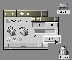
I posted a screenshot of my current "Solaris lookalike" CDE-desktop here:
http://www.swisswuff.ch/cde-screenshot.jpg
It is really an AIX 5.2 system, but one can edit the colors which is what I did.
What I like so much about this - and what I miss on Mac OS X - is the option of having a theme where just the front window is coloured and highlighted, and all the rest can be one gray blur.
This is very ergonomic, and allows for easier working with more than one window than OS X Aqua or many of these themes that are available for ShapeShifter. A noteable exception would be the BeOS.
I would like to file a request with anyone who attempts to not just 'beef up' the way Mac OS X looks like, but to make it more useable.
Mac themes for OS 9 (Kaleidoscope) that were extremely useful and ergonomic to work with had been published on masswerk.at, you can access them and their preview images here: http://www.masswerk.at/schemes_set.htm.
I would be very happy to provide any screenshot directly off the CDE system I am using to whoever is getting ready to program such a theme.
Thank you very much!
|
|
|
| |
|
|
|
|
|
|
|
Grizzled Veteran
Join Date: Apr 2004
Location: Philadelphia, PA
Status:
Offline
|
|
MacSolaris was among my favs in the SchemeTime!  
A theme based on that would be so usable. The Solaris interface is nearly perfect, boring to many but very useable.
|
|
|
| |
|
|
|
|
|
|
|
Senior User
Join Date: Apr 2003
Location: Montréal (Québec)
Status:
Offline
|
|
Wow, that brings back alot of fond memories...
My favorite Masswerk scheme was this one:
Nothing fancy, but really great for getting out of the way while being very effective. Hey I might even give it a shot if I manage to master TP correctly one day
|
|
|
| |
|
|
|
|
|
|
|
Forum Regular
Join Date: May 2001
Location: Philadelphia, PA, US
Status:
Offline
|
|
There have been a number of attempts at a very clean, basic, no frills os x theme. Rhapsodized is a great example. It has clean widgets but then it kept brushed metal which for me killed the idea of it being a minimalistic theme.
There is also NeXT port by Swiz that would be pretty close to what you want, but it needs quite a few more appskins to be thoroughly usable.
This is not a personal knock on Max, Swiz or any themers out there. As I am someone who doesn't have the time to invest in creating a theme... I seriously appreciate the work these people do.
Shapeshifter is quite new if you think about it... appskins are quite new... the ability to have a different "metal" appearance is new. Going to take folks a few stabs at theming before they wrap their head around the concepts.
It be nice if one GUI team formed to do nothing but crank out a set of "no frills" themes like CDE. I know most themers aren't inspired by designs like these, but there must be two or three that really find enjoyment in working with minimalism.
|
|
|
| |
|
|
|
|
|
|
|
Mac Enthusiast
Join Date: May 2004
Location: norway
Status:
Offline
|
|
I'm pretty sure I wouldn't be using a Solaris/CDE-GUIKit. Too simple and boring IMO.
But a Ximian Guikit on the other hand..

|
|
|
| |
|
|
|
|
|
|
|
Senior User
Join Date: Apr 2003
Location: Montréal (Québec)
Status:
Offline
|
|
Speaking of the Linux side, I've always been a fan of the Gorilla skin by jimmac...
Oh I wish I could use that one on my Mac 
|
|
|
| |
|
|
|
|
|
|
|
Fresh-Faced Recruit
Join Date: Nov 2004
Location: Vienna, Austria
Status:
Offline
|
|
Hi!
First: Thanks for (pleasing) comments on the mass:werk-schemes!
I'm looking forward to some spare time and OS9 to OS X migration at the end of this year, so I might well take a closer look to shapeshifter themes. Implementing a CDE/Solaris-look is a sure candidate for this.
The main point to this will be the handling of custom borders for OS X windows. As far as I know, you've to stick with the standard window's border sizes. Also it seems that the window's controls (close, zoom, minimize) have to stay at the upper left corner. Does anyone know more about that issue?
|
|
mass:werk
|
| |
|
|
|
|
|
|
|
Junior Member
Join Date: Oct 2000
Status:
Offline
|
|
Yes, and yes. Right now, everyone is stuck with the current OS X border concept, i.e. as little as possible. Windows are more defined by their shadows than by a pixelated edge, the metal window style being an exception.
Unless the ShapeShifter crew can pull off some magic as regards the size and placement of widgets, size (and existence!) of window borders we are practically stuck in the Kaleidoscope 1.x days. 
Remember IZA Shock Absorber?
|
|
|
| |
|
|
|
|
|
|
|
Fresh-Faced Recruit
Join Date: Nov 2004
Location: Vienna, Austria
Status:
Offline
|
|
Yes, I do remember IZA Shock Absorber.
Could we use the shadows (alpha at 100%) for optional borders?
Else we would be left with an entierely new design attempt ...
(The Gorilla screenshot is defenitly nice)
(
Last edited by masswerk; Nov 1, 2004 at 04:22 PM.
)
|
|
mass:werk
|
| |
|
|
|
|
|
|
|
Grizzled Veteran
Join Date: Jul 2004
Location: Canada
Status:
Offline
|
|
Originally posted by masswerk:
Yes, I do remember IZA Shock Absorber.
Could we use the shadows (alpha at 100%) for optional borders?
Else we would be left with an entierely new design attempt ...
(The Gorilla screenshot is defenitly nice)
Unfortunately not, the shadows are not part of the theme but rather generated by Quartz on the fly.
I'm not really a fan of window borders and tried really hard to get rid of them when i was a windows user working with skins.
|
|
|
| |
|
|
|
|
|
|
|
Mac Enthusiast
Join Date: Dec 2003
Location: Phoenix, Arizona
Status:
Offline
|
|
Am I the only one who thinks both those themes remind me way too much of OS9? 
an OS theme that I'm happy I'm no longer having to look at! 
|
The Graphic Mac: Tips, tricks and commentary for design, Adobe and Mac OSX.
|
| |
|
|
|
|
|
|
|
Grizzled Veteran
Join Date: Apr 2004
Location: Philadelphia, PA
Status:
Offline
|
|
maybe it is too much candy for OSX - shock absorber was nearly too much even for OS9!
The original idea of porting MacSolaris or one of the other K-Schemes and updating it to SS2.0 levels is an interesting challenge. Although it requires remaking all the elements.
|
|
|
| |
|
|
|
|
|
|
|
Junior Member
Join Date: Oct 2000
Status:
Offline
|
|
maybe it is too much candy for OSX - shock absorber was nearly too much even for OS9!
Oh, it was. But Izawa made a lite version "IZA Shock Absorber Spirit" which was more usable.
Am I the only one who thinks both those themes remind me way too much of OS9?
They're supposed to remind you of Solaris and linuxWMs...
Bring 'em back!
|
|
|
| |
|
|
|
|
|
|
|
Grizzled Veteran
Join Date: Apr 2004
Location: Philadelphia, PA
Status:
Offline
|
|
working on an OPWIN layout but there is no ETA and unfortunately there is no way to do the "zooming" windows. bummer.
|
|
|
| |
|
|
|
|
|
|
|
Mac Enthusiast
Join Date: May 2004
Location: norway
Status:
Offline
|
|
Originally posted by FB Eye:
Speaking of the Linux side, I've always been a fan of the Gorilla skin by jimmac...
Oh I wish I could use that one on my Mac
yes, that Gorilla-theme is certainly hot. Someone should definitely port it!
|
|
|
| |
|
|
|
|
|
|
|
Fresh-Faced Recruit
Join Date: Nov 2004
Location: Vienna, Austria
Status:
Offline
|
|
Originally posted by aristotles:
Unfortunately not, the shadows are not part of the theme but rather generated by Quartz on the fly.
I'm not really a fan of window borders and tried really hard to get rid of them when i was a windows user working with skins.
I'm not really a fan of borders, too. At least not that kind of borders wich can be found at ms-windows or System 8/9. So for productivity I prefere the System 7 style.
What was really interesting about CDE is that those windows are altogether different in feeling from win/mac windows and give a neat working environment although they do have borders ...
But I don't think that there will be any possibility of implementing them in OS X in near future, since you would have to replace the whole Aqua layer. So let's work out something different.
|
|
mass:werk
|
| |
|
|
|
|
|
|
|
Fresh-Faced Recruit
Join Date: Feb 2004
Location: Western, NY
Status:
Offline
|
|
One of my faves for Kaleidoscope was QNX by Maury McCown http://www.railheaddesign.com
I think someone should port that to an OSX theme....
Just my $.02
|
|
Life's not too short, your just dead for so long...
|
| |
|
|
|
|
|
|
|
Fresh-Faced Recruit
Join Date: Nov 2004
Location: Vienna, Austria
Status:
Offline
|
|
Originally posted by negativeSpace:
One of my faves for Kaleidoscope was QNX by Maury McCown ...
Yes, QNX (the old blue/grey Photon interface) was great.
May be I'll work out some guide lines to what could be called a Plain-GUI-Philosophy and post this on my website. (Eventually it will be too large to be inlined in a thread.)
The main point: A GUI should be somewhere likeable but should do everything to reduce the load of visual information to be processed by the user. Imho any element of a theme should not ad any information but reduce information. This is the very problem with photorealistic textures and elements. And Aqua is subject to this too. (P.e. 3D-effects should not be incoroporated for their own sake but only be used to group elements - as does the title bar, as do the sort buttons of OS 8/9 list views ...)
|
|
mass:werk
|
| |
|
|
|
|
|
|
|
|
|
|
|
|
 
|
|
|
Forum Rules
|
|
|
|
You may not post new threads
You may not post replies
You may not post attachments
You may not edit your posts
|
HTML code is Off
|
|
|
|
|
|
|
|
|
|
|
|


