 |
 |
VLC 0.5.0 TRUE brushed appearance
|
|
|
|
|
Mac Elite
Join Date: Jul 2002
Location: Montreal, Qc
Status:
Offline
|
|
I'm willing to bet M-Audio is responsible for VLC's new appearance as well as for most of the improvements. Honestly, I don't understand it's preferences and I don't like the new gui too much...so I changed it a bit so that it looks more like a brushed app.
Here's a preview of what I made it look like:

Download Here
Anyone know how to make the counter text black instead of blue? Also, has anyone tried out the new Revolution 7.1 soundcard?
|

Data Bytes Computers - Montreal, QC
Ventes & Services / Sales & Services
|
| |
|
|
|
|
|
|
|
Mac Elite
Join Date: Dec 2001
Location: Windham, ME
Status:
Offline
|
|
LOL yah beat me 2 it, thanx for the time saver. 
|
|
|
| |
|
|
|
|
|
|
|
Mac Enthusiast
Join Date: Sep 2001
Location: C'dale, IL
Status:
Offline
|
|
I also use VLC and also hate the new interface... here's what I did with it:

I de-brushed the interface and made it smaller, rearranged the buttons, and re-did the resource graphics.
Anyway, that's my 2�
-Carbon
|

:: Carbon Themes v1.5 ::
|
| |
|
|
|
|
|
|
|
Professional Poster
Join Date: Mar 2001
Location: Seattle, WA
Status:
Offline
|
|
Originally posted by CarbonG4:
I also use VLC and also hate the new interface... here's what I did with it:
I de-brushed the interface and made it smaller, rearranged the buttons, and re-did the resource graphics.
Anyway, that's my 2�
-Carbon
That looks badass, could you email me or post your nib file?
Thanks.
|
|
|
| |
|
|
|
|
|
|
|
Mac Enthusiast
Join Date: Sep 2001
Location: C'dale, IL
Status:
Offline
|
|
Sure thing, here's my modded Resource folder from inside vlc.app:
http://www.621.org/~carbon/files/vlc/Resources.zip
This is not very tested and isn't a perfect interface mod... so feel free to do whatever you want with it, like making changes and reposting, etc.
Also, it was designed to look right in FatalE, so I don't know how it will look in other themes, but here it is anyway.
edit: one more thing, I used Unsanitys metallifizer to de-brush it... I'm sure it can be toggled off in Interface Builder but I didn't care to look around ;P
-Carbon
(to install you just have to right-click on vlc.app and navigate to the Resources folder and replace it w/ my Resources folder.)
(
Last edited by CarbonG4; Feb 5, 2003 at 12:49 AM.
)
|
:: Carbon Themes v1.5 ::
|
| |
|
|
|
|
|
|
|
Dedicated MacNNer
Join Date: Jun 2002
Location: Sweden
Status:
Offline
|
|
Here's mine:

Clean and simple. I'm thinking of adding a background picture too, with volume symbols.. But I dunno. I rather like it like this
|
|
|
| |
|
|
|
|
|
|
|
Mac Enthusiast
Join Date: Sep 2001
Location: C'dale, IL
Status:
Offline
|
|
That's cool Cerbero... I like the the solid gray button graphics better than mine as well.
|
:: Carbon Themes v1.5 ::
|
| |
|
|
|
|
|
|
|
Forum Regular
Join Date: Dec 2002
Location: canadia
Status:
Offline
|
|
Originally posted by Cerbero:
Here's mine:
Clean and simple. I'm thinking of adding a background picture too, with volume symbols.. But I dunno. I rather like it like this
make it available to the masses....
|
|
= decursive =
|
| |
|
|
|
|
|
|
|
Dedicated MacNNer
Join Date: Jun 2002
Location: Sweden
Status:
Offline
|
|
Ok, here it is.
Just put the Resources folder contained within in vlc.app/Contents/.
|
|
|
| |
|
|
|
|
|
|
|
Addicted to MacNN
Join Date: Nov 1999
Location: Madison, WI
Status:
Offline
|
|
Mine:

Use it the same way. Sure took along time to make , 42!
-Owl
(
Last edited by OwlBoy; Feb 8, 2003 at 03:45 PM.
)
|
|
|
| |
|
|
|
|
|
|
|
Mac Elite
Join Date: Dec 2001
Location: Windham, ME
Status:
Offline
|
|
Originally posted by OwlBoy:
Mine:
Use it the same way. Sure took along time to make , 42!
-Owl
sweet dude, i like yers, can i get it? I wanan tweak it a bit and make it more aquay when I get home on monday, email it to me will yah? thanx!
|
|
|
| |
|
|
|
|
|
|
|
Addicted to MacNN
Join Date: Nov 1999
Location: Madison, WI
Status:
Offline
|
|
Shure I guess you could make it more aqua, I'm not too good at that, click the image in the forum for the file.
-Owl
|
|
|
| |
|
|
|
|
|
|
|
Fresh-Faced Recruit
Join Date: May 2001
Location: amsterdam
Status:
Offline
|
|
Originally posted by Cerbero:
Here's mine:
Clean and simple. I'm thinking of adding a background picture too, with volume symbols.. But I dunno. I rather like it like this
very nice! specialy with the Milk theme.
|
|
|
| |
|
|
|
|
|
|
|
Fresh-Faced Recruit
Join Date: Feb 2003
Status:
Offline
|
|
can some one make one for the mmx mecury theme? as that is the theme that i use plz???
|
|
|
| |
|
|
|
|
|
|
|
Mac Enthusiast
Join Date: Oct 2001
Status:
Offline
|
|
Originally posted by pixeljunky:
can some one make one for the mmx mecury theme? as that is the theme that i use plz???
Cerbero's theme uses your currently installed buttons and etc.
For example, I'm using the milk theme:

|
|
|
| |
|
|
|
|
|
|
|
Mac Elite
Join Date: Oct 2000
Status:
Offline
|
|
Has anyone considered changing that horrible non standard font back to Lucida? It's not that hard, just select the text field and do command-t.
|
|
|
| |
|
|
|
|
|
|
|
Addicted to MacNN
Join Date: Nov 1999
Location: Madison, WI
Status:
Offline
|
|
Originally posted by Synotic:
Has anyone considered changing that horrible non standard font back to Lucida? It's not that hard, just select the text field and do command-t.
Um, it is Lucida...
-Owl
|
|
|
| |
|
|
|
|
|
|
|
Mac Elite
Join Date: Oct 2000
Status:
Offline
|
|
Originally posted by OwlBoy:
Um, it is Lucida...
-Owl
Shh! Point is 18 size fonts are non standard and it doesn't look good 
P.S. Liquidity and I are also working on cleaner brushed look, more in line with the current iApps.
|
|
|
| |
|
|
|
|
|
|
|
Mac Enthusiast
Join Date: Oct 2001
Status:
Offline
|
|
Originally posted by Cerbero:
Ok, here it is.
Just put the Resources folder contained within in vlc.app/Contents/.
I've modified the nib file from this to make it work with vlc 0.5.3. Just replace it in Resources/English.lproj/
It's here.
|
|
|
| |
|
|
|
|
|
|
|
Mac Elite
Join Date: Nov 2002
Status:
Offline
|
|
Cool, I didn't like the interface it comes with.
|
|
|
| |
|
|
|
|
|
|
|
Grizzled Veteran
Join Date: Oct 2002
Status:
Offline
|
|
Originally posted by mrbiiggy2:
I've modified the nib file from this to make it work with vlc 0.5.3. Just replace it in Resources/English.lproj/
It's here.
It's meant to look like this:

?!
WTF happened?
|
|
BayBook (13" MacBook Pro, 2.4GHz Core 2 Duo, 4GB RAM, 1TB HD) // BayPhone (iPhone 4, 32GB, black)
|
| |
|
|
|
|
|
|
|
Mac Enthusiast
Join Date: Oct 2001
Status:
Offline
|
|
Originally posted by megasad:
It's meant to look like this:
?!
WTF happened?
You still need to install these, and then put my modified nib file over that. GL
|
|
|
| |
|
|
|
|
|
|
|
Grizzled Veteran
Join Date: Oct 2002
Status:
Offline
|
|
Originally posted by mrbiiggy2:
You still need to install these, and then put my modified nib file over that. GL
D'oh-eth. Thank you.
|
|
BayBook (13" MacBook Pro, 2.4GHz Core 2 Duo, 4GB RAM, 1TB HD) // BayPhone (iPhone 4, 32GB, black)
|
| |
|
|
|
|
|
|
|
Grizzled Veteran
Join Date: Sep 2000
Location: The Basement
Status:
Offline
|
|
can you guys make the timer font way smaller? it's nasty big!
|
|
|
| |
|
|
|
|
|
|
|
Mac Enthusiast
Join Date: Oct 2001
Status:
Offline
|
|
Originally posted by brainchild2b:
can you guys make the timer font way smaller? it's nasty big!
This is something simple you can do for yourself by opening the nib file.
|
|
|
| |
|
|
|
|
|
|
|
Grizzled Veteran
Join Date: Sep 2000
Location: The Basement
Status:
Offline
|
|
Originally posted by mrbiiggy2:
This is something simple you can do for yourself by opening the nib file.
I have to have developer tools for this or what program should I be opening the nib file with?
|
|
|
| |
|
|
|
|
|
|
|
Dedicated MacNNer
Join Date: Jun 2002
Location: Sweden
Status:
Offline
|
|
Originally posted by brainchild2b:
I have to have developer tools for this or what program should I be opening the nib file with?
Yeah, you'll need the developer tools.
|
|
|
| |
|
|
|
|
|
|
|
Fresh-Faced Recruit
Join Date: Aug 2003
Location: Stockholm, Sweden
Status:
Offline
|
|
Anyone that have made some progress on customizing VLC Media player? Especially the slider..
How do i change the buttons, and how do i chanhe lenght of the "default" duration slider? (when i change the lenght in the .nib file it's getting messed up)
What do i do with this?
The VLC (0.6) controller in IB
Sorry, lot's of questions..
I'm not so used to IB.. So...
Cheers
|
|
|
| |
|
|
|
|
|
|
|
Grizzled Veteran
Join Date: Oct 2000
Location: Netherlands
Status:
Offline
|
|
Wow guys. nice work
Actually we have been wanting to get a new interface for some time. Though this one was a huge improvement over the lack of a real interface earlier, it's definelty not professional.
However we lack true graphic artitst, so if someone could help out that would be wonderful and this all shows quite some promise.
If you want to change the icons, that's cool too. we just got new ones, but we are not satisfied about those either.
(remember the Apple guidelines and use the traffic cone since it's the official VideoLAN logo)
However some pointers for the real stuff.
- the interface will be used by 30000 people keep it a tad generic. We currently want a combo between iTunes and DVD player and then in a Panther style (flat buttons etc)
- keep in mind the playlist. the current one slides under the controller, but this has the nasty effect of not being able to resize the playlist (at least larger then the controller). We need a better solution, either in an iTunes like style or in it has to get it's own window (xmms style ?)
it will also have random/repeat etc. controls soon. keep those in mind as well.
- custom controls require custom programming of controls (sliders can be done however).
- we also want a mini controller (to show during pause in fullscreen for instance) mini means as small or preferred even smaller than the iTunes mini controller. a mini controller doesn't need a titlebar
- Don't use a background with elements drawn onto it. This makes it hard to reposition elements when this might be required.
every single element has to have it's own picture (multiple states etc)
- simplicity is key.
- we want previous/rewind, play/pause, stop, next/ff buttons and a way to show the playlist. When you can fit it in nicely a fullscreen button might be nice. The prefs button will probably go. A scrolling text area might be cool too (iTunes or xmms style i don't care).
- a nicer integration of the DVD specific control stuff would be nice. try to fit them in a drawer or something like that, so users of files are not bothered by useless controls.
I will take care of implementing everything, if I can just get some talented people to do the artwork please, i'm terrible at that.
|

Derk-Jan Hartman, Student of the University Twente (NL), developer of VLC media player
|
| |
|
|
|
|
|
|
|
Baninated
Join Date: Jul 2002
Location: The Moon
Status:
Offline
|
|
I would LOVE to see a iTunes like VLC player. One that has the flat iTunes widgets.
|
|
|
| |
|
|
|
|
|
|
|
Registered User
Join Date: Jul 2000
Location: Newcastle, Australia
Status:
Offline
|
|
I might step up to this one. I'd like to see it appear somewhat like DVDPlayer 4.0 in Panther (which looks sweet!). I'll have a bash at it this weekend.
|
|
|
| |
|
|
|
|
|
|
|
Baninated
Join Date: Jul 2002
Location: The Moon
Status:
Offline
|
|
That would be cool 
|
|
|
| |
|
|
|
|
|
|
|
Grizzled Veteran
Join Date: Oct 2000
Location: Netherlands
Status:
Offline
|
|
Originally posted by neoTony:
I might step up to this one. I'd like to see it appear somewhat like DVDPlayer 4.0 in Panther (which looks sweet!). I'll have a bash at it this weekend.
Thank you so much, i would love to see some work.
you can always contact me via thedj at sourceforge.net for any questions or something.
DJ
|
Derk-Jan Hartman, Student of the University Twente (NL), developer of VLC media player
|
| |
|
|
|
|
|
|
|
Professional Poster
Join Date: Jan 2001
Location: Manchester,UK
Status:
Offline
|
|
I may have a go too, Holiday Week end here. I will have a dig around the net and see if I can find pic's of real world DVD remotes for some inspiration. Would the background have to be brushed or can you do some sort of 'Audion' style custom shaped background (I am NOT thinking 'funky' shapes, don't worry).
|
|
|
| |
|
|
|
|
|
|
|
Grizzled Veteran
Join Date: Oct 2000
Location: Netherlands
Status:
Offline
|
|
Originally posted by Mediaman_12:
I may have a go too, Holiday Week end here. I will have a dig around the net and see if I can find pic's of real world DVD remotes for some inspiration. Would the background have to be brushed or can you do some sort of 'Audion' style custom shaped background (I am NOT thinking 'funky' shapes, don't worry).
Well, anything is allowed, as long as it 'feels' like a mac application and not alienates 'beginner' users.
|
Derk-Jan Hartman, Student of the University Twente (NL), developer of VLC media player
|
| |
|
|
|
|
|
|
|
Addicted to MacNN
Join Date: Nov 1999
Location: Madison, WI
Status:
Offline
|
|
I was going to say, any GOOD theme/scheme/skin/appearance will NEED cooperation with the (DJ) programmer.
if you looked at mine, I do have custom shaped buttons, but they overlap, even if they dont look like it. And the depressed state of the buttons can't be customized in just IB.
-Owl
|
|
|
| |
|
|
|
|
|
|
|
Addicted to MacNN
Join Date: Nov 1999
Location: Madison, WI
Status:
Offline
|
|
What I have so far:

I am wanting some feedback before I continue.
I could make it brushed very quickly.
Missing anything? I know there was a scrubber bar in VLC, but the DVD played don't have it. So I did not include one.
Opinions?
I am thinking optional looks might need to be considered
-Owl
|
|
|
| |
|
|
|
|
|
|
|
Addicted to MacNN
Join Date: Oct 2002
Location: England | San Francisco
Status:
Offline
|
|
omfg
Thats freaking awesome! gimme gimme gimme!
|
|
we don't have time to stop for gas
|
| |
|
|
|
|
|
|
|
Mac Elite
Join Date: Dec 2002
Location: Trapped in the depths of my mind
Status:
Offline
|
|
OwlBoy:
Wow, I like it. But what about making it a little more "raised" instead of flat, and adding some polish/reflection on it to make it shine. Imagine the "metallic Black" on a sports car. I guess that's what I'm picturing. Like the BBX Mercury Safari Skin by Max.
|
|
|
| |
|
|
|
|
|
|
|
Fresh-Faced Recruit
Join Date: Jun 2003
Status:
Offline
|
|
I like that OwlBoy, but maybe add more traditional plastic buttons, with a sharp, clear shine to it. And also maybe cleaning up the edges on that display thing.
|
|
|
| |
|
|
|
|
|
|
|
Addicted to MacNN
Join Date: Nov 1999
Location: Madison, WI
Status:
Offline
|
|
Originally posted by TheIceMan:
OwlBoy:
Wow, I like it. But what about making it a little more "raised" instead of flat, and adding some polish/reflection on it to make it shine. Imagine the "metallic Black" on a sports car. I guess that's what I'm picturing. Like the BBX Mercury Safari Skin by Max.
Hmmm...

or

Originally posted by jagededge
I like that OwlBoy, but maybe add more traditional plastic buttons, with a sharp, clear shine to it. And also maybe cleaning up the edges on that display thing.
Well, right now they are "Darker" versions of what iTunes, DVD player, and Quicktime Player use in Panther. (The buttons)
I agree about the info area, I will work on smoothing it out.
-Owl
|
|
|
| |
|
|
|
|
|
|
|
Addicted to MacNN
Join Date: Nov 1999
Location: Madison, WI
Status:
Offline
|
|


Smoothed out the display area.
-Owl
|
|
|
| |
|
|
|
|
|
|
|
Fresh-Faced Recruit
Join Date: Jun 2003
Status:
Offline
|
|
Originally posted by OwlBoy:
That looks much better on the display. And I realize they're supposed to be darker, but they still look a little blurry. I'm just asking if you can make that shine in it the buttons a little crisper.
|
|
|
| |
|
|
|
|
|
|
|
Addicted to MacNN
Join Date: Nov 1999
Location: Madison, WI
Status:
Offline
|
|
Originally posted by jagededge:
That looks much better on the display. And I realize they're supposed to be darker, but they still look a little blurry. I'm just asking if you can make that shine in it the buttons a little crisper.
Ah! ok, sorry about that.

Sooo right, thanks for the tip. And welcome to the forums!
-Owl
|
|
|
| |
|
|
|
|
|
|
|
Addicted to MacNN
Join Date: Nov 1999
Location: Madison, WI
Status:
Offline
|
|

Is the newest incarnation. The feedback is great!
-Owl
|
|
|
| |
|
|
|
|
|
|
|
Professional Poster
Join Date: Jun 2001
Location: South Detroit
Status:
Offline
|
|
Originally posted by OwlBoy:
Ah! ok, sorry about that.
Sooo right, thanks for the tip. And welcome to the forums!
That's great! I wouldn't even cringe every time VLC started up if it looked like that! Can't wait for a release!
|

I love the U.S., but we need some time apart.
|
| |
|
|
|
|
|
|
|
Mac Elite
Join Date: Oct 2000
Location: Oakland, CA
Status:
Offline
|
|
|
|
|
|
| |
|
|
|
|
|
|
|
Registered User
Join Date: Jul 2003
Location: Perched on a monument.
Status:
Offline
|
|

Nice work OwlBoy :) same sentiments as Tewksbury.
|
|
|
| |
|
|
|
|
|
|
|
Registered User
Join Date: May 2003
Location: between a rock and a hard place.
Status:
Offline
|
|
i like this one better...it's less confusing.
|
|
|
| |
|
|
|
|
|
|
|
Registered User
Join Date: May 2003
Location: between a rock and a hard place.
Status:
Offline
|
|
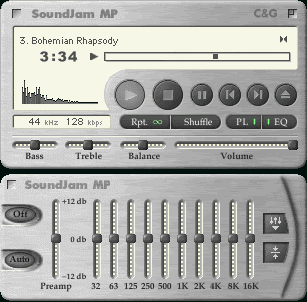
actually...get rid of the bubble buttons and this is a mighty fine starting point...add a drawer on the bottom for lesser used controls and even a display area and other groovy stuff...
remember this? i thought this looked jammy! [that means groovy, zimphire]
[ignore the equalizer]
(
Last edited by quandarry; Aug 22, 2003 at 08:21 PM.
)
|
|
|
| |
|
|
|
|
|
|
|
|
|
|
|
|
 
|
|
|
Forum Rules
|
|
|
|
You may not post new threads
You may not post replies
You may not post attachments
You may not edit your posts
|
HTML code is Off
|
|
|
|
|
|
|
|
|
|
|
|


