 |
 |
Everyong has an opinion, here's your chance. (large PNG)
|
|
|
|
|
Mac Elite
Join Date: Aug 2001
Location: Capitol City
Status:
Offline
|
|
I'm trying improve my sales page. I've posted a similar thread before, but now this one is for real. Take a look, and tell me how I can make this page more useable, more sellable, and all around better. I'm not looking for advice on how to make aqua buttons, but feel free to post that too.
This is a commercial site owned by myself and another MacNN member, so if you feel like its your moral duty to not comment, thats cool. Just trying to run it by as many people as possible.
Mac users know usability, so I'm asking you. Thanks for your contributions.
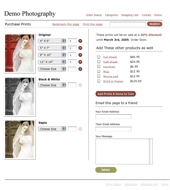
This is how it looks right now:
|
|
|
| |
|
|
|
|
|
|
|
Clinically Insane
Join Date: Jun 2001
Location: planning a comeback !
Status:
Offline
|
|
Link, by any chance ? And the pics don't come up either !
-t
|
|
|
| |
|
|
|
|
|
|
|
Addicted to MacNN
Join Date: Jul 2002
Location: Minnesota - Twins Territory
Status:
Offline
|
|
they look the same to me 
|

"I'm for anything that gets you through the night, be it prayer, tranquilizers, or a bottle of Jack Daniel's."
|
| |
|
|
|
|
|
|
|
Addicted to MacNN
Join Date: Nov 1999
Location: Madison, WI
Status:
Offline
|
|
---------
I'm trying improve my sales page. I've posted a similar thread before, but now this one is for real. Take a look, and tell me how I can make this page more useable, more sellable, and all around better. I'm not looking for advice on how to make aqua buttons, but feel free to post that too.
This is a commercial site owned by myself and another MacNN member, so if you feel like its your moral duty to not comment, thats cool. Just trying to run it by as many people as possible.
Mac users know usability, so I'm asking you. Thanks for your contributions.

This is how it looks right now:

---------
|
|
|
| |
|
|
|
|
|
|
|
Dedicated MacNNer
Join Date: Mar 2003
Location: UK
Status:
Offline
|
|
No capital 'T' in "these as well".
Thicker lettering in the buttons is a good choice.
"Email this page to a friend" isn't styled like a link, and why is it in a different place to "Bookmark" and "Print" (because it's got to have a form, but think about it � and could they do better being next to the email fields?)?
What happens when you pick more than 5 different sizes? Does the page reflow?
Can you enter quantities for the mugs and keyrings? Or does a quantity field appear when you check the box?
My tuppence.
-R
|
|
|
| |
|
|
|
|
|
|
|
Mac Elite
Join Date: Aug 2001
Location: Capitol City
Status:
Offline
|
|
Thanks owlboy for quoting me. The pictures are coming up fine for me, I'm not really sure what the problem there is.
holygoat: The page would reflow downward as they added more and more sizes. The left column only would be affected. One of the problems with the lower mockup is that a photographer has the option to add as many sizes as he wants. One of our photographers has about 20 sizes, and it makes these columns quite long. I'm hoping to solve that with these drop downs.
I'll include qtys for the keyrings. Can't believe I missed that.
About the print and bookmark, are you suggesting that they should be located by the email? I'm not even 100% sure they will be useful, and I'm also not sure I can even bookmark these pages. I'm going to have to discuss this with my programmer. Again, thanks for your comments, everyone.
|
|
|
| |
|
|
|
|
|
|
|
Addicted to MacNN
Join Date: Nov 1999
Location: Madison, WI
Status:
Offline
|
|
Originally Posted by DeathMan
Thanks owlboy for quoting me. The pictures are coming up fine for me, I'm not really sure what the problem there is.
holygoat: The page would reflow downward as they added more and more sizes. The left column only would be affected. One of the problems with the lower mockup is that a photographer has the option to add as many sizes as he wants. One of our photographers has about 20 sizes, and it makes these columns quite long. I'm hoping to solve that with these drop downs.
I'll include qtys for the keyrings. Can't believe I missed that.
About the print and bookmark, are you suggesting that they should be located by the email? I'm not even 100% sure they will be useful, and I'm also not sure I can even bookmark these pages. I'm going to have to discuss this with my programmer. Again, thanks for your comments, everyone.
We all see "no hotlinking" images, you don't since you leaded the URLs as the "real" images already, and your browser has them in cache. Keep that in mind in the future, don't use that host for that.
-Owl
|
|
|
| |
|
|
|
|
|
|
|
Caffeinated Theme Master  Join Date: Nov 1999
Location: hell (says dakar)
Status:
Offline
|
|
Here's a few quick thoughts ... - I would structure the page vertically and not use a 2-column layout so your customers can better understand the flow of the purchasing process.
- While the layout does look very nice, there are a few issues in regards to the page structure where things could be labeled a bit more clearly (see my img below)
- When creating a layout for such a page, I usually try to make it as easy to understand as possible, so that even a DUI (= dumbest user imaginable) won't be able to make man mistakes. One of the best examples for a purchasing page that come to mind is the one created by the Panic folks - link - even though I think it would be even easier if they had aligned the headers for each step to the left and made them a tinsy bit larger.

HTH

edit: Just read that you already have a vertically expanding left column and that the (vertical) size of the right column is fixed. In that case I would suggest making the left column visibly wider than the one on the right (e.g. 65% vs. 35%) so that the width of each column helps communicating the respective relevance of its contents (left column is reason why the user is on that page - purchasing something, the right column contains addtl. options - kinda like a sidebar/cross-marketing thingie)
Also, unless the "email this page" feature is of extreme importance, I would probably make it a link only and make it part of the meta navigation ("bookmark this page", etc.).
edit #2: D'oh - the search function should of course be located in a prominent spot - my orange box is too wide.
(
Last edited by effgee; May 5, 2005 at 05:14 AM.
)
|
|
|
| |
|
|
|
|
|
|
|
Dedicated MacNNer
Join Date: Mar 2003
Location: UK
Status:
Offline
|
|
|
|
|
|
| |
|
|
|
|
|
|
|
Mac Elite
Join Date: Aug 2001
Location: Capitol City
Status:
Offline
|
|
The "Demo Photography" is actually the Logo of the company who is selling the prints. I'm 100% with you on making the main column wider and the other one smaller. I feel like keeping the purchase button above the fold is a good idea for those with small monitors, but I will probably put more emphasis on it. The Email this page is going to be a primary source of marketing in this case, so I would very much prefer to have a quick-send available on this page, but I do agree that it could be made less emphasized.
And I'll move those other links down to the bottom of the page. Most of the action on this page is going to happen on the top 1/3 of the page, so I'm thinking I want the buy button up there. Do you think this is a bad idea?

Edit: did a minor update
(
Last edited by DeathMan; May 5, 2005 at 02:30 PM.
)
|
|
|
| |
|
|
|
|
|
|
|
Addicted to MacNN
Join Date: Oct 2002
Location: Boston, MA
Status:
Offline
|
|
Looks very nice. 
|

"Never give in, never give in, never, never, never, never - in nothing, great or small, large or petty - never give in except to convictions of honor and good sense." Winston Churchill
|
| |
|
|
|
|
|
|
|
Mac Elite
Join Date: Aug 2001
Location: Capitol City
Status:
Offline
|
|
|
|
|
|
| |
|
|
|
|
|
|
|
Caffeinated Theme Master Join Date: Nov 1999
Location: hell (says dakar)
Status:
Offline
|
|
Hmmm ... I understand your desire to keep the "add to cart" button above the the fold but OTH I remain a bit sceptical of whether or not the flow of information is appropriate with this button being so "disconnected" from the left column. Three aspects that might warrant consideration:
1. Labeling each step of the process with a number ("step 1 of 2 - select/add prints", "step 2 of 2 add items to cart") might help alleviate your problem
2. Who is the intended audience for the site? Is it a B2C site (private folks, larger probability of small resolution) or is it a B2B site (prefessionals, usually have larger monitors/resolutions)
3. Using smaller thumbnails for the images (and providing a "magnify" link below each image) will help in saving valuable (vertical) space
If it were my project I would probably (since I may not be aware of all the facts the layout is based upon) put "proper" information architecture/task flow over concerns regarding the screen resolution of the audience, helping myself by using points 1 and 2 mentioned above.
Also, I'd rather use the frame/box in the right column to draw attention to my current special/marketing campaign ("20% off") than to frame the "add to cart" element.
I'll probably have an additional comment re: the logo and the page header in the morning - am too tired right now to string two words together to form a somewhat coherent sentence.
But overall, this is shaping up rather nicely - good job
|
|
|
| |
|
|
|
|
|
|
|
Mac Elite
Join Date: Aug 2001
Location: Capitol City
Status:
Offline
|
|
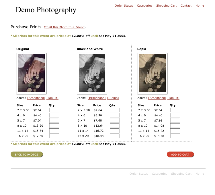
In case anyone who is following this thread:
http://lasko.org/uploads/buypage1/#
I've put in some javascript and a little error checking. If you find something that really breaks it (aside from the text fading, which isn't fully decided on yet, and is pretty broken), let me know.
Thats where I'm at with the page as of right now. I will be taking heed of the advice of the special offer. Thats probably a valuable sales tool right there. I haven't been able to convince myself to 1) reduce the size of the thumbnails, and/or 2) move the buy button so far down the page. I don't know if screen resolution is a big deal, but I just feel like the additional products and the height of column one, I sort of feel like this is my best option.
The site is B2C.
|
|
|
| |
|
|
|
|
|
|
|
Mac Elite
Join Date: Jun 2004
Location: Edmonton, AB
Status:
Offline
|
|
I think that the two columns should be made into one, two columns just seem less user friendly.
|
|
|
| |
|
|
|
|
|
|
|
|
|
|
|
|
 
|
|
|
Forum Rules
|
|
|
|
You may not post new threads
You may not post replies
You may not post attachments
You may not edit your posts
|
HTML code is Off
|
|
|
|
|
|
|
|
|
|
|
|


