 |
 |
Photo Critique Thread - [JPEG] (Page 19)
|
|
|
|
|
Photo Architect
Join Date: Jun 2003
Location: Bamberg, Germany
Status:
Offline
|
|
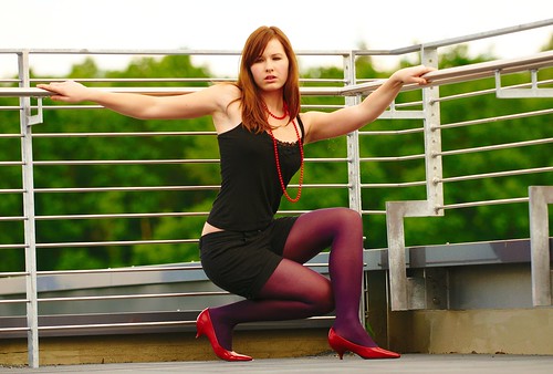
Lately I've been working with a few amateur models which I highly recommend.
Since both parties are in it for the fun of it there's no pressure to get everything right.
It's a great way to experiment and learn.
Here are some of the better shots:
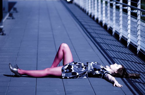
I like the light on her arms:
And the Ninja is back too:
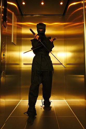
Did a whole series with her in the kitchen as the "Ninja Chef". Great fun cutting vegetables in the air. Big mess also.
|
"Microsoft is a cross between the Borg and the Ferengi. Unfortunately, they use Borg to do their marketing and Ferengi to do their programming." Simon Slavin
Me on Flickr.
|
| |
|
|
|
|
|
|
|
Addicted to MacNN
Join Date: Feb 2003
Location: NY²
Status:
Offline
|
|
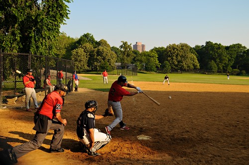
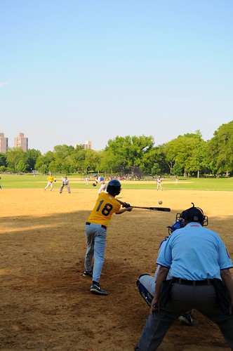
Yesterday was filled with photos.
I took the Brooklyn Bridge photos in the morning and then later in the day I shot two baseball games in Central Park and then went to dinner at a restaurant called Ninja.

|
|
|
| |
|
|
|
|
|
|
|
Mac Elite
Join Date: May 2001
Location: Up north
Status:
Offline
|
|
|
|
|
|
| |
|
|
|
|
|
|
|
Mac Elite
Join Date: May 2001
Location: Up north
Status:
Offline
|
|
Originally Posted by mdc 
Yesterday was filled with photos.
I took the Brooklyn Bridge photos in the morning and then later in the day I shot two baseball games in Central Park and then went to dinner at a restaurant called Ninja.
I like the first one a lot, you must have steady hands for what must have been low light 
The second is my favorite. Nice timing, and really rich colors. I like the light falling on the people, too bad it didn't fall on the batter to give him more focus. If you had captured the ball on a strike, having the batter in the dark might have been interesting. Very cool nonetheless. 
|
|
|
| |
|
|
|
|
|
|
|
Mac Elite
Join Date: Jan 2001
Location: .CL
Status:
Offline
|
|
|
(
Last edited by ARENA; Jul 7, 2008 at 09:36 AM.
)
|
|
|
| |
|
|
|
|
|
|
|
Mac Elite
Join Date: Dec 2003
Location: I'll let you know when I get there...
Status:
Offline
|
|
Originally Posted by ARENA
http://farm4.static.flickr.com/3029/2639439460_cda1f2fae9.jpg
I really like the color in the first picture!
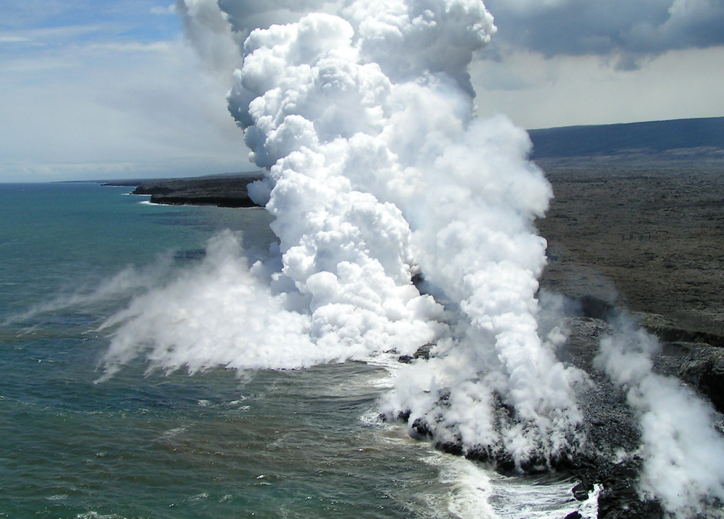
Taken from a helicopter above the coast of the Big Island of Hawaii.
|
|
|
| |
|
|
|
|
|
|
|
Posting Junkie
Join Date: May 2001
Location: Brisbane, Australia
Status:
Offline
|
|
Great shot! Love the bright light emphasising the texture of the steam. You might want to straighten it though.
Switching gears for a moment, here's one my better half took (and I post processed):
|
|
|
| |
|
|
|
|
|
|
|
Mac Elite
Join Date: Dec 2003
Location: I'll let you know when I get there...
Status:
Offline
|
|
Originally Posted by - - e r i k - -
Great shot! Love the bright light emphasising the texture of the steam. You might want to straighten it though.
what do you mean by straighten it? The horizon is pretty much parallel with the top and bottom crop.
|
|
|
| |
|
|
|
|
|
|
|
Posting Junkie
Join Date: May 2001
Location: Brisbane, Australia
Status:
Offline
|
|
The horizon might be technically straight, but there's a definite visual imbalance in the shot.
|
|
|
| |
|
|
|
|
|
|
|
Senior User
Join Date: Sep 2001
Location: California
Status:
Offline
|
|
|
|

not all who wander are lost.
|
| |
|
|
|
|
|
|
|
Mac Elite
Join Date: Dec 2003
Location: I'll let you know when I get there...
Status:
Offline
|
|
Originally Posted by - - e r i k - -
The horizon might be technically straight, but there's a definite visual imbalance in the shot.
I see... this is the original, but I don't like it either (obviously needs to crop the edge of the chopper, color correction):
Do you like these lines more? Feel free to show me what you mean
|
|
|
| |
|
|
|
|
|
|
|
Posting Junkie
Join Date: Mar 2005
Location: Louisiana
Status:
Offline
|
|
Originally Posted by mr. burns
Loooove that shot. Really cool.
I swore to myself I was going to stay out of this thread, but I'm back, so I might as well post a picture.
Flickr members, forgive the redundancy. The rest of you, forgive the watermark.
|
|
|
| |
|
|
|
|
|
|
|
Posting Junkie
Join Date: May 2001
Location: Brisbane, Australia
Status:
Offline
|
|
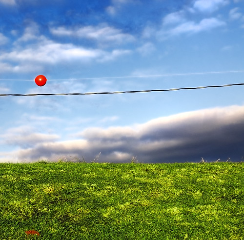
No comments for my best girl's photo?
|
|
|
| |
|
|
|
|
|
|
|
Posting Junkie
Join Date: May 2001
Location: Brisbane, Australia
Status:
Offline
|
|
Originally Posted by boy8cookie
Do you like these lines more? Feel free to show me what you mean
Yeah, that doesn't work either. I guess it's just hard because of the way the steam cuts the picture in half.
|
|
|
| |
|
|
|
|
|
|
|
Addicted to MacNN
Join Date: Sep 2001
Location: Toronto
Status:
Offline
|
|
Originally Posted by - - e r i k - -
No comments for my best girl's photo?
It doesn't really work for me. An unremarkable photo, polished up through post processing. And I don't even like what you did there. The darkening of the clouds, the over saturation of the grass, nope.
Sorry, really not trying to be an ass, but you did ask for an opinion.
|
|
|
| |
|
|
|
|
|
|
|
Addicted to MacNN
Join Date: Sep 2001
Location: Toronto
Status:
Offline
|
|
Originally Posted by mr. burns
Very nice treatment. The composition is a little off, with the tree being pretty much smack bang in the middle of the frame. You could have created more interest by shooting at a different angle or by implementing the rule of thirds.
Still, looks lovely.
|
|
|
| |
|
|
|
|
|
|
|
Posting Junkie
Join Date: May 2001
Location: Brisbane, Australia
Status:
Offline
|
|
Originally Posted by Mastrap
It doesn't really work for me. An unremarkable photo, polished up through post processing. And I don't even like what you did there. The darkening of the clouds, the over saturation of the grass, nope.
Sorry, really not trying to be an ass, but you did ask for an opinion.
That's okay. Cheery oversaturated images are obviously not for everyone. And especially not for you judging by your posting history in this thread
The clouds are naturally dark, I'd prefer them to be overall nice and fluffy in this shot.
|
|
|
| |
|
|
|
|
|
|
|
Posting Junkie
Join Date: Feb 2005
Location: 888500128
Status:
Offline
|
|
My first thought was that the shot reminded me of the default wallpaper in Windows XP due to the over-processing, but I didn't want to sound insulting.
|
|
|
| |
|
|
|
|
|
|
|
Banned
Join Date: Jun 2005
Location: Indy.
Status:
Offline
|
|
Originally Posted by Mastrap
Very nice treatment. The composition is a little off, with the tree being pretty much smack bang in the middle of the frame. You could have created more interest by shooting at a different angle or by implementing the rule of thirds.
Still, looks lovely.
Here you and I go again disagreeing on the rule of thirds: It has a number of elements that hit the thirds. The horizon line, the edges of the branches all land on the thirds. The composition creates a lot of interest. It evokes a Ansel Adams feel but without the outrageous contrast.
I really like the shot. The colors are very strong feeling of melancholy. The way the grasses come up into the reflection of the leaves and branches.
My eye is initially drawn to the strong tree trunk and the branches and then discovers the grasses and then moves onto the surrounding brush and finally the misty hillside.
Normally I am not a fan of square crops and I wonder if this shot would benefit from a portrait framing, but I am not sure.
|
|
|
| |
|
|
|
|
|
|
|
Banned
Join Date: Jun 2005
Location: Indy.
Status:
Offline
|
|
Originally Posted by Jawbone54
Loooove that shot. Really cool.
Me too.
Originally Posted by Jawbone54
I swore to myself I was going to stay out of this thread,
Awww, don't be like that!
Originally Posted by Jawbone54
... but I'm back, so I might as well post a picture.
Flickr members, forgive the redundancy. The rest of you, forgive the watermark.
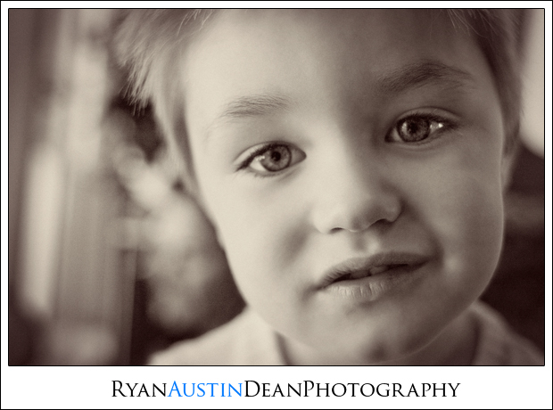
I love these kinds of shots. I have thousands of them of my kids. Having said that, not many people like that emotion or kind of shot. When I do a sessions with kids I always include a shot like that with the proofs and I have never sold one.
The colors are a little washed out, but I am trying to picture more contrast and am not sure that would really improve it. I like the shallow DOF, but with the DOF so shallow you need to be careful to focus on the eyes and not the nose/mouth area. You've toned down on your vignetting and it works very well with this shot. This picture would work well in a table book of children's portraits.
|
|
|
| |
|
|
|
|
|
|
|
Banned
Join Date: Jun 2005
Location: Indy.
Status:
Offline
|
|
Originally Posted by - - e r i k - -
Great shot! Love the bright light emphasising the texture of the steam. You might want to straighten it though.
Switching gears for a moment, here's one my better half took (and I post processed):
I like the post processing, and although the subject is a bit bland, it makes me think of days in my childhood where I would lie in the nearby fields of straw staring up into the sky.
But I think the square crop is harsh. A normal landscape framing would look much nicer.
|
|
|
| |
|
|
|
|
|
|
|
Banned
Join Date: Jun 2005
Location: Indy.
Status:
Offline
|
|
Originally Posted by boy8cookie
I see... this is the original, but I don't like it either (obviously needs to crop the edge of the chopper, color correction):
Do you like these lines more? Feel free to show me what you mean
To be honest, the first version made me a little dizzy. Thanks for showing the original image.
Here's a rotated version showing the horizon line dead flat: Let me know if you don't want me hosting it on my server, I will deleted it as soon as possible if you want.

|
|
|
| |
|
|
|
|
|
|
|
Banned
Join Date: Jun 2005
Location: Indy.
Status:
Offline
|
|
Might as well post a picture since I criticiszed... err critiqued a few up there:
A bit of a snapshot, but I like the way it turned out.

|
|
|
| |
|
|
|
|
|
|
|
Moderator Emeritus
Join Date: Mar 2004
Location: Copenhagen
Status:
Offline
|
|
I can think of about seventeen things on that guy’s body that look like they’re either broken or just sticking out in funny ways. My very first thought was actually, “Wait—this guy has how many legs?!”, though that particular optical illusion didn’t last more than about half a second.
I like the freeze-frame feel to the picture, but I’m missing a bit more context of some kind. The white blob-blur-bloob-thingy (here I go again with my hyper-professional terminology) at the bottom gives a bit, but not enough to really ‘ground’ the picture anywhere, since I can’t figure out what the blob-blur-bloob-thingy it supposed to be!
|
|
|
| |
|
|
|
|
|
|
|
Addicted to MacNN
Join Date: Sep 2001
Location: Toronto
Status:
Offline
|
|
Originally Posted by Railroader
Here you and I go again disagreeing on the rule of thirds: It has a number of elements that hit the thirds. The horizon line, the edges of the branches all land on the thirds.
......
My eye is initially drawn to the strong tree trunk
I think you said it better than I could. The main point of interest, the first thing you see, is directly in the middle of the image. That is not a composition according to the rule of thirds. The fact that secondary elements are positioned on the thirds is, probably, more happy accident than conscious placement. Maybe the photographer could chime in and let me know?
Having said that, I too really like the shot and am quite aware of the fact that I am nitpicking. Had I been the photographer I would have experimented with a number of different compositions. A shot composed with the thirds in mind is not automatically a good shot, and vice versa.
|
|
|
| |
|
|
|
|
|
|
|
Banned
Join Date: Jun 2005
Location: Indy.
Status:
Offline
|
|
Originally Posted by Oisín
I can think of about seventeen things on that guy’s body that look like they’re either broken or just sticking out in funny ways. My very first thought was actually, “Wait—this guy has how many legs?!”, though that particular optical illusion didn’t last more than about half a second.
I like the freeze-frame feel to the picture, but I’m missing a bit more context of some kind. The white blob-blur-bloob-thingy (here I go again with my hyper-professional terminology) at the bottom gives a bit, but not enough to really ‘ground’ the picture anywhere, since I can’t figure out what the blob-blur-bloob-thingy it supposed to be!
It's called "The Iceberg" ( I think).
Here it is in context:

|
|
|
| |
|
|
|
|
|
|
|
Moderator Emeritus
Join Date: Mar 2004
Location: Copenhagen
Status:
Offline
|
|
Hm, yeah, I can see how that would be difficult to fit in a composition without losing the focus of the flying guy and making it a generic ‘landscape shot’ kinda thing instead …
|
|
|
| |
|
|
|
|
|
|
|
Moderator Emeritus
Join Date: Apr 2001
Location: Fort Lauderdale, FL
Status:
Offline
|
|
the grudge??:

sucks that dude is in the background, but I like it:

|
|
ice
|
| |
|
|
|
|
|
|
|
Addicted to MacNN
Join Date: Sep 2001
Location: Toronto
Status:
Offline
|
|
Ice, dodge and burn. Just darken him out.
Tear tattoo, eh? How many years?
|
|
|
| |
|
|
|
|
|
|
|
Moderator Emeritus
Join Date: Apr 2001
Location: Fort Lauderdale, FL
Status:
Offline
|
|
true. are you asking how old she is? I'd assume at least 21, since we were in the club.
I showed this photo to a girlfriend of mine and she said it's like the 5th tear tattoo on a hand that she's seen in the last month. hm.
|
|
ice
|
| |
|
|
|
|
|
|
|
Posting Junkie
Join Date: Feb 2005
Location: 888500128
Status:
Offline
|
|
I think he was asking how many years in the slammer.
|
|
|
| |
|
|
|
|
|
|
|
Addicted to MacNN
Join Date: Sep 2001
Location: Toronto
Status:
Offline
|
|
That's right. Tear tattoo = jail time. Unless it's the latest fashion item.
|
|
|
| |
|
|
|
|
|
|
|
Moderator Emeritus
Join Date: Apr 2001
Location: Fort Lauderdale, FL
Status:
Offline
|
|
I thought tear tattoo(ON the face)=you killed someone.
Anyhow, it's certainly a fashion thing now, especially easy to do on the finger, out of sight compared to a tattoo on yer face.
|
|
ice
|
| |
|
|
|
|
|
|
|
Addicted to MacNN
Join Date: Sep 2001
Location: Toronto
Status:
Offline
|
|
|
|
|
|
| |
|
|
|
|
|
|
|
Moderator Emeritus
Join Date: Apr 2001
Location: Fort Lauderdale, FL
Status:
Offline
|
|
perhaps this girl has ripped out the hearts of a few young men in her time. coold bloooded.
|
|
ice
|
| |
|
|
|
|
|
|
|
Banned
Join Date: Jun 2005
Location: Indy.
Status:
Offline
|
|
Thread resurrection!
I took this shot during a wedding I did candid shots for. I was hoping to capture movement, but it looks like I mostly achieved ghosting.

|
|
|
| |
|
|
|
|
|
|
|
Posting Junkie
Join Date: Apr 2007
Location: Iowa, how long can this be? Does it really ruin the left column spacing?
Status:
Offline
|
|
|
|
|
|
| |
|
|
|
|
|
|
|
Banned
Join Date: Jun 2005
Location: Indy.
Status:
Offline
|
|
Reduce background clutter (poles, trains...) and move in closer and lower.
|
|
|
| |
|
|
|
|
|
|
|
Posting Junkie
Join Date: Apr 2007
Location: Iowa, how long can this be? Does it really ruin the left column spacing?
Status:
Offline
|
|
Originally Posted by Railroader
Reduce background clutter (poles, trains...) and move in closer and lower.
Although Photoshop use is frowned upon, I was planning on getting rid of all of the telephone poles. I also thought it would look cool if the train was moving quickly. Unfortunately, it was inching along, so I didn't really get the effect I wanted.
|
|
|
| |
|
|
|
|
|
|
|
Addicted to MacNN
Join Date: Sep 2001
Location: Toronto
Status:
Offline
|
|
Originally Posted by Laminar
If you let me have that one as a RAW file I'll make some suggestions.
|
|
|
| |
|
|
|
|
|
|
|
Banned
Join Date: Jun 2005
Location: Indy.
Status:
Offline
|
|
Originally Posted by Laminar
Although Photoshop use is frowned upon, I was planning on getting rid of all of the telephone poles. I also thought it would look cool if the train was moving quickly. Unfortunately, it was inching along, so I didn't really get the effect I wanted.
I was talking in your photo technique, not Photoshop. I rarely use Photoshop to alter a picture other than to use the "Smart Sharpen" filter.
I'd retake the pictures. This time, move closer, use a wider focal length, and take care not to include poles in your shots. OR use the poles as a focal point/pattern effect. Try to find an alley with little clutter. Also lower your vantage point while taking the pictures. Make your lens about as high as the headlights. Or, raise your perspective above the normal sight line.
|
|
|
| |
|
|
|
|
|
|
|
Banned
Join Date: Jun 2005
Location: Indy.
Status:
Offline
|
|
Originally Posted by Laminar
Here's some quick and dirty editing. I just rotated the image 1.5 degrees CCW, cropped the photo, added the black bars, adjusted levels to add contrast, and applied the Unsharp Mask filter.
Let me know if you want me to delete it from my here and my site.

|
|
|
| |
|
|
|
|
|
|
|
Posting Junkie
Join Date: Apr 2007
Location: Iowa, how long can this be? Does it really ruin the left column spacing?
Status:
Offline
|
|
Thanks for the suggestions so far. Unfortunately, all I have to use is my Canon SD750. Next week I should have a DSLR available though.
|
|
|
| |
|
|
|
|
|
|
|
Moderator Emeritus
Join Date: Apr 2001
Location: Fort Lauderdale, FL
Status:
Offline
|
|
much more could be done with the actual RAW file, this is just a lil sum-sum from your jpeg:

|
|
ice
|
| |
|
|
|
|
|
|
|
Administrator  Join Date: Apr 2001
Location: San Antonio TX USA
Status:
Offline
|
|
Originally Posted by Railroader
Here's some quick and dirty editing. I just rotated the image 1.5 degrees CCW, cropped the photo, added the black bars, adjusted levels to add contrast, and applied the Unsharp Mask filter.
Let me know if you want me to delete it from my here and my site.
That image is MUCH more dramatic and dynamic. The car looks like it's ready to go FAST just sitting there. Great eye, Railroader!
|
 Glenn -----OTR/L, MOT, Tx
|
| |
|
|
|
|
|
|
|
Banned
Join Date: Jun 2005
Location: Indy.
Status:
Offline
|
|
Originally Posted by Laminar
Thanks for the suggestions so far. Unfortunately, all I have to use is my Canon SD750. Next week I should have a DSLR available though.
You don't NEED a high end DSLR for basic images like that. But you do need a camera that will allow you to enter manual mode where you can change the aperture settings. Does the SD750 have a manual mode?
Also, adjusting color saturation, cropping, color balance sharpening, and levels don't usually count as photoshopping. Sometimes, with certain camera models, those things can be done in-camera.
Originally Posted by ghporter
That image is MUCH more dramatic and dynamic. The car looks like it's ready to go FAST just sitting there. Great eye, Railroader!
[blush] awwww.... [/blush]
Actually, I like Ice's treatments better.
|
|
|
| |
|
|
|
|
|
|
|
Moderator Emeritus
Join Date: Apr 2001
Location: Fort Lauderdale, FL
Status:
Offline
|
|
Originally Posted by Railroader
Actually, I like Ice's treatments better.
thanks dude. it reminds me of something Mastrap might do (I think the initial squarish crop lends itself to that though)
|
|
ice
|
| |
|
|
|
|
|
|
|
Addicted to MacNN
Join Date: Sep 2001
Location: Toronto
Status:
Offline
|
|
Overdone, quick and dirty. Much more could be done from RAW.
Before:

After:

|
|
|
| |
|
|
|
|
|
|
|
Banned
Join Date: Jun 2005
Location: Indy.
Status:
Offline
|
|
Laminar, one other thing you can do, is to place a piece of polarized glass over the lens to really make the sky pop. You can either use a lens from a pair of sunglasses, or spend a bit more and buy a polarized lens filter for standard lenses and just hold it infront of your lens. Your sky will turn a very deep and more realistic deep blue.
|
|
|
| |
|
|
|
|
|
|
|
Administrator Join Date: Apr 2001
Location: San Antonio TX USA
Status:
Offline
|
|
Originally Posted by Railroader
[blush] awwww.... [/blush]
Actually, I like Ice's treatments better.
I like his too, but yours is dynamic while his is dramatic. I LOVE that blue he got in the sky. (I also wonder how Laminar found WHITE rail cars that don't have even a tiny bit of graffiti!)
|
Glenn -----OTR/L, MOT, Tx
|
| |
|
|
|
|
|
|
|
|
|
|
|
|
 
|
|
|
Forum Rules
|
|
|
|
You may not post new threads
You may not post replies
You may not post attachments
You may not edit your posts
|
HTML code is Off
|
|
|
|
|
|
|
|
|
|
|
|


