 |
 |
Photo Critique Thread - [JPEG] (Page 9)
|
|
|
|
|
Posting Junkie
Join Date: May 2001
Location: Brisbane, Australia
Status:
Offline
|
|
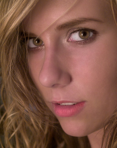
Looks way overprocessed. I could "glam" her up myself if I wanted to, but you don't really need to do that to people who are already pretty or are not going to be in seedy men's magazines 
|
|
|
| |
|
|
|
|
|
|
|
Mac Elite
Join Date: Aug 2003
Status:
Offline
|
|
This latest photo of Erik's is an example of a shot that I hate getting. it has SOOO much potential, has excellent composition and a great subject, but has inherent flaws (the slow shutter speed causing the camera shake, much more noticeable when viewed large) that would always bug me.
In portraits the eyes just have to be in focus for me.... at least the closest one anyway.
|
|
|
| |
|
|
|
|
|
|
|
Posting Junkie
Join Date: May 2001
Location: Brisbane, Australia
Status:
Offline
|
|
I get paid to do glam photos too:
Glamour - a set on Flickr
That does not mean I would treat people I love that way. It is a "style", which some do prefer, and others think is tacky. I'm leaning towards the latter, but in doing so I'm a hypocrite for taking people's money doing it. Meh.
The over-processed look is still there. As Francesca herself commented: "I look like an airbrushed hooker".
I'm not sure about your "one way or the other way" remark either. Are you saying my original looks like
"a home snap of their wife in the morning before she brushed her teeth and made up."?
James L is right on the money here. It's a shot you hate to get: it's a great shot, yet technically flawed.
|
|
|
| |
|
|
|
|
|
|
|
Addicted to MacNN
Join Date: Feb 2003
Location: NY²
Status:
Offline
|
|
I haven't taken any photos in a while since my D50 started putting a red line on each photo I took. About 3cm in on the left. It has been sent off to be repaired.
I've been putting away money towards a D300 and some new lenses, but currently I'm cameraless.
|
|
|
| |
|
|
|
|
|
|
|
Posting Junkie
Join Date: May 2001
Location: Brisbane, Australia
Status:
Offline
|
|
Back on track, here's another - more technically correct (but still not perfect) shot from the same session for comparison:
|
|
|
| |
|
|
|
|
|
|
|
Banned
Join Date: Jun 2005
Location: Indy.
Status:
Offline
|
|
Originally Posted by - - e r i k - - 
I like this shot MUCH better actually, technical aspects aside. The mouth is better posed, her eyes give a little more depth and emotion...
The negatives though: The catch lights aren't as good as the first, but they aren't that bad. Also, It's not necessarily a shot to hang on the wall at your parents house, as it is a little sexier than your average portrait. the color is a little "off" too, but I am not sure it's much of a negative.
|
|
|
| |
|
|
|
|
|
|
|
Moderator  Join Date: Jan 2001
Location: Polwaristan
Status:
Offline
|
|
I've deleted a lot of the derailing, thread-crapping posts. This is an otherwise good thread, so let's keep it on topic.
Update: nuked a few more. PM me with issues. Otherwise, new posts should be on topic.
(
Last edited by Cold Warrior; Apr 20, 2008 at 01:01 PM.
)
|
|
|
| |
|
|
|
|
|
|
|
Addicted to MacNN
Join Date: Mar 2001
Location: USA
Status:
Offline
|
|
I did this one yesterday...

|
|
|
| |
|
|
|
|
|
|
|
Banned
Join Date: Jun 2005
Location: Indy.
Status:
Offline
|
|
Originally Posted by RAILhead
For a shot showing objects that represent color, I don't think you should have applied your cross-processing tech here. Also, the DOF could be a little deeper.
|
|
|
| |
|
|
|
|
|
|
|
Banned
Join Date: Jun 2005
Location: Indy.
Status:
Offline
|
|
I'll admit, over processed, but the original was kind of boring and this gave it a little life. Plus it was for a wedding invite cover.

|
|
|
| |
|
|
|
|
|
|
|
Posting Junkie
Join Date: Mar 2005
Location: Louisiana
Status:
Offline
|
|
Maybe if I post a few pictures of my own for people to critique, it will ease the tension. 
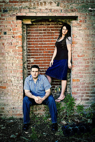
From an engagement session the other day. These guys are going to be my first solo wedding. Rest of their set here.
|
|
|
| |
|
|
|
|
|
|
|
Addicted to MacNN
Join Date: Mar 2006
Location: California
Status:
Offline
|
|
the lighting in the third is how it should be in the second. any way to tone down the sun in the second pic? it's like, "oh hey, there's the sun... ohh there are also happy people as well
|
|
|
| |
|
|
|
|
|
|
|
Posting Junkie
Join Date: May 2001
Location: Brisbane, Australia
Status:
Offline
|
|
Originally Posted by Railroader
I'll admit, over processed, but the original was kind of boring and this gave it a little life. Plus it was for a wedding invite cover.
This was for a wedding invite? With a burnt out candle? Way to instil confidence in that marriage. 
|
|
|
| |
|
|
|
|
|
|
|
Addicted to MacNN
Join Date: Mar 2006
Location: California
Status:
Offline
|
|
one can not give what he does not have
|
|
|
| |
|
|
|
|
|
|
|
Moderator Emeritus
Join Date: Apr 2001
Location: Fort Lauderdale, FL
Status:
Offline
|
|
Originally Posted by - - e r i k - -
This was for a wedding invite? With a burnt out candle? Way to instil confidence in that marriage.

|
|
ice
|
| |
|
|
|
|
|
|
|
Addicted to MacNN
Join Date: Mar 2006
Location: California
Status:
Offline
|
|
the drooping flowers do not help either.
|
|
|
| |
|
|
|
|
|
|
|
Moderator  Join Date: May 2001
Location: Hilbert space
Status:
Offline
|
|
Originally Posted by Jawbone54
Maybe if I post a few pictures of my own for people to critique, it will ease the tension.
[snip]
From an engagement session the other day. These guys are going to be my first solo wedding. Rest of their set here.
I like the last one best, although it sort of feels like a couple where one partner is seriously ill or so. The mood is quite gloomy, you get the feeling that they are heading toward an uncertain future. (If that were your message, this photo would be really good in my opinion.)
The first one is good, but they look more like brother and sister (have a look at the distance that separates them).
The second one is the one you can tell they're a happy couple. I think I would have used a flash (manually corrected, of course) to brighten up the faces a bit.
Edit: I've had a look at the other photos on your flickr page, they're much, much better at giving you the `we're a happy couple' feeling. Other than that you've apparently fallen in love with vignetting (too pronounced for my taste), I think you've captured some of their essence. This one, for instance, would look much nicer without extreme vignetting it. Just the blues (of shirt and wall) and the contrast to their skin color works in my book.
|
|
I don't suffer from insanity, I enjoy every minute of it.
|
| |
|
|
|
|
|
|
|
Moderator Emeritus
Join Date: Mar 2004
Location: Copenhagen
Status:
Offline
|
|
So … all six of them, then?
These guys are going to be my first solo wedding.
Solo wedding?
How does that work, exactly? “Do you take yourself to be your lawfully wedded spouse”? 
I love the first of Jawbone’s pictures, though I would never have associated it with happy couple. Looks much more like a promotional band shot to me.
|
|
|
| |
|
|
|
|
|
|
|
Posting Junkie
Join Date: May 2001
Location: Brisbane, Australia
Status:
Offline
|
|
Why the hell would you call them crayons? These are crayons:

Colouring pencils are not.
Originally Posted by Wikipedia
A crayon is a stick of colored wax, charcoal, chalk, or other materials used for writing and drawing. A crayon made of oiled chalk is called an oil pastel; when made of pigment with a dry binder, it is simply a pastel. A grease pencil or china marker (UK chinagraph pencil) is made of colored hardened grease and is useful for marking on hard, glossy surfaces such as porcelain or glass.
(
Last edited by - - e r i k - -; Apr 21, 2008 at 07:34 PM.
)
|
|
|
| |
|
|
|
|
|
|
|
Banned
Join Date: Jun 2005
Location: Indy.
Status:
Offline
|
|
Originally Posted by - - e r i k - -
Why the hell would you call them crayons? These are crayons:
Colouring pencils are not.
Note the wide depth of field. The accurate color. Nice photo.
|
|
|
| |
|
|
|
|
|
|
|
Posting Junkie
Join Date: Mar 2005
Location: Louisiana
Status:
Offline
|
|
Originally Posted by Oisín
Solo wedding?
How does that work, exactly? “Do you take yourself to be your lawfully wedded spouse”?
I love the first of Jawbone’s pictures, though I would never have associated it with happy couple. Looks much more like a promotional band shot to me.
Heh...I guess I should've clarified. I'm shooting it myself, instead of second-shooting for someone else.
And I guess it could've been a band shot since he plays the mandolin and she's a phenomenal singer. But yeah, not so engagement-ish, is it?
Originally Posted by OreoCookie
I like the last one best, although it sort of feels like a couple where one partner is seriously ill or so. The mood is quite gloomy, you get the feeling that they are heading toward an uncertain future. (If that were your message, this photo would be really good in my opinion.)
I never really thought of the uncertain future analogy. Actually, you're the first person to bring that up. I can see where you're coming from, but I'm not sure that will be a universal sentiment. Do you like this one any better (prepare yourself for more vignette)?

The first one is good, but they look more like brother and sister (have a look at the distance that separates them).
Truth. The grittiness of the post processing doesn't make it feel any warmer either, does it? I still like the shot, but it's not a perfect "We're in love" photo.
The second one is the one you can tell they're a happy couple. I think I would have used a flash (manually corrected, of course) to brighten up the faces a bit.
Edit: I've had a look at the other photos on your flickr page, they're much, much better at giving you the `we're a happy couple' feeling. Other than that you've apparently fallen in love with vignetting (too pronounced for my taste), I think you've captured some of their essence. This one, for instance, would look much nicer without extreme vignetting it. Just the blues (of shirt and wall) and the contrast to their skin color works in my book.
I'm slowly drifting away from incorporating the vignette so often. Fore whatever reason, I fell in love with it, and it became kind of overkill. You're not the first to point out that it's being used too often. I'm starting to listen. 
When I gave them the disc, each of the pictures had at least one "alternate edit." For instance, the blue wall/vignette shot was processed without the vignette, as well as a SX-70 version.
People's tastes are very different, so I've been doing that for most of my clients. One shot in the last batch had 4 different versions. I thought at first that it'd be overkill, but the last 3 clients have really liked the variety.
|
|
|
| |
|
|
|
|
|
|
|
Moderator Emeritus
Join Date: Mar 2004
Location: Copenhagen
Status:
Offline
|
|
Oh dear. That last one there sort of says … how do I put this nicely? … ‘special’ Olympics, to me. Looks like something from a programme on Glad TV (‘Happy TV’, a Danish TV station that focuses on people with various forms of disabilities, especially Down’s Syndrome). Something about the look of serene happiness on their faces while running, I suppose. Not my favourite shot.
(Plus they sort of look like you’ve Photoshopped the picture and added an Outer Glow filter to their bodies or something—was the Sun setting behind them really responsible for that ‘corona’?)
For the record, to make up, I didn’t catch the uncertain future association at all. On the contrary: to me it looked a lot more like a happy ending, walking off into the sunset to live happily ever after.
|
|
|
| |
|
|
|
|
|
|
|
Posting Junkie
Join Date: Mar 2005
Location: Louisiana
Status:
Offline
|
|
Actually, the sun setting was indeed responsible for the "corona."
|
|
|
| |
|
|
|
|
|
|
|
Posting Junkie
Join Date: May 2001
Location: Brisbane, Australia
Status:
Offline
|
|
Originally Posted by Oisín
Oh dear. That last one there sort of says … how do I put this nicely? … ‘special’ Olympics, to me. Looks like something from a programme on Glad TV (‘Happy TV’, a Danish TV station that focuses on people with various forms of disabilities, especially Down’s Syndrome). Something about the look of serene happiness on their faces while running, I suppose. Not my favourite shot.
Muhahaha, a valid reason to post this (for comparison):

|
|
|
| |
|
|
|
|
|
|
|
Moderator Join Date: May 2001
Location: Hilbert space
Status:
Offline
|
|
@Jawbone
I like the version of the pic you posted now much better. I noticed that it was probably just the selection you've made, the other pictures have a much better couple `vibe'. And yes, of course, you're right, as long as the customer is happy …
Concerning the first one, it's the composition, not the color tone: the people are walking away from the camera into a distant horizon. I've had the same association as Oísin with the first one. The sun is setting. Even if the sunlight has a warm quality, it doesn't alter this. Something tragic has happened. Now the second one you've posted is different: people are walking towards you, you can see they're smiling (which you obviously cannot on the other one), they seem like they're half-running towards you. The impression I have with this one is completely different. (Although I still don't like the vignette )
I'm not saying the first one is a bad picture, I don't think so, but at least I don't get the `right message' (happy couple, etc. etc.). BTW, I also like that your pictures aren't perfectly straight, it gives everything a subtle dynamics. Don't overdo it, though.
(
Last edited by OreoCookie; Apr 22, 2008 at 03:25 AM.
)
|
|
I don't suffer from insanity, I enjoy every minute of it.
|
| |
|
|
|
|
|
|
|
Addicted to MacNN
Join Date: Oct 2002
Location: England | San Francisco
Status:
Offline
|
|
|
|
|
we don't have time to stop for gas
|
| |
|
|
|
|
|
|
|
Moderator Emeritus
Join Date: Mar 2004
Location: Copenhagen
Status:
Offline
|
|
I've had the same association as Oísin with the first one. The sun is setting. Even if the sunlight has a warm quality, it doesn't alter this. Something tragic has happened. Now the second one you've posted is different: people are walking towards you, you can see they're smiling (which you obviously cannot on the other one), they seem like they're half-running towards you. The impression I have with this one is completely different.
Given the rest of the paragraph, don’t you mean the exact opposite association to mine?
|
|
|
| |
|
|
|
|
|
|
|
Addicted to MacNN
Join Date: Sep 2001
Location: Toronto
Status:
Offline
|
|
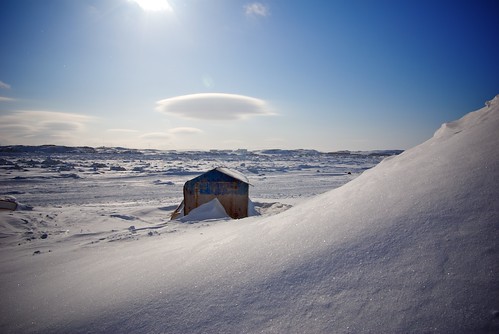
Just back from the arctic. This shot was taken in Iqaluit, the capital of Nunavut. The temperature yesterday was about -25ºC and windy.
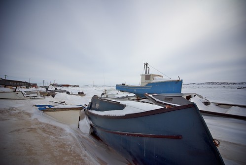
Overlooking Frobischer Bay. Nothing but snow and ice for thousands of miles from here on.
|
|
|
| |
|
|
|
|
|
|
|
Posting Junkie
Join Date: May 2001
Location: Brisbane, Australia
Status:
Offline
|
|
Lucky bastard. It's on my list of places to go
And great shots too. I love the clouds in the second one.
|
|
|
| |
|
|
|
|
|
|
|
Moderator Emeritus
Join Date: Mar 2004
Location: Copenhagen
Status:
Offline
|
|
The middle cloud in the second shot kind of makes it look like that little hut (?) has a halo.
|
|
|
| |
|
|
|
|
|
|
|
Posting Junkie
Join Date: Mar 2005
Location: Louisiana
Status:
Offline
|
|
Very cool shots. The cloud looks like it's indicating the birth of a savior in the little shed below.
You're so lucky to be able to go there.
|
|
|
| |
|
|
|
|
|
|
|
Administrator  Join Date: Apr 2001
Location: San Antonio TX USA
Status:
Offline
|
|
I like both pictures, Mastrap. They convey the cold, but also the tranquility of the place (wind or not). Both also feel lonely or isolated-even the first one with the buildings in the background. Nice catches!
(
Last edited by ghporter; Apr 22, 2008 at 09:44 AM.
Reason: Clarified whose pictures I was referring to.)
|
 Glenn -----OTR/L, MOT, Tx
|
| |
|
|
|
|
|
|
|
Moderator Join Date: May 2001
Location: Hilbert space
Status:
Offline
|
|
If you were referring to this picture, then no:
It's a variation of the one I was commenting on:
And I actually did have the disabled/cancer/incurable disease association.
|
|
I don't suffer from insanity, I enjoy every minute of it.
|
| |
|
|
|
|
|
|
|
Posting Junkie
Join Date: May 2001
Location: Brisbane, Australia
Status:
Offline
|
|
Originally Posted by OreoCookie
The focus (DOF) here is on an empty patch of road. Something is terribly wrong with this one.
|
|
|
| |
|
|
|
|
|
|
|
Moderator Join Date: May 2001
Location: Hilbert space
Status:
Offline
|
|
If you have a look at the other pictures on his flickr page, this might as well be on purpose. Not sure, though.
|
|
I don't suffer from insanity, I enjoy every minute of it.
|
| |
|
|
|
|
|
|
|
Addicted to MacNN
Join Date: Sep 2001
Location: Toronto
Status:
Offline
|
|
Originally Posted by Tesselator
Is that digital? How does your DC
act in -25c weather?
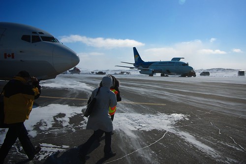
Yes, it's a Pentax K10D. Great camera, and it worked flawlessly. Having said that, I kept it underneath the parka whenever I could, exposing it to the cold for as short a period of time as possible.
I consider myself very lucky being able to go up there. It's a totally different way of life, only three hours flight from Ottawa. And that's the southern arctic. Up to the northernmost tip of Canada it's almost a nine hour flight across nothing but icy deserts. It really brings home what a huge country Canada is, and how thinly populated.
This is a shot from the airport. That drifting snow on the runway is moving at about 30-40 clicks, even at 1/1000 of a second it still isn't frozen. Gives you an idea of just how cold it gets up there. I don't consider this a great shot, it's just here for illustration purposes.
Jawbone, there are a couple of shots in your flickr set I really like.
You've got linking switched off, so I took a screenshot. Let me know if you'd rather have me delete it:

(
Last edited by Mastrap; Apr 22, 2008 at 11:02 AM.
)
|
|
|
| |
|
|
|
|
|
|
|
Mac Enthusiast
Join Date: Nov 2006
Status:
Offline
|
|
I've been looking at the last shots on the last couple of pages and I'm just in awe of your guys' talent. I love taking pictures but I don't have anywhere near the skill to do stuff like that. I've got a Samsung Digimax v700/v10. Lost the manuals WAY before I had an interest in shooting in a mode other than automatic. I keep telling myself one of these days I'm going to learn, but the last site I went to to try and learn was so above my head I'm ashamed to say I just gave up. Looking at the HDR pool on flikr though has made me want to learn again. I know I can't do HDR with this camera but I would love to be able to learn to take really awesome shots with it. If anyone has a site or something that can give me a boost of knowledge on how to use this camera better it'd be much appreciated.
Here's my albums on .Mac. My opinion, my best work was the Tulip festival in Woodburn Oregon.
My Photos
|
|
Backups are like guns and condoms. It's better to have it and not need it than to need it and not have it.
|
| |
|
|
|
|
|
|
|
Posting Junkie
Join Date: Mar 2005
Location: Louisiana
Status:
Offline
|
|
Originally Posted by Mastrap
I consider myself very lucky being able to go up there. It's a totally different way of life, only three hours flight from Ottawa. And that's the southern arctic. Up to the northernmost tip of Canada it's almost a nine hour flight across nothing but icy deserts. It really brings home what a huge country Canada is, and how thinly populated.
This is a shot from the airport. That drifting snow on the runway is moving at about 30-40 clicks, even at 1/1000 of a second it still isn't frozen. Gives you an idea of just how cold it gets up there. I don't consider this a great shot, it's just here for illustration purposes.
Looks mind-numbingly cold, but also beautiful. I watched a movie last night called "Steep" that had tons of footage of snow skiers doing their thing in Alaska. There's just something in that "Wshhhkkkrrk-wshhhkkrrrk" sound that makes it seem even more beautiful. Do you have any more from that trip?
I guess snow isn't quite as lovely for those of you who see it all winter long.
Jawbone, there are a couple of shots in your flickr set I really like.
You've got linking switched off, so I took a screenshot. Let me know if you'd rather have me delete it:
I don't mind at all. I forgot that I had linking switched off (whoorps). I appreciate the comments.
That shot was actually one of their three favorites. It's way up there on my list too. Not perfect by any means, but at least it's intimate.
|
|
|
| |
|
|
|
|
|
|
|
Posting Junkie
Join Date: May 2001
Location: Brisbane, Australia
Status:
Offline
|
|
Originally Posted by Tesselator
Here's some more from me to beat up:
1/40s @ f/2.8 - ISO 100 - 8.0mm - Converted from RAW and cropped, no PS adjustments.
1/35s @ f/2.8 - ISO 100 - 8.0mm - Converted from RAW and cropped, no PS adjustments.
1/12s @ f/3.7 - ISO 100 - 16.3mm - Converted from RAW and cropped, no PS adjustments.
1/20s @ f/2.8 - ISO 100 - 8.0mm - Converted from RAW and cropped, PS USM on water only.
Glad you say beat up, because like your first entry in the thread there's very little to like here.
1. Busy, blown out sky. Tree covers the main subject in an aesthetically displeasing way. Trying to save the blown out sky by lowering brightness caused a garish grey to appear.
2. Tilting right. Main subject has a pole slightly behind it. Uninteresting. Foul image compression/artifacted. Blown out sky.
3. Tilts left. Trees framing could have been good had they been on the same plane. Too much uninteresting stuff that needs to be cropped out on top - ESPECIALLY the yet again blown out dull sky. The main subject (gateway) needs to be brightened.
4. Blown out sky AND water. Dull colours (that goes for all of them - the light was just a disaster for this shoot). Poor composition. Building only partly in frame on the left should have at least been cropped out. Same with the half-tree on the right, although you'd still had that unsightly branch sticking in to frame.
My advice: Go reshoot, these shots may be worthy to the average point and shoot tourist, but not something I'd post in a critique thread.
|
|
|
| |
|
|
|
|
|
|
|
Posting Junkie
Join Date: May 2001
Location: Brisbane, Australia
Status:
Offline
|
|
Again, what is with the blown out highlights everywhere? The last image is the only interesting one, but you need to do something about the yellow-green colour cast and otherwise dull colours. Also there's a bit too much roof.
|
|
|
| |
|
|
|
|
|
|
|
Addicted to MacNN
Join Date: Sep 2001
Location: Toronto
Status:
Offline
|
|

Your flash is blowing out your details there. Gold is notoriously difficult to photograph, reflected light helps a lot.

I like the sense of space you get from that image, but I would have kept one horizon line straight.
An amazing building, in any case.
|
|
|
| |
|
|
|
|
|
|
|
Posting Junkie
Join Date: Mar 2005
Location: Louisiana
Status:
Offline
|
|
That first hall shot is nice. There's something about the lines that make me want to tilt my head to the right though. Maybe a slight straighten, and finished? I'd use the level at the top of the stairs as a reference.
I do like it though.
I was going to say that the 4th shot could've used an even wider perspective, but the distortion of the people at the bottom indicates that you were probably already using a pretty wide lens. Perhaps taking a step or two back would've helped? There's some gorgeous stuff in there, but I wanted a bit more of the room in the shot.
Can I ask why you're so adamant about not making any Photoshop adjustments at all?
|
|
|
| |
|
|
|
|
|
|
|
Posting Junkie
Join Date: May 2001
Location: Brisbane, Australia
Status:
Offline
|
|
Originally Posted by Tesselator
[COLOR="DarkRed"]If I want to edit it in an app
like photoshop I can create a whole'nother unrealistic but appeasing reality. I'm more
just wondering what the crits will be about from only cropped exposures right out of
the camera.
Well the "crits" are in: Your images look unfinished.
That hallway shot is fine though (minus the lamp).
By the way, blown out areas can't be fixed. Try exposing for the brightest parts so you have a greater range to work with and then adjust overall exposure in post.
|
|
|
| |
|
|
|
|
|
|
|
Administrator Join Date: Apr 2001
Location: San Antonio TX USA
Status:
Offline
|
|
Tesselator, I'm curious if you had problems with maintaining a good vertical reference in that locale, or if you have a problem with that in general-I'm just going off the set of temple shots here. You may want to spend a dollar or two and get a tiny little "bullet level" so you can have a good vertical reference. Then, if you intend to skew it, you'll have a reference for how far off you went. If you don't, then you can keep those poles, steeples, statues, etc. standing straight up.
I have a t-square in my head most of the time, so I get vertical and horizontal pretty close by eyeball, but I'm getting a new bullet level for my camera bag just to keep myself honest.
|
Glenn -----OTR/L, MOT, Tx
|
| |
|
|
|
|
|
|
|
Moderator Join Date: Jan 2001
Location: Polwaristan
Status:
Offline
|
|
Let's leave it there and continue on-topic.
|
|
|
| |
|
|
|
|
|
|
|
Moderator Emeritus
Join Date: Mar 2004
Location: Copenhagen
Status:
Offline
|
|
Originally Posted by Cold Warrior
Let's leave it there and continue on-topic.
Yes, please.
These are both mediocre shots (at the very best), but since I haven’t got any useful pictures to post and these are all I have handy, and since this is just to get the thread rolling again, slag away.
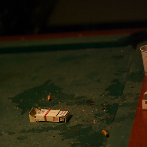
Our poor pool table, after being repeatedly molested by idiot kids who manage to get into our basement on weekends when the workers forget to lock the doors after themselves.
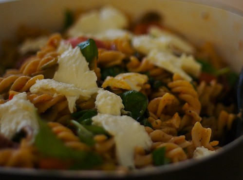
Uhm, well … pasta salad. Obviously. What? I said I didn’t have anything useful to post!
(I do realise the depth of field, cropping, and [in the first one] horizon are all a bit wonky—I’m still getting used to this fixed 50mm thing)
|
|
|
| |
|
|
|
|
|
|
|
Posting Junkie
Join Date: May 2001
Location: Brisbane, Australia
Status:
Offline
|
|
Yeah, you might want to start out cropping away all that junk on the right there
Both photos are underexposed. That pasta sald is making me very hungry though.
|
|
|
| |
|
|
|
|
|
|
|
Clinically Insane
Join Date: Jun 2001
Location: planning a comeback !
Status:
Offline
|
|
Originally Posted by Oisín
Our poor pool table, after being repeatedly molested by idiot kids who manage to get into our basement on weekends when the workers forget to lock the doors after themselves.
I thought this was a street before I read the text.
-t
|
|
|
| |
|
|
|
|
|
|
|
Addicted to MacNN
Join Date: Sep 2001
Location: Toronto
Status:
Offline
|
|
Originally Posted by - - e r i k - -
Both photos are underexposed. That pasta sald is making me very hungry though.
I don't think they are, they look to me like they've been shot in low light.
|
|
|
| |
|
|
|
|
|
|
|
Posting Junkie
Join Date: May 2001
Location: Brisbane, Australia
Status:
Offline
|
|
Originally Posted by Mastrap
I don't think they are, they look to me like they've been shot in low light.
Well duh
|
|
|
| |
|
|
|
|
|
|
|
|
|
|
|
|
 
|
|
|
Forum Rules
|
|
|
|
You may not post new threads
You may not post replies
You may not post attachments
You may not edit your posts
|
HTML code is Off
|
|
|
|
|
|
|
|
|
|
|
|


