|
 |
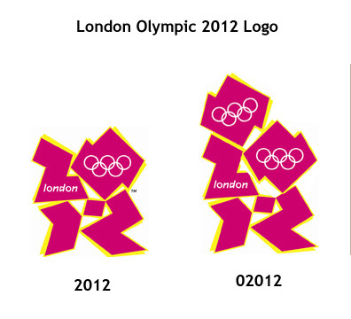
Awful London 2012 Olympic logo (Page 2)
|
|
|
|
|
Moderator Emeritus
Join Date: Apr 2001
Location: Fort Lauderdale, FL
Status:
Offline
|
|
|
|
|
ice
|
| |
|
|
|
|
|
|
|
Registered User
Join Date: Sep 2006
Location: South Korea
Status:
Offline
|
|
Originally Posted by IceEnclosure 
This one is waaaay better! 

|
|
|
| |
|
|
|
|
|
|
|
Mac Enthusiast
Join Date: Apr 2007
Status:
Offline
|
|

Apparently, It comes in all manner of vomitus hues.
|
|
|
| |
|
|
|
|
|
|
|
Posting Junkie
Join Date: Feb 2005
Location: 888500128
Status:
Offline
|
|
Jeezus.
That's even worse than the 2006 football world cup logo:

And I thought THAT was ridiculous.
|
|
|
| |
|
|
|
|
|
|
|
Addicted to MacNN
Join Date: Oct 2001
Location: Automatic
Status:
Offline
|
|
Is that true !? 
What happened to the candidate city logo?, at least that was OK with the multicolour band reflecting the River Thames…

That one for Chicago 2016 is really beautiful.
|
|
|
| |
|
|
|
|
|
|
|
Mac Elite
Join Date: Aug 2006
Location: London
Status:
Offline
|
|
HALF A MILLION ENGLISH POUNDS..... what were they smoking??
|
|
MacBook Pro 2.2 i7 | 4GB | 128GB SSD ~ 500GB+2TB Externals ~ iPhone 4 32GB
Canon 5DII | EF 24-105mm IS USM | EF 100-400mm L IS USM | 50mm 1.8mkII
iMac | Mac Mini | 42" Panasonic LED HDTV | PS3
|
| |
|
|
|
|
|
|
|
Posting Junkie
Join Date: Feb 2005
Location: 888500128
Status:
Offline
|
|
The price reflects the importance and presence of the logo, as well as its world-wide use and syndication to all manner of products.
The same logo done for a small two-man office company might only have cost £1500, but if people are going to make tens of millions off it in merchandising and press licensing, then the design agency's payment *must* reflect that.
Kraftwerk received DM 400000 for their 30-second Expo 2000 jingle (though they also made the brilliant move to retain all rights, allowing them to produce a number of singles/remix releases which probably made them millions in addition).
|
|
|
| |
|
|
|
|
|
|
|
Mac Elite
Join Date: Sep 2001
Location: Some dust-bowl of a planet
Status:
Offline
|
|
|
|
|
|
| |
|
|
|
|
|
|
|
Senior User
Join Date: Apr 2005
Status:
Offline
|
|
Originally Posted by Dakarʒ
*bow*
Ahem, I do believe that was a collaborative effort...
|
|
|
| |
|
|
|
|
|
|
|
Posting Junkie
Join Date: Mar 2001
Location: Salamanca, España
Status:
Offline
|
|
I don't think any Olympic Games logo has ever incorporated the Olympic Rings within it before. Usually there is a custom logo for the games and the traditional rings under or beside it. Not *in* it.
I wonder if the IOC has given the green-light for the use of this logo at all.
But more incredibly, I cannot *believe* the BBC just aired a &%$#( ****** logo idea... I mean whoa /Keanu
V
|
|
I could take Sean Connery in a fight... I could definitely take him.
|
| |
|
|
|
|
|
|
|
Junior Member
Join Date: Dec 2002
Status:
Offline
|
|
|
|
|
|
| |
|
|
|
|
|
|
|
Clinically Insane
Join Date: Oct 2000
Location: Los Angeles
Status:
Offline
|
|
|
|

"The natural progress of things is for liberty to yield and government to gain ground." TJ
|
| |
|
|
|
|
|
|
|
Professional Poster
Join Date: Apr 2007
Location: A House of Ill-Repute in the Sky
Status:
Offline
|
|
Originally Posted by RIRedinPA
Ahem, I do believe that was a collaborative effort...
*point and applaud*
|
|
|
| |
|
|
|
|
|
|
|
Professional Poster
Join Date: Apr 2007
Location: A House of Ill-Repute in the Sky
Status:
Offline
|
|
|
|
|
|
| |
|
|
|
|
|
|
|
Registered User
Join Date: Sep 2006
Location: South Korea
Status:
Offline
|
|
Originally Posted by Dakarʒ
What's the point of that post?
|
|
|
| |
|
|
|
|
|
|
|
Posting Junkie
Join Date: Jun 2001
Location: Baltimore, MD
Status:
Offline
|
|
Originally Posted by Tiresias
What's the point of that post?
General hilarity.
|
|
|
| |
|
|
|
|
|
|
|
Registered User
Join Date: Sep 2006
Location: South Korea
Status:
Offline
|
|
Originally Posted by nonhuman
General hilarity.
Oh, I see. Spot the difference.
The original is so bad I hardly noticed.  (And apologies.)
|
|
|
| |
|
|
|
|
|
|
|
Professional Poster
Join Date: Apr 2007
Location: A House of Ill-Repute in the Sky
Status:
Offline
|
|
Originally Posted by Tiresias
What's the point of that post?
Originally Posted by RIRedinPA
It looks like a girl with big hair and a lot of ear rings giving a BJ to someone...it is awful.
...
|
|
|
| |
|
|
|
|
|
|
|
Senior User
Join Date: Apr 2005
Status:
Offline
|
|
Originally Posted by Dakarʒ
*point and applaud*

The gif was quite brilliant as well.
|
|
|
| |
|
|
|
|
|
|
|
Professional Poster
Join Date: Apr 2007
Location: A House of Ill-Repute in the Sky
Status:
Offline
|
|
|
|
|
|
| |
|
|
|
|
|
|
|
Mac Elite
Join Date: Sep 2006
Status:
Offline
|
|
Originally Posted by RIRedinPA View Post
It looks like a girl with big hair and a lot of ear rings giving......
Pretty sure it is Lisa Simpson.
|
|
|
| |
|
|
|
|
|
|
|
Mac Elite
Join Date: Mar 2002
Status:
Offline
|
|
The whole London Olympics thing has epic failure written all over it, anyway.
Maybe the rubbish logo is appropriate.

|
|
|
| |
|
|
|
|
|
|
|
Professional Poster
Join Date: Apr 2007
Location: A House of Ill-Repute in the Sky
Status:
Offline
|
|
London: Land of the Rising Sun
|
|
|
| |
|
|
|
|
|
|
|
Grizzled Veteran
Join Date: Feb 2000
Location: Dayton, OH
Status:
Offline
|
|
Originally Posted by voodoo
I wonder if the IOC has given the green-light for the use of this logo at all.
Yeah, thats the route I'm taking on this one too. While they're not exactly known for having the market cornered on taste the IOC is waaaaaay beyond anal about people f'ing with their marks.
The British press isnt much better at details than their US counterparts and a story like this is bound to garner a lot more readership than another "this is one of the ideas" article.
|
|
|
| |
|
|
|
|
|
|
|
Posting Junkie
Join Date: Sep 2001
Status:
Offline
|
|
Originally Posted by kiskynet
HAHAAHAHAHAHAHAHAHAHAHAHAHAHA
|
|
|
| |
|
|
|
|
|
|
|
Posting Junkie
Join Date: Mar 2005
Location: Louisiana
Status:
Offline
|
|
From the linked story...

Putting London in lower case and in cartoon writing is a "disgrace" to the city, says Mr Autry, and there's an imbalance in having the word London and the Olympic rings both in the top half of the logo.
"The word London is in an inelegant font, which devalues London as a city," he adds. "It looks like a child's writing."
What?
|
|
|
| |
|
|
|
|
|
|
|
Professional Poster
Join Date: Apr 2007
Location: A House of Ill-Repute in the Sky
Status:
Offline
|
|
OMG our name isn't capitalised! The horror! The horror!
Step 1. Bend over
Step 2. Stick hand up ass
Step 3. Remove stick
|
|
|
| |
|
|
|
|
|
|
|
Mac Elite
Join Date: May 2001
Location: Utah
Status:
Offline
|
|
|
|
|
|
| |
|
|
|
|
|
|
|
Clinically Insane
Join Date: Jul 2005
Location: Vacation.
Status:
Offline
|
|
Originally Posted by Jawbone54
From the linked story...
What?
Those comments refer to the official logo (top of page hideous thing). The one you posted (the good one) is something someone knocked up in his lunch break to embarrass the authorities who gave approval to the official one.
|
|
Been inclined to wander... off the beaten track.
That's where there's thunder... and the wind shouts back.
|
| |
|
|
|
|
|
|
|
Posting Junkie
Join Date: Mar 2005
Location: Louisiana
Status:
Offline
|
|
Whoops.
|
|
|
| |
|
|
|
|
|
|
|
Professional Poster
Join Date: Apr 2007
Location: A House of Ill-Repute in the Sky
Status:
Offline
|
|
|
|
|
|
| |
|
|
|
|
|
|
|
Addicted to MacNN
Join Date: Sep 2001
Location: Toronto
Status:
Offline
|
|
The problem with this logo is that is uses the Olympic rings in the Olympic colours, I am pretty certain that the IOC won't allow that.
A shame, because it looks a hell of a lot better than the official brain fart.
|
|
|
| |
|
|
|
|
|
|
|
Clinically Insane
Join Date: Jul 2005
Location: Vacation.
Status:
Offline
|
|
I'm actually really liking this one:

|
|
Been inclined to wander... off the beaten track.
That's where there's thunder... and the wind shouts back.
|
| |
|
|
|
|
|
|
|
Senior User
Join Date: Feb 2007
Status:
Offline
|
|
Can we please see some designs that don't just mix the numbers "2012" with the phrase "London" please, true the original sucks, but so far the idea that "any 9 year old with a chunky pen could do better" doesn't seem to ring true.
Design is not easy, no doubt Wolff Ollins submitted hundreds of ideas over the course of the R&D, why are they (as the designers) getting the flack, when it was the client that chose this particular outcome?!?
Once again the design industry takes a beating, grrr...
But once again the national press has seized the chance to jump on what appears to be the unjustifiably high cost (£400 000) for ‘just a logo’, when there is evidently more at stake. In time, will designers suffer from this latest mainstream design backlash? source
|
|
|
| |
|
|
|
|
|
|
|
Professional Poster
Join Date: Apr 2007
Location: A House of Ill-Repute in the Sky
Status:
Offline
|
|
|
|
|
|
| |
|
|
|
|
|
|
|
Senior User
Join Date: Mar 2007
Location: Illinois
Status:
Offline
|
|
The Chicago one looks pretty neat, it kind of reminds me of the elements in the white city created for World Expo in 1893.
|
|
_________________
- highstakes
|
| |
|
|
|
|
|
|
|
Professional Poster
Join Date: Feb 2007
Location: T •
Status:
Offline
|
|
|
|
|
|
| |
|
|
|
|
|
|
|
Addicted to MacNN
Join Date: Mar 2006
Status:
Offline
|
|
Nice. The Goat se one is beautiful too.
|
|
|
| |
|
|
|
|
|
|
|
Posting Junkie
Join Date: May 2001
Location: Brisbane, Australia
Status:
Offline
|
|
Originally Posted by Jawbone54
People really like this one? Are you blind? This was obviously some extreme hack-job. The rings aren't even lined up, the kerning is off, the thick lowercase l. And to top it off they have used F*CKING ARIAL!
|
|
|
| |
|
|
|
|
|
|
|
Posting Junkie
Join Date: Jun 2001
Location: Baltimore, MD
Status:
Offline
|
|
Originally Posted by - - e r i k - -
People really like this one? Are you blind? This was obviously some extreme hack-job. The rings aren't even lined up, the kerning is off, the thick lowercase l. And to top it off they have used F*CKING ARIAL!
It's still better than the official one...
|
|
|
| |
|
|
|
|
|
|
|
Addicted to MacNN
Join Date: Mar 2006
Status:
Offline
|
|
Please why is 2012 important?
|
|
|
| |
|
|
|
|
|
|
|
Clinically Insane
Join Date: Jul 2005
Location: Vacation.
Status:
Offline
|
|
Originally Posted by peeb
Please why is 2012 important?
Because it'll be remembered as the worst olympics in the entire history of human endeavour. The logo is but a taster of just how crap it'll be.
|
|
Been inclined to wander... off the beaten track.
That's where there's thunder... and the wind shouts back.
|
| |
|
|
|
|
|
|
|
Professional Poster
Join Date: Oct 2004
Status:
Offline
|
|
Originally Posted by Doofy
Because it'll be remembered as the worst olympics in the entire history of human endeavour.
Hey, maybe there will be some really good food!
|
__________________________________________________
My stupid iPhone game: Nesen Probe, it's rather old, annoying and pointless, but it's free.
Was free. Now it's gone. Never to be seen again.
Off to join its brother and sister apps that could not
keep up with the ever updating iOS. RIP Nesen Probe.
|
| |
|
|
|
|
|
|
|
Registered User
Join Date: Feb 2003
Location: retired
Status:
Offline
|
|
I find it very hard to look at. Five seconds and I have to turn away.
Londoners will surely suffer over the next years when this is plastered everywhere. I envision rebellious riots and many dead. It makes me want to destroy and rape and pillage.
|
|
|
| |
|
|
|
|
|
|
|
Clinically Insane
Join Date: Jul 2005
Location: Vacation.
Status:
Offline
|
|
Apparently, the version of this designed for TV ads is giving people epileptic fits.
Like Britain, it just gets better and better!
|
|
Been inclined to wander... off the beaten track.
That's where there's thunder... and the wind shouts back.
|
| |
|
|
|
|
|
|
|
Posting Junkie
Join Date: Jan 2006
Location: Colorado
Status:
Offline
|
|
It seems as if the British version of Photoshop is just as good as British cars.
|
|
|
| |
|
|
|
|
|
|
|
Addicted to MacNN
Join Date: Sep 2001
Location: Toronto
Status:
Offline
|
|
^ Jags, Land Rover, Rolls Royce, Aston Martin, Bentley, Mini, Morgan, Lotus.
Beats your average Chevy any day. At least for me.
|
|
|
| |
|
|
|
|
|
|
|
Posting Junkie
Join Date: Mar 2001
Location: Salamanca, España
Status:
Offline
|
|
Originally Posted by Mastrap
^ Jags, Land Rover, Rolls Royce, Aston Martin, Bentley, Mini, Morgan, Lotus.
Beats your average Chevy any day. At least for me.
You know why the Brits don't make computers?
....Because they can't leak oil.

V
|
|
I could take Sean Connery in a fight... I could definitely take him.
|
| |
|
|
|
|
|
|
|
Clinically Insane
Join Date: Jul 2005
Location: Vacation.
Status:
Offline
|
|
Originally Posted by Mastrap
^ Jags, Land Rover, Rolls Royce, Aston Martin, Bentley, Mini, Morgan, Lotus.
You forgot Marcos and Maclaren. And Caterham. And Westfield. And Bowler. Woot!
|
|
Been inclined to wander... off the beaten track.
That's where there's thunder... and the wind shouts back.
|
| |
|
|
|
|
|
|
|
Addicted to MacNN
Join Date: Sep 2001
Location: Toronto
Status:
Offline
|
|
Land Rovers don't leak, they just mark their territory.
|
|
|
| |
|
|
|
|
|
|
|
|
|
|
|
|
 
|
|
|
Forum Rules
|
|
|
|
You may not post new threads
You may not post replies
You may not post attachments
You may not edit your posts
|
HTML code is Off
|
|
|
|
|
|
|
|
|
|
|
|