 |
 |
Photo Critique Thread - [JPEG] (Page 10)
|
|
|
|
|
Moderator Emeritus
Join Date: Mar 2004
Location: Copenhagen
Status:
Offline
|
|
The pasta salad is underexposed; the pool table was shot in low light. They’re renovating the entire place (hence the workers), and they’ve recently installed new wires and cables and things in the basement, but haven’t actually switched half of it on, so there’s very little light. There’s only one small, weak lamp (typical pool table lamp) to light up the entire room, so it was quite dark.
I actually wanted more of the junk on the right, but the picture kind of stopped there, so I couldn’t get it. I fear cropping it out will obscure the corner hole, leaving the whole thing unrecogniseable as a pool table (qv. turtle’s post).
Oh, and the pasta salad was pretty damn good, if I do say so myself. 
|
|
|
| |
|
|
|
|
|
|
|
Moderator Emeritus
Join Date: Mar 2004
Location: Copenhagen
Status:
Offline
|
|
I just realised that the last six posts have been made by people from a very small part of the globe (Germany, Denmark, Norway), spread out over very large portions of the globe (US, Canada, Denmark, Australia).
North Europe is taking over the world! 
|
|
|
| |
|
|
|
|
|
|
|
Addicted to MacNN
Join Date: Jul 2001
Status:
Offline
|
|
Originally Posted by Oisín 
The pasta salad is underexposed;
I could always photoshop your pasta to look like a cheap tart. 
|
|
|
| |
|
|
|
|
|
|
|
Clinically Insane
Join Date: Jun 2001
Location: planning a comeback !
Status:
Offline
|
|
Originally Posted by Oisín
North Europe is taking over the world!
Keep dreaming 
Sincerely,
A German in the USofA
|
|
|
| |
|
|
|
|
|
|
|
Professional Poster
Join Date: Mar 2006
Status:
Offline
|
|
I didn't take this aerial photo of the UC Berkeley (CA) Campus and environs but I ran across it and thought it would be of great interest to many of the posters here.
However, the photographer seems very good at protecting his intellectual rights (and with good reason!) so, after reading his conditions for using the photo and not being quite sure which of the conditions I would best qualify for I decided I'd just post the link to the image and let anyone who wants a copy for their refrigerator to deal with that and any other usage issues with Mr. Greenspun.
Photograph by Philip Greenspun: uc-berkeley-aerial-4
Here's the link for a larger image:
http://philip.greenspun.com/images/2...aerial-4.4.jpg
And here is the link to his copyright conditions.
Philip Greenspun Copyright Notice
Finally, I chose to post it here rather than starting a new thread.
And with that, enjoy.
|
America should know the political orientation of government officials who might be in a position to adversely influence the future of this country. http://tinyurl.com/4vucu5
|
| |
|
|
|
|
|
|
|
Posting Junkie
Join Date: May 2001
Location: Brisbane, Australia
Status:
Offline
|
|
Separate thread would have been the better option. This thread is for posting images you have taken for others to critique (and hopefully help you to take better pictures in the future).
|
|
|
| |
|
|
|
|
|
|
|
Posting Junkie
Join Date: Feb 2005
Location: 888500128
Status:
Offline
|
|
Originally Posted by - - e r i k - -
you need to do something about the yellow-green colour cast and otherwise dull colours.
The colour is actually pretty accurate - what doesn't come across, though, is the sense of serenity and reservedness generated by the contrast of subdued luxury. (This obviously doesn't apply to the gold chandeliers and stuff in the actually prayer halls of Buddhist temples.)
It's the opposite of "bling", and knowing what that place *really* feels like makes me want to go back so bad.
|
|
|
| |
|
|
|
|
|
|
|
Moderator Emeritus
Join Date: Mar 2004
Location: Copenhagen
Status:
Offline
|
|
I (personally) would have included more of the cup on the right and trimmed off from the back edge of the table.
Yeah, I would too, if I’d managed to get the rest of the cup in the shot in the first place.
You're DOF is about 2 or 3 inches in front of the tobacco package too - don't know if that's on purpose or not.
Nope, it’s not. It was just too dark for me to be able to see that when taking the shot, otherwise the focus would have been on the pack of cigarettes, not the patch of nothingness in front of it.
|
|
|
| |
|
|
|
|
|
|
|
Addicted to MacNN
Join Date: Sep 2001
Location: Toronto
Status:
Offline
|
|
Originally Posted by - - e r i k - -
Well duh
Heh. What I was saying is that the highlights in both shots look blown out already, so they aren't underexposed, they're badly lit. There's a difference there. /nitpick
|
|
|
| |
|
|
|
|
|
|
|
Posting Junkie
Join Date: May 2001
Location: Brisbane, Australia
Status:
Offline
|
|
I'd say both.
|
|
|
| |
|
|
|
|
|
|
|
Administrator  Join Date: Apr 2001
Location: San Antonio TX USA
Status:
Offline
|
|
Originally Posted by Oisín
These are both mediocre shots (at the very best), but since I haven’t got any useful pictures to post and these are all I have handy, and since this is just to get the thread rolling again, slag away.
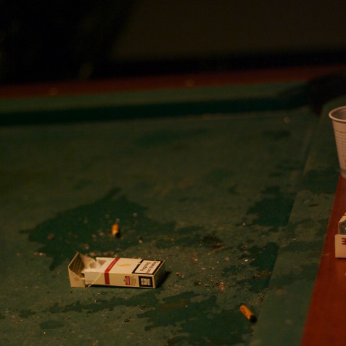
Our poor pool table, after being repeatedly molested by idiot kids who manage to get into our basement on weekends when the workers forget to lock the doors after themselves.
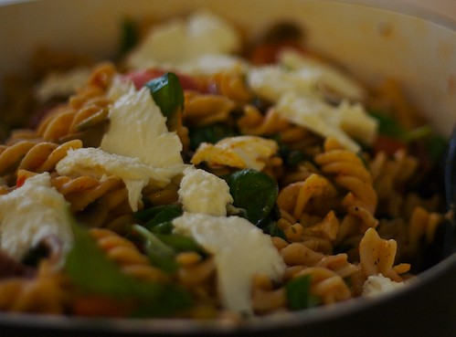
Uhm, well … pasta salad. Obviously. What? I said I didn’t have anything useful to post!
The juxtaposition of the messy/dirty pool table and the underexposed pasta makes me think "I'm NEVER eating there!" The colors and lighting on the pasta salad seem to fit with the pool table-even if the pictures were taken in very different locations. Is this something about the camera, or did you simply dig up pictures that went together well? (even though you don't think much of them).
|
 Glenn -----OTR/L, MOT, Tx
|
| |
|
|
|
|
|
|
|
Moderator Emeritus
Join Date: Mar 2004
Location: Copenhagen
Status:
Offline
|
|
It’s neither—it’s a complete coincidence that I hadn’t even noticed.
I can kind of see what you mean, though, and it’s a bit odd, ’cause normally I tend to go way overboard and put blue in everything (easily observable if you go through my flickr photostream), whereas here it seems to be the green/dark red combination that’s dominant. How strange.
|
|
|
| |
|
|
|
|
|
|
|
Moderator Emeritus
Join Date: Mar 2004
Location: Copenhagen
Status:
Offline
|
|
Okay, I give up. What is that?
|
|
|
| |
|
|
|
|
|
|
|
Posting Junkie
Join Date: Mar 2005
Location: Louisiana
Status:
Offline
|
|
|
|
|
|
| |
|
|
|
|
|
|
|
Posting Junkie
Join Date: Mar 2005
Location: Louisiana
Status:
Offline
|
|
Here's another dandy for those of you who hate heavy post-processing.
|
|
|
| |
|
|
|
|
|
|
|
Moderator Emeritus
Join Date: Mar 2004
Location: Copenhagen
Status:
Offline
|
|
Originally Posted by Jawbone54
Moth?
I read your reply. Then I looked at the image again for about two seconds.
Then I jumped twelve feet in the air and fell back and crashed into my table. UCK!
I hate moths.
|
|
|
| |
|
|
|
|
|
|
|
Posting Junkie
Join Date: Mar 2005
Location: Louisiana
Status:
Offline
|
|
Originally Posted by Oisín
I read your reply. Then I looked at the image again for about two seconds.
Then I jumped twelve feet in the air and fell back and crashed into my table. UCK!
I hate moths.
Ha...
Coincidental story coming up. On the way to work this morning, I took a look down at my t-shirt and saw several weird holes at the bottom left. I couldn't figure it out forever, and then realized that a moth must've gotten into our closet. I'm going to have to check the rest of my clothes tonight.
|
|
|
| |
|
|
|
|
|
|
|
Posting Junkie
Join Date: Mar 2005
Location: Louisiana
Status:
Offline
|
|
Originally Posted by Tesselator
This little guy spends 7 years under ground and then only gets to fly around, suck tree sap and mate for 5 days before it's time for him to turn back into
earth. He's emerging from his shell here and is waiting for his wings to dry
out. He's about 3 min. old in this shot. He's about 3 inches long or so.
Oh wow...at first I thought he was eating another bug.
|
|
|
| |
|
|
|
|
|
|
|
Posting Junkie
Join Date: Mar 2005
Location: Louisiana
Status:
Offline
|
|
Originally Posted by Tesselator
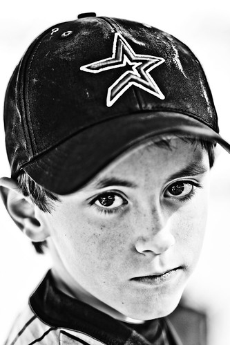
BTW, that kid above would look awesome (IMO) if there was no brim ghost
on the hat. That's the only thing... Good pic!
Thanks. I tried for about 2 minutes to edit it out without losing the look that I had worked for, but decided I didn't have enough time to fix it. If it was a client, I'd put a bit more work into it, but my family will never know the difference. They literally think I can do no wrong.
I'm doing my best to keep them out of this thread.
|
|
|
| |
|
|
|
|
|
|
|
Posting Junkie
Join Date: May 2001
Location: Brisbane, Australia
Status:
Offline
|
|
For Tesselator:
The first picture needs to be a portrait, eliminating most of the out of focus bits. Second bug picture is quite good. I'd try doing something with the washed out / out of focus top left corner though, it's a bit distracting.
Third picture? :zzz:
For Jawbone:
Too overprocessed for my liking. Looks like desaturated HDR. The brim has been mentioned, but it's his ear that bothers me the most. Gorgeous eyes though!
|
|
|
| |
|
|
|
|
|
|
|
Addicted to MacNN
Join Date: Mar 2006
Location: California
Status:
Offline
|
|
i saw the square and automatically thought trash bin. it really ruins the photo. other than that, it's an awesome picture. the signature is in the exact right spot.
|
|
|
| |
|
|
|
|
|
|
|
Banned
Join Date: Jun 2005
Location: Indy.
Status:
Offline
|
|
Originally Posted by Tesselator
Hehehe I spent 15min. setting up the shot just to get that effect - and the 1st guy
to see it says to remove it. LOL!
LOL! Why would you ever intentionally add loss of detail by washing out part of the shot. Especially for a detailed macro shot. I think it detracts greatly. The detail on the bug is superb, yet the blurred/washout area is awful.
|
|
|
| |
|
|
|
|
|
|
|
Administrator Join Date: Apr 2001
Location: San Antonio TX USA
Status:
Offline
|
|
The only problem with in-camera effects is that is all you get. If you get it right, it's great. If not, hope you have another chance at the subject.
|
Glenn -----OTR/L, MOT, Tx
|
| |
|
|
|
|
|
|
|
Posting Junkie
Join Date: Mar 2005
Location: Louisiana
Status:
Offline
|
|
Definitely.
If film was still the order of the day, price would be a certain impediment to my breaking into the photography realm. With a senior or family session, I'll shoot between 600-800 images within an hour and a half or so. This would've been unimaginable in the film days, at least for a poor college student like myself. All I needed was $200 for an 8 GB and 4 GB "extra" card.
|
|
|
| |
|
|
|
|
|
|
|
Addicted to MacNN
Join Date: Mar 2006
Location: California
Status:
Offline
|
|


hope these are to peoples likings.
edit:
a little dark, but then again these were taken at sunset
|
|
|
| |
|
|
|
|
|
|
|
Administrator Join Date: Apr 2001
Location: San Antonio TX USA
Status:
Offline
|
|
Originally Posted by Tesselator
Very true. This is the one hugh advantage of digital over film. The price
per shot with digital is almost zero.
Which is why I got back into photography when the first megapixel cameras started showing up. But nature pictures, pictures that depend on weather conditions, and pictures that depend on the sun are very sensitive subjects (literally), and that means I'd probably never try to mess with manipulation of the environment I was going to shoot when trying to take one of those pictures. I'd go for a slight underexposure of the primary subject and play with it afterward-just to make sure I get the composition and basic tone I want.
Originally Posted by Tesselator
PS:
We need more people "flooding" the thread with their images and crits
and less people complaining about it imo.
I would REALLY be playing my part except that my camera is still on backorder.  I'm looking forward to both a great camera and some extra time on my hands in the next few months, and that should allow me to correct my lack of input here.
|
Glenn -----OTR/L, MOT, Tx
|
| |
|
|
|
|
|
|
|
Administrator Join Date: Apr 2001
Location: San Antonio TX USA
Status:
Offline
|
|
Originally Posted by brassplayersrock²
Picture 2
Picture 2
hope these are to peoples likings.
edit:
a little dark, but then again these were taken at sunset
I like 'em. The sunset shows in the color of the light, but it's not overdone-no extra red-orange in the highlights, just "this is fall" in the light and the subject. The composition works for me too-there's direction and interest throughout both. I wouldn't use both pictures together though-they're so similar in feel that they'd be better bookend images than if used side by side.
|
Glenn -----OTR/L, MOT, Tx
|
| |
|
|
|
|
|
|
|
Posting Junkie
Join Date: May 2001
Location: Brisbane, Australia
Status:
Offline
|
|
|
|
|
|
| |
|
|
|
|
|
|
|
Posting Junkie
Join Date: May 2001
Location: Brisbane, Australia
Status:
Offline
|
|
Originally Posted by Tesselator
No wonder you are against digital post production, seeing as you are completely inept at it. This is severely over-sharpened. Notice the halos around the mountains.
Otherwise a nice image. Love the tonality of the sky.
|
|
|
| |
|
|
|
|
|
|
|
Addicted to MacNN
Join Date: Sep 2001
Location: Toronto
Status:
Offline
|
|
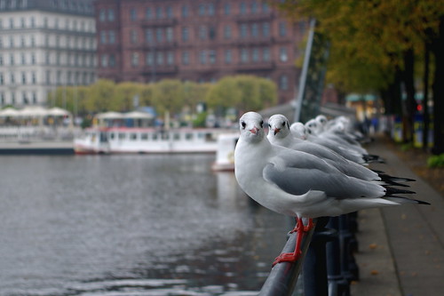
Taken last year in Hamburg, Germany.
|
|
|
| |
|
|
|
|
|
|
|
Posting Junkie
Join Date: May 2001
Location: Brisbane, Australia
Status:
Offline
|
|
I like it. I'd crop off a bit more on the left though.
|
|
|
| |
|
|
|
|
|
|
|
Addicted to MacNN
Join Date: Mar 2006
Location: California
Status:
Offline
|
|
no need for the crop. it looks perfect that way
|
|
|
| |
|
|
|
|
|
|
|
Administrator Join Date: Apr 2001
Location: San Antonio TX USA
Status:
Offline
|
|
Mastrap, that's almost perfectly a classic "rule of thirds" composition. Cropping the left would ruin that. Good color, good lines, movement and life without blur. Very nice.
|
Glenn -----OTR/L, MOT, Tx
|
| |
|
|
|
|
|
|
|
Posting Junkie
Join Date: May 2001
Location: Brisbane, Australia
Status:
Offline
|
|
I agree with both of you that the composition works. It wasn't a detraction from the image at all, it's just that by following that rule you are also creating a whole lot of negative space. My suggestion was simply an alternative crop.
|
|
|
| |
|
|
|
|
|
|
|
Addicted to MacNN
Join Date: Sep 2001
Location: Toronto
Status:
Offline
|
|
Thanks for the comments, all.
I looked into cropping it, but for me a crop would weaken the picture. I only had a second to take it before the gulls all took off. Had I had more time I would have moved the camera down just a tad, creating more visual interest.
|
|
|
| |
|
|
|
|
|
|
|
Moderator  Join Date: May 2001
Location: Hilbert space
Status:
Offline
|
|
People, people, keep it civil, will ya?
@Mastrap
The idea is nice, but the photo doesn't quite work for me. It's not that there is something wrong with it, technically, but it's just a bit too much gray and the background is too noisy (aperture 2.8 or so would have helped to smoothen things out). Perhaps a portrait version of it would have been better (to emphasize the notion of space), but it doesn't quite work out for me.
|
|
I don't suffer from insanity, I enjoy every minute of it.
|
| |
|
|
|
|
|
|
|
Senior User
Join Date: Nov 2003
Status:
Offline
|
|
here are two of my personal favorites, taken with my trusty 300D and the kit lens.


|
|
"The road to success is dotted with the most tempting parking spaces."
|
| |
|
|
|
|
|
|
|
Moderator Emeritus
Join Date: Mar 2004
Location: Copenhagen
Status:
Offline
|
|
Originally Posted by OreoCookie
The idea is nice, but the photo doesn't quite work for me. It's not that there is something wrong with it, technically, but it's just a bit too much gray and the background is too noisy (aperture 2.8 or so would have helped to smoothen things out). Perhaps a portrait version of it would have been better (to emphasize the notion of space), but it doesn't quite work out for me.
I have to agree a bit. The composition is lovely, but I’m missing some contrast between foreground (birds) and background (everything else).
|
|
|
| |
|
|
|
|
|
|
|
Senior User
Join Date: Apr 2002
Location: Aarhus, Denmark
Status:
Offline
|
|
I have for a long time been wanting to experiment with "light-painting". This weekend I had a good chance and this is the result:
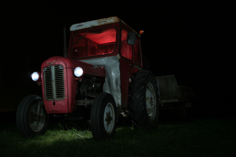
I think it turned out good
|
|
|
| |
|
|
|
|
|
|
|
Addicted to MacNN
Join Date: Mar 2006
Location: California
Status:
Offline
|
|
it's a lil dark, but it has a very eery feeling to it. I like it
|
|
|
| |
|
|
|
|
|
|
|
Mac Elite
Join Date: Jan 2001
Location: .CL
Status:
Offline
|
|
|
|
|
|
| |
|
|
|
|
|
|
|
Posting Junkie
Join Date: May 2001
Location: Brisbane, Australia
Status:
Offline
|
|
What did you "paint" it with? A fairly strong flashlight I take it? Nice cabin lights.
|
|
|
| |
|
|
|
|
|
|
|
Posting Junkie
Join Date: May 2001
Location: Brisbane, Australia
Status:
Offline
|
|
…and here comes ARENA to embarrass us all
|
|
|
| |
|
|
|
|
|
|
|
Junior Member
Join Date: Jan 2008
Location: New York
Status:
Offline
|
|
|
|

[15" MacBook Pro 2.6 Ghz] [G4 733] [G4 MDD DP 1.25]
|
| |
|
|
|
|
|
|
|
Posting Junkie
Join Date: May 2001
Location: Brisbane, Australia
Status:
Offline
|
|
Top one needs a good top-crop. I like photos #2 and #4.
|
|
|
| |
|
|
|
|
|
|
|
Addicted to MacNN
Join Date: Sep 2001
Location: Toronto
Status:
Offline
|
|
Originally Posted by - - e r i k - -
Top one needs a good top-crop. I like photos #2 and #4.
You and your crops.
I actually like the image the way it is. It conforms to the rule of thirds and the top area communicates the heaviness of the walls.
|
|
|
| |
|
|
|
|
|
|
|
Posting Junkie
Join Date: May 2001
Location: Brisbane, Australia
Status:
Offline
|
|
Originally Posted by Mastrap
You and your crops.
I actually like the image the way it is. It conforms to the rule of thirds and the top area communicates the heaviness of the walls.
I'm a designer. Take away, take away, take away. Kill your darlings.
Originally Posted by Antoine De Saint-Exupery
“A designer knows he has achieved perfection not when there is nothing left to add, but when there is nothing left to take away.”
If the top part of the wall was the main subject it would conform to the "rule" of thirds, however it's not and that part is fairly uninteresting:

What is interesting here is the window, the walls are just framing the subject giving it context:
With a tighter crop, the main subjects moves closer to the thirds making for a much more interesting and dynamic image:

|
|
|
| |
|
|
|
|
|
|
|
Addicted to MacNN
Join Date: Mar 2006
Location: California
Status:
Offline
|
|
i like it without the crop. more character
|
|
|
| |
|
|
|
|
|
|
|
Posting Junkie
Join Date: May 2001
Location: Brisbane, Australia
Status:
Offline
|
|
Depends on what kind of "character" you are talking about I s'pose…
|
|
|
| |
|
|
|
|
|
|
|
Senior User
Join Date: Apr 2002
Location: Aarhus, Denmark
Status:
Offline
|
|
Originally Posted by - - e r i k - -
What did you "paint" it with? A fairly strong flashlight I take it? Nice cabin lights.
Originally Posted by Tesselator
Neat-o! Is that a long exposure with multiple flash ignitions?
I used my camera flash with some red paper over to paint the cabin, and then I used the flash without anything to light up the rest of the tractor. Well, except the headlamps, there I used my LED-flashlight. And it's a 105 seconds exposure. I had hoped for a little help from the moon, but it was cloudy when I was out, to the photo is a little dark.
|
|
|
| |
|
|
|
|
|
|
|
|
|
|
|
|
 
|
|
|
Forum Rules
|
|
|
|
You may not post new threads
You may not post replies
You may not post attachments
You may not edit your posts
|
HTML code is Off
|
|
|
|
|
|
|
|
|
|
|
|


