|
 |
Why I hate hate hate Amateurs
|
|
|
|
|
Mac Enthusiast
Join Date: Feb 2004
Location: Hell's Kitchen, NYC
Status:
Offline
|
|
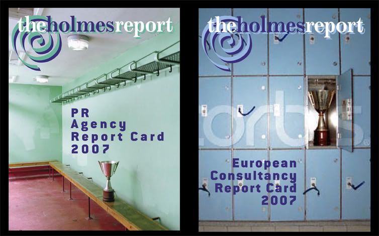
This small company I design for has a really nice logo. It's a little pointless, (as many logos are) but it's attractive, distinctive, unique and functions well:

Guess what? The boss' wife, who has a salary, though no one knows what for, decided she am a deziner and put together a lo-res "logo" and wants me to create a hi-res version.
ARRRRRGH:

After 31 years in the business, I thought I had stopped taking these things personally... but ARRRRRRGH... this is such a mundane mediocre uninteresting thing... and it's not even a logo... I mean, WTF is that grey clam in the lower right? A turtle's shell as he slips out of view? A soccer ball someone left behind? A hubcap that fell off a passing car? It sure ain't a world globe...
waaaaaaaah...
There oughta be a law...
|
|
|
| |
|
|
|
|
|
|
|
Professional Poster
Join Date: Apr 2007
Location: A House of Ill-Repute in the Sky
Status:
Offline
|
|
Say what you will about the grey globe in the lower right corner, but I think her simple text layout for the Report is better than the loud busy version above.
|
|
|
| |
|
|
|
|
|
|
|
Senior User
Join Date: Feb 2007
Status:
Offline
|
|
...and that is why I try to design objectively to solve a problem, rather than stylistically and deal with the hundreds of subjective opinions out there.
Ask her what her aims are with the new logo? What's the desired response? Where will it be used? What was wrong with the old one? You can't just say ARRRRRRGH (although it's fun), personally I quite like her new (if not a little stale) identity... orange makes me smile.
|
|
|
| |
|
|
|
|
|
|
|
Senior User
Join Date: Feb 2007
Status:
Offline
|
|
(Dakar beats me at everything, tsk.)
|
|
|
| |
|
|
|
|
|
|
|
Clinically Insane
Join Date: Oct 2001
Location: San Diego, CA, USA
Status:
Offline
|
|
I have to agree with tpicco. The new one is boring and generic; it lacks personality and doesn't really convey anything. It looks like something I'd expect to see at the top of one of those squatted domains that are supposed to look like Web gateways. But aside from the extreme vanilla flavor, I wouldn't say it's actively offensive. It's OK-looking just in and of itself. I've seen much worse first attempts at designing a logo.
I also have to agree that it looks like a turtle shell in the bottom right.
|
|
Chuck
___
"Instead of either 'multi-talented' or 'multitalented' use 'bisexual'."
|
| |
|
|
|
|
|
|
|
Professional Poster
Join Date: Mar 2003
Location: In the South
Status:
Offline
|
|
I have to say the gray and orange one is clean and more modern looking compared to the one above. Plus, it is more cost effective than the 4Color version.
I agree on the globe soccer ball thing tho- maybe you can convince them to lose that part.
|
|
|
| |
|
|
|
|
|
|
|
Dedicated MacNNer
Join Date: Feb 1999
Location: ME
Status:
Offline
|
|
Everybody's a designer. Tony, do the high res - whatever, and charge them up the wazoo.
W2
|
|
|
| |
|
|
|
|
|
|
|
Baninated
Join Date: Oct 2002
Location: In yer threads
Status:
Offline
|
|
I hate to say this too.. but I like her design more than yours. Except for that globe thing at the bottom that doesn't scale well.
Hers is more pleasing to the eye, and more professional looking IMHO.
Yours wouldn't look bad without the yellow circle image thing you have going in the back.
Not that I the am end all or be all in design. There are much more experienced, talented people on this board than I. So take what I say with a grain of salt.
|
|
|
| |
|
|
|
|
|
|
|
Clinically Insane
Join Date: Oct 2001
Location: San Diego, CA, USA
Status:
Offline
|
|
For those who think the new one is fine: Can anybody tell me what that odd swishy square beside the name is supposed to convey? It looks like it came out of a random pattern generator or something.
|
|
Chuck
___
"Instead of either 'multi-talented' or 'multitalented' use 'bisexual'."
|
| |
|
|
|
|
|
|
|
Professional Poster
Join Date: Apr 2007
Location: A House of Ill-Repute in the Sky
Status:
Offline
|
|
Originally Posted by Chuckit 
For those who think the new one is fine: Can anybody tell me what that odd swishy square beside the name is supposed to convey? It looks like it came out of a random pattern generator or something.
I was actually thinking that was the spot that the OP should use all his talents and powers to improve.
(I think it's another globe and some extra arrow or something...)
|
|
|
| |
|
|
|
|
|
|
|
Professional Poster
Join Date: Dec 2003
Location: Los Angeles of the East
Status:
Offline
|
|
the first logo is not a 'really nice logo' and the second one is a bit too vanilla and both logo's don't convey anything to me. both the box and that swirl need work, but if i had to choose i'd definitely go with the latter.
|
NOW YOU SEE ME! 2.4 MBP and 2.0 MBP (running ubuntu)

|
| |
|
|
|
|
|
|
|
Mac Enthusiast
Join Date: Feb 2004
Location: Hell's Kitchen, NYC
Status:
Offline
|
|
For the record, the original logo wasn't mine... so my ego is not involved here... merely taste...
And I cannot discuss anything with the boss' wife... she knows everything and is never wrong... ask her if you don't believe me...
I think the new logo is so generic and mundane as to be invisible... I mean, a globe? Gee... 10,000 other logos have globes... and correct me if I am wrong, but aren't logos supposed to be memorable, not forgettable?
For additional visual input, here are this years' dummies for the two annual publications I design for them. Once again, I did not design the magazine banner... but the cover designs (photo chioce, headline font & colors) are my work...
Yeah yeah, I know, there are worse things happening in the world.... but this makes me sad sometimes... very few people seem to respect the fact that good designers have trained their eyes for 10, 20, 30 years... there is no phrase in graphics that equals the musical term "perect pitch" but there should be...
People have eyes and they think they see... but IMHO, many artists and designers are the ones who really SEE visuals...
grumble grumble grumble
|
|
|
| |
|
|
|
|
|
|
|
Mac Enthusiast
Join Date: Feb 2004
Location: Hell's Kitchen, NYC
Status:
Offline
|
|
Originally Posted by Westbo
Everybody's a designer. Tony, do the high res - whatever, and charge them up the wazoo. W2
...well that's a given.
|
|
|
| |
|
|
|
|
|
|
|
Mac Elite
Join Date: Sep 2006
Status:
Offline
|
|
If she is a "deziner" I hope she doesn't belong to any public Mac oriented forums, like, say macnn!

|
|
|
| |
|
|
|
|
|
|
|
Mac Enthusiast
Join Date: Feb 2004
Location: Hell's Kitchen, NYC
Status:
Offline
|
|
Yeah I would be f**ked, wouldn't I?
|
|
|
| |
|
|
|
|
|
|
|
Fresh-Faced Recruit
Join Date: Oct 2006
Location: Seattle, WA
Status:
Offline
|
|
Originally Posted by JonoMarshall
...orange makes me smile.
I love designing with orange
|
|
|
| |
|
|
|
|
|
|
|
Mac Enthusiast
Join Date: Feb 2004
Location: Hell's Kitchen, NYC
Status:
Offline
|
|
Originally Posted by Dakarʒ
I was actually thinking that was the spot that the OP should use all his talents and powers to improve.
(I think it's another globe and some extra arrow or something...)
What is an OP?
|
|
|
| |
|
|
|
|
|
|
|
Professional Poster
Join Date: Apr 2007
Location: A House of Ill-Repute in the Sky
Status:
Offline
|
|
|
|
|
|
| |
|
|
|
|
|
|
|
Mac Enthusiast
Join Date: Feb 2004
Location: Hell's Kitchen, NYC
Status:
Offline
|
|
|
|
|
|
| |
|
|
|
|
|
|
|
Professional Poster
Join Date: Apr 2007
Location: A House of Ill-Repute in the Sky
Status:
Offline
|
|
|
|
|
|
| |
|
|
|
|
|
|
|
Senior User
Join Date: Feb 2005
Location: Mississippi
Status:
Offline
|
|
|
|
|
|
| |
|
|
|
|
|
|
|
Mac Enthusiast
Join Date: Feb 2004
Location: Hell's Kitchen, NYC
Status:
Offline
|
|
i am not a web designer...
|
|
|
| |
|
|
|
|
|
|
|
Mac Enthusiast
Join Date: Feb 2004
Location: Hell's Kitchen, NYC
Status:
Offline
|
|
Maybe I should try & get this thread killed before I get in any trouble...
|
|
|
| |
|
|
|
|
|
|
|
Professional Poster
Join Date: Mar 2003
Location: In the South
Status:
Offline
|
|
I'm thinkin that may not be a bad idea. I would hate for them to see this and figure you out.
|
|
|
| |
|
|
|
|
|
|
|
Mac Enthusiast
Join Date: Feb 2004
Location: Hell's Kitchen, NYC
Status:
Offline
|
|
I e-mailed the admin to have it pulled... is that how it happens around here? I have never been this stupid before (at least not on this board...) 
|
|
|
| |
|
|
|
|
|
|
|
Moderator  Join Date: Jun 2000
Location: inside 128, north of 90
Status:
Offline
|
|
the second one is kind of generic, but I do like the typography sans swirl of the first one. The tagline shouldn't be in the same bold as the main type, and the box/circle cutout is like 40 zillion other box circle cutout. And the bottom globe shouldn't be part of a logo, what the heck? How does it relate to the rest of the logo?
Has anyone else weighed in on the fact that she rewrote the company tagline on a whim as well?
It took us 3 internal focus groups and an outside consultant to change our tagline. And it's been 3 years of us tweaking the logo desperately trying to get changes made. Baby steps.
Also this reminds me of the time our president took the annual meeting design home and gave it to his son to do in Microsoft Paint. Despite having 20 trained designers inhouse. Sigh.
|
|
|
| |
|
|
|
|
|
|
|
Mac Enthusiast
Join Date: Feb 2004
Location: Hell's Kitchen, NYC
Status:
Offline
|
|
Thank you andi*pandi...
as for her whims, this is a mighty small consulting firm, consisting of Boss Holmes, his wife, their salesman and their factotum in the office (receptionist, bookkeeper, travel agent, messenger, etc etc)...
|
|
|
| |
|
|
|
|
|
|
|
Mac Elite
Join Date: Apr 2005
Location: Las Vegas, NV
Status:
Offline
|
|
Originally Posted by tpicco
there is no phrase in graphics that equals the musical term "perect pitch" but there should be...
Agreed...
Originally Posted by andi*pandi
Also this reminds me of the time our president took the annual meeting design home and gave it to his son to do in Microsoft Paint. Despite having 20 trained designers inhouse. Sigh.
(>_<)
the worst part is... this entire thread, and everything you've described happening to you is so typical!!
|

"In a world without walls or fences, what need have we for windows or gates?"
|
| |
|
|
|
|
|
|
|
Mac Enthusiast
Join Date: Feb 2004
Location: Hell's Kitchen, NYC
Status:
Offline
|
|
yeah... well... after 30 years designing, one develops a thicker skin... but sometimes it just really gets to me...
|
|
|
| |
|
|
|
|
|
|
|
Senior User
Join Date: Feb 2007
Status:
Offline
|
|
I have thick skin on my toes sometimes.. an emery stone normally sorts it out.
Graphic design isn't exactly fashion, there are some rules that can back up your opinions/decisions?!?!
|
|
|
| |
|
|
|
|
|
|
|
Moderator Join Date: Aug 2001
Location: Nobletucky
Status:
Offline
|
|
Originally Posted by tpicco
yeah... well... after 30 years designing, one develops a thicker skin... but sometimes it just really gets to me...
Join the club.
I've been doing this for the same number of years and still have to deal with regional sales VPs who fancy themselves art-directors. Of course, my being a contractor/freelancer tends to mean I have to take the direction from them and do whatever they say. At least that's the culture at the particular firm I'm thinking of. And, yeah, the CEO's wife occasionally chimes-in with her advice as well.
I think a lot of it has to do with the overall devaluing of what we do. We really aren't seen as knowledgeable professionals anymore. We're merely a service being paid to do what we're told to do, regardless of the experience and talent we bring to the table.
I've always thought it's because everyone grows up drawing in some way or another as kids. It's one of the more enjoyable life experiences. Thus, no one like to be told their opinions (when it comes to "art") are wrong. Or, at least, that your ideas are better.
Anyway, that's my cranky-armchair-designer-psychology moment for today 
|
|
|
| |
|
|
|
|
|
|
|
Dedicated MacNNer
Join Date: Feb 1999
Location: ME
Status:
Offline
|
|
Originally Posted by Thorzdad
Join the club.
I've been doing this for the same number of years and still have to deal with regional sales VPs who fancy themselves art-directors. Of course, my being a contractor/freelancer tends to mean I have to take the direction from them and do whatever they say. At least that's the culture at the particular firm I'm thinking of. And, yeah, the CEO's wife occasionally chimes-in with her advice as well.
I think a lot of it has to do with the overall devaluing of what we do. We really aren't seen as knowledgeable professionals anymore. We're merely a service being paid to do what we're told to do, regardless of the experience and talent we bring to the table.
I've always thought it's because everyone grows up drawing in some way or another as kids. It's one of the more enjoyable life experiences. Thus, no one like to be told their opinions (when it comes to "art") are wrong. Or, at least, that your ideas are better.
Anyway, that's my cranky-armchair-designer-psychology moment for today
As Jimmy Durante would say: "Ev'rybody wants ta get inta the act!" 
W2
|
|
|
| |
|
|
|
|
|
|
|
Junior Member
Join Date: Sep 2000
Location: Carol Stream, IL USA
Status:
Offline
|
|
Originally Posted by tpicco
I e-mailed the admin to have it pulled... is that how it happens around here? I have never been this stupid before (at least not on this board...)
And the best part is this thread is now listed on the front page of MacNN!!!!
Poor guy...
|
|
Powerbook G4 15" 1.0GHz FW800 60GIG HDD / 1.5GB RAM 10.5.X
iBook G3/800 12" 30GIG 640MB RAM 10.4.11
Mirror Door G4 1.0DP .5TB/1.5TB/40GB/30GB 1.5GB RAM 10.5 Server
Mini 1.83GHz C2D 80GB HDD 1GB RAM
|
| |
|
|
|
|
|
|
|
Addicted to MacNN
Join Date: Jan 2002
Location: PDX
Status:
Offline
|
|
The tagline under the new logo bugs me because its way too long. Extending that far beyond the company name looks really bad to me.
And there's the gray upside down bowl. We all know thats gotta go.
The 2 shades of gray on the logo is bugging me too. Looks like a mistake, even if it wasn't.
My list goes on...
But this is all beside the point, since I'm sure there is no reasoning with the boss's wife. As a designer working for a company, there will be many times you have to swallow your pride and just let it go. The company I work for just went through a logo redesign. The higher-ups gave us 2 weeks to come up with a brand new logo from scratch. And we had to do it in our spare time. Needless to say the submissions were weak. The result was a lame ass, overdone, poorly executed logo. And its on my damn business card. There was nothing I could do but say "hmf." and walk away.
So now all I have to do is stay with this company for about 10 years, in which time a new logo design might be needed and I will submit a super uber logo that I've been working on for said 10 years. I can't wait.
|
|
|
| |
|
|
|
|
|
|
|
Dedicated MacNNer
Join Date: Feb 1999
Location: ME
Status:
Offline
|
|
Originally Posted by FastAMX79
And the best part is this thread is now listed on the front page of MacNN!!!!
Poor guy...
Not the first time our guy has been controversial. T-man don't sweat the small stuff. 
W2
|
|
|
| |
|
|
|
|
|
|
|
Professional Poster
Join Date: Mar 2002
Location: Minneapolis, MN U.S.A.
Status:
Offline
|
|
I feel your pain. In situations such as this I generally give the client what they asked for then I give them a good option to replace their caca.
Best of luck.
|
|
|
| |
|
|
|
|
|
|
|
Mac Elite
Join Date: Aug 2000
Location: Minneapolis, MN
Status:
Offline
|
|
At least in everyday life, todos hacemos caca!
|
|
|
| |
|
|
|
|
|
|
|
Baninated
Join Date: Oct 2002
Location: In yer threads
Status:
Offline
|
|
What is worse, is when ad-reps think they know better.
I have one that thinks the MORE COLORS the better.
"She payed for a full color add, there needs to be more than 2 or 3 colors in it.."
I want to smack em. I had to sit down with them once. Showing ads of professional companies. How using all the colors in the rainbow usually =
|
|
|
| |
|
|
|
|
|
|
|
Baninated
Join Date: Oct 2002
Location: In yer threads
Status:
Offline
|
|
Originally Posted by Thorzdad
Join the club.
I've been doing this for the same number of years and still have to deal with regional sales VPs who fancy themselves art-directors. Of course, my being a contractor/freelancer tends to mean I have to take the direction from them and do whatever they say. At least that's the culture at the particular firm I'm thinking of. And, yeah, the CEO's wife occasionally chimes-in with her advice as well.
I think a lot of it has to do with the overall devaluing of what we do. We really aren't seen as knowledgeable professionals anymore. We're merely a service being paid to do what we're told to do, regardless of the experience and talent we bring to the table.
I've always thought it's because everyone grows up drawing in some way or another as kids. It's one of the more enjoyable life experiences. Thus, no one like to be told their opinions (when it comes to "art") are wrong. Or, at least, that your ideas are better.
Anyway, that's my cranky-armchair-designer-psychology moment for today
Ah this shiz is funny though

AHAHHAHAHH
"Just like grandma used to taste"
|
|
|
| |
|
|
|
|
|
|
|
Moderator Join Date: Aug 2001
Location: Nobletucky
Status:
Offline
|
|
Originally Posted by Kevin
Ah this shiz is funny though
AHAHHAHAHH
"Just like grandma used to taste"
Thank you!
You'd be amazed how few clients I show that to get the joke. 
|
|
|
| |
|
|
|
|
|
|
|
Fresh-Faced Recruit
Join Date: Jan 2006
Status:
Offline
|
|
Just what I do, after 13 years in the field, with a bunch of diplomas in the Design industry, I learned that every third cousin of the boss is a Designer, so I just "clear" what they want and charge em a leg, an arm and a blue-gray eye for it.
Rolando
|
|
|
| |
|
|
|
|
|
|
|
Professional Poster
Join Date: Mar 2002
Location: Minneapolis, MN U.S.A.
Status:
Offline
|
|
Originally Posted by Kevin
What is worse, is when ad-reps think they know better.
I have one that thinks the MORE COLORS the better.
"She payed for a full color add, there needs to be more than 2 or 3 colors in it.."
I want to smack em. I had to sit down with them once. Showing ads of professional companies. How using all the colors in the rainbow usually =
Any agency with 'ad reps' is a whipping post for creatives. Prepare to bust rocks.
|
|
|
| |
|
|
|
|
|
|
|
Professional Poster
Join Date: Mar 2002
Location: Minneapolis, MN U.S.A.
Status:
Offline
|
|
Originally Posted by Rolando_jose
Just what I do, after 13 years in the field, with a bunch of diplomas in the Design industry, I learned that every third cousin of the boss is a Designer, so I just "clear" what they want and charge em a leg, an arm and a blue-gray eye for it.
Rolando
I would never diminish the value of education. However, the truth is diplomas mean diddly for creatives, especially art directors and designers. For example, one of the long running CDs at Weiden working on the Nike business is a college dropout. She's among the best in the business and everyone here who is into the biz has seen her work. I could list more but I think this one example gives credit to the point.
|
|
|
| |
|
|
|
|
|
|
|
Professional Poster
Join Date: Mar 2002
Location: Minneapolis, MN U.S.A.
Status:
Offline
|
|
Originally Posted by ::maroma::
The tagline under the new logo bugs me because its way too long. Extending that far beyond the company name looks really bad to me.
That's not a tagline, that's a f*cking mission statement.
Taglines are short, sweet and they convey the brand position. Some recognizable examples:
• Just do it.
• For life.
• The ulitmate driving machine.
• Think different.
|
|
|
| |
|
|
|
|
|
|
|
Mac Elite
Join Date: Nov 2006
Location: here
Status:
Offline
|
|
The globe so far down on the right looks like it's leaving the frame.
It's falling. Thrown away.
Earth, dumped. No need for earth. Holmes Report doesn't need earth.
I think this is a message.
Regarding the new headline (I'm sure that's the wrong expression in designer country, and I wonder what's the punishment for using it), it also has a mission statement in its design "let us help you to fall asleep with our exciting news".
The old logo conveyed more pride and self-assurance, and the contrast of black and red is attractive.
There could be two reasons for the swirl. 1. Designed in the early eighties 2. Holmes Report is about the ice cream industry.
|
|
|
| |
|
|
|
|
|
|
|
Mac Elite
Join Date: Nov 2003
Location: Rockville, MD
Status:
Offline
|
|
Perhaps one reason why so many talentless execs think they are designers is because they've watched shows like The Apprentice so many times they start believing they really can and should do everything.
Only trouble with this theory is that self-important incompetence has been around way longer than that.
|
|
|
| |
|
|
|
|
|
|
|
Moderator Join Date: Jun 2000
Location: inside 128, north of 90
Status:
Offline
|
|
Originally Posted by Veltliner
There could be two reasons for the swirl. 1. Designed in the early eighties 2. Holmes Report is about the ice cream industry.

|
|
|
| |
|
|
|
|
|
|
|
Baninated
Join Date: Oct 2002
Location: In yer threads
Status:
Offline
|
|
Originally Posted by art_director
Any agency with 'ad reps' is a whipping post for creatives. Prepare to bust rocks.
Not this office. The ad reps aren't even allowed in my office without going to my boss first. 
If they turn in a request that doesn't meet the guidelines, I just send it back. They don't get their commission for it.
Ad reps have (had) a habit of sloppy and non-finished paperwork they do at the last minute to get in as much commission on their check as possible. Which made my job 10x harder. So my Boss told me if I run into anymore of them, just to give them to him, he will hold them a week and then give it back to the rep to fix.
Of course the rep will be expecting that ad on their check, and it wont be there. Then when they go to my boss and get all upset, my boss shows them their shoddy work they turned in and they come out of their offices with their tails between their legs.
The ad-reps do not run this office like they have in other offices I've been in.
|
|
|
| |
|
|
|
|
|
|
|
Grizzled Veteran
Join Date: Apr 2004
Location: Philadelphia, PA
Status:
Offline
|
|
the final design kind of reminds me of a telecom company... oh well, it's the client and I gotta go with the view - as long as they are paying -
smile and nod,
thank-you for your input,
you like the design?
I'm glad. It's been a pleasure working with you.
Yes, we had our differences. <chucklechuckle>
What? Sure we should collaborate more often.
You too, have a nice day. <click>
EFF Y O U!!!!! just pay your damn bill on time!
Originally Posted by tpicco
Maybe I should try & get this thread killed before I get in any trouble...
just delete the images... thanks for sharing your frustration, we all feel that from time to time.
(
Last edited by eyevaan; Aug 9, 2007 at 08:29 AM.
)
|
|
|
| |
|
|
|
|
|
|
|
|
|
|
|
|
 
|
|
|
Forum Rules
|
|
|
|
You may not post new threads
You may not post replies
You may not post attachments
You may not edit your posts
|
HTML code is Off
|
|
|
|
|
|
|
|
|
|
|
|