 |
 |
Apple special event today
|
|
|
|
|
Registered User
Join Date: Sep 2000
Location: Irvine, CA
Status:
Offline
|
|
Thoughts?
1) Mavericks update and release date
2) Mac Pro update and release date
3) New iPads
4) Not announced, but updated in stores...new MBP with Haswell (most likely 1-2 weeks from now)
|
|
|
| |
|
|
|
|
|
|
|
Games Meister  Join Date: Aug 2009
Location: Eternity
Status:
Offline
|
|
So, anything you guys are interested in Mavericks? I don't keep up any more.
|
|
|
| |
|
|
|
|
|
|
|
Addicted to MacNN
Join Date: Sep 2000
Location: Isle of Manhattan
Status:
Offline
|
|
My interest in Mavericks is how to permanently remove the notification center from the system. If not the world.
|
|
"Faster, faster! 'Till the thrill of speed overcomes the fear of death." - HST
|
| |
|
|
|
|
|
|
|
Registered User
Join Date: Sep 2000
Location: Irvine, CA
Status:
Offline
|
|
I will be updating right away for the tabbed Finder and for the improved battery life for laptops. That is assuming it works well with VirtualBox, which I depend on.
|
|
|
| |
|
|
|
|
|
|
|
Professional Poster
Join Date: Dec 2000
Location: UK
Status:
Offline
|
|
Something I haven't seen anything about, but maybe the iPod Nano OS will get iOS7erized?!? If there are iPod updates, will the Classic survive this time?
|

It'll be much easier if you just comply.
|
| |
|
|
|
|
|
|
|
Clinically Insane
Join Date: Nov 1999
Location: 888500128, C3, 2nd soft.
Status:
Online
|
|
Originally Posted by mindwaves 
Thoughts?
1) Mavericks update and release date
2) Mac Pro update and release date
3) New iPads
4) Not announced, but updated in stores...new MBP with Haswell (most likely 1-2 weeks from now)
5) New iWork.
6) New iLife.
definitely for iOS7, and if they had the capacity to develop Mac versions alongside the major push on Mavericks, the new version will integrate more nicely with with iOS 7 and iWork for iCloud.
|
|
|
| |
|
|
|
|
|
|
|
Addicted to MacNN
Join Date: Feb 2001
Location: Your Anus
Status:
Offline
|
|
My prediction? Everything will cost a little more than expected and do a little less then expected. People will be disappointed.
Mavericks ship date
iOS 7 updates for iBooks and Garage Band and some other iPad apps
New iPad Mini
16GB Non Retina $279
16GB Retina $349 Standard price jumps for storage and LTE -- A6, No Fingerprint Scanner
New iPad
Same Prices, A7, Fingerprint scanner, smaller lighter...
Mac Pro Starts at $3,500 bucks, New 4K display, $2000 bucks.
New MacBook spec bumps, Haswell, no big surprises
No watch, no TV
|

My sig is 1 pixel too big.
|
| |
|
|
|
|
|
|
|
Games Meister Join Date: Aug 2009
Location: Eternity
Status:
Offline
|
|
That watch isn't coming until everyone else faceplants with their own attempt.
|
|
|
| |
|
|
|
|
|
|
|
Moderator  Join Date: Jun 2000
Location: inside 128, north of 90
Status:
Offline
|
|
of course they will release new ilife, because I finally just bought iphoto. yes.
|
|
|
| |
|
|
|
|
|
|
|
Professional Poster
Join Date: Dec 2000
Location: UK
Status:
Offline
|
|
Mavericks is free, from Snow Leopard, Lion and Mountain Lion. Today.
Did not expect that.
|
It'll be much easier if you just comply.
|
| |
|
|
|
|
|
|
|
Addicted to MacNN
Join Date: Sep 2000
Location: Isle of Manhattan
Status:
Offline
|
|
That MacPro looks sweet, the specs are insane, even the base machine.
|
|
"Faster, faster! 'Till the thrill of speed overcomes the fear of death." - HST
|
| |
|
|
|
|
|
|
|
Addicted to MacNN
Join Date: Feb 2001
Location: Your Anus
Status:
Offline
|
|
It's just so awesome to learn that Phil Schiller is such a huge Black Knight fan.
|
My sig is 1 pixel too big.
|
| |
|
|
|
|
|
|
|
Professional Poster
Join Date: Dec 2000
Location: UK
Status:
Offline
|
|
Still not sure whether the final finish is anodised black like the promo images or chromed/polished like in the USA factory video.
|
It'll be much easier if you just comply.
|
| |
|
|
|
|
|
|
|
Professional Poster
Join Date: Dec 2000
Location: UK
Status:
Offline
|
|
Originally Posted by ort888
It's just so awesome to learn that Phil Schiller is such a huge Black Knight fan.
Tis but a scratch
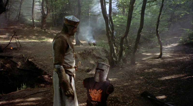
*made up fact* they got the idea for the Mac Pro design from Black Knight's helmet 
|
It'll be much easier if you just comply.
|
| |
|
|
|
|
|
|
|
Addicted to MacNN
Join Date: Sep 2000
Location: Isle of Manhattan
Status:
Offline
|
|
Originally Posted by ajprice
Still not sure whether the final finish is anodised black like the promo images or chromed/polished like in the USA factory video.
yes, in the clip I just saw it looks like dark tinted mercury
|
|
"Faster, faster! 'Till the thrill of speed overcomes the fear of death." - HST
|
| |
|
|
|
|
|
|
|
Professional Poster
Join Date: Jan 2003
Location: Teaneck, NJ
Status:
Offline
|
|
Nice that the event is streaming live. The quality on the Apple TV is excellent.
|
|
AT&T iPhone 5S and 6; 13" MBP; MDD G4.
|
| |
|
|
|
|
|
|
|
Professional Poster
Join Date: Jan 2003
Location: Teaneck, NJ
Status:
Offline
|
|
iPad Air? Couldn't they just call it iPad 5 ... or the new new iPad?
|
|
AT&T iPhone 5S and 6; 13" MBP; MDD G4.
|
| |
|
|
|
|
|
|
|
Professional Poster
Join Date: Dec 2000
Location: UK
Status:
Offline
|
|
iPad Air, mini style bezel, 7.5mm thick, 1lb weight. Air name making room for an 'iPad Pro' ?
|
It'll be much easier if you just comply.
|
| |
|
|
|
|
|
|
|
Addicted to MacNN
Join Date: Feb 2001
Location: Your Anus
Status:
Offline
|
|
Well, it sounded like they killed the old "fatty" MacBook Pros, but they only actually killed the 15" MacBook Pro. The 13" is still available.
And you can't go have fun building a $20,000 Mac Pro yet... BOOO!
It's als pretty crazy that the iPad 2 of all things is still kickin' it. Who in their right mind would pay $399 for an iPad 2 right now?
|
My sig is 1 pixel too big.
|
| |
|
|
|
|
|
|
|
Clinically Insane
Join Date: Jun 2001
Location: Chicago, Bang! Bang!
Status:
Offline
|
|
Originally Posted by The Final Dakar
So, anything you guys are interested in Mavericks? I don't keep up any more.
I'm mildly interested in tagging, but the WWDC demo made it seem weaksauce.
|
|
|
| |
|
|
|
|
|
|
|
Addicted to MacNN
Join Date: Sep 2000
Location: The Rock
Status:
Online
|
|
I really don't see any downside to the mini, other than screen size? I'll probably get one.
|
|
Mankind's only chance is to harness the power of stupid.
|
| |
|
|
|
|
|
|
|
Professional Poster
Join Date: Jul 2005
Location: Winnipeg, MB
Status:
Offline
|
|
I hate iWork for the Mac with a hatred that could burn a thousand suns!
Seriously, Apple needs to stop making apps with iconography that looks like it was made in MS Word! iWork feels like a freaking Windows 8 app! Using the contextual whatever the hell it is, I found myself saying, "Aww hell the ribbon made it to OS X."
Thankfully Pages 4.3 still works. I was so excite for an update to Pages, but when Cue said "They're new from the ground up" I got a pit in my stomach. The new app is super quick, which is good. But it feels ugly. It feels really ugly. I think this is what OS X .10 is going to look like ... which is scary. They use things like the stupid looking share icon from iOS 7, and ... just ... ugh I can't even articulate how terrible the UI of the app is. They also ruined the minimalist full screen mode, it's now all cluttered up and gross.
|
|
|
| |
|
|
|
|
|
|
|
Clinically Insane
Join Date: Apr 2003
Location: 46 & 2
Status:
Offline
|
|
Essentially an 8" Mini with Retina, what isn't to love? Can't wait to get one.
|
|
"Those who expect to reap the blessings of freedom must, like men, undergo the fatigue of supporting it."
- Thomas Paine
|
| |
|
|
|
|
|
|
|
Addicted to MacNN
Join Date: Sep 2000
Location: The Rock
Status:
Online
|
|
Retina is great, and sounds like it's essentially the same A7 chip as the iPad Air? That's pretty impressive.
|
|
Mankind's only chance is to harness the power of stupid.
|
| |
|
|
|
|
|
|
|
Addicted to MacNN
Join Date: Apr 2000
Status:
Offline
|
|
iPad Air. Like it. (probably wont get it cause of iOS7) Wished it came in black/slate. iPad Mini 2. Like (black/slate... wishing). iPad2, still on sale..... kinda confusing.
Interesting that the new iPhone5S and new iPads share the same processor.
MacBooks.... good upgrade, and price drops. Mavericks.... glad it's free  .
MacPro.... very cool, but pricey. Wouldn't be surprised if the bump in price has to do with 'assembly costs'. I'm sure there must be pent up demand for this product. I am a bit concerned about the effect that limitations on expandability and pricing will have on demand. (On a side note... why doesn't the iMac/MacBooks come in slate/black?)
iWork, iLife.... glad they are effectively 'bundled' with new device purchases. (Reminds me of when they used to come bundled with the iMacs).
The only 'stain' on the entire thing was the hideous, amateurish and sometimes nonsensical iOS7 icons and colors. I still can't seem to get past that.
|
|
|
| |
|
|
|
|
|
|
|
Professional Poster
Join Date: Oct 2008
Location: UKland
Status:
Offline
|
|
Apple seem to be on a journey from fantastic UI design to being kings of sucking. Honestly the flatter look of Pages and Numbers is just abysmal. It's like it's been thrown together from a child's toybox of ui elements. Everything from the icons them selves to the placing of elements through the colour palet seems to have been deliberately chosen to look just off enough to be deliberate.
It's the same in Mavericks. Opening System Preferences and it's immediately obvious that they've updated every icon etc just enough to make it thoroughly uncomfortable to look at.
|
|
This space for Hire! Reasonable rates. Reach an audience of literally dozens!
|
| |
|
|
|
|
|
|
|
Clinically Insane
Join Date: Apr 2003
Location: 46 & 2
Status:
Offline
|
|
Oh shit, I forgot about the new Cube! Bleh.
So glad I bought a previous gen aluminum beast.
|
|
"Those who expect to reap the blessings of freedom must, like men, undergo the fatigue of supporting it."
- Thomas Paine
|
| |
|
|
|
|
|
|
|
Junior Member
Join Date: Sep 2013
Status:
Offline
|
|
Does this mean I can just bring my mac computer to the store for an update, and for free
|
|
|
| |
|
|
|
|
|
|
|
Registered User
Join Date: Sep 2000
Location: Irvine, CA
Status:
Offline
|
|
I can't wait to update my Pages. I use it a lot. The collaboration would be nice! Looking forward to pick up a 16GB iPad Air.
|
|
|
| |
|
|
|
|
|
|
|
Addicted to MacNN
Join Date: Sep 2000
Location: Isle of Manhattan
Status:
Offline
|
|
I am excited about all this stuff. I will be getting a couple of iPad minis and perhaps the MacPro around Christmas.
Already updated iOS, and aside from the gawd frickin awful icons and colors, I am quite pleased.
|
|
"Faster, faster! 'Till the thrill of speed overcomes the fear of death." - HST
|
| |
|
|
|
|
|
|
|
Clinically Insane
Join Date: Nov 1999
Location: 888500128, C3, 2nd soft.
Status:
Online
|
|
Originally Posted by Doc HM
It's the same in Mavericks. Opening System Preferences and it's immediately obvious that they've updated every icon etc just enough to make it thoroughly uncomfortable to look at.
They didn't change any of the System Preference icons in Mavericks.
|
|
|
| |
|
|
|
|
|
|
|
Posting Junkie
Join Date: Apr 2007
Location: Iowa, how long can this be? Does it really ruin the left column spacing?
Status:
Offline
|
|
Are you sure? I didn't look too closely but I feel as though they were different.
|
|
|
| |
|
|
|
|
|
|
|
Clinically Insane
Join Date: Nov 1999
Location: 888500128, C3, 2nd soft.
Status:
Online
|
|
You're right; I was wrong.
iCloud has changed and is no longer brushed metal, Software Update had been replaced by App Store, and Sound and the Printer look subtly different.
Beyond that, the icons are the same, just scaled slightly larger, AFAICS.
|
|
|
| |
|
|
|
|
|
|
|
Professional Poster
Join Date: Oct 2008
Location: UKland
Status:
Offline
|
|
Originally Posted by Spheric Harlot
Beyond that, the icons are the same, just scaled slightly larger, AFAICS.
Just sized and placed with enough awkwardness to be annoying. It's like Apples sense of what rests easy on the eye is has completely deserted them!
|
|
This space for Hire! Reasonable rates. Reach an audience of literally dozens!
|
| |
|
|
|
|
|
|
|
Clinically Insane
Join Date: Nov 1999
Location: 888500128, C3, 2nd soft.
Status:
Online
|
|
It looks like the old ones were scaled to some intermediate size that made them really ugly and fuzzy, and Mavericks finally displays them at their proper resolution.
|
|
|
| |
|
|
|
|
|
|
|
Registered User
Join Date: Sep 2000
Location: Irvine, CA
Status:
Offline
|
|
I plan on buying a new iPad Air 16GB for personal use (I think) and using my old iPad 3 for my business as a sort of terminal.
|
|
|
| |
|
|
|
|
|
|
|
Addicted to MacNN
Join Date: Apr 2000
Status:
Offline
|
|
Finally watched the entire presentation. (I wonder if anyone at Apple reads this stuff?). Now i know that a lot of work and thought goes into these presentations, so no disrespect intended. But just some constructive criticism....
Tim Cook. Quit with the 'passion', 'innovation', 'feelings' talk, it sounds corny and fake, not to mention redundant. Focus on the numbers, we know that's what your great at, so talk it up. Sure mention the 'passion', but leave if for the end, don't harp on about it every time your on the stage. I realized that with Seteve Jobs, we knew he liked the Beatles and Dylan. With Tim Cook?
Phil Shiller. No complaints. Little humor every now and then is very welcome. And i think he does have some geek cred (not withstanding the 'Black Knight' comment ). His presentation segments are 'fun'.
Craig "Hair Force One" Federighi. I remember seeing him for the first time on stage a few years ago, and i remember how nervous he was. He's come a long way, and his presentation style is light, lively and fun.
Eddy Cue. Presentation style is fine. And while showcasing apps and services are useful. I think app demos need to be shorter and more focused. I think Eddy should (and can) do major services/content announcements.
Johny Ive. Enough with the heavenly aura already. Repetition and regurgitation of the same phrases over and over. Just make one video where you do not mention any product by name, and reuse it in every product video. Design genius, yes. Presentation skills limited, yes. Stop forcing him into the spotlight with these videos.
In general, i think the presentation was fine, although i found the use of videos a little over board. I'm really not interested in seeing lines at Apple stores, or Apple retail employees getting syked and high fiving. Sure when there's a retail announcement, its cool. But just for the heck of it... ?
Now i'm not sure if this opinion is nostalgia on my part, but the Apple ads of late have become...... kinda preachy and self-gloating almost. I kinda miss the Goldblum ads from 10-15 years ago, they were kinda folksy and had a bit of 'culture' to them. 'Born to be Wild' for the Mighty Mouse ad, Purple Haze for the G4Cube, etc.
Thoughts?
|
|
|
| |
|
|
|
|
|
|
|
Clinically Insane
Join Date: Jun 2001
Location: Chicago, Bang! Bang!
Status:
Offline
|
|
There was a lot of stumbling. They needed to rehearse more.
I agree that whomever is writing these needs to stop with the repetition of marketing speak. No one gives a **** what you think of it.
|
|
|
| |
|
|
|
|
|
|
|
Addicted to MacNN
Join Date: Sep 2000
Location: Isle of Manhattan
Status:
Offline
|
|
Originally Posted by Hawkeye_a
Finally watched the entire presentation. (I wonder if anyone at Apple reads this stuff?). Now i know that a lot of work and thought goes into these presentations, so no disrespect intended. But just some constructive criticism....
Tim Cook. Quit with the 'passion', 'innovation', 'feelings' talk, it sounds corny and fake, not to mention redundant. Focus on the numbers, we know that's what your great at, so talk it up. Sure mention the 'passion', but leave if for the end, don't harp on about it every time your on the stage. I realized that with Seteve Jobs, we knew he liked the Beatles and Dylan. With Tim Cook?
Phil Shiller. No complaints. Little humor every now and then is very welcome. And i think he does have some geek cred (not withstanding the 'Black Knight' comment ). His presentation segments are 'fun'.
Craig "Hair Force One" Federighi. I remember seeing him for the first time on stage a few years ago, and i remember how nervous he was. He's come a long way, and his presentation style is light, lively and fun.
Eddy Cue. Presentation style is fine. And while showcasing apps and services are useful. I think app demos need to be shorter and more focused. I think Eddy should (and can) do major services/content announcements.
Johny Ive. Enough with the heavenly aura already. Repetition and regurgitation of the same phrases over and over. Just make one video where you do not mention any product by name, and reuse it in every product video. Design genius, yes. Presentation skills limited, yes. Stop forcing him into the spotlight with these videos.
In general, i think the presentation was fine, although i found the use of videos a little over board. I'm really not interested in seeing lines at Apple stores, or Apple retail employees getting syked and high fiving. Sure when there's a retail announcement, its cool. But just for the heck of it... ?
Now i'm not sure if this opinion is nostalgia on my part, but the Apple ads of late have become...... kinda preachy and self-gloating almost. I kinda miss the Goldblum ads from 10-15 years ago, they were kinda folksy and had a bit of 'culture' to them. 'Born to be Wild' for the Mighty Mouse ad, Purple Haze for the G4Cube, etc.
Thoughts?
I love your post, I would change a couple of things too, in hopes that someone at Apple is reading.
From now on Tim Cook must use the word "Fabulous" for every needed adjective he utters. Everything is fabulous, the new MacPro is fabulous, sales are fabulous, etc... Flaunt it baby! Wear more purple silks and satin - maybe dress like Jimi Hendrix, only more fabulous.
I love Phil Schiller. The guy is a walking vaudeville act. Keep the corniness coming, keep it campy and fun.
Craig, carmanooch baby - what is there to say. Keep it up paisan! Travel to Bay Ridge and keep your hair up to date on schedule as planned. Salute!
Ed Cue. I had no idea you were in the keynote. Hmmm. Drawing a blank here.
Johnny John Jon Johnnie boy Ives - you come across as the most obnoxious pretentious little prick on earth - lighten up, for chrissake, I know you're a funny guy deep, deep, deep inside, maybe. I hope. You're starting to scare people and probably have a negative affect on market share.
|
|
"Faster, faster! 'Till the thrill of speed overcomes the fear of death." - HST
|
| |
|
|
|
|
|
|
|
Clinically Insane
Join Date: Jun 2001
Location: Chicago, Bang! Bang!
Status:
Offline
|
|
Why didn't anyone talk about how they worked their butts off?
|
|
|
| |
|
|
|
|
|
|
|
Addicted to MacNN
Join Date: Sep 2000
Location: Isle of Manhattan
Status:
Offline
|
|
Originally Posted by subego
Why didn't anyone talk about how they worked their butts off?
Classic Steve.
|
|
"Faster, faster! 'Till the thrill of speed overcomes the fear of death." - HST
|
| |
|
|
|
|
|
|
|
Professional Poster
Join Date: Jul 2005
Location: Winnipeg, MB
Status:
Offline
|
|
I'm still angry about how they ****ed up iWork for the Mac. I'm almost tempted not to buy an iPad mini in protest. If iWork is what Mac apps are going to look like in the future ... then I'm screwed. Because I can't stand Windows, and Android bugs me. Sadly sticking with Lion is not an option.
I think whoever's deciding the visual direction at Apple needs to learn a few lessons.
1) A word is not a button. Especially if you don't put it on a button.
2) Icons are better than words. There's a reason Safari doesn't have any words in the tool bar, it would look stupid.
3) Lofty goals are great. But the user experience shouldn't suffer because of dogmatic assumptions.
Overall I like a lot of the visual choices in iOS 7. Eliminating the black bar at the top by the time, actually makes the screen feel bigger, the app fuller. The OS feels very snappy, and the colour pallet is fun.
That said the iconography is garbage. Pure and simple, garbage. The Purchased glyph in the store apps looks like a bastardized Chi Rho. It's weird, it doesn't fit the OS. It's clever in it's own right, but it doesn't work as part of a unit. And that's the problem iOS 7 is full of clever ideas that don't work. Control centre is a great idea, it looks like garbage though. I get these blurry cotton candy looking flubs under it, and the iconography is needlessly harsh. It often doesn't even match the app that you're going to. Why not? They use the same icon from camera, but not the same one for calculator? Doesn't make a lot of sense.
Ugh, I was hoping they'd get a year's worth of feedback and tone it down to something more usable like they always did every time they brutalized iTunes only to bring to changes to the broader OS in a more thought out way. But I'm genuinely scared about what 10.10 is going to look like.
|
|
|
| |
|
|
|
|
|
|
|
Registered User
Join Date: Sep 2000
Location: Irvine, CA
Status:
Offline
|
|
Yeah, I don't like the new Pages of iWork '13. I reverted back to iWork '09. So many missing features and I'm not a power user.
|
|
|
| |
|
|
|
|
|
|
|
|
|
|
|
|
 
|
|
|
Forum Rules
|
|
|
|
You may not post new threads
You may not post replies
You may not post attachments
You may not edit your posts
|
HTML code is Off
|
|
|
|
|
|
|
|
|
|
|
|


