|
 |
Official Leopard GUI discussion thread (Page 5)
|
|
|
|
|
Clinically Insane
Join Date: Oct 2001
Location: San Diego, CA, USA
Status:
Offline
|
|
Originally Posted by Kevin 
So the things I was told didn't happen, does. I guess Apple is doing things a bit differently this time around for some reason. 
What are you talking about? What did someone say doesn't happen that did? A minor cosmetic change to one piece of Dock artwork?
|
|
Chuck
___
"Instead of either 'multi-talented' or 'multitalented' use 'bisexual'."
|
| |
|
|
|
|
|
|
|
Baninated
Join Date: Oct 2002
Location: In yer threads
Status:
Offline
|
|
Originally Posted by .Neo
How is that confusing? Those applications aren't Mac OS X applications and obviously they won't magically convert to spot a Quartz rendered picture perfect Aqua interface.
I don't think I ever used the word confusing. I said they didn't like that they didn't match. That people wanted their classic apps to have an Aqua look, or they wanted OS X to have a Platinum look. I remember these arguments in here from LONG ago when Me, synotic, swizz, and a few others of us were basically the only OS X themers out there.
It isn't that much different from running Windows XP applications on the Mac OS X desktop using VMware Fusion or Parallels: Those will still spot Luna or Windows Classic as well. They aren't an actual part of Mac OS X, nor are applications in the Classic environment. They rely for the full 100% on Mac OS 9 frameworks.
Right, and I agree. I wasn't one of those complainers BTW. I thought it to be ok for the classic Apps to have the classic look.. I actually WANTED it that way. Others complained though.
Platinum never was an official part of any retail Mac OS X release, so I fail to see why anyone would bring it up in an article dating from 2005.
I just told you.  Platinum wasn't Part of OS X's Aqua. But Classic did indeed run in OS X. And was yet another GUI within OS X.
That is what he was referring to. I think he went a bit over-board in using that as an example of inconsistencies. But whatever.
Originally Posted by .Neo
Or they just did some bugfixes.
He specifically mentioned GUI changes.
"Another thing to keep in mind is that the GM version of 10.5.0 definitely contains at least some significant differences from the last version seeded via ADC to developers. Anyone taking screenshots of the Dock on the side of the screen, for example, is going to have to retake them after installing the public release."
That is a GUI change, made at the last minute. Apple did this with their other builds, but they released teh GM to the ADC. This time they did not for some reason.
Originally Posted by Chuckit
What are you talking about? What did someone say doesn't happen that did?
"Some people" told me that Apple doesn't make such changes to their OS so soon before it's release. That what we saw on their page is what we get. This has now been shown to simply not be true.
A minor cosmetic change to one piece of Dock artwork?
Well that is just one change he mentioned. But a change is still a change. No one said any MAJOR changes would be made. As a matter of fact, I said all these last minutes changes Apple makes at the end, that I was told didn't happen, were indeed minor.
Swapping out graphic files isn't major work. And it is something Apple did at the last minute in their FC stages.
(
Last edited by Kevin; Oct 23, 2007 at 11:46 AM.
)
|
|
|
| |
|
|
|
|
|
|
|
Clinically Insane
Join Date: Oct 2001
Location: San Diego, CA, USA
Status:
Offline
|
|
Originally Posted by Kevin
"Some people" told me that Apple doesn't make such changes to their OS so soon before it's release. That what we saw on their page is what we get. This has now been shown to simply not be true.
Which image on Apple's site needs to be changed, again?
Originally Posted by Kevin
Well that is just one change he mentioned. But a change is still a change. No one said any MAJOR changes would be made. As a matter of fact, I said all these last minutes changes Apple makes at the end, that I was told didn't happen, were indeed minor.
Again, you'll have to be specific. It sounded like you were talking about major revisions to the OS X skin. If all you meant was "The Dock might look slightly different on the side," I think people would have agreed more readily that it was possible. That's a far cry from changing the actual parts of people's applications or significantly altering the advertised look of the system.
|
|
Chuck
___
"Instead of either 'multi-talented' or 'multitalented' use 'bisexual'."
|
| |
|
|
|
|
|
|
|
Addicted to MacNN
Join Date: Jul 2001
Location: Behind the dryer, looking for a matching sock
Status:
Offline
|
|
Well we will know very soon now what if any changes have been made. My copy is scheduled for overnight delivery on the 26th.
|
|
|
| |
|
|
|
|
|
|
|
Banned
Join Date: Jun 2003
Status:
Offline
|
|
Originally Posted by Chuckit
Which image on Apple's site needs to be changed, again?
Again, you'll have to be specific. It sounded like you were talking about major revisions to the OS X skin. If all you meant was "The Dock might look slightly different on the side," I think people would have agreed more readily that it was possible. That's a far cry from changing the actual parts of people's applications or significantly altering the advertised look of the system.
In all fairness, I'm going to have to disagree and say that if the Dock has received a facelift (I don't think anyone said it looked 'slightly different' on the side, the rumor says that it looks like the application switcher bezel...a huge change) when it's positioned on the side (a change that will get noticed right away by anyone as opposed to a minor change), then it's entirely conceivable that changes to the OS X skin *could* happen between 559 and 581. Probable? Not really. Conceivable? Entirely. The probability was already low that the Dock could receive last minute changes but many signs point to "yes, it received a facelift when placed on the side". Of course, the new Dock look (if rumors are true) probably received little to no testing...so it's surprising this stunt would have been pulled by Apple but that means they could pull a similar stunt for window widgets and all the Leopard website screenshots, videos and Leopard GM PDF manual picture (yes, it's floating around on the net this very minute) are screenshots from older builds.
Anything's possible just not highly probable.
|
|
|
| |
|
|
|
|
|
|
|
Professional Poster
Join Date: Apr 1999
Location: Copenhagen, Denmark
Status:
Offline
|
|
Originally Posted by Kevin
That is a GUI change, made at the last minute. Apple did this with their other builds, but they released teh GM to the ADC. This time they did not for some reason.
As far as I remember Apple has not released the GM on ADC until the OS was released in retail - at least in the last couple of releases.
I remember bitching about people who went into an Apple shop on the release day at 6pm got the OS, but ADC had to wait until Monday-Tuesday (or something like that). I even thought about buying Tiger just to be able to install it during the weekend even though we're ADC Premier members and furthermore have maintenence on Mac OS X.
|
|
JLL
- My opinions may have changed, but not the fact that I am right.
|
| |
|
|
|
|
|
|
|
Professional Poster
Join Date: Apr 1999
Location: Copenhagen, Denmark
Status:
Offline
|
|
Originally Posted by Kevin
Well the developers were wanting to (Most hated Aqua, believe me, there was a reason I was getting dev builds right and left to update my sosumi theme for OS X at the time) Steve just didn't want to do it in that way. He wanted to KILL any remnants of OS 9 he could. Then Adobe started throwing fits and they came up with the classic layer.
Carbon is the result of Adobe's bitching - not Classic. (and now they're bitching about no 64bit Carbon)
|
|
JLL
- My opinions may have changed, but not the fact that I am right.
|
| |
|
|
|
|
|
|
|
Addicted to MacNN
Join Date: Jul 2004
Location: Toronto
Status:
Offline
|
|
Originally Posted by Horsepoo!!!
the rumor says that it looks like the application switcher bezel...a huge change
Sounds good!
Originally Posted by JLL
Carbon is the result of Microsoft, Macromedia, and Adobe's requirements - not Classic.
Fixed!
|
|
|
| |
|
|
|
|
|
|
|
Baninated
Join Date: Oct 2002
Location: In yer threads
Status:
Offline
|
|
Originally Posted by Chuckit
Which image on Apple's site needs to be changed, again?
What does that statement have to do with what I said? Nothing
Again, you'll have to be specific. It sounded like you were talking about major revisions to the OS X skin.
No, I specifically said "minor changes" many times.
If all you meant was "The Dock might look slightly different on the side," I think people would have agreed more readily that it was possible. That's a far cry from changing the actual parts of people's applications or significantly altering the advertised look of the system.
Sorry Chuckit. You were wrong. And now are attempting to backpedal. Either that, or you simply haven't been paying attention. From the start I said minor changes. They wouldn't be showing an OS 9 looking OS, then change it to Aqua in a week no. That is MAJOR changes.
changing a button, or a scroll bar. Those aren't major changes.
Originally Posted by JLL
As far as I remember Apple has not released the GM on ADC until the OS was released in retail - at least in the last couple of releases.
I don't think I recall saying either way about that instance. I said *I* was able to get such a thing.
Originally Posted by JLL
Carbon is the result of Adobe's bitching - not Classic. (and now they're bitching about no 64bit Carbon)
Well they didn't want to run in Classic, but they also didn't want to recode. But you are correct.
The fact is, Apple does change small GUI things, (even the way scroll bars look) till the end. I've noticed these things, swiz , who is the man on the GUI in this forum said as much as well.
And now it's all coming out to be true.
Will it have the changes I hoped it would? Doubtful. But that's not my point.
I can safely say both sides were wrong on this account.
Now lets put this all behind us. It's over. Lets move on.
Anyone seen the GM screenshots yet?
|
|
|
| |
|
|
|
|
|
|
|
Mac Enthusiast
Join Date: Jan 2007
Location: Amsterdam, NL
Status:
Offline
|
|
Originally Posted by Kevin
I don't think I ever used the word confusing. I said they didn't like that they didn't match. That people wanted their classic apps to have an Aqua look, or they wanted OS X to have a Platinum look. I remember these arguments in here from LONG ago when Me, synotic, swizz, and a few others of us were basically the only OS X themers out there.
I just told you. Platinum wasn't Part of OS X's Aqua. But Classic did indeed run in OS X. And was yet another GUI within OS X.
I wasn't referring to you complaining, I was referring to the writer. He started involving platinum. But again, I think he's calling Unified "platinum".
|
|
|
| |
|
|
|
|
|
|
|
Baninated
Join Date: Oct 2002
Location: In yer threads
Status:
Offline
|
|
Originally Posted by .Neo
I wasn't referring to you complaining, I was referring to the writer. He started involving platinum. But again, I think he's calling Unified "platinum".
Hey may be. Who knows. Write to him.
|
|
|
| |
|
|
|
|
|
|
|
Banned
Join Date: Jun 2003
Status:
Offline
|
|
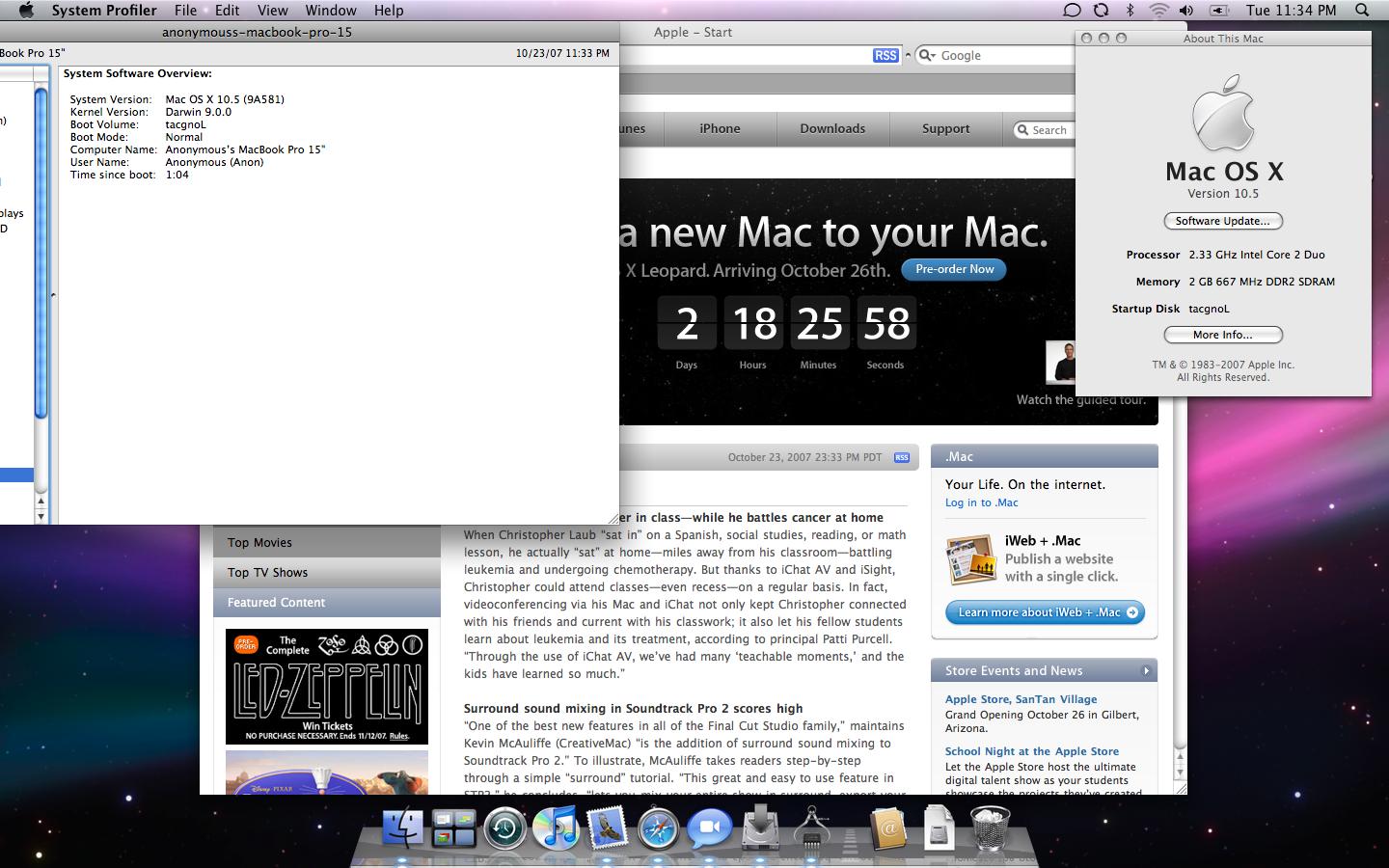
So I've seen a screenshot of the Dock on the side on MacRumors...it's nice. But I've lost hope for Aqua elements being removed...the buttons on the 'About This Mac' window are clearly Aqua.
Ah well...Apple came this ' ' close. Apple should at the very least remove the non-Aqua scrollbars from iTunes and iPhoto (if they haven't already).
|
|
|
| |
|
|
|
|
|
|
|
Baninated
Join Date: Oct 2002
Location: In yer threads
Status:
Offline
|
|
Originally Posted by Horsepoo!!!
So I've seen a screenshot of the Dock on the side on MacRumors...it's nice.
I guess. But it does show Apple changes such things at the last minute. 
But I've lost hope for Aqua elements being removed...the buttons on the 'About This Mac' window are clearly Aqua.
Well I've lost hope for Apple doing it anyhow. I still have two hands. 
Ah well...Apple came this ' ' close. Apple should at the very least remove the non-Aqua scrollbars from iTunes and iPhoto (if they haven't already).
They are... as far as I can see. Probablem is, iTunes supports double scroll bars.

iPhoto does not and does this.

Yay for consistency!
|
|
|
| |
|
|
|
|
|
|
|
Addicted to MacNN
Join Date: Aug 2004
Location: FFM
Status:
Offline
|
|
iPhoto supports scroll arrows placed together just fine:

|
|
|
| |
|
|
|
|
|
|
|
Addicted to MacNN
Join Date: Jul 2001
Location: Behind the dryer, looking for a matching sock
Status:
Offline
|
|
Originally Posted by Horsepoo!!!
So I've seen a screenshot of the Dock on the side on MacRumors...it's nice.
I wish the Dock would look like that on the bottom as well. I just don't really care for the pimped-out, multi-shadow, reflective look it has.
|
|
|
| |
|
|
|
|
|
|
|
Mac Enthusiast
Join Date: Jan 2007
Location: Amsterdam, NL
Status:
Offline
|
|
Originally Posted by Kevin
They are... as far as I can see. Probablem is, iTunes supports double scroll bars.
iPhoto does not and does this.
Yay for consistency!
My iMac does not share that problem with iPhoto...
 
Originally Posted by Horsepoo!!!
So I've seen a screenshot of the Dock on the side on MacRumors...it's nice.
Link?
Never mind, saw it on the front page.  I wouldn't mind having it like that at the bottom either. Looks nice.
|
|
|
| |
|
|
|
|
|
|
|
Posting Junkie
Join Date: Mar 2001
Location: Salamanca, España
Status:
Offline
|
|
Originally Posted by CharlesS
Two possibilities:
1. Apple's security has become really tight this time
2. The last build that was released to developers is the GM
I don't know which it is, but #2 wouldn't surprise me at all.
Door number one was the correct one.. it has been published on the series of tubes at TPB.
V
|
|
I could take Sean Connery in a fight... I could definitely take him.
|
| |
|
|
|
|
|
|
|
Senior User
Join Date: Aug 2002
Location: Auckland, NZ
Status:
Offline
|
|
Yeah that dock on the side looks nice! Are the desktop icons dock aware if it's on the right now? It would make it pretty tempting especially on a wide screen, which is really what they should be aiming towards given all the Apple displays are - enough of this focusing on having the dock at the bottom.
|
|
|
| |
|
|
|
|
|
|
|
Mac Enthusiast
Join Date: Jan 2007
Location: Amsterdam, NL
Status:
Offline
|
|
I heard this command will turn the 3D Dock into the 2D Dock while it's at the bottom of your screen.
Copy/paste in Terminal:
defaults write com.apple.dock no-glass -boolean YES
(
Last edited by .Neo; Oct 23, 2007 at 06:36 PM.
)
|
|
|
| |
|
|
|
|
|
|
|
Senior User
Join Date: Aug 2002
Location: Auckland, NZ
Status:
Offline
|
|
Heh, had a feeling it wouldn't be too hard .
|
|
|
| |
|
|
|
|
|
|
|
Professional Poster
Join Date: May 2007
Status:
Offline
|
|
Nice! I don't have too much of a problem with the look of the 3D dock, but the fact that the shelf ends halfway down the icons bothers me. Hopefully that command works!
|
|
|
| |
|
|
|
|
|
|
|
Posting Junkie
Join Date: Sep 2001
Status:
Offline
|
|
That side Dock is freakin' perfect. I like it much better.  I have mine on the left side as well. I've been using ClearDock forever to make the Dock look just like that—white trim with the faded black interior. Perfect!
|
|
|
| |
|
|
|
|
|
|
|
Mac Elite
Join Date: Nov 2005
Location: Seattle, WA, USA
Status:
Offline
|
|

Not taken by me, but found elsewhere on the intertubes. Nifty, if you really hate the new 3D dock.
|
 Any ramblings are entirely my own, and do not represent those of my employers, coworkers, friends, or species
|
| |
|
|
|
|
|
|
|
Posting Junkie
Join Date: Mar 2001
Location: Salamanca, España
Status:
Offline
|
|
Le screenshot from le 10.5
Ah.. 9A581 = 10.5.0 GM
V
|
|
I could take Sean Connery in a fight... I could definitely take him.
|
| |
|
|
|
|
|
|
|
Posting Junkie
Join Date: Sep 2001
Status:
Offline
|
|
Originally Posted by TheoCryst
Not taken by me, but found elsewhere on the intertubes. Nifty, if you really hate the new 3D dock.
Hallelujah. I'm doin' that Friday.
|
|
|
| |
|
|
|
|
|
|
|
Posting Junkie
Join Date: May 2001
Location: Brisbane, Australia
Status:
Offline
|
|
Just saying it: iChat theatre is freaking awesome and so is the Mosaic screensaver.
|
|
|
| |
|
|
|
|
|
|
|
Baninated
Join Date: Oct 2002
Location: In yer threads
Status:
Offline
|
|
Originally Posted by TETENAL
iPhoto supports scroll arrows placed together just fine:
Well I guess my picture is lying... (It does it on the one at work too)
And I have no third party GUI hacks going on. Lets say it doesn't consistently show up correctly.
[Edit] So I go into my system prefs. And hit the Place scroll arrows option a few times back and forth. Now iPhoto displays them "correctly" So it was still a bug.
Also no matter what I do, this never changes.

The top part is mismatched. If I can see these things glaringly, surely the people designing the GUI should. This is just lack of quality control.
|
|
|
| |
|
|
|
|
|
|
|
Baninated
Join Date: Oct 2002
Location: In yer threads
Status:
Offline
|
|
Originally Posted by MindFad
That side Dock is freakin' perfect. I like it much better. I have mine on the left side as well. I've been using ClearDock forever to make the Dock look just like that—white trim with the faded black interior. Perfect!
It's amazing how such a little GUI change makes a difference huh?
|
|
|
| |
|
|
|
|
|
|
|
Mac Enthusiast
Join Date: Jan 2007
Location: Amsterdam, NL
Status:
Offline
|
|
Originally Posted by Kevin
The top part is mismatched. If I can see these things glaringly, surely the people designing the GUI should. This is just lack of quality control.
Why don't you send feedback to Apple about that and the other "gap" bug?
|
|
|
| |
|
|
|
|
|
|
|
Baninated
Join Date: Oct 2002
Location: In yer threads
Status:
Offline
|
|
Originally Posted by .Neo
Why don't you send feedback to Apple about that and the other "gap" bug?
Done and did it. This happened when iTunes first changed scroll thumbs too. Then they started using the native ones.
|
|
|
| |
|
|
|
|
|
|
|
Mac Enthusiast
Join Date: Jan 2007
Location: Amsterdam, NL
Status:
Offline
|
|
What native ones in iTunes? I still have those purple things.
|
|
|
| |
|
|
|
|
|
|
|
Baninated
Join Date: Oct 2002
Location: In yer threads
Status:
Offline
|
|
Not in the most recent version of iTunes.. I was referring to an older build.
See some people use the hidden double scroll feature on both ends in Mac OSX. This makes all the new applications with their own GUI break or not show properly. (Steve says no double scroll on both sides!!1) iTunes just ignores it, iPhoto does what I showed above.
This was what happened with the first versions of iTunes as well. Then people complained, and Apple made iTunes either draw from the extras, or added graphic resources to it to support double on both ends.
|
|
|
| |
|
|
|
|
|
|
|
Mac Enthusiast
Join Date: Jan 2007
Location: Amsterdam, NL
Status:
Offline
|
|
Oh well, I guess it's an unsupported/hidden option for a reason.
|
|
|
| |
|
|
|
|
|
|
|
Baninated
Join Date: Oct 2002
Location: In yer threads
Status:
Offline
|
|
Cause Steve didn't want it available. I like having my double scroll on both ends. (It was cool in OS 9 too) I do think it looks better..
But honestly, since I've been using the scroll wheel it doesn't matter to me. So I can live with a single scroll at one end. No big deal anymore.
Except for the side to side one... which I fixed by making it so when I click on my wheel it changes to side to side. I love the scroll wheel.
And I'd have put the scroll at the top, not the bottom.
|
|
|
| |
|
|
|
|
|
|
|
Addicted to MacNN
Join Date: Feb 2003
Location: NY²
Status:
Offline
|
|
The black dock looks nice, but maybe I'm in the minority, but I like the 3D dock.
I couldn't care less that the lighting is off, etc, etc.
|
|
|
| |
|
|
|
|
|
|
|
Baninated
Join Date: Oct 2002
Location: In yer threads
Status:
Offline
|
|
I like the look of the 3D dock too. But I'll have to USE it first before making any comments. And I don't think the dock is black so much as it is transparent dark. Like sun glasses.
I like the way the 3D looks in screenshots. It seems more in tune with the focal point.
I see Apple updating it and a few other things before 10.6 hits.
|
|
|
| |
|
|
|
|
|
|
|
Addicted to MacNN
Join Date: Jul 2001
Location: Behind the dryer, looking for a matching sock
Status:
Offline
|
|
Originally Posted by MindFad
Hallelujah. I'm doin' that Friday.
Amen to that, brotha. Now, I just have to wait until Candybar 3 comes out so I can change the drab Leopard folders.
(
Last edited by xi_hyperon; Oct 24, 2007 at 11:24 AM.
)
|
|
|
| |
|
|
|
|
|
|
|
Mac Enthusiast
Join Date: Jan 2007
Location: Amsterdam, NL
Status:
Offline
|
|
On Mac OS X Leopard iTunes does not have those new min/max/close glyphs. Sucks.
|
|
|
| |
|
|
|
|
|
|
|
Baninated
Join Date: Oct 2002
Location: In yer threads
Status:
Offline
|
|
Originally Posted by .Neo
On Mac OS X Leopard iTunes does not have those new min/max/close glyphs. Sucks.
What are you referring to?
Originally Posted by xi_hyperon
Amen to that, brotha. Now, I just have to wait until Candybar 3 comes out so I can change the drab Leopard folders.
I LOVE Leopard's folders. Reminds me of Classic's look, but a bit more modern.
|
|
|
| |
|
|
|
|
|
|
|
Professional Poster
Join Date: Apr 2007
Location: A House of Ill-Repute in the Sky
Status:
Offline
|
|
Originally Posted by TheoCryst
Not taken by me, but found elsewhere on the intertubes. Nifty, if you really hate the new 3D dock.
Nice, a dock that darkens rather than lightens.
|
|
|
| |
|
|
|
|
|
|
|
Addicted to MacNN
Join Date: Jul 2001
Location: Behind the dryer, looking for a matching sock
Status:
Offline
|
|
Originally Posted by MindFad
Hallelujah. I'm doin' that Friday.
Originally Posted by Kevin
What are you referring to?
I LOVE Leopard's folders. Reminds me of Classic's look, but a bit more modern.
I know, I know, I am trying to like them, and maybe I'll get used to them. You are right, though, there's definitely an echo of Classic in them.
|
|
|
| |
|
|
|
|
|
|
|
Grizzled Veteran
Join Date: Aug 2002
Location: Springfield, Oregon
Status:
Offline
|
|
Interesting... Wonder how they got the new dock look to be at the bottom of the screen!? That is SO what I want! A rounded-corner dock, mmMMmm 
Originally Posted by TheoCryst
Not taken by me, but found elsewhere on the intertubes. Nifty, if you really hate the new 3D dock.
|
Live Victoriously. Live Virtuously. Hale the Old Gods!
Odin, Thor, Freya, Freyr, Sif, Balder, Frigga, Loki, Ran, Njord, Aegir, Bragi, Forseti, Gefion, Heimdall, Hermod, Hulda, Idhunn, Mimir, Sigyn, Skadi, Tyr, Ull, Nanna.
Hale All!
|
| |
|
|
|
|
|
|
|
Clinically Insane
Join Date: Oct 2000
Location: Los Angeles
Status:
Offline
|
|
The noglass command works no matter where the Dock is located, apparently.
|

"The natural progress of things is for liberty to yield and government to gain ground." TJ
|
| |
|
|
|
|
|
|
|
Baninated
Join Date: Oct 2002
Location: In yer threads
Status:
Offline
|
|
I still like the LOOK of the other better. But I will have to check it out before making final decision. Hopefully by the time I get home..
|
|
|
| |
|
|
|
|
|
|
|
Mac Elite
Join Date: Jul 2003
Location: North Carolina
Status:
Offline
|
|
Originally Posted by TheoCryst
Not taken by me, but found elsewhere on the intertubes. Nifty, if you really hate the new 3D dock.
Awesome. I really hate the new dock and that'll be the first thing I do on Friday. The second thing I want to do is disable stacks and enable the old folder browsing within the dock functionality.
Anyone know if there's a similar command that can disable stacks? Oh, and also disabling the folder preview icon in the dock. I don't want the appearance of folders in my dock changing.
|
|
|
| |
|
|
|
|
|
|
|
Addicted to MacNN
Join Date: May 2001
Status:
Offline
|
|
I'm with Kevin. I prefer to have double scroll arrows at the top and the bottom of the scroll bar. Every time I install a new version of OS X I just enter the following in Terminal:
defaults write "Apple Global Domain" AppleScrollBarVariant DoubleBoth
That's all it takes and it works perfectly. Unfortunately, the new iTunes just doesn't respect this setting. The value of this approach is that you can change direction on your scroll without having to mouse all the way to the top/bottom of the window.
OAW
|
|
|
| |
|
|
|
|
|
|
|
Posting Junkie
Join Date: May 2001
Location: Brisbane, Australia
Status:
Offline
|
|
Originally Posted by G0Ducks
Interesting... Wonder how they got the new dock look to be at the bottom of the screen!? That is SO what I want! A rounded-corner dock, mmMMmm
Someone didn't actually look at the screen shot.
|
|
|
| |
|
|
|
|
|
|
|
Baninated
Join Date: Oct 2002
Location: In yer threads
Status:
Offline
|
|
Originally Posted by OAW
I'm with Kevin. I prefer to have double scroll arrows at the top and the bottom of the scroll bar. Every time I install a new version of OS X I just enter the following in Terminal:
defaults write "Apple Global Domain" AppleScrollBarVariant DoubleBoth
That's all it takes and it works perfectly. Unfortunately, the new iTunes just doesn't respect this setting. The value of this approach is that you can change direction on your scroll without having to mouse all the way to the top/bottom of the window.
OAW
And I have always done this, and liked this setting. If Apple doesn't want people doing it, they need to take the option out.
I don't care really much anymore since the scroll wheel.
But still. I think it aesthetically looked better.
|
|
|
| |
|
|
|
|
|
|
|
Posting Junkie
Join Date: May 2001
Location: Brisbane, Australia
Status:
Offline
|
|
Regarding TimeMachine
Currently you have to invoke Time Machine through opening the application itself, which means you always need to have it in the dock. Is it me or does this seem inconsistent with how similar features are invoked in OS X like Dashboard or Exposé? I know that by default Dashboard at least have a dock-icon, but most people remove that and use the keyboard shortcut instead.
Furthermore, not all applications support Time Machine. Invoking it in Mail, iPhoto or Address Book gives Time Machine interfaces for those, but anywhere else it gives you the front-most Finder window.
So wouldn't it make more sense to have a toolbar button in the applications that support it instead? QuickLook gets its own toolbar button in Finder, so why not Time Machine? A global button (dock icon) makes little sense when the feature is applied to a local window.
I could still see a global keyboard shortcut be useful too though.
|
|
|
| |
|
|
|
|
|
|
|
Professional Poster
Join Date: May 2007
Status:
Offline
|
|
Fully agree, but I think that the dock icon is the best way to do it. The other option would be a menu bar icon (too small), or a Time Machine Icon in each supported app (too complicated and confusing)
|
|
|
| |
|
|
|
|
|
|
|
|
|
|
|
|
 
|
|
|
Forum Rules
|
|
|
|
You may not post new threads
You may not post replies
You may not post attachments
You may not edit your posts
|
HTML code is Off
|
|
|
|
|
|
|
|
|
|
|
|