|
 |
Latest Leopard Seed: Brushed Metal is Dead (Page 2)
|
|
|
|
|
Professional Poster
Join Date: Jan 2002
Location: London, UK
Status:
Offline
|
|
Transparent title bars (for inactive windows) is something Apple had in 10.0 (and 10.1?) and were dropped - Apple has already been through the "wow" phase 6 years ago.
FWIW, one thing that is very apparent from the screen shots at Think Secret is that the dark look makes the "status" bar text at the bottom of Finder windows barely legible.
|
|
|
| |
|
|
|
|
|
|
|
Posting Junkie
Join Date: Feb 2005
Location: 888500128
Status:
Offline
|
|
Originally Posted by JKT 
Transparent title bars (for inactive windows) is something Apple had in 10.0 (and 10.1?) and were dropped - Apple has already been through the "wow" phase 6 years ago.
That is probably my favorite little tidbit about Vista.
"Oh yeah, Apple tried that seven years ago, but decided it sucked."
Wow.

|
|
|
| |
|
|
|
|
|
|
|
Clinically Insane
Join Date: Dec 1999
Status:
Offline
|
|
Originally Posted by analogika
"Oh yeah, Apple tried that seven years ago, but decided it sucked."
"Oh yeah, Apple tried that seven years ago, but decided it sucked. But we decided, 'Hey, why stop at suck?' So we made the transparencies frosted so you can't actually see what's behind it, rendering the point of a transparent window, well, pointless!"
Fixed. 
|
|
"…I contend that we are both atheists. I just believe in one fewer god than
you do. When you understand why you dismiss all the other possible gods,
you will understand why I dismiss yours." - Stephen F. Roberts
|
| |
|
|
|
|
|
|
|
Clinically Insane
Join Date: Oct 2001
Location: San Diego, CA, USA
Status:
Offline
|
|
I liked the transparency on inactive title bars, personally. It both de-emphasized the windows and blocked out less of the desktop. Having it on active windows is annoying, though.
|
|
Chuck
___
"Instead of either 'multi-talented' or 'multitalented' use 'bisexual'."
|
| |
|
|
|
|
|
|
|
Professional Poster
Join Date: Jan 2002
Location: London, UK
Status:
Offline
|
|
Originally Posted by Chuckit
I liked the transparency on inactive title bars, personally. It both de-emphasized the windows and blocked out less of the desktop. Having it on active windows is annoying, though.
Ditto - OS X has become noticeably blander and more boring looking with each version, and it looks like Leopard has the potential to make things even worse. Personally, I can't bear the iTunes 7 look and this is seemingly what we are going to get.
|
|
|
| |
|
|
|
|
|
|
|
Addicted to MacNN
Join Date: Oct 2002
Location: England | San Francisco
Status:
Offline
|
|
surely they're removing all the tiger themes and leaving them that colour so they can add the new UI stuff at the very last minute? </obvious>
|
|
we don't have time to stop for gas
|
| |
|
|
|
|
|
|
|
Professional Poster
Join Date: Mar 2003
Location: Down by the river
Status:
Offline
|
|
I don't particularly care for a flashy interface so much as one that's consistent, easy on the eyes, and easy to figure out. I know when I shopped for a car I wanted capabilities, not crazy effects on my speedometer...
|
|
|
| |
|
|
|
|
|
|
|
Addicted to MacNN
Join Date: Aug 2004
Location: FFM
Status:
Offline
|
|
|
|
|
|
| |
|
|
|
|
|
|
|
Posting Junkie
Join Date: May 2001
Location: Brisbane, Australia
Status:
Offline
|
|
Originally Posted by TETENAL
Haha. This thread is hillarious 
BTW, where did Gorgonzoloa get this piece of information? Out of his ass?
Originally Posted by Gorgonzola
Be pleased. Apple is writing an Appearance Control app that will let you skin X to your hearts content...
like Kaleidoscope, but built by Apple and thus fully supported by the OS.
It will appear in a new iTools section where people can post their appearance themes.
have fun
i can smell aqua burning as we speak
I'm guessing ass here.
|
|
|
| |
|
|
|
|
|
|
|
Addicted to MacNN
Join Date: Feb 2003
Location: NY²
Status:
Offline
|
|
Maybe he got it from ThinkSecret.
|
|
|
| |
|
|
|
|
|
|
|
Professional Poster
Join Date: Mar 2002
Location: Brantford, ON. Canada
Status:
Offline
|
|
Originally Posted by - - e r i k - -
Haha. This thread is hillarious
BTW, where did Gorgonzoloa get this piece of information? Out of his ass?
I'm guessing ass here.
More like his post was all sarcasm, and you apparently missed it 
|
|
|
| |
|
|
|
|
|
|
|
Posting Junkie
Join Date: May 2001
Location: Brisbane, Australia
Status:
Offline
|
|
Originally Posted by kmkkid
More like his post was all sarcasm, and you apparently missed it
O rly? More like he was restating a rumor judging by everyone else.
In fact what he was talking about was the misunderstanding that Apperance would allow skins as well as just switching between aqua and platinum.
|
|
|
| |
|
|
|
|
|
|
|
Posting Junkie
Join Date: Nov 2000
Location: in front of my Mac
Status:
Offline
|
|
Originally Posted by Chuckit
I liked the transparency on inactive title bars, personally. It both de-emphasized the windows and blocked out less of the desktop. Having it on active windows is annoying, though.
I agree. I like transparency on inactive windows (de-emphasizes and helps inactive windows get 'out of your way'), but I think active elements (windows and menus) should be solid.
|
|
•
|
| |
|
|
|
|
|
|
|
Posting Junkie
Join Date: Nov 2000
Location: in front of my Mac
Status:
Offline
|
|
Originally Posted by - - e r i k - -
I'm guessing ass here.
If he didn't get it from MOSR I'd guess ass as well.
|
|
•
|
| |
|
|
|
|
|
|
|
Mac Elite
Join Date: May 2000
Location: Not Quite Phoenix
Status:
Offline
|
|
I'm not a designer. I'm not a GUI expert. I'm just an end-user who knows what he likes.
All the Aqua elements seem out of date. Some will say change for change's sake is dumb. It may be, but I'm ready for something different. Enough with the gummy gels.
I must be the only one in Macland who never had a problem with Brushed Metal. I get that originally it was to be used only for apps that had a real-world counterpart. Calculator, DVD Player, etc... Then they bastardized it and used it randomly for a lot of stuff. Still, I didn't mind it most of the time.
I'm just hoping for some consistency in Leopard. Whatever they go with, I hope it's the ONLY look. No more Aqua this, Brushed Metal that, Unified the other. Just pick one.
And here's my official wish/guess that the rumored "Licorice" theme will be it. Somebody hinted at the iPhone's dark interface elements. I'd welcome that. And look at the pro apps, not to mention certain elements of iLife, like the iPhoto "Edit" dialogue.
I'd love a dark theme like that, with a restrained splash of gloss here and there.
|
|
Jalen's dad. Carrie's husband. partisan. Bleu blanc et rouge.
|
| |
|
|
|
|
|
|
|
Mac Elite
Join Date: Mar 2002
Status:
Offline
|
|
Originally Posted by TETENAL
Funny. When Aqua was new people complained that it was "too bright". Just three threads out of many:
Now the darker unified variant is "too dark".
Cheetah:

Panther w/ Iridium:

Tiger:

Leopard?:

If Apple want to go ahead with that dark look, they should at least give users the option to change the Finder window background colour in column mode. The difference in brightness between title bar and window content is too extreme, in my opinion.
And what's with this crap?

I mean, just look at it. The text is clearly too dark for the background they picked, so what do they do? They add a bloody white shadow, one pixel down. Hideous.
|
|
|
| |
|
|
|
|
|
|
|
Addicted to MacNN
Join Date: Aug 2004
Location: FFM
Status:
Offline
|
|
Originally Posted by red rocket
If Apple want to go ahead with that dark look, they should at least give users the option to change the Finder window background colour in column mode. The difference in brightness between title bar and window content is too extreme, in my opinion.
Do you have a problem with this in iTunes? I have never heard someone complain about this there.
Actually, I don't even see this as darker as the current brushed metal appearance of Finder.
The text is clearly too dark for the background they picked, so what do they do? They add a bloody white shadow, one pixel down. Hideous.
They did nothing. That's exactly the same way the text is drawn as it is now in Tiger.
|
|
|
| |
|
|
|
|
|
|
|
Professional Poster
Join Date: Jan 2002
Location: London, UK
Status:
Offline
|
|
Originally Posted by TETENAL
Do you have a problem with this in iTunes? I have never heard someone complain about this there.
Actually, I don't even see this as darker as the current brushed metal appearance of Finder.
The brushed metal is noticeably brighter in the vertical centre of windows (i.e. it has a gradient applied to it). FWIW, iTunes doesn't have a pure colour main window due to the striping to indicate each row.
They did nothing. That's exactly the same way the text is drawn as it is now in Tiger.
That's the problem - the bright white drop shadow for the Finder text is "popping" in the Leopard screenshots which makes the text difficult to read on the darker background - if you look at iTunes, they use a subtler grey highlight which makes the same text legible.
|
|
|
| |
|
|
|
|
|
|
|
Clinically Insane
Join Date: Oct 2001
Location: San Diego, CA, USA
Status:
Offline
|
|
Originally Posted by red rocket
And what's with this crap?
I mean, just look at it. The text is clearly too dark for the background they picked, so what do they do? They add a bloody white shadow, one pixel down. Hideous.
The white "shadow" has always been there. It's kind of a convention on brushed-metal windows. I think it was first introduced in iTunes. Anyway, like I've said, I suspect unifying the GUI is only the first step to something else.
|
|
Chuck
___
"Instead of either 'multi-talented' or 'multitalented' use 'bisexual'."
|
| |
|
|
|
|
|
|
|
Fresh-Faced Recruit
Join Date: Apr 2007
Location: UK
Status:
Offline
|
|
I've been lurking here for a while and have been interested in the speculation about Leopard's UI.
Based on no inside information and trying desperately to keep my own wishful thinking out of the equation, here are my thoughts:
1. The name 'Leopard' scream to me that it's the version where OS X *does* change its spots.
2. I think these latest screengrabs use a placeholder UI. Why? If I wanted to develop and test a new UI engine, but keep the actual style under wraps I'd use something that was similar to the status quo, but different enough to tell if it's working as it should.
3. Those drop shadows in the status bar text look horrible, as has already been mentioned. Similar drop shadows in iTunes look much better. In this respect the UI looks unfinished. If all they were doing was darkening the existing UI, would this have got into the beta at all?
4. Aqua is very long in the tooth. Why did Apple get rid of it in iTunes 7 if it didn't think so too?
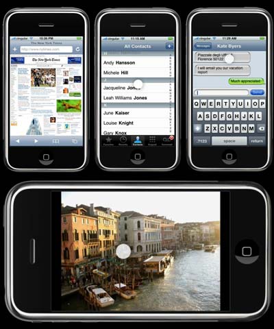
5. Regardless of the differences in user interface, I can't believe Apple won't capitalise on the clamour for the iPhone by not bringing Leopard more in line style-wise, especially if the two are sharing at least a subset of the same OS.
6. I also find it hard to believe that the styles adopted by Aperture and the Leopard Sneak Peek pages on apple.com are completely removed from how Leopard will end up looking too. (although this kind-of contradicts point 4.
7. Anything Microsoft can do, Apple can do better.
|
|
|
| |
|
|
|
|
|
|
|
Posting Junkie
Join Date: Sep 2001
Status:
Offline
|
|
I like that everything is unified, now, but honestly, I think it's a smidge too dark. Contrasts a bit much with the content of the window for my tastes, but hey—it's a great start in unification. I am agreeing with the placeholder idea even more because of the practically unreadable at the bottom of windows (as pointed out above). Seems like they're just getting everything in place to do the real fiddling.
|
|
|
| |
|
|
|
|
|
|
|
Clinically Insane
Join Date: Oct 2001
Location: San Diego, CA, USA
Status:
Offline
|
|
Personally, I'm expecting to see the final UI at WWDC. That will probably be the big thing announced there. I wonder if it will be more than a skin. There are a lot of ideas that have been toyed around with since the original developer previews of OS X.
|
|
Chuck
___
"Instead of either 'multi-talented' or 'multitalented' use 'bisexual'."
|
| |
|
|
|
|
|
|
|
Addicted to MacNN
Join Date: Jul 2004
Location: Toronto
Status:
Offline
|
|
Originally Posted by PhilH
The name 'Leopard' scream to me that it's the version where OS X *does* change its spots.
Yeah, that's certain.
Originally Posted by PhilH
Regardless of the differences in user interface, I can't believe Apple won't capitalise on the clamour for the iPhone by not bringing Leopard more in line style-wise, especially if the two are sharing at least a subset of the same OS.
Take a look at the blue-ish "windows" in the iPhone. Maybe Leopard will also have these gray-blue windows instead of dark gray? And those dark blue toolbar buttons for iPhone's Mail app look vaguely like the dark blue toolbar buttons in Tiger's Mail app.
|
|
|
| |
|
|
|
|
|
|
|
Fresh-Faced Recruit
Join Date: Apr 2007
Location: UK
Status:
Offline
|
|
Originally Posted by lpkmckenna
Take a look at the blue-ish "windows" in the iPhone. Maybe Leopard will also have these gray-blue windows instead of dark gray?
Is it me, or do those blue-ish windows look roughly the same colour as the scollbars in iTunes 7?
Hmmm.
|
|
|
| |
|
|
|
|
|
|
|
Posting Junkie
Join Date: May 2001
Location: Brisbane, Australia
Status:
Offline
|
|
Unfeasable. A blue interface would screw up every graphic designer on the planet.
|
|
|
| |
|
|
|
|
|
|
|
Mac Elite
Join Date: May 2000
Location: Not Quite Phoenix
Status:
Offline
|
|
Originally Posted by - - e r i k - -
Unfeasable. A blue interface would screw up every graphic designer on the planet.
That's why there'd likely still be a "graphite" version for those who just want their GUI to get out of the way.
|
|
Jalen's dad. Carrie's husband. partisan. Bleu blanc et rouge.
|
| |
|
|
|
|
|
|
|
Posting Junkie
Join Date: Nov 2000
Location: in front of my Mac
Status:
Offline
|
|
Am I the only one here who thinks Apple might be smart enough to understand that a GUI for a cell phone (and iPod) doesn't have the same requirements as the GUI of an OS and therefore not every design choice made by the iPhone team will necessarily also be present in Leopard?
|
|
•
|
| |
|
|
|
|
|
|
|
Fresh-Faced Recruit
Join Date: Apr 2007
Location: UK
Status:
Offline
|
|
Originally Posted by Simon
Am I the only one here who thinks Apple might be smart enough to understand that a GUI for a cell phone (and iPod) doesn't have the same requirements as the GUI of an OS and therefore not every design choice made by the iPhone team will necessarily also be present in Leopard?
No, of course not. But will they leave them completely stylistically unrelated? I doubt it.
The point about the importance of a neutral scheme to suit graphic designers is very valid, although we've already seen apps like Aperture, Lightroom and the new Quicklook (I think that's what it's called) coming with their own dark UIs.
While it would be nice to have a more consistant UI, it would be even better if the UI was flexible to meet the needs of each app. After all, just because image manipulation benefits from a darkroom-like environment doesn't mean that everybody will want to stare into the crypt all the time.
|
|
|
| |
|
|
|
|
|
|
|
Addicted to MacNN
Join Date: Apr 2005
Status:
Offline
|
|
Talk about a boring theme; it's like Platinum crossed with Windows 98. I doubt this will be the final look for Leopard.
|
|
|
| |
|
|
|
|
|
|
|
Posting Junkie
Join Date: May 2001
Location: Brisbane, Australia
Status:
Offline
|
|
Aperture does not have a dark UI. Most of it's UI is around 18% grey, which is ideal for photography.
The viewer background is adjustable (as each photograph benefits from a different background), but by default it is 25% grey.
I don't see how that is a dark UI at all.
|
|
|
| |
|
|
|
|
|
|
|
Baninated
Join Date: Oct 2002
Location: In yer threads
Status:
Offline
|
|
Originally Posted by JKT
Ditto - OS X has become noticeably blander and more boring looking with each version, and it looks like Leopard has the potential to make things even worse. Personally, I can't bear the iTunes 7 look and this is seemingly what we are going to get.
Um a GUI should be a wrapper for the content. It should NEVER distract from it. That is why Platinum was so awesome. Esp for design.
|
|
|
| |
|
|
|
|
|
|
|
Addicted to MacNN
Join Date: Mar 1999
Location: Bellevue, WA
Status:
Offline
|
|
After seeing those screenshots, I prefer the brushed metal on Tiger.
|
|
|
| |
|
|
|
|
|
|
|
Posting Junkie
Join Date: Jan 2006
Location: Colorado
Status:
Offline
|
|
I prefer Tiger as well or Panther.
|
|
|
| |
|
|
|
|
|
|
|
Professional Poster
Join Date: Jan 2002
Location: London, UK
Status:
Offline
|
|
Originally Posted by Kevin
Um a GUI should be a wrapper for the content. It should NEVER distract from it. That is why Platinum was so awesome. Esp for design.
Who said an attractive GUI need be distracting? Is it beyond Apple's scope to design an UI that isn't tedious to look at but is functional as well? Or to provide a separate dumbed down, blandest of the bland "pro" theme for the minority of their users who need it?
|
|
|
| |
|
|
|
|
|
|
|
Professional Poster
Join Date: Apr 1999
Location: Copenhagen, Denmark
Status:
Offline
|
|
Originally Posted by JKT
That's the problem - the bright white drop shadow for the Finder text is "popping" in the Leopard screenshots which makes the text difficult to read on the darker background - if you look at iTunes, they use a subtler grey highlight which makes the same text legible.
The correct statement would've been. They did nothing because they didn't get to that part yet.
It's 100% clear that the current built of Leopard just unified the interface and removed the brushed metal and the light unified look. Nothing else has been made to unify the previous two looks.
|
|
JLL
- My opinions may have changed, but not the fact that I am right.
|
| |
|
|
|
|
|
|
|
Baninated
Join Date: Oct 2002
Location: In yer threads
Status:
Offline
|
|
Originally Posted by JKT
Who said an attractive GUI need be distracting? Is it beyond Apple's scope to design an UI that isn't tedious to look at but is functional as well? Or to provide a separate dumbed down, blandest of the bland "pro" theme for the minority of their users who need it?
IT isn't the minority that is asking for it. It's the majority. It's the minority that wants the bells and whistles and flashy shiny stuff.
Why else would Apple be moving from Aqua, to something a bit more usable?
Compared to Platinum, Aqua was HORRIBLE as far as HIG went. Distracting fruity colors and stripes? On a OS that is used for design?
I am just glad you could set to graphite, and hack the stripes out.
I did that with the FIRST prerelease OS X out. Before the Public Beta. That is where "simple aqua" came from.
But I wanted a more platinum less distracting look. That is where Sosumi came from. TONS of people loved that theme because of it's easy on the eyes features.
Apple just kept changing and bloating the Extras.rsrc and people kept ripping off themers where it became no fun.
It would be GREAT if Apple offered a easy to theme OS that had built in theme support. That would really set OS X over the edge.
But UNTIL then, Apple NEEDS a usable non-distracting GUI.
|
|
|
| |
|
|
|
|
|
|
|
Clinically Insane
Join Date: Oct 2001
Location: San Diego, CA, USA
Status:
Offline
|
|
Originally Posted by Kevin
IT isn't the minority that is asking for it. It's the majority. It's the minority that wants the bells and whistles and flashy shiny stuff.
Why else would Apple be moving from Aqua, to something a bit more usable?
Who said Apple isn't moving from Aqua to Rainbow, so to speak? I don't see any reason to believe it will be more usable from your point of view.
|
|
Chuck
___
"Instead of either 'multi-talented' or 'multitalented' use 'bisexual'."
|
| |
|
|
|
|
|
|
|
Professional Poster
Join Date: Mar 2002
Location: Brantford, ON. Canada
Status:
Offline
|
|
Originally Posted by Kevin
Compared to Platinum, Aqua was HORRIBLE as far as HIG went. Distracting fruity colors and stripes? On a OS that is used for design?
OS X isn't just used by Designers/Pros anymore, and Apple is realizing that. Sure they need to give the option for a 'monochromatic' GUI, but I believe they will definitely be leaning towards home users for this release, and make it 'flashier' to compete with Vistas GUI. The iPhones GUI shows that Apple wants to be hip and cool still, and to do that at this point in time means you have to be 3D, flashy, special effect laden, to grab the prospective users attention. People realize now that computers don't have to be bland, and would rather have all the eye candy in the world.
|
|
|
| |
|
|
|
|
|
|
|
Baninated
Join Date: Oct 2002
Location: In yer threads
Status:
Offline
|
|
Originally Posted by Chuckit
Who said Apple isn't moving from Aqua to Rainbow, so to speak? I don't see any reason to believe it will be more usable from your point of view.
Compared to the screenshots I saw with the "new" GUI it is.
Originally Posted by kmkkid
OS X isn't just used by Designers/Pros anymore and Apple is realizing that
No, but A GREAT AMOUNT of income comes from this group. I would never make a comment as to what Apple was realizing since I am not Apple nor do I realize what they are realizing. I do know OS X's gui was designed to OOOH and AAAH computer users to garner more sales. This sorta backfired on them however.
Sure they need to give the option for a 'monochromatic' GUI, but I believe they will definitely be leaning towards home users for this release, and make it 'flashier' to compete with Vistas GUI.
There can be "flashiness" while still being usable. For example FOR IT'S TIME Platium was pretty modern looking. Yet very usable.
You really can't say the same about Aqua.
The iPhones GUI shows that Apple wants to be hip and cool still, and to do that at this point in time means you have to be 3D, flashy, special effect laden, to grab the prospective users attention.
Actually I don't mind iPhone's GUI. It's more centered towards what I am referring to. I am not sure at this point you understand my complaint.
You can have "prettiness" and "eye candy" and still be usable.
Aqua wasn't a good example of this. With it's distracting stand out colors and horizontal stripes.
Regardless of WHAT you do with your computer, your GUI should never take over the content. The content, be it a web page, or what have you should always be the focal point of what you are looking at.
This holds true not matter what you use your computer for.
It's just more important for graphics people.
|
|
|
| |
|
|
|
|
|
|
|
Professional Poster
Join Date: Mar 2003
Location: Down by the river
Status:
Offline
|
|
I'd love it if Apple used the theme for Aperture for the rest of the UI. Nice looking yet subtle and refined.

|
|
|
| |
|
|
|
|
|
|
|
Baninated
Join Date: Oct 2002
Location: In yer threads
Status:
Offline
|
|
Yeah that is sweet. Just give it iTune's scroll bars .
|
|
|
| |
|
|
|
|
|
|
|
Professional Poster
Join Date: Mar 2002
Location: Brantford, ON. Canada
Status:
Offline
|
|
Platinum was ugly and dull. Just FYI
|
|
|
| |
|
|
|
|
|
|
|
Professional Poster
Join Date: Feb 2007
Location: T •
Status:
Offline
|
|
Originally Posted by cgc
I'd love it if Apple used the theme for Aperture for the rest of the UI. Nice looking yet subtle and refined.
I like it also but it is a bit cold and much of the UI is tiny even on a 20" LCD.
|
|
|
| |
|
|
|
|
|
|
|
Baninated
Join Date: May 2005
Location: England
Status:
Offline
|
|
i think it looks fugly atm.
|
|
|
| |
|
|
|
|
|
|
|
Senior User
Join Date: Mar 2007
Location: South Carolina
Status:
Offline
|
|
Apple should do what UNO does and stop right there until a new windowless borderless GUI arrives.
|
|
Web dev, Poe, faux-naïf, keyboard warrior, often found imitating online contrarians . My stuff : DELL XPS, iPhone 6
|
| |
|
|
|
|
|
|
|
Clinically Insane
Join Date: Oct 2001
Location: San Diego, CA, USA
Status:
Offline
|
|
Originally Posted by kmkkid
Platinum was ugly and dull. Just FYI
Platinum was not particularly interesting, but I don't think it was ugly. Definitely could have been better, but I still think it's one of the better themes I've seen on an OS.
|
|
Chuck
___
"Instead of either 'multi-talented' or 'multitalented' use 'bisexual'."
|
| |
|
|
|
|
|
|
|
Mac Elite
Join Date: Aug 2001
Status:
Offline
|
|
Aperture's UI theme is probably the best I've seen. Subdued, unintrusive, beautiful.
|
|
|
| |
|
|
|
|
|
|
|
Addicted to MacNN
Join Date: Aug 2004
Location: FFM
Status:
Offline
|
|
Aperture is good, but I think it could be better. Aperture's is a little bit boring and especially the scrollbars could be better. iTunes' scroolbars are better and I don't think even those are perfect.
|
|
|
| |
|
|
|
|
|
|
|
Posting Junkie
Join Date: Jan 2006
Location: Colorado
Status:
Offline
|
|
I do like Aperture as well. I think Leopard should take some cues from Apple's Pro apps.
|
|
|
| |
|
|
|
|
|
|
|
Posting Junkie
Join Date: Nov 2000
Location: in front of my Mac
Status:
Offline
|
|
Aperture looks serious and it's fairly cleaned up. I'd get rid of the gumdrop window buttons and scroll bars too though (iTunes' scroll bars aren't great but they are better).
My biggest gripe with the Aperture UI is that it's so darn gray. If I look at such a dark gray screen for 14h a day I'm bound to get depressed. At the very least they should brighten it up a bit.
|
|
•
|
| |
|
|
|
|
|
|
|
|
|
|
|
|
 
|
|
|
Forum Rules
|
|
|
|
You may not post new threads
You may not post replies
You may not post attachments
You may not edit your posts
|
HTML code is Off
|
|
|
|
|
|
|
|
|
|
|
|