|
 |
Idea....themers read (Page 2)
|
|
|
|
|
Mac Elite
Join Date: Nov 2002
Status:
Offline
|
|
Originally posted by MorphOSX:
I'm already drooling
Dave
lol glad you like what you see so far. I'm going to rework the buttons before I'm done, I don't like them the way they are now.
So anyone up to maybe making some icons and desktops for it?
|
|
|
| |
|
|
|
|
|
|
|
Mac Elite
Join Date: Jan 2003
Location: Montpellier
Status:
Offline
|
|
Pretty nice. Eventhough I'm not a big fan of army green colors, your dark green mock-up is promising. Keep going 
|
|
Powerbook 1.67ghz 15" (100GB HD, 128MB VRAM, 1.5GB RAM)
|
| |
|
|
|
|
|
|
|
Mac Elite
Join Date: Apr 2003
Location: SoCal
Status:
Offline
|
|
Here's an idea I've been toying around with lately...

I dunno if it would be considered too Shinobi-ish though.
|
|
|
| |
|
|
|
|
|
|
|
Mac Elite
Join Date: Nov 2002
Status:
Offline
|
|
Originally posted by Sage:
Here's an idea I've been toying around with lately...
I dunno if it would be considered too Shinobi-ish though.
Ya glowing LEDs are kinda cool.
|
|
|
| |
|
|
|
|
|
|
|
GUI Punk
Join Date: Jan 2002
Location: S.E. Mitten
Status:
Offline
|
|
Originally posted by Sage:
Here's an idea I've been toying around with lately...
I dunno if it would be considered too Shinobi-ish though.
Its cool, has the Shake feel.
|
 24" AlumiMac 2.4ghz C2D, 4g Ram, 300g HD, 750g USBHD • 80g iPod • 160g ATV • iPhone 3g
|
| |
|
|
|
|
|
|
|
Mac Elite
Join Date: Apr 2003
Location: SoCal
Status:
Offline
|
|
Thanks! 
I'll probably wait on it until the SS version with Omega comes out to see if there are any extra goodies (not to mention I'll have more time then, since Finals week is coming up soon!)
|
|
|
| |
|
|
|
|
|
|
|
Mac Elite
Join Date: Nov 2002
Status:
Offline
|
|
Originally posted by Sage:
Thanks!
I'll probably wait on it until the SS version with Omega comes out to see if there are any extra goodies (not to mention I'll have more time then, since Finals week is coming up soon!)
You kinda gave me an idea for an end light on the buttons, (nothing like yours) I'll work it into my mockup.
|
|
|
| |
|
|
|
|
|
|
|
Mac Elite
Join Date: Apr 2003
Location: SoCal
Status:
Offline
|
|
Originally posted by NetworkShadow:
You kinda gave me an idea for an end light on the buttons, (nothing like yours) I'll work it into my mockup.
No prob. This is an open source project of sorts, so feel free to adapt ideas.
|
|
|
| |
|
|
|
|
|
|
|
Mac Enthusiast
Join Date: Sep 2001
Location: C'dale, IL
Status:
Offline
|
|
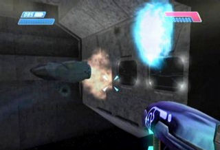
NetworkShadow ... I like your Halo concept, it's really nice. However, my only suggestion is that you tone down the glare and amount of shine in the overall look. The textures in Halo seem more dusty and rugged to me. Here is what I propose:

Just some constructive criticism. Of course, it is your theme so do what you want with it man
//Carbon
|

:: Carbon Themes v1.5 ::
|
| |
|
|
|
|
|
|
|
Mac Elite
Join Date: Apr 2003
Location: SoCal
Status:
Offline
|
|
Heh heh... knowing NetworkShadow, he absolutely loves shine (just look at Dark Glass and his website ). Not that that's necessarily a bad thing, but I think it'll take some extra convincing to get him to tone it down.
|
|
|
| |
|
|
|
|
|
|
|
Mac Enthusiast
Join Date: Sep 2003
Location: Pittsburgh, PA
Status:
Offline
|
|
Somewhere in between maybe? I like and would use either one.
|
|
|
| |
|
|
|
|
|
|
|
Mac Elite
Join Date: Nov 2002
Status:
Offline
|
|
Ya I indeed plan on making the metal more warn looking once I get to the point of doing the finished art.


Your mockup has lost the metallic look and has more of a plastic look, but maybe a bit more like the Halo 2 armor in the 2nd screen. I intend on keeping the metallic look in mine. As for the dark widget cap, the lights like that are on the green metal on the actual armor design, but I may try like you did. Thanks for the input.
Edit: wow replies before I'm done replaying myself. Ya I may tone it down just a bit, but not a lot I know I want to keep it as metallic as I can.
Hay how about a theme based on the aliens?
|
|
|
| |
|
|
|
|
|
|
|
Forum Regular
Join Date: Jan 2002
Status:
Offline
|
|
|
(
Last edited by MorphOSX; Dec 9, 2003 at 04:06 AM.
)
|
|
|
| |
|
|
|
|
|
|
|
Junior Member
Join Date: Sep 2003
Status:
Offline
|
|
A Covenant theme? As long as the colors are balanced (i.e. not all blue). And yeah, that would be shiny.
|
|
|
| |
|
|
|
|
|
|
|
Mac Enthusiast
Join Date: Dec 2001
Location: Michigan
Status:
Offline
|
|
can you do this now with themes? or could you always do it?
like the first one would be the standard look and then the second would be the mouse over. if anyone knows what i mean by this then let me know the answer. That would be cool to do, have it like disappear on mouse over. And even maybe do it for the right side also?
|
|
|
| |
|
|
|
|
|
|
|
Junior Member
Join Date: Sep 2003
Status:
Offline
|
|
Originally posted by Hi I'm Mike:
can you do this now with themes? or could you always do it?
like the first one would be the standard look and then the second would be the mouse over. if anyone knows what i mean by this then let me know the answer. That would be cool to do, have it like disappear on mouse over. And even maybe do it for the right side also?
I know what you mean, and I suspect that's it's possible, but I don't think I would like it necessarily. At least with this color scheme and theme concept. For a theme that was in imitation of flashing lights and LED's, it would be entirely appropriate.
|
|
|
| |
|
|
|
|
|
|
|
Professional Poster
Join Date: Jun 2002
Location: Southern California
Status:
Offline
|
|
A covenant theme would kick ass.
|
|
|
| |
|
|
|
|
|
|
|
Mac Elite
Join Date: Nov 2002
Status:
Offline
|
|
Originally posted by RydDragyn:
A Covenant theme? As long as the colors are balanced (i.e. not all blue). And yeah, that would be shiny.
Mostly purple.  I'll work on that after this theme and my other one.
|
|
|
| |
|
|
|
|
|
|
|
Fresh-Faced Recruit
Join Date: Dec 2003
Status:
Offline
|
|
I started working on a covenant theme when I first saw the master chief one...not much now, it's hard to make the cov colors not look ugly. I'll post a screen of what I'm working on tommorrow if I have the time.
|
|
|
| |
|
|
|
|
|
|
|
Mac Elite
Join Date: Nov 2002
Status:
Offline
|
|
Originally posted by firn:
I started working on a covenant theme when I first saw the master chief one...not much now, it's hard to make the cov colors not look ugly. I'll post a screen of what I'm working on tommorrow if I have the time.
Cool. Actually I was working on a chrome theme mockup some time ago and tried purple with it and it looked like a covenant gun, I'll post a little sample of the chrome I was using.
|
|
|
| |
|
|
|
|
|
|
|
Fresh-Faced Recruit
Join Date: Dec 2003
Status:
Offline
|
|
Originally posted by NetworkShadow:
Cool. Actually I was working on a chrome theme mockup some time ago and tried purple with it and it looked like a covenant gun, I'll post a little sample of the chrome I was using.
I'm currently using just the flat color which I'm going to crome later on, but I'm sure what you've done will give me many ideas
|
|
|
| |
|
|
|
|
|
|
|
Mac Elite
Join Date: Nov 2002
Status:
Offline
|
|
|
|
|
|
| |
|
|
|
|
|
|
|
Dedicated MacNNer
Join Date: Oct 2002
Location: California
Status:
Offline
|
|
I think the purple looks best on the plasma pistol. Also, the LED thing that shows it charging on the pistol would be nice to integrate.
|
|
|
| |
|
|
|
|
|
|
|
Mac Elite
Join Date: Nov 2002
Status:
Offline
|
|
|
|
|
|
| |
|
|
|
|
|
|
|
Forum Regular
Join Date: Jan 2002
Status:
Offline
|
|
I deffinitely like the second bar there, it fits in well with the theme i see in the guns.
Dave
|
|
|
| |
|
|
|
|
|
|
|
Mac Enthusiast
Join Date: Sep 2003
Location: Pittsburgh, PA
Status:
Offline
|
|
The Covenant theme came out pretty well. I wasn't expecting to like it. The button in the mockup is awesome, but I prefer the third title bar (square widgets). Awesome work on both themes. Do we have an ETA for either?
|
|
|
| |
|
|
|
|
|
|
|
Senior User
Join Date: Apr 2003
Location: Montréal (Québec)
Status:
Offline
|
|
|
(
Last edited by FB Eye; Dec 10, 2003 at 04:33 PM.
)
|
|
|
| |
|
|
|
|
|
|
|
Mac Elite
Join Date: Nov 2002
Status:
Offline
|
|
Originally posted by rhythmicmoose:
The Covenant theme came out pretty well. I wasn't expecting to like it. The button in the mockup is awesome, but I prefer the third title bar (square widgets). Awesome work on both themes. Do we have an ETA for either?
Well no real time frame for ether, and I don't know if I'll keep going on with the Covenant theme. If someone whants my .ai file with the mockup let me know.
I'll keep going with the Master Chief theme, but I wouldn't expect it until Jan at the soonest. Plus I need someone to put it together for me since I haven't mastered Theme Park yet.
|
|
|
| |
|
|
|
|
|
|
|
Grizzled Veteran
Join Date: Sep 2003
Location: I have no idea
Status:
Offline
|
|
Good stuff. I like the black one.
|

Those cows won't know what hit 'em. They won't know what hit them even after it hits them, because they're cows.
|
| |
|
|
|
|
|
|
|
Mac Enthusiast
Join Date: Dec 2003
Location: Vermont
Status:
Offline
|
|
...or greyscale, by honz, the one pictured in trillian there. Looks very nice, but it would have to wait until shapeshifter supports borders (if ever). About chosenOS, though, I hope that when swiz ports it to panther it will be, well, better. I never really cared for the mac version, the apple menu, and how he used the XP-style scroll bar arrows instead of the more mac os 9-like triangles for the scroll bars, like the ORIGINAL chosenOS. This Halo theme seems nice, but it also seems like something I'd get bored of after a few days. the one that Carbon drew was nicer IMHO; nicer on the eyes. Same with the black area where the close/min/max widgets are.
(
Last edited by Frisbee; Dec 11, 2003 at 06:52 AM.
)
|
|
|
| |
|
|
|
|
|
|
|
Dedicated MacNNer
Join Date: Apr 2003
Location: Rochester, NY
Status:
Offline
|
|
I really like what I'm seeing in this thread so far. Did anybody do anything else with that Ice/Frost theme mockup? Here's another mini-idea to play with if anybody wants to think about getting another crew together for another project. I like the widgets the most really, I haven't bothered thinking about scroll bars, buttons were going to be pretty similar to the widgets.

|
|
|wishing is for suckers|
|
| |
|
|
|
|
|
|
|
Mac Elite
Join Date: Nov 2002
Status:
Offline
|
|
just a note on the Halo armor theme, carbon's mockup is sharper than mine due to jpeg compression differences. It's a lot sharper on my .ai file, I'll try and save a higher quality mockup next time.
I do plan on making it a bit cleaner, but I intend on keeping the look from the game.
I also need to finish my other theme that has not yet been seen by anyone before I get this out off the ground.
|
|
|
| |
|
|
|
|
|
|
|
Mac Enthusiast
Join Date: Dec 2001
Location: Michigan
Status:
Offline
|
|
Originally posted by NetworkShadow:
just a note on the Halo armor theme, carbon's mockup is sharper than mine due to jpeg compression differences. It's a lot sharper on my .ai file, I'll try and save a higher quality mockup next time.
I do plan on making it a bit cleaner, but I intend on keeping the look from the game.
I also need to finish my other theme that has not yet been seen by anyone before I get this out off the ground.
thank the lord.
|
|
|
| |
|
|
|
|
|
|
|
Mac Elite
Join Date: Nov 2002
Status:
Offline
|
|
Originally posted by Hi I'm Mike:
thank the lord.
Ya I know you want me to get on that one. I really haven't spent a lot of time on the halo one that would have been put toward my other theme, I've got to finish my finals before I can really get to work on them (next week I'll be done with school) and then I'll really get something done on them.
|
|
|
| |
|
|
|
|
|
|
|
Grizzled Veteran
Join Date: Aug 2002
Location: Springfield, Oregon
Status:
Offline
|
|
The First one fully rocks. If someone did this, I would totally be willing to contribute my TransMin Icons to go with it (see earlier page in this thread!)
|
Live Victoriously. Live Virtuously. Hale the Old Gods!
Odin, Thor, Freya, Freyr, Sif, Balder, Frigga, Loki, Ran, Njord, Aegir, Bragi, Forseti, Gefion, Heimdall, Hermod, Hulda, Idhunn, Mimir, Sigyn, Skadi, Tyr, Ull, Nanna.
Hale All!
|
| |
|
|
|
|
|
|
|
Mac Elite
Join Date: Nov 2002
Status:
Offline
|
|
Originally posted by G0Ducks:
The First one fully rocks. If someone did this, I would totally be willing to contribute my TransMin Icons to go with it (see earlier page in this thread!)
Ya cool, we should split this topic up into separate projects and use this topic as a brain storming topic for new ideas.
|
|
|
| |
|
|
|
|
|
|
|
Forum Regular
Join Date: May 2003
Location: J�mtland - Sweden
Status:
Offline
|
|
I have an ice mockup if anyone can host it.
|
|
Mighty3k @ #MacNN
|
| |
|
|
|
|
|
|
|
Mac Elite
Join Date: Nov 2002
Status:
Offline
|
|
Originally posted by 1c3:
I have an ice mockup if anyone can host it.
Sure, send me an email: nfdman AT spymac.com
|
|
|
| |
|
|
|
|
|
|
|
Mac Elite
Join Date: Nov 2002
Status:
Offline
|
|
Originally posted by 1c3:
I have an ice mockup if anyone can host it.
1c3's ice mockup:

|
|
|
| |
|
|
|
|
|
|
|
Forum Regular
Join Date: May 2003
Location: J�mtland - Sweden
Status:
Offline
|
|
I know that the button is like *puke*
But I like the widgets and that,,
|
|
Mighty3k @ #MacNN
|
| |
|
|
|
|
|
|
|
Mac Elite
Join Date: Aug 2002
Location: Connecticut
Status:
Offline
|
|
I see where you're going with this, but as I said before, I think ice could go somewhere different... like just imagine real ice, how it's kinda bumpy and clearish blue... I think this theme could look much cooler and different, maybe with some help from SS.

|
|
|
| |
|
|
|
|
|
|
|
Mac Elite
Join Date: Aug 2002
Location: Connecticut
Status:
Offline
|
|
Originally posted by CarbonG4:
NetworkShadow ... I like your Halo concept, it's really nice. However, my only suggestion is that you tone down the glare and amount of shine in the overall look. The textures in Halo seem more dusty and rugged to me. Here is what I propose:
Just some constructive criticism. Of course, it is your theme so do what you want with it man
//Carbon
This looks great! But I think there should be some more battle tear in this, some scratches, smudges, etc... maybe as one of the variants. This is really kick ass, thanks carbon. (I say 1 week until a windows port).
|
|
|
| |
|
|
|
|
|
|
|
Mac Elite
Join Date: Nov 2002
Status:
Offline
|
|
Originally posted by phillryu:
This looks great! But I think there should be some more battle tear in this, some scratches, smudges, etc... maybe as one of the variants. This is really kick ass, thanks carbon. (I say 1 week until a windows port).
lol ya stupid PeeCee users. I'm not going to show a lot more mockups to keep the complete look from being stolen.
|
|
|
| |
|
|
|
|
|
|
|
Mac Elite
Join Date: Aug 2002
Location: Connecticut
Status:
Offline
|
|
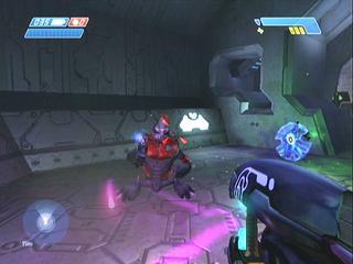
I just played Halo and it's like 
|
|
|
| |
|
|
|
|
|
|
|
Forum Regular
Join Date: Mar 1999
Location: Union,MO,USA
Status:
Offline
|
|
If you folks want some inspiration you could look to what themers did with Kaleidoscope. The new and updated themes archives are closed for new additions which is understandable but the themes archived there are still viewable. So look around and see if you get any good ideas.
Kaleidoscope Theme Archives
Here's an example of a theme I liked:

P.S. I know some of these themes are not practical from a developers sense but that doesn't mean they can't inspire you to design something even better.
|
|
It is better to light one candle than to curse the darkness
|
| |
|
|
|
|
|
|
|
Forum Regular
Join Date: May 2003
Location: J�mtland - Sweden
Status:
Offline
|
|
Feela like this thread has died... ^^
|
|
Mighty3k @ #MacNN
|
| |
|
|
|
|
|
|
|
Registered User
Join Date: Jul 2003
Location: Sweden
Status:
Offline
|
|
Originally posted by NetworkShadow:
1c3's ice mockup:
This is a plastic like gradient with a regular shape, just as phillryu points out ice is a transparent metal, much like glass, that is (most often) formed by nature; which means, it's completely irregular. Also brushed ice should look somewhat like brushed metal...somewhat...
And it's transparent or white...the blue would be reflections...maybe.
(
Last edited by solidfox; Dec 18, 2003 at 02:43 PM.
)
|
|
|
| |
|
|
|
|
|
|
|
Mac Elite
Join Date: Nov 2002
Status:
Offline
|
|
Originally posted by phillryu:
I just played Halo and it's like
Ya I've been playing it for almost 2 years now. ^^
|
|
|
| |
|
|
|
|
|
|
|
|
|
|
|
|
 
|
|
|
Forum Rules
|
|
|
|
You may not post new threads
You may not post replies
You may not post attachments
You may not edit your posts
|
HTML code is Off
|
|
|
|
|
|
|
|
|
|
|
|