|
 |
Photo Critique Thread - [JPEG] (Page 11)
|
|
|
|
|
Mac Elite
Join Date: Dec 2003
Location: I'll let you know when I get there...
Status:
Offline
|
|
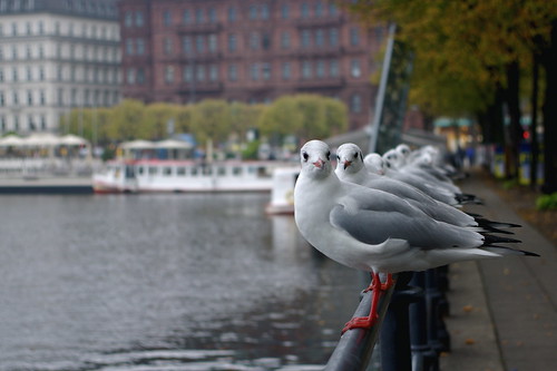
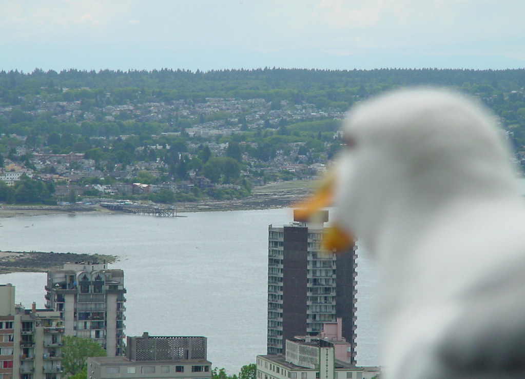
Taken on a hotel balcony in Vancouver.
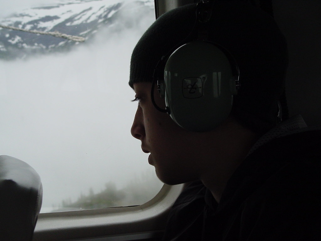
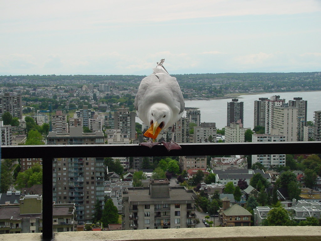
Taken in a little plane above Alaska.
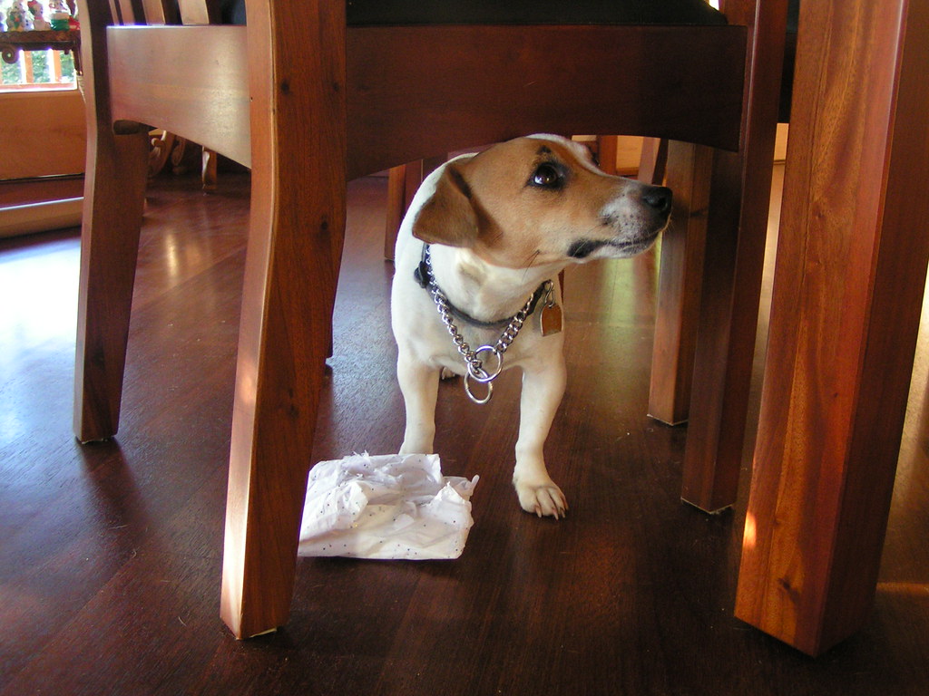
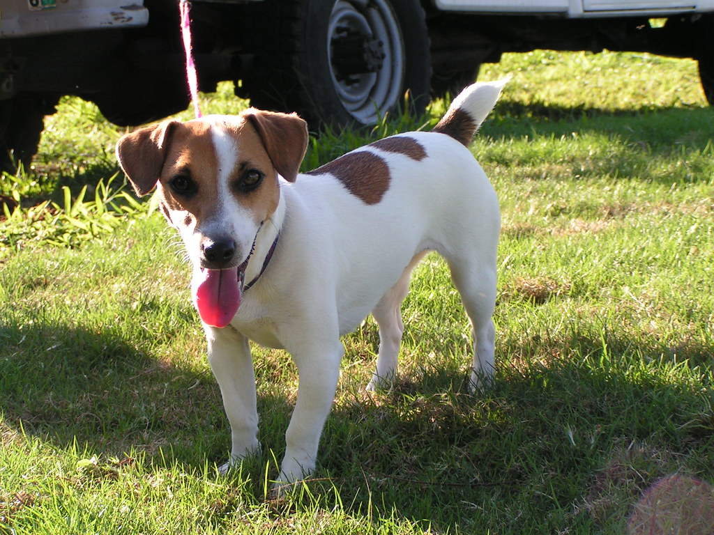
Taken in the dining room of my house.
I'm no pro, and I'm sure it shows, but I thought these were at least interesting to look at. Please let me know how I can improve them 
|
|
|
| |
|
|
|
|
|
|
|
Addicted to MacNN
Join Date: Sep 2001
Location: Toronto
Status:
Offline
|
|
Originally Posted by - - e r i k - - 
I'm a designer. Take away, take away, take away. Kill your darlings.
If the top part of the wall was the main subject it would conform to the "rule" of thirds, however it's not and that part is fairly uninteresting:

What is interesting here is the window, the walls are just framing the subject giving it context:
With a tighter crop, the main subjects moves closer to the thirds making for a much more interesting and dynamic image:

Kill your darlings? You're the guy from Australia who commented on my blog?
Anyway, you're misinterpreting the rule of thirds. It has nothing do with where the main focus of an image is, it's purely a composition guideline.
The image on top gives reference to the building, creates drama by adding the photographic equivalent of white space. The cropped image removes that, filling all available space with information instead, achieving the opposite effect.
I know that we're entering the realm of personal taste here of course.
|
|
|
| |
|
|
|
|
|
|
|
Posting Junkie
Join Date: May 2001
Location: Brisbane, Australia
Status:
Offline
|
|
Originally Posted by Mastrap
Kill your darlings? You're the guy from Australia who commented on my blog?
Huh? I doubt it.
Anyway, you're misinterpreting the rule of thirds. It has nothing do with where the main focus of an image is, it's purely a composition guideline. [/QUOTE]True, but the point of composition is to give focus to the subject you are presenting in a photo/design.
Originally Posted by Mastrap
The image on top gives reference to the building, creates drama by adding the photographic equivalent of white space. The cropped image removes that, filling all available space with information instead, achieving the opposite effect.
I know that we're entering the realm of personal taste here of course.
If it was just that simple. The negative space here is not equivalent to white space as it is in your earlier image (which is why I was more inclined to agree with your composition as opposed to my suggestion), but rather a competing subject competing for "eyeballing" with another, more interesting subject which deserves to be more in focus.
|
|
|
| |
|
|
|
|
|
|
|
Posting Junkie
Join Date: May 2001
Location: Brisbane, Australia
Status:
Offline
|
|
Boy8Cookie: Your images are all great story-telling images. Kudos. While I do have technical suggestions, they all seem to be rather unwanted in this critique-thread 
|
|
|
| |
|
|
|
|
|
|
|
Administrator  Join Date: Apr 2001
Location: San Antonio TX USA
Status:
Offline
|
|
Composition rules are guidelines-pictures tell stories. Here's what these two tell me:
Originally Posted by - - e r i k - -
In this picture, the story is about the whole structure-the window is the focus, but the context is where it is in the building.
Originally Posted by - - e r i k - -
In THIS picture, the focus is the window, but without the other structures, the story is now about the window-and what's on the other side of it.
Even that relatively small crop changes the story. I'd only crop the original if I was trying to tell a limited story.
Great colors and light, by the way.
|
 Glenn -----OTR/L, MOT, Tx
|
| |
|
|
|
|
|
|
|
Posting Junkie
Join Date: May 2001
Location: Brisbane, Australia
Status:
Offline
|
|
You are correct, the latter tells a story about the window. The former tells two stories, each competing for your attention.
Why is everyone so eager to defend what is ultimately a bad composition? And I honestly mean that in the utmost objective way. This is the critique thread is it not? Or did it somehow get changed into Defend The Photographer's Choice thread?
Oh, and in case you thought I was the only one to make this choice, I took the liberty of taking it to a completely unbiased forum:
Flickr: Discussing Crop or not? in Critique
So far 2 out of 2 agrees on the crop being the better decision.
(
Last edited by - - e r i k - -; Apr 29, 2008 at 09:26 AM.
)
|
|
|
| |
|
|
|
|
|
|
|
Addicted to MacNN
Join Date: Sep 2001
Location: Toronto
Status:
Offline
|
|
Originally Posted by boy8cookie
Taken on a hotel balcony in Vancouver.
I think you and I had the same seagull problem. This image would be stronger if the background would be less in focus. I really like the seagull, but everything else is distracting.
|
|
|
| |
|
|
|
|
|
|
|
Addicted to MacNN
Join Date: Oct 2002
Location: England | San Francisco
Status:
Offline
|
|
Originally Posted by Tesselator
I LOVE this photo!
Do you have the original? Whats the flickr link?
|
|
we don't have time to stop for gas
|
| |
|
|
|
|
|
|
|
Clinically Insane
Join Date: Jun 2001
Location: planning a comeback !
Status:
Offline
|
|
Originally Posted by - - e r i k - -
So far 2 out of 2 agrees on the crop being the better decision.
I don't, and most people here at 'NN don't.
I'm just too lazy to sign up for a Flickr account to leave a comment there.
-t
|
|
|
| |
|
|
|
|
|
|
|
Addicted to MacNN
Join Date: Mar 2006
Location: California
Status:
Offline
|
|
i really like the second picture. only because of the way you were able to capture the light beams
|
|
|
| |
|
|
|
|
|
|
|
Junior Member
Join Date: Jan 2008
Location: New York
Status:
Offline
|
|
Originally Posted by ghporter
Composition rules are guidelines-pictures tell stories. Here's what these two tell me:
In this picture, the story is about the whole structure-the window is the focus, but the context is where it is in the building.
In THIS picture, the focus is the window, but without the other structures, the story is now about the window-and what's on the other side of it.
Even that relatively small crop changes the story. I'd only crop the original if I was trying to tell a limited story.
Great colors and light, by the way.
Hot damn, I'm not supposed to know all that before I take the picture, am I?
And thanks everyone, for the positive critiquing, it is nice to have a little confidence in something you are trying to get better at.
Tesselator, I like the light in the 3rd image, on the right, how it creeps through the tree, did you do anything to the image, or is that natural?
|

[15" MacBook Pro 2.6 Ghz] [G4 733] [G4 MDD DP 1.25]
|
| |
|
|
|
|
|
|
|
Moderator  Join Date: May 2001
Location: Hilbert space
Status:
Offline
|
|
Arena, great combination of light and colorful backgrounds. I love the first and third shot in particular (I'm partial to interesting portraits). I assume they aren't snapshots … how long did it take you to choose the location and composition?
|
|
I don't suffer from insanity, I enjoy every minute of it.
|
| |
|
|
|
|
|
|
|
Mac Elite
Join Date: Jan 2001
Location: .CL
Status:
Offline
|
|
Thanks for the comments.
OreoCookie, true to be told, both are snapshots: a friend and my girlfriend respectively. I carry my camera around with my most of the time, so when the opportunity shows up I take a shot. So neither of those two shots you liked were planned.
|
|
|
| |
|
|
|
|
|
|
|
Administrator Join Date: Apr 2001
Location: San Antonio TX USA
Status:
Offline
|
|
Originally Posted by packet of krisps
Hot damn, I'm not supposed to know all that before I take the picture, am I?
Know what story you're trying to tell and get all of it in the picture. Later, if and when you see another story there, you can crop, adjust and otherwise mess with the picture to bring out the other story. Those composition rules are from painting, by the way, and while they're still valid for photography, they would apply to the final, finished print-however you crop, dodge, enhance, etc. it. It's helpful to have the rule of thirds in your head when you're lining up a shot, but not essential.
|
Glenn -----OTR/L, MOT, Tx
|
| |
|
|
|
|
|
|
|
Mac Elite
Join Date: Dec 2003
Location: I'll let you know when I get there...
Status:
Offline
|
|
Originally Posted by - - e r i k - -
Boy8Cookie: Your images are all great story-telling images. Kudos. While I do have technical suggestions, they all seem to be rather unwanted in this critique-thread
I'd like to hear (read) them, in a PM if you must 
(
Last edited by boy8cookie; Apr 29, 2008 at 09:53 PM.
)
|
|
|
| |
|
|
|
|
|
|
|
Professional Poster
Join Date: May 2007
Status:
Offline
|
|
|
|
|
|
| |
|
|
|
|
|
|
|
Moderator Join Date: May 2001
Location: Hilbert space
Status:
Offline
|
|
Originally Posted by ARENA
OreoCookie, true to be told, both are snapshots: a friend and my girlfriend respectively.
You've got a very good eye.
If you had shot them slightly differently, they would have turned out as boring shots (if you know what I mean), but you have an eye for light and composition
Originally Posted by ARENA
I carry my camera around with my most of the time, so when the opportunity shows up I take a shot. So neither of those two shots you liked were planned.
So you're using a P&S?
|
|
I don't suffer from insanity, I enjoy every minute of it.
|
| |
|
|
|
|
|
|
|
Administrator Join Date: Apr 2001
Location: San Antonio TX USA
Status:
Offline
|
|
As I've said here before, the person commenting needs to state a rationale (even if it's just "I just don't care for it") and the person ASKING for comments needs to have a thick enough skin to take those comments. That means that we ALL need to respect each other. People often put a lot of themselves into their photos, and acting like the photographer is a moron is simply hurtful. But if you voluntarily post a picture, then you're explicitly asking for people to comment on it.
As to respect and authority, you can take or leave any comment-they're just words. I think people like Mastrap and OreoCookie have enough photography credibility that I'd accept their critique and make use of it. Other people, maybe not so much.
|
Glenn -----OTR/L, MOT, Tx
|
| |
|
|
|
|
|
|
|
Mac Elite
Join Date: Dec 2003
Location: I'll let you know when I get there...
Status:
Offline
|
|
Originally Posted by boy8cookie
Originally Posted by - - e r i k - -
Boy8Cookie: Your images are all great story-telling images. Kudos. While I do have technical suggestions, they all seem to be rather unwanted in this critique-thread
I'd like to hear (read) them, in a PM if you must
Still waiting >.>
|
|
|
| |
|
|
|
|
|
|
|
Banned
Join Date: Jun 2005
Location: Indy.
Status:
Offline
|
|
I'll critique them for you, though it would be much easier if you'd only post one picture at a time.
Originally Posted by boy8cookie
Taken on a hotel balcony in Vancouver.
You did a good job of capturing a very interesting moment. Did you throw the dorito, or did the bird pick it up from somewhere? If you threw it, it would have been cool to have captured the bird catching it in mid air. Also, normally your subject shouldn't be right in the middle of the frame, but this shot doesn't suffer even though that's what you did.
However, the sky is kind of drab and boring. It tends to distract from the shot. I think that if you would have framed the shot a little lower and captured a bit more of the balcony, to give a feel of your location ad to reduce the thin line that the balcony edge produces. Also, the colors are a bit too cool and could be warmed up a bit.
Originally Posted by boy8cookie
Taken in a little plane above Alaska.
I think this shot is well framed, and captures the mood of the passenger quite well. But I think you should have waited a bit more for the plane to have cleared the clouds. Also, I think if you exposed more for the outside and placed the passenger more in a darker profile, or go the other way completely, exposed for the passenger and shown his emotion more, it would have looked better. On a quick second look, I think the passenger just needs to be exposed a very slightly amount more.
Originally Posted by boy8cookie
Taken in the dining room of my house.
Remove the towel/paper (whatever it is) and I think this is a hilarious shot. The dog looks obviously guilty and shameful. The colors are accurate and very warming. But the paper/towel is a bit disgusting and ambiguous.
Originally Posted by boy8cookie
I'm no pro, and I'm sure it shows, but I thought these were at least interesting to look at. Please let me know how I can improve them
If you think your shot looks interesting, then really, that's what counts. If you want to improve you craft, take all critiques (even overtly rude ones) into account. Sometimes the changes they offer will please you, sometimes you'll think they are rubbish. But if you are happy with the results of your work... That's what matters.
I've seen "pros" take some pretty awful shots and sell them. Pros are all about maximizing profits and reducing costs.
Artists are another story, they want to provoke a feel or mood regardless of costs.
It's the Artistic-Pro who is the standout in photography. They want to make what they sell look awesome and take a large amount of pride in their work.
And now, to follow the rules, here's a shot I took a couple summers ago at a local High School baseball game:

The shadows are a little harsh, but I think it gives the photo a bit more edge. It might look more "rules following" with lighter shadows though.
|
|
|
| |
|
|
|
|
|
|
|
Moderator Emeritus
Join Date: Mar 2004
Location: Copenhagen
Status:
Offline
|
|
I like that one, except for the fact that (for me anyway) it took far too much active thinking to figure out how many hands and feet there were in the shot, and whose was whose. A split second earlier or later would probably have given a slightly different posture of the two people, and shown off their various limbs a bit less ambiguously.
|
|
|
| |
|
|
|
|
|
|
|
Mac Elite
Join Date: Dec 2003
Location: I'll let you know when I get there...
Status:
Offline
|
|
@Railroader Thanks for the comments. I fully agree with you on the first shot, the sky sucks, the framing is a little crooked and both those things bothered me, but the birds pose is just too cool.
For the second shot, I kind of liked the ominous look of the outside, to me it matched the expression of the passenger's face; I could see exposing the passenger more though.
On the third I find the paper towel to be a little distracting as well, but it also kind of serves as an explanation as to why the pup is feeling guilty. Maybe it's too telling though, hard to tell without seeing it both ways for me, but I see where you're coming from.
Thanks again for your comments!
Your shot is an interesting one. I like how you've captured the action: the dirt flying through the air, etc. I'm not sure why you chose to have so much foreground instead of showing more of the players, especially the one sliding. I'm also not sure on the focus, but I can't figure out why I don't like it or what I would change. It's a great capture nonetheless, and my comments are just my personal feelings, like I said, I'm no pro.
|
|
|
| |
|
|
|
|
|
|
|
Moderator Emeritus
Join Date: Mar 2004
Location: Copenhagen
Status:
Offline
|
|
I'm not sure why you chose to have so much foreground instead of showing more of the players, especially the one sliding.
The close crop helps to add extra motion to the picture; I think it works well, even though it violates the ‘don’t decapitate your subjects’ golden rule.
|
|
|
| |
|
|
|
|
|
|
|
Professional Poster
Join Date: May 2007
Status:
Offline
|
|
Well, I got one critique. That's... good. :/ I just liked the composition of the Hummel one. No real reason I chose a Hummel figure for the subject, though.
|
|
|
| |
|
|
|
|
|
|
|
Moderator Emeritus
Join Date: Mar 2004
Location: Copenhagen
Status:
Offline
|
|
I love the top and wish the picture would continue like that. Unfortunately, all the light (street lamps, other buildings, cars, that—uh—thing right in front of the building itself, etc.) create far too much distraction. If you could just get rid of the surrounding buildings and street lamps, the photo would shine. Or rather, it would stop shining so much, which would make it a lot more efficient.
(What is “Mode Hal Isen” supposed to be, by the way? In Danish, it means, “Fashion, Hall, The Ice”, not that I’d really know what that’s supposed to mean)
|
|
|
| |
|
|
|
|
|
|
|
Mac Elite
Join Date: Dec 2003
Location: I'll let you know when I get there...
Status:
Offline
|
|
@Tesselator Thanks for your comments, they were... interesting This is an actual picture, no CG, no touch up, no cropping, straight from my camera to the web. That's part of the reason I found it so interesting, it's seemingly impossible, yet there it is.
Your shot is pretty neat, the building itself is really cool. I really like the colors of the windows and the sky. I can see where Oisín is coming from, the foreground is a little distracting, but I'm not sure how this could be fixed.
I see this building as unique, it could be interesting to see more of the surrounding buildings, that is if they are squarish, normal looking ones, that make this particular building really standout.
I'm at work with no images to post, I'll find one to put up when I pau hana.
|
|
|
| |
|
|
|
|
|
|
|
Moderator Emeritus
Join Date: Mar 2004
Location: Copenhagen
Status:
Offline
|
|
I can see where Oisín is coming from, the foreground is a little distracting, but I'm not sure how this could be fixed.
Proactive urban planning.
(Aka bulldozers)
I'll find one to put up when I pau hana.
Ge…sundheit?
|
|
|
| |
|
|
|
|
|
|
|
Mac Elite
Join Date: Dec 2003
Location: I'll let you know when I get there...
Status:
Offline
|
|
Its hawaiian actually, in context it means finish work, the literal translation is pau(done) hana(work)
|
|
|
| |
|
|
|
|
|
|
|
Mac Elite
Join Date: Aug 2003
Status:
Offline
|
|
Originally Posted by Tesselator
That's weird now the cyans are back... I guess it's the difference between
Safari and FireFox. Safari (that I surf with) shows the cyans. FireFox (that I upload to
the FTP with) does not. 
Safari is a colour aware browser. Firefox, up until the current beta I think, is not.
Safari will read the colour profile you used in the photo and display it correctly. Pretty much all other browsers will render the photo in sRGB, which is the colour space you should use for images displayed on the web (to avoid display issues like you are describing above).
|
|
|
| |
|
|
|
|
|
|
|
Mac Elite
Join Date: Dec 2003
Location: I'll let you know when I get there...
Status:
Offline
|
|
Tess, I like the colors and the reflection concept, but I feel the picture is too busy otherwise. It is a city scene, and cities are normally busy, but its just unsettling to me. That orange is really cool though.
Here's an interesting one I took from the same balcony, different bird though...
|
|
|
| |
|
|
|
|
|
|
|
Administrator Join Date: Apr 2001
Location: San Antonio TX USA
Status:
Offline
|
|
Originally Posted by James L
Safari is a colour aware browser. Firefox, up until the current beta I think, is not.
Safari will read the colour profile you used in the photo and display it correctly. Pretty much all other browsers will render the photo in sRGB, which is the colour space you should use for images displayed on the web (to avoid display issues like you are describing above).
I just did a side-by-side comparison, and that's amazing! In Safari the colors are much richer than in Firefox. I didn't know what I was missing.
|
Glenn -----OTR/L, MOT, Tx
|
| |
|
|
|
|
|
|
|
Moderator Emeritus
Join Date: Mar 2004
Location: Copenhagen
Status:
Offline
|
|
Where can I hire the guy who cleaned the windows on that building?
(And 駐車場 is a funny word for a station  )
|
|
|
| |
|
|
|
|
|
|
|
Moderator Emeritus
Join Date: Mar 2004
Location: Copenhagen
Status:
Offline
|
|
Originally Posted by Tesselator
Why? Did you find the bird poop on the second window down there? I thought for
sure that would go unnoticed or be mistaken for a white window reflection.
Nah, it just looks really really clean, which is more than can be said of my windows.
Ah-hem...  hehehe... the station is actually a block behind that foreground
lower building.
Ah, now I get it. 駐車場 is a parking place, not a station! D’oh. That makes much more sense, too. Ignore my Sinocentric ignorance, please.
|
|
|
| |
|
|
|
|
|
|
|
Mac Elite
Join Date: Dec 2003
Location: I'll let you know when I get there...
Status:
Offline
|
|
@Tesselator Yes, I like that a lot more. Even though some of the orange is lost, the yellow at the top stands out more, probably because there is less to digest. How did you decide on the crop? I'm curious because, unless it's blatant, I don't have a good sense for what I should or shouldn't crop.
I wish I was that good at CG. Less birds, more puppies:
There's some lens flare in the bottom right, probably should crop it out? I kinda like it.
|
|
|
| |
|
|
|
|
|
|
|
Posting Junkie
Join Date: May 2001
Location: Brisbane, Australia
Status:
Offline
|
|
Originally Posted by Tesselator
As I'm working with a client I really don't have any new photos to post (and the original format of the thread was to post a photo if you critiqued a photo), so I haven't had much chance to critique as of late.
I do however want to butt in and say that I love this photo Tesselator. Great treatment 
|
|
|
| |
|
|
|
|
|
|
|
Mac Elite
Join Date: Aug 2003
Status:
Offline
|
|
I was out practicing some lighting techniques with a few friends today:


|
|
|
| |
|
|
|
|
|
|
|
Addicted to MacNN
Join Date: Sep 2001
Location: Toronto
Status:
Offline
|
|
Nitpicking, I know, but the sky is blown out in the first image.
|
|
|
| |
|
|
|
|
|
|
|
Mac Elite
Join Date: Aug 2003
Status:
Offline
|
|
Nitpicking, I know, but the sky is blown out in the first image.
It is, I agree.
Originally Posted by Tesselator
Looks nice! Is that a flash or a reflector panel off the Sun? Where is that BTW?
If you shot RAW you can always import a second exposure and paste the sky in.
The two layers and an eraser tool works well if it's important to you to do that.
The sun is just starting to set camera left, there is an off camera flash triggered via pocket wizard camera right. The background is actually underexposed by a stop or two already (this was shot in the bright early afternoon) to darken it down, and then the flash is brought in with a snoot just to light the face and upper body of the subject. In looking at it in post I can see I should have underexposed the ambient another stop, but that's why we practice!
I'm not big on a ton of photoshopping when I can get it right in camera. That's not to say I'm against post at all, but when using lighting you can control the subject and ambient lighting separately so there really is no need for a lot of post production when you can get it done right in the first place. The goal here was to try to tame bright mid day light through selective exposure, then use flash to bring light back on the subject. Still need some practice though!
This is in Vancouver, btw.
(
Last edited by James L; May 2, 2008 at 11:19 AM.
)
|
|
|
| |
|
|
|
|
|
|
|
Moderator Join Date: May 2001
Location: Hilbert space
Status:
Offline
|
|
I like that one, too. And no amount of photoshopping is a substitute for correct lighting!
|
|
I don't suffer from insanity, I enjoy every minute of it.
|
| |
|
|
|
|
|
|
|
Mac Elite
Join Date: Aug 2003
Status:
Offline
|
|
|
|
|
|
| |
|
|
|
|
|
|
|
Addicted to MacNN
Join Date: Sep 2001
Location: Toronto
Status:
Offline
|
|
The XTi is a great camera. When I looked into buying new gear last year it was a definite contender. In the end I decided that a: it was too small for my hands and b: the Pentax K10D offered the best value for money. As I had no legacy glass to worry about that was my choice and I've never regretted it.
Having said that, almost all new DSLRs are fantastic cameras and will deliver outstanding results. It is really up to personal preference.
And as this is a picture thread, now for something in b/w:
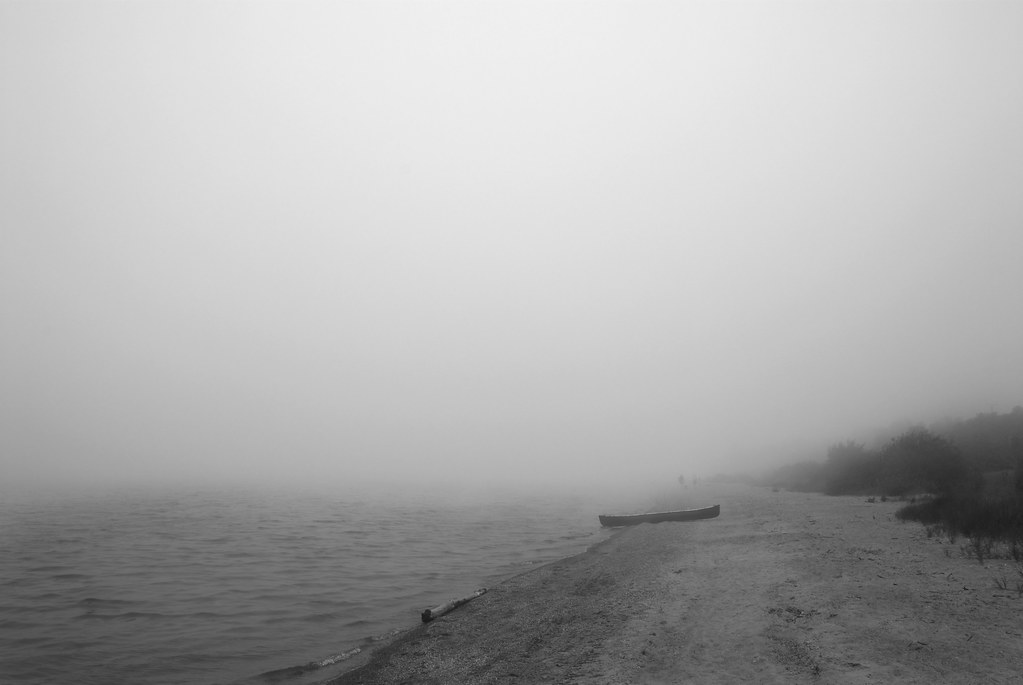
Lake Huron in spring, morning fog just before the sun broke through. Best viewed in large.
|
|
|
| |
|
|
|
|
|
|
|
Clinically Insane
Join Date: Jun 2001
Location: planning a comeback !
Status:
Offline
|
|
Originally Posted by James L
I was out practicing some lighting techniques with a few friends today:
Are you in AK ?
-t
|
|
|
| |
|
|
|
|
|
|
|
Moderator Emeritus
Join Date: Apr 2001
Location: Wasilla, Alaska
Status:
Offline
|
|
Originally Posted by turtle777
Are you in AK ?
Vancouver. Almost AK.
|
|
|
| |
|
|
|
|
|
|
|
Mac Elite
Join Date: Aug 2003
Status:
Offline
|
|
Originally Posted by AKcrab
Vancouver. Almost AK.
I think you mean AK is almost Vancouver.
|
|
|
| |
|
|
|
|
|
|
|
Posting Junkie
Join Date: Mar 2005
Location: Louisiana
Status:
Offline
|
|
Originally Posted by Mastrap
And as this is a picture thread, now for something in b/w:
Hey, I really like the picture. It might've been enhanced by pulling up the darks in curves, and I agree with the earlier statement that it would've been nice to get a little closer to the boat. Other than that, I find the picture interesting, and I'm a major sucker for B&W.
And now for one of my shots from a recent senior session...
I'd like to be posting a scenic shot or something that could be critiqued a bit easier, but portraits and event photography are all I've had time to do lately. I have two more sessions in the next 4 days, so that won't change for a bit longer. I am going to Destin the next week, though...so maybe then.
Here's what I'm looking for specifically in this shot. While we were shooting this session, I found an old barn with some interesting textures, so I snapped a few pictures and overlaid one of them on top of this shot. Do you guys think it works?
It's subtle, but...
It's almost 4 a.m. and I can't stop editing. Over the next day or two I'm going to continue adding to the collection on Flickr.
|
|
|
| |
|
|
|
|
|
|
|
Addicted to MacNN
Join Date: Sep 2001
Location: Toronto
Status:
Offline
|
|
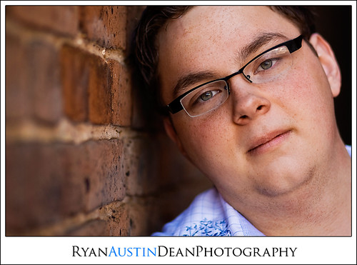
I think you're overegging the cake with these pictures. All I find myself looking at are the effects you've created rather than the person who's portrait it is. Your editing is overshadowing the photography, and the photography isn't bad at all. It just doesn't stand a chance against all the layers, textures, curves, tinting, etc. It's all over the place, especially as you haven't developed a coherent style of your own yet that might be able to keep everything together. Right now it looks as if you're insecure about the quality of your images and as a result hide them behind a layer of editing.
I think you've got a very good eye, but you're overdoing the post processing. Concentrate on shooting great pictures, which I think you've got the ability to do, do the bare minimum to them afterwards.
Oh, and I would also suggest to remove your name from the images on flickr. It's distracting, and we know it already. It looks like you're trying way too hard. Relax a little. Enjoy more.
PS: I've just reread this and I realized that the above sounds pretty harsh. That's not my intention. I really like a great many of your images. All of my comments are just my opinion, so feel free to ignore them as the ramblings of the madman if you so choose.
(
Last edited by Mastrap; May 5, 2008 at 09:30 AM.
)
|
|
|
| |
|
|
|
|
|
|
|
Posting Junkie
Join Date: Mar 2005
Location: Louisiana
Status:
Offline
|
|
Originally Posted by Mastrap
I think you're overegging the cake with these pictures. All I find myself looking at are the effects you've created rather than the person who's portrait it is. Your editing is overshadowing the photography, and the photography isn't bad at all. It just doesn't stand a chance against all the layers, textures, curves, tinting, etc. It's all over the place, especially as you haven't developed a coherent style of your own yet that might be able to keep everything together. Right now it looks as if you're insecure about the quality of your images and as a result hide them behind a layer of editing.
I think you've got a very good eye, but you're overdoing the post processing. Concentrate on shooting great pictures, which I think you've got the ability to do, do the bare minimum to them afterwards.
Oh, and I would also suggest to remove your name from the images on flickr. It's distracting, and we know it already. It looks like you're trying way too hard. Relax a little. Enjoy more.
PS: I've just reread this and I realized that the above sounds pretty harsh. That's not my intention. I really like a great many of your images. All of my comments are just my opinion, so feel free to ignore them as the ramblings of the madman if you so choose.
Make no apologies; I can take it. Trust me.
Like you said, I am still trying to develop a nice, consistent style in post. I'm just not there yet, and it's taking a bit longer than I anticipated. The wide range of styles is kind of intentional, though. While going through this set, I have at least one edit of each shot. When I present to clients, I have some that are done like these, heavily edited, and then some that are scaled WAY back. I just don't post many of those on here.
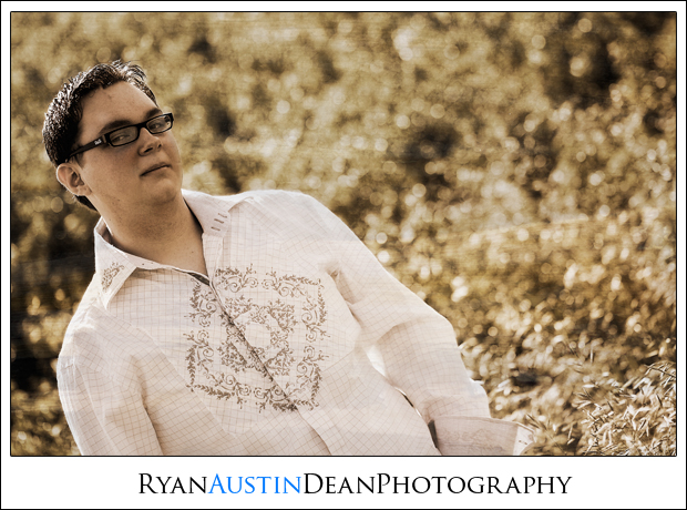
For instance, almost every picture I take has one edit that looks like this:
This particular customer is paying for a DVD with all the high-res images on it. In a situation like this, do you think the wide range of editing styles will be detrimental? I can imagine that if they were buying individual prints, it might start to get frustrating, but since they're going to have them all anyways, do any of you guys think that it still might be a problem?
I really appreciate the comments, Mastrap. I'm not going to be overly defensive about my photos. I'm aware of some of my shortcomings, and if others can help me start smoothing out the wrinkled edges, then I'm up for it. I'll start working on some more consistency and scaling back the post processing.
Oh, about the name on the pictures: I'm doing that now because a lot of my customers are seniors in high school who are using these pictures on their MySpace and Flickr, often as their default picture. I usually go back and check their profiles, and I noticed that a lot of people are asking, "Who took these shots?" and the senior will sometimes never respond. I decided that if I stuck my name on the lower-res shots that I put on Flickr, it would be a way to get my name out there to their friends and family members who visit their profiles.
|
|
|
| |
|
|
|
|
|
|
|
Addicted to MacNN
Join Date: Sep 2001
Location: Toronto
Status:
Offline
|
|
See, the reality is that you can't be all things to all people.
Every good photographer I know has developed a style of his, or her, own. That style typically helps them to communicate what they feel is important in the images they create. It's fine to experiment, important to experiment, but I would suggest working towards a style that is uniquely yours, a style that you feel comfortable with and that expresses your take on how these images should look like, what they should say and how they should say it.
Just be confident about the YOU, the rest will follow.
|
|
|
| |
|
|
|
|
|
|
|
Moderator Emeritus
Join Date: Mar 2004
Location: Copenhagen
Status:
Offline
|
|
Originally Posted by Jawbone54
Apart from Mastrap’s comments (with which I agree completely), the thing that bugs me most about this picture is the fact that the poor guy looks like he’s about to fall out of it altogether. Was he really so diagonal when you took the picture, or have you rotated him?
The fact that he seems to have absolutely no chin bugs me a bit, too, but you’re hardly to blame for that.
|
|
|
| |
|
|
|
|
|
|
|
Posting Junkie
Join Date: Mar 2005
Location: Louisiana
Status:
Offline
|
|
Originally Posted by Oisín
Apart from Mastrap’s comments (with which I agree completely), the thing that bugs me most about this picture is the fact that the poor guy looks like he’s about to fall out of it altogether. Was he really so diagonal when you took the picture, or have you rotated him?
I've rotated him.
The fact that he seems to have absolutely no chin bugs me a bit, too, but you’re hardly to blame for that.
|
|
|
| |
|
|
|
|
|
|
|
|
|
|
|
|
 
|
|
|
Forum Rules
|
|
|
|
You may not post new threads
You may not post replies
You may not post attachments
You may not edit your posts
|
HTML code is Off
|
|
|
|
|
|
|
|
|
|
|
|