|
 |
Photo Critique Thread - [JPEG]
|
|
|
|
|
Banned
Join Date: Jun 2005
Location: Indy.
Status:
Offline
|
|
Well, we derailed Jawbone's thread with some pictures and critique discussions. But I really enjoyed the posting of images and the critiquing.
Rules:
1. Post a picture. You don't post a picture, you don't get to critique someone else's picture.
2. If you write a critique, post a picture to be critiqued. Post your picture at the end of the critique.
3. Constructive criticism first. If you think a person could improve their picture, tell them how.
4. Keep personal comments and opinions cordial. Focus on the picture, not the person posting the picture.
5. ONLY post pictures you have taken.
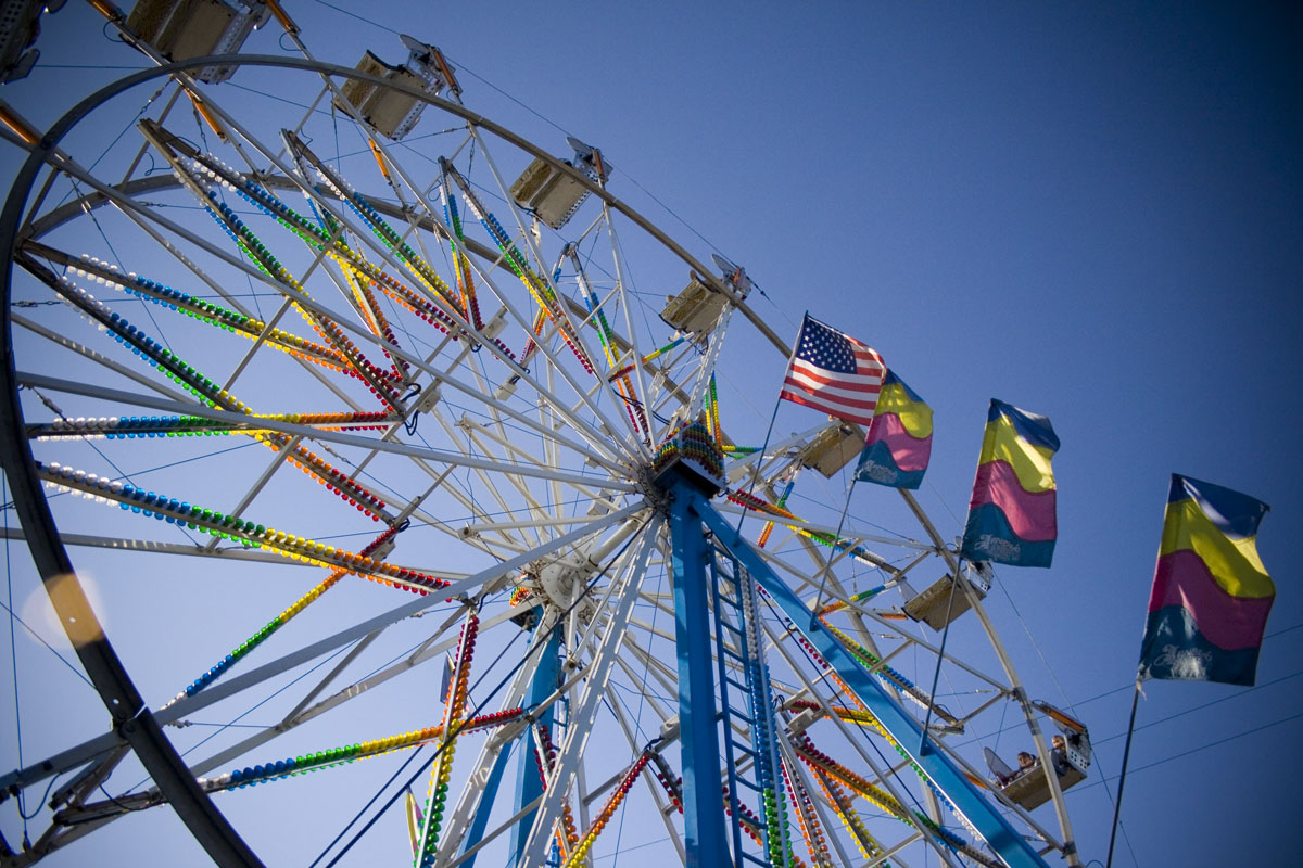
I will start:
(click on picture for a larger version)

|
|
|
| |
|
|
|
|
|
|
|
Mac Elite
Join Date: Dec 2001
Location: Pacific NW
Status:
Offline
|
|
In photography like this thread, I like to break the rules sometimes. The photo needs more lens flare.
|
|
climber
|
| |
|
|
|
|
|
|
|
Addicted to MacNN
Join Date: Feb 2003
Location: NY²
Status:
Offline
|
|
Railroader,
I like your photo, but I am not crazy about the vignetting on the right hand side. Did you photoshop that in? If possible could we see a version without that?

My submission, click for larger.
|
|
|
| |
|
|
|
|
|
|
|
Administrator  Join Date: Apr 2001
Location: San Antonio TX USA
Status:
Offline
|
|
I like the image. It has direction and flow, and the bright colors help with that. I particularly like the gradual fade of the sky from light to dark, which emphasizes the angle of the Ferris wheel.
I might have moved closer to the diagonal support in front so it would line up with the direction of the shot, but maybe that makes the image more interesting.
Here's mine:
Again, click on the image for a full-sized version.
|
 Glenn -----OTR/L, MOT, Tx
|
| |
|
|
|
|
|
|
|
Banned
Join Date: Jun 2005
Location: Indy.
Status:
Offline
|
|
Originally Posted by mdc 
Railroader,
I like your photo, but I am not crazy about the vignetting on the right hand side. Did you photoshop that in? If possible could we see a version without that?
I fiddled with the levels and added a little vignetting in Adobe Bridge RAW. There was a little vignetting just from the lens and the angle of the sun. Here is the default version with only some sharpening:

Originally Posted by mdc
VERY nice. I like it a lot. I'd like to see a version that's isn't framed so tightly, but as it is, I'd give it a 9 out of 10.
Originally Posted by ghporter
I like the image. It has direction and flow, and the bright colors help with that. I particularly like the gradual fade of the sky from light to dark, which emphasizes the angle of the Ferris wheel.
I might have moved closer to the diagonal support in front so it would line up with the direction of the shot, but maybe that makes the image more interesting.
I composed it as a desktop image. I keep my desktop very clean, and I framed the shot so that icons on the desktop would be lined up in that area of the sky.
Originally Posted by ghporter
Unfortunately, the sky was a bit hazy during your shot. It is a little washed out also probably because your camera had a difficult time metering with the sun in the shot. I like the expansion of the suns reflection in the water. Perhaps cropping your image a little lower to raise the horizon line in your image would draw more focus to that reflection. [yup, I held a piece of paper up to crop out most of the sky and it improves it quite a bit]
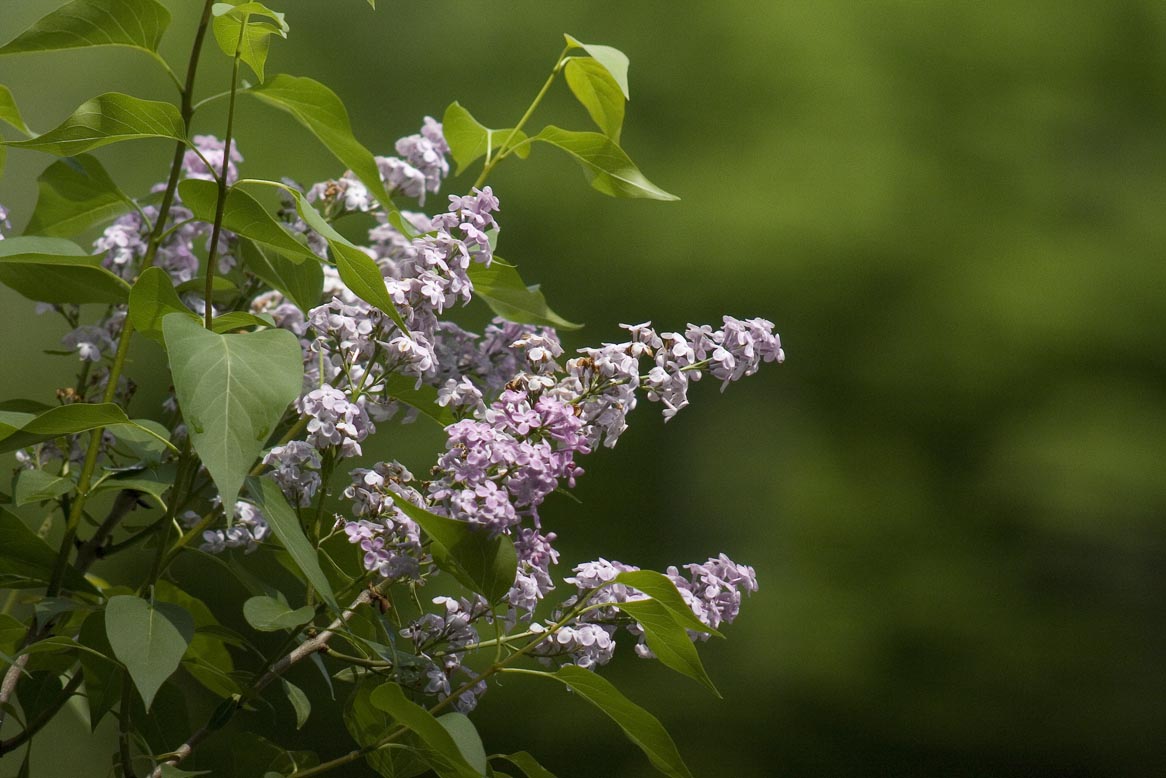
And, since I offered critiques:
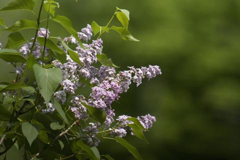
This is a lilac bush that we planted the month we moved into our house. It was given to us as a house warming gift.
[CLICK FOR A LARGER VERSION]
|
|
|
| |
|
|
|
|
|
|
|
Banned
Join Date: Jun 2005
Location: Indy.
Status:
Offline
|
|
Here's what I was talking about :
Your original image:
Cropped and levels adjusted. I may have cropped too much. I also noticed it was about half a degree off parallel, so I straightened it:
|
|
|
| |
|
|
|
|
|
|
|
Addicted to MacNN
Join Date: Feb 2003
Location: NY²
Status:
Offline
|
|
ghporter, I agree with Railroader and like his cropped photo.
Railroader, I like the lilac bush photo. The green and lilac work nicely together and bokeh is really nice. Thank you for the compliments regarding my photo. I do not have a version that isn't framed so tightly. I have this one that is a little further out, but portrait.
My next submission.

|
|
|
| |
|
|
|
|
|
|
|
Administrator Join Date: Apr 2001
Location: San Antonio TX USA
Status:
Offline
|
|
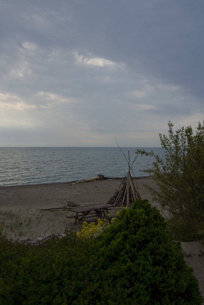
Railroader, I think your cropping works very well-and yes, the camera didn't like metering the sun and the shadows all at the same time. I had originally liked what I saw as the intersecting directions of the clouds and the waves (low left to high right and low right to high left respectively) when I framed the picture, but the waves didn't cooperate (or the lighting, probably), so I reframed a bit and got the original picture. It's amazing what you see from the stern of a ship as you power out of a harbor...
No more critiques from me until I find another "masterpiece" to post. 
|
Glenn -----OTR/L, MOT, Tx
|
| |
|
|
|
|
|
|
|
Addicted to MacNN
Join Date: Oct 2002
Location: England | San Francisco
Status:
Offline
|
|
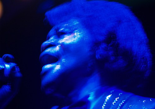
mdc, I really like the photo  theres quite a lot of noise on the lady - I wonder if thats due to the file format or the camera -- what did you shoot it with?
ghporter broke the rules! 

|
|
we don't have time to stop for gas
|
| |
|
|
|
|
|
|
|
Addicted to MacNN
Join Date: Feb 2001
Status:
Offline
|
|
Originally Posted by mdc
OK, I'll give it a go. I really like this image. The hands on the glass are especially evocative and I feel like the woman in the photo is trying to commune with the fish in the tank. I think the blues and greens contrast well with the black and the circular frame is like a target for the eye. Very cool.
In the ideal world, I would have waited a little longer for a fish to come up to the window so that you got more of the sense of her communicating with the fish. I would also have waited for the people on the sides to move or changed the angle so that they weren't in the shot. The person on the right is particularly disturbing. One thing I would have tried (if you knew the woman) would be to go to her right and get in close trying to just get her silhouette and her hands in the frame. Obviously though, with shots like this, you very often just see something and have to capture it fast so this is all ideal world.
As far as the exposure goes, I would have used a slightly faster shutter speed to darken the shadows more. You could also do this in levels in Photoshop. I would also go for a much tighter crop perhaps using a square. The space at the bottom isn't doing anything for the image.
Overall though a great moment that you've captured.
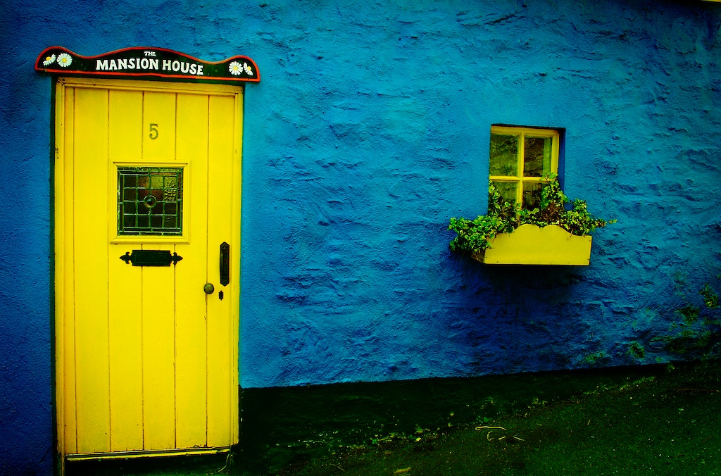
Here's a shot I took in Kinsale in Ireland. I worked on it quite a bit in Photoshop cloning out some unsightly cables, lomo-fying the colours and adding the vignette. This was taken with a Canon 350D (Digital Rebel) with a Canon 17-85mm IS at 17mm, aperture: f9 exposed for 1/50th of a second.
(
Last edited by Troll; May 27, 2007 at 12:32 PM.
)
|
|
|
| |
|
|
|
|
|
|
|
Mac Elite
Join Date: Sep 2006
Location: Back in the Good Ole US of A
Status:
Offline
|
|
Originally Posted by Railroader
I fiddled with the levels and added a little vignetting in Adobe Bridge RAW. There was a little vignetting just from the lens and the angle of the sun. Here is the default version with only some sharpening:
Railroader... I confess I like the original version better... although the flags add a sense of motion, I'm wondering if I would like the photo better without them.
Originally Posted by Troll
Here's a shot I took in Kinsale in Ireland. I worked on it quite a bit in Photoshop cloning out some unsightly cables, lomo-fying the colours and adding the vignette. This was taken with a Canon 350D (Digital Rebel) with a Canon 17-85mm IS at 17mm, aperture: f9 exposed for 1/50th of a second.
Troll... I really like your photo. The contrast between the yellow and blue is awesome. Do you think the vignette might be a little to much on the right side of the photo?
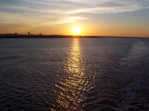
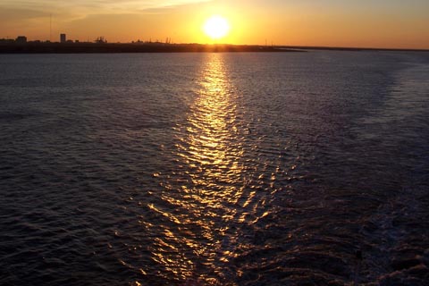
Well, I guess it's my turn for some criticism. I'm not much of a photographer. I have a simple little Canon PowerShot SD550. I take my camera everywhere and needed something small. And when it comes to photo editing... well, let's just say I can spell photoshop but that's about the extent of it. My photo is straight out of the camera.. nothing has been adjusted except to make the image smaller. It's a picture I took in Tobago. I love sunsets and have a zillion photos of them. I've always been of the mind that if you take enough photos, you'll get a few good shots. I'm not sure if the leaves on the left edge of the photo add depth or are just a distraction.

|
|
|
| |
|
|
|
|
|
|
|
Banned
Join Date: Jun 2005
Location: Indy.
Status:
Offline
|
|
Originally Posted by Atheist
Well, I guess it's my turn for some criticism. I'm not much of a photographer. I have a simple little Canon PowerShot SD550. I take my camera everywhere and needed something small. And when it comes to photo editing... well, let's just say I can spell photoshop but that's about the extent of it. My photo is straight out of the camera.. nothing has been adjusted except to make the image smaller. It's a picture I took in Tobago. I love sunsets and have a zillion photos of them. I've always been of the mind that if you take enough photos, you'll get a few good shots. I'm not sure if the leaves on the left edge of the photo add depth or are just a distraction.
[IMG]http://img509.imageshack.us/img509/7470/cocoreefzr7.jpg[IMG]
I think your shot is beautiful. With the horizon line low, the focus is certainly on that sun and the rays coming in from the cloud cover. But, you are right about the leaves on the left being a distraction. I'd crop a little tighter and eliminate the shore line at the bottom of the image.
I have been thinking of buying an older Canon Elph just to have something to have with me at all times. The worst shot is the one that was never taken because you didn't have your camera with you.
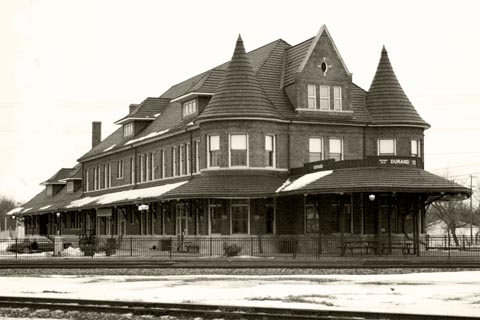
This is a picture of a major historical landmark in my hometown. It's also in my sig picture (I didn't take that one).
I did all kinds of photoshopping to this one. I eliminated a radio tower, cleaned up the sky, converted to B&W, and added a sepia toning.
[CLICK FOR LARGE SIZE]
|
|
|
| |
|
|
|
|
|
|
|
Addicted to MacNN
Join Date: Sep 2001
Location: Toronto
Status:
Offline
|
|
I've got say that I believe that the leaves actually help with the making of the image. Adding a framing device, such a these leaves, creates depth in an image. If anything I would have tried to make more of them. The same is true, in my opinion, about the bottom shoreline. Again, it gives definition to the image and creates a sense of space.
The sunset is near perfectly positioned, according to the law of thirds. It's one third in, one third up, which is part of what makes the image so appealing. If I'd change anything I'd move the horizon up to match the blue line, then move the sunset to the left a little.

My opinion only of course. 
(
Last edited by Mastrap; May 27, 2007 at 03:37 PM.
)
|
|
|
| |
|
|
|
|
|
|
|
Posting Junkie
Join Date: May 2001
Location: Brisbane, Australia
Status:
Offline
|
|
Law of thirds is not so much a law as it is a guideline.
|
|
|
| |
|
|
|
|
|
|
|
Posting Junkie
Join Date: May 2001
Location: Brisbane, Australia
Status:
Offline
|
|
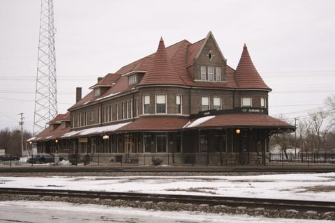
Originally Posted by Railroader
Sure this is a recent photo? In that case, you've done an excellent job of making this as authentic as possible. It really has that "old" feeling to it. Great job!
|
|
|
| |
|
|
|
|
|
|
|
Mac Elite
Join Date: Jan 2001
Location: .CL
Status:
Offline
|
|
|
|
|
|
| |
|
|
|
|
|
|
|
Banned
Join Date: Jun 2005
Location: Indy.
Status:
Offline
|
|
Originally Posted by - - e r i k - -
Sure this is a recent photo? In that case, you've done an excellent job of making this as authentic as possible. It really has that "old" feeling to it. Great job!
Thanks, I took the picture Feb. 24th this year. I thought about cloning the car out as that gives a time frame to the picture, but it is a late 80's/early 90's model so it doesn't reveal the real date... but it certainly doesn't make it look like a real old picture that I was going for.
Here's a JPG version of the RAW file:
Originally Posted by - - e r i k - -
Excellent. Great example of a shallow depth of field and perspective. I really like the color. I can picture this framed and hanging in a bar or a game room in someone's house. Tiny suggestion: PS out the small light colored line in the upper left.
Here's a shot I took last weekend during a parade. I am not happy that the top of his hat was cut off, but I like the depth of field putting his face as the focal point, and the bokeh in the background. I saturated the colors a little bit more in Adobe Bridge RAW.
[CLICK...LARGE...YADA...YADA]

|
|
|
| |
|
|
|
|
|
|
|
Administrator Join Date: Apr 2001
Location: San Antonio TX USA
Status:
Offline
|
|
Originally Posted by Peter
ghporter broke the rules!
No, I didn't. I posted a RESPONSE to the critique of my picture-then I shut up! No critique, no need to post another picture. And I've been too busy to find another to post so I won't critique anyone else's pictures until I do. But I will say that I LIKE this thread! Lots of pretty pictures, and real discussion on something I'm very interested in. Love it.
Oh, and "the Code is law."
|
Glenn -----OTR/L, MOT, Tx
|
| |
|
|
|
|
|
|
|
Addicted to MacNN
Join Date: Sep 2001
Location: Toronto
Status:
Offline
|
|
Originally Posted by - - e r i k - -
Law of thirds is not so much a law as it is a guideline.
It's called the law, or the rule, of thirds for a reason.
But of course you're right. Following any rule will never guarantee an aesthetically pleasing image. It's all in the eye. 
RR, great shot. I actually like the fact that his hat is cut off, it gives the image more life. Depth of field works extremely well here too.
This is one of my first working with RAW experiments. I wanted to achieve an almost HDR effect, making sure that the shadows were still registering some detail.
|
|
|
| |
|
|
|
|
|
|
|
Banned
Join Date: Jun 2005
Location: Indy.
Status:
Offline
|
|
Mastrap, I'm just saying, look at this:
Original:
Cropped:

|
|
|
| |
|
|
|
|
|
|
|
Addicted to MacNN
Join Date: Sep 2001
Location: Toronto
Status:
Offline
|
|
The top image tells me much more of a story than the bottom image. It has dimension, it has multiple layers of interest. The bottom image is flat by comparison.
Please understand that I am not trying to start an argument.
As always, this is just the way I am looking at things.
|
|
|
| |
|
|
|
|
|
|
|
Posting Junkie
Join Date: May 2001
Location: Brisbane, Australia
Status:
Offline
|
|
Originally Posted by Railroader
Excellent. Great example of a shallow depth of field and perspective. I really like the color. I can picture this framed and hanging in a bar or a game room in someone's house. Tiny suggestion: PS out the small light colored line in the upper left.
Well at least someone liked it, it was the first image I sold
And the iStockphoto-version is a lot better, with the cloning out of the line and better color:

Good colour, I would crop a tiny bit more of the left side though. Notice eye-lines in photos, people should always have more room in the direction they are looking.
Edit: Forgot to post a picture:
People are usually divided on this one. Needs to view the large size to make it shine though
|
|
|
| |
|
|
|
|
|
|
|
Moderator  Join Date: May 2001
Location: Hilbert space
Status:
Offline
|
|
@Arena: I like yours. Did you use an IR filter or just fiddle with the colors afterwards?
@Troll: I like your shot, too. I probably would have made a shot that isn't at an angle with the wall. But I like the texture of the wall in the shot. vaguely reminds me of a picture I've taken in Italy.
Here's mine: I've taken it last week right next to the Golden Gate Bridge. The guy in the pic is actually my office mate. I haven't played with the pic at all, no color corrections, nothing. What do you guys think?

|
|
I don't suffer from insanity, I enjoy every minute of it.
|
| |
|
|
|
|
|
|
|
Banned
Join Date: Jun 2005
Location: Indy.
Status:
Offline
|
|
Originally Posted by Mastrap
The top image tells me much more of a story than the bottom image. It has dimension, it has multiple layers of interest. The bottom image is flat by comparison.
* Please understand that I am not trying to start an argument.
As always, this is just the way I am looking at things.
* I understand. And I recognize that it a is personal preference. Technically they are both good, both break "the rules" though, and from there it comes down to personal preference.
|
|
|
| |
|
|
|
|
|
|
|
Banned
Join Date: Jun 2005
Location: Indy.
Status:
Offline
|
|
Originally Posted by - - e r i k - -
Good colour, I would crop a tiny bit more of the left side though. Notice eye-lines in photos, people should always have more room in the direction they are looking.
Noted. I kind of knew that already... I was using a 200mm lens with a 2x converter (which equals 640mm on my APSC sensor), and I was having issues with just keeping the subject in the frame. Next time I'll put the camera on multiple exposure and move the lens around a bit.
Edit: Forgot to post a picture:
People are usually divided on this one. Needs to view the large size to make it shine though [/QUOTE]
I like it. Did you change the colors? Not that there's anything wrong with that, but I have a feeling that is straight out of the camera. This, as well as the stars one, I can see hanging up somewhere. This time a blues club or a concert venue showing the famous acts that have played. Or as promotion material for an upcoming concert series.
But again, there's that little nagging distraction in the upper left corner. Can you tell I have a touch of OCD about distraction in pictures?
And now mine:
[CLICK, MAKE IT LARGE]
This is almost directly out of my camera. I overexposed it intentionally. All I did was crop.
|
|
|
| |
|
|
|
|
|
|
|
Posting Junkie
Join Date: May 2001
Location: Brisbane, Australia
Status:
Offline
|
|
Yeah, that one come straight out of the camera. I have of course better shots in the same series (see below), but I really like the 3 dimensional effect of the light sculpting his face.

You have a really good eye for distractions. I'll try and put mine to use the next time I upload something. I'm usually better at finding distractions in other people's shots.
As for your shot. I'm not sure about it. Immediately I liked it, but then the overexposure and the tones started nagging me. It feels like there's chromatic aberration, though I can't really spot any. Maybe it could have been even softer.
@Oreo: The dullish orange sunset reminds me of countless compact snapshots from my youth, so it's not really doing anything for me. Perhaps if you increased the saturation and shifted the hues to something more dramatic… The story of the photo has potential, it just needs some post production TLC.
|
|
|
| |
|
|
|
|
|
|
|
Addicted to MacNN
Join Date: Oct 2002
Location: England | San Francisco
Status:
Offline
|
|
Originally Posted by Railroader
[CLICK, MAKE IT LARGE]
This is almost directly out of my camera. I overexposed it intentionally. All I did was crop.
Great photo, love it. The overexposure adds a ton to the photo.
Do you have flickr?
Here is my (intentionally) noisy photo:

|
|
we don't have time to stop for gas
|
| |
|
|
|
|
|
|
|
Banned
Join Date: Jun 2005
Location: Indy.
Status:
Offline
|
|
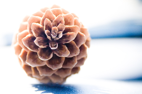
Originally Posted by - - e r i k - -
As for your shot. I'm not sure about it. Immediately I liked it, but then the overexposure and the tones started nagging me. It feels like there's chromatic aberration, though I can't really spot any. Maybe it could have been even softer.
There is some aberration there. Good eye. It's actually in the center of the pine cone. It's much more visible in the RAW file.
Originally Posted by - - e r i k - -
@Oreo: The dullish orange sunset reminds me of countless compact snapshots from my youth, so it's not really doing anything for me. Perhaps if you increased the saturation and shifted the hues to something more dramatic… The story of the photo has potential, it just needs some post production TLC.
2nded.
|
|
|
| |
|
|
|
|
|
|
|
Forum Regular
Join Date: Dec 2003
Status:
Offline
|
|
|
|
|
|
| |
|
|
|
|
|
|
|
Banned
Join Date: Jun 2005
Location: Indy.
Status:
Offline
|
|
Originally Posted by Peter
Great photo, love it. The overexposure adds a ton to the photo.
Do you have flickr?
Here is my (intentionally) noisy photo:
I do have a flickr account, but it is mostly unused. I use it mostly now to host eBay auction pictures. But I do have one small gallery there: Gallery - a photoset on Flickr
I like the streaks of rain in your shot. It is a very heavy mood shot. Although is is clear skies and sunny here, I can really feel the mood of a melancholy day in your image. The drop of water is captured nicely. I wouldn't have been sure it was raining unless it was there. The bokeh is nice too. What aperture and focal length did you use? Consider this: you could make it even a little more dramatic by upping the contrast a little bit.
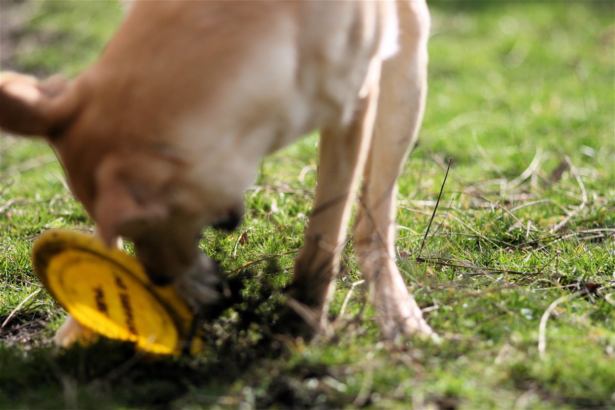
My dog. He didn't catch the disc in the air, so he was tearing at it in anger. View it in the larger size to get a real feel for it.
[CLICK. LARGE]

(
Last edited by Railroader; May 28, 2007 at 02:11 PM.
)
|
|
|
| |
|
|
|
|
|
|
|
Addicted to MacNN
Join Date: Sep 2001
Location: Toronto
Status:
Offline
|
|
Lovely shot, but would have been stronger if the focus would have been anywhere on your dog's face or the Frisbee. As it is, the focus is behind him, pulling attention to where you don't want it to go.
I really like the glow of the sun through the disc, that looks great.
|
|
|
| |
|
|
|
|
|
|
|
Banned
Join Date: Jun 2005
Location: Indy.
Status:
Offline
|
|
My intent was to give the photo a feeling of chaos with the dog out of focus and the grass over saturated.
Here is a picture from that day with the dog in focus:

Do you like this one better?
|
|
|
| |
|
|
|
|
|
|
|
Posting Junkie
Join Date: May 2001
Location: Brisbane, Australia
Status:
Offline
|
|
I like that one much much better. "Intentionally" defocused shots are extremely hard to do, and even more extremely hard for me to like. I don't even like shots that are overly devoted to bokeh, like Peter's up there. It might just be my personal preference, but I think a shot should devote at least a third to an interesting in focus object.
Specifically at Peter: I really think this shot could have benefitted if you shot it a little bit lower, bringing more of the chair (?) into frame.
At Uriel: You are breaking the rules of the thread. Critique one photo and post one photo. Right now it seems it's just me and Rail going back and forth critiquing each other's shots
By the way. Your photos are very nice, I like them all
Have any larger versions / Flickr?
Flickr + Aperture + FlickrExport Pro = The bomb
Now, this one was taken with a really bad camera:
Thus it suffers at large sizes…
|
|
|
| |
|
|
|
|
|
|
|
Addicted to MacNN
Join Date: Sep 2001
Location: Toronto
Status:
Offline
|
|
Originally Posted by - - e r i k - -
I don't even like shots that are overly devoted to bokeh
Same here. I like my shallow depth of field as much as the next aspiring photographer, but most of the images on the flickr bokeh groups are just weird. I especially don't like it when it's an effect created in PS.
(
Last edited by Mastrap; May 28, 2007 at 10:22 PM.
)
|
|
|
| |
|
|
|
|
|
|
|
Addicted to MacNN
Join Date: Sep 2001
Location: Toronto
Status:
Offline
|
|
Originally Posted by Railroader
Do you like this one better?
I do. While I understand what you were trying to achieve with the top shot, for me it ended up just looking like a focussing error.
|
|
|
| |
|
|
|
|
|
|
|
Addicted to MacNN
Join Date: Sep 2001
Location: Toronto
Status:
Offline
|
|
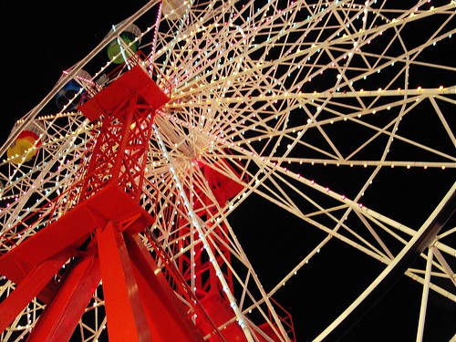
Originally Posted by - - e r i k - -
Thus it suffers at large sizes…
Very nice. It captures the perspective of a child gazing up to the wheel. You can almost hear the fairground music in the background. I also noticed that it adheres to the law of thirds.
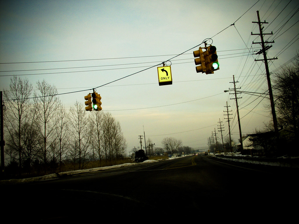
A lomographied shot of a crossroad in Michigan. Totally different image, but also following the law.
|
|
|
| |
|
|
|
|
|
|
|
Moderator Join Date: May 2001
Location: Hilbert space
Status:
Offline
|
|
@Mastrap
IMHO the shot is a tad too dark and has too much green in it (take a look at the yellow sign). I'd put in a bit more orange and brighten up the shadows.
@RR
I like the second one better. Was the focal point of the other dog pic deliberately chosen? I was also under the impression that the AF simply missed the dog …
I really like the pinnacle, excellent high-key shot.
|
|
I don't suffer from insanity, I enjoy every minute of it.
|
| |
|
|
|
|
|
|
|
Mac Elite
Join Date: Sep 2006
Location: Back in the Good Ole US of A
Status:
Offline
|
|
Originally Posted by Uriel
Ok, I'm a photo n00b with a crap camera so be gentle please.

I love this shot. I can't really explain why... just that it evokes a lot of feeling in me.
There's a lot of great pictures in this thread. Very few of people however. Do you all feel it's harder to take pictures of living creatures over still life?
Here's a shot of some coconut palms near Manzanilla on the east coast here in Trinidad. I love the silhouette of the trees however I fear the shot is too dark:

|
|
|
| |
|
|
|
|
|
|
|
Banned
Join Date: Jun 2005
Location: Indy.
Status:
Offline
|
|
Originally Posted by Atheist
There's a lot of great pictures in this thread. Very few of people however. Do you all feel it's harder to take pictures of living creatures over still life?[/IMG]
MINOR RULE BREAKAGE: Most of my pictures of people are of my family. I learned a long time ago not to post personal pictures.
|
|
|
| |
|
|
|
|
|
|
|
Moderator Join Date: May 2001
Location: Hilbert space
Status:
Offline
|
|
@Atheist
Yes, it is harder. I've been in the Bay Area for over a month now and I still need to get a feel for the people here. I find that it takes some time until you can take pictures of people in a new place. Also, on my first weekend with my new camera, some stranger complained that I took pictures of street musicians (other strangers), claiming that I need their permission.
For the same reasons as RR, I hesitate to post any pics of my people. Especially when they don't know that their pic will be published on some obscure internet forum
|
|
I don't suffer from insanity, I enjoy every minute of it.
|
| |
|
|
|
|
|
|
|
Banned
Join Date: Jun 2005
Location: Indy.
Status:
Offline
|
|
Originally Posted by Atheist
Here's a shot of some coconut palms near Manzanilla on the east coast here in Trinidad. I love the silhouette of the trees however I fear the shot is too dark:
Actually, I think you could make the trees darker and the sky more vivid. I think it is an excellent shot, I would like to see a little bit more of that top palm tree, but otherwise, I like the composition. I think that palm tree shots should be done in the layout you did, portrait.
Here's a people pic. Well, no faces, some clients had contracted me to take pictures of their son during his baseball game, and I don't have permission to use the faces.

(
Last edited by Railroader; May 29, 2007 at 07:23 PM.
Reason: corrected links)
|
|
|
| |
|
|
|
|
|
|
|
Professional Poster
Join Date: Jan 2000
Location: Detroit
Status:
Offline
|
|
Uriel:
those remind me of a motivational poster photos.
this is from camping last year; a tree with a fungus problem:

|
|
|
| |
|
|
|
|
|
|
|
Administrator Join Date: Apr 2001
Location: San Antonio TX USA
Status:
Offline
|
|
I have a picture to post-not as much for critique as for an example:

Neither my kittens nor my wife would worry about posting this publicly. ANYTHING beyond showing what I'm showing of my wife (her hands in this case) I would most definitely ask for permission.
(And YOU try getting 6-week old kittens to stay still enough to get them focused! )
|
Glenn -----OTR/L, MOT, Tx
|
| |
|
|
|
|
|
|
|
Professional Poster
Join Date: Jan 2000
Location: Detroit
Status:
Offline
|
|
looks like the guy in the photo in back is doing a line...
|
|
|
| |
|
|
|
|
|
|
|
Baninated
Join Date: Dec 2006
Status:
Offline
|
|
Originally Posted by Railroader
I will start:
(click on picture for a larger version)
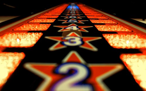
A little too dark. Nice composition. Bump up the contrast a bit, mess with the levels so it isn't so dark. Overall a sweet picture.
|
|
|
| |
|
|
|
|
|
|
|
Addicted to MacNN
Join Date: Aug 2006
Location: The deep backwoods of the PNW
Status:
Offline
|
|
I'm no good at critique - I just don't know enough yet...but I can post one of my own:

|
|
Sell or send me your vintage Mac things if you don't want them.
|
| |
|
|
|
|
|
|
|
Addicted to MacNN
Join Date: Oct 2002
Location: England | San Francisco
Status:
Offline
|
|
what lens did you take that with? stunning!
|
|
we don't have time to stop for gas
|
| |
|
|
|
|
|
|
|
Addicted to MacNN
Join Date: Aug 2006
Location: The deep backwoods of the PNW
Status:
Offline
|
|
No lens - just a Canon PowerShot SD300 on macro mode, autofocus, and as close as I could get - that butterfly didn't move a nanometer until after I'd managed to take four pics - this is the best of the bunch.
But, yeah. For a $200 sub-compact digital camera, that Canon packs a wallop.
|
|
Sell or send me your vintage Mac things if you don't want them.
|
| |
|
|
|
|
|
|
|
Forum Regular
Join Date: Dec 2003
Status:
Offline
|
|
I really like the angle of this picture. I feel it's a little dark (as a previous poster said) and it also feels a little washed out. I'm the colors seem muted to me instead of jumping at me. I think some color adjustment could fix a lot of this.
Here's one of mine, the only thing that was photoshop was the hue shift.

(
Last edited by Uriel; May 30, 2007 at 12:17 PM.
)
|
|
|
| |
|
|
|
|
|
|
|
Forum Regular
Join Date: Dec 2003
Status:
Offline
|
|

Best picture in the thread. Great shot. Has a cold, soft feeling to it.

|
|
|
| |
|
|
|
|
|
|
|
|
|
|
|
|
 
|
|
|
Forum Rules
|
|
|
|
You may not post new threads
You may not post replies
You may not post attachments
You may not edit your posts
|
HTML code is Off
|
|
|
|
|
|
|
|
|
|
|
|