 |
 |
Photo Critique Thread - [JPEG] (Page 2)
|
|
|
|
|
Forum Regular
Join Date: Dec 2003
Status:
Offline
|
|

MUCH better than the other. I understand what you were going for in the other one, however I feel that the position of the dog makes it difficult to understand what's going on. This one offers much more clarity.

|
|
|
| |
|
|
|
|
|
|
|
Moderator  Join Date: May 2001
Location: Hilbert space
Status:
Offline
|
|
@Uriel: I like the low-key shot of the woman. The one with the bench is a bit too steril IMHO.
|
|
I don't suffer from insanity, I enjoy every minute of it.
|
| |
|
|
|
|
|
|
|
Baninated
Join Date: Dec 2006
Status:
Offline
|
|
Originally Posted by Uriel 
Ugh. Totally cliche dude. Black and white. Empty park bench. Yuck. Try something new please. The composition and everything is fine, but the subject kills it.
|
|
|
| |
|
|
|
|
|
|
|
Forum Regular
Join Date: Dec 2003
Status:
Offline
|
|
While I agree that A: it is sterile and B: that it is cliche. It was one of my first, the intention was to feel sterile and lonely, hence the black and white.
Second, no critquing without a picture. Also, some constructive criticism would help. Thanks!

I like the low-key shot of the woman.
Thank you, that's my beautiful fiancé.
|
|
|
| |
|
|
|
|
|
|
|
Banned
Join Date: Jun 2005
Location: Indy.
Status:
Offline
|
|
So much for my request to keep the thread civil.
Uriel: I too like the low-key shot of the woman. It gives a feeling of loneliness and isolation, yet with a slight sense of hope. Maybe I am reading too much into it, but that's what I see.
I also like the park bench photo. It relays the sense that someone has rushed off in a hurry and left their magazine. Great perspective and an excellent use of a shallow depth of field.
I am not too sure about the field of grass and piece of wood. Is it a detail of a boat, or a strange bird house?
And I am not too sure about the border you add. I understand that it gives the photo a more formal professional appearance, but I don't think that should be added during a critique.
Here's a picture I took for some clients.

(
Last edited by Railroader; May 30, 2007 at 02:22 PM.
)
|
|
|
| |
|
|
|
|
|
|
|
Baninated
Join Date: Dec 2006
Status:
Offline
|
|
Originally Posted by Uriel
While I agree that A: it is sterile and B: that it is cliche. It was one of my first, the intention was to feel sterile and lonely, hence the black and white.
You succeeded in your intentions. The problem is that almost EVERY photo major around the world has already taken that exact same shot, with those exact same intentions. It's boring, because it's been done 100 billion times before. From a technical standpoint, the photo is great. Again, it's just the subject. I mean.... you might as well take a picture of an empty swingset in black and white too.
I think what COULD work would be realizing this is cliche subject matter, and adding something subtle to the composition to throw someone off. Like.... maybe that exact same shot, but with a prosthetic limb, because who the hell would leave that? Or one sneaker? Who knows. SOMETHING, ANYTHING to get it away from cliche and maybe into a photo that realizes that shot is cliche, and plays with it somehow. Perhaps a strange animal sitting on the park bench, reading a newspaper? I dunno. I'm not saying my ideas are great, but something to help pull it away from boringville.
Second, no critquing without a picture. Also, some constructive criticism would help. Thanks!
I posted a pic but nobody critiqued it yet. Knock yourself out! 
|
|
|
| |
|
|
|
|
|
|
|
Forum Regular
Join Date: Dec 2003
Status:
Offline
|
|
You succeeded in your intentions. The problem is that almost EVERY photo major around the world has already taken that exact same shot, with those exact same intentions. It's boring, because it's been done 100 billion times before. From a technical standpoint, the photo is great. Again, it's just the subject. I mean.... you might as well take a picture of an empty swingset in black and white too.
Touché. However at that time in my picture taking (like the first week) I was aiming for cliche. I wasn't trying to be original as much as I was trying to begin to learn the mechanics of a good picture and do it myself. Your analysis isn't far off, yet your critique isn't applicable.
I appreciate your opinion though. Please keep it up.
I am not too sure about the field of grass and piece of wood. Is it a detail of a boat, or a strange bird house?
It was a freaking door that I found in the middle of the woods. I have no idea how it got there. I just thought it was interesting and the colors were a nice contrast.
Uriel: I too like the low-key shot of the woman. It gives a feeling of loneliness and isolation, yet with a slight sense of hope. Maybe I am reading too much into it, but that's what I see.
That's actually exaclty what it was. Glad the emotion came through. I take pictures that I feel. (which is the reason I have a lot of "dry spells" of not taking pictures). This was a time I was having a really hard time with some people that I'd trusted for a long time, but it was also a time where my fiancé and I became really close and she was a great encouragment.
The darkness, thorns are behind her in an attempt to kind of give the feeling that yes, it was bad but it's behind her and she's coming out of it into the light.
Sorry if that's corny, it's what I was feeling at the time.
|
|
|
| |
|
|
|
|
|
|
|
Grizzled Veteran
Join Date: Jan 2003
Location: The midwest...
Status:
Offline
|
|
|
|
|
Joe
|
| |
|
|
|
|
|
|
|
Baninated
Join Date: May 2007
Status:
Offline
|
|
The last shot isn't centered, and the perspective is to normal. If you'd been closer to it, I think it'd be incredible, especially with a wide angle lense.
|
|
|
| |
|
|
|
|
|
|
|
Grizzled Veteran
Join Date: Jan 2003
Location: The midwest...
Status:
Offline
|
|
Yeah, I've noticed that to, but the colors kick @ss so I try and look past it. Thanks!
|
|
Joe
|
| |
|
|
|
|
|
|
|
Moderator  Join Date: Jun 2000
Location: inside 128, north of 90
Status:
Offline
|
|
incredible clarity on that butterfly shifui. RR, I prefer the second dog photo as well.
I'm not sure which of these is better, so I will post both. I tend to prefer not futzing with pictures, so no post-production has been done. Should it be?
outdoor heated pool, in winter flurry, partially underwater:

closeup:

|
|
|
| |
|
|
|
|
|
|
|
Addicted to MacNN
Join Date: Sep 2001
Location: Toronto
Status:
Offline
|
|
Originally Posted by andi*pandi
I tend to prefer not futzing with pictures, so no post-production has been done.
If you're not shooting RAW then the camera does all your post production for you. It will translate the image on the sensor into whatever it sees fit. While that can work out beautifully, and I really like those two images, another camera will come up with a very different interpretation.
I prefer to make these choices myself, almost all of my pics are in some way retouched.
|
|
|
| |
|
|
|
|
|
|
|
Baninated
Join Date: May 2007
Status:
Offline
|
|
Originally Posted by andi*pandi
incredible clarity on that butterfly shifui. RR, I prefer the second dog photo as well.
I'm not sure which of these is better, so I will post both. I tend to prefer not futzing with pictures, so no post-production has been done. Should it be?
outdoor heated pool, in winter flurry, partially underwater:
closeup:
They're both too grey, without much contrast.
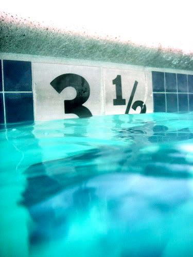
Fixed.
|
|
|
| |
|
|
|
|
|
|
|
Addicted to MacNN
Join Date: Sep 2001
Location: Toronto
Status:
Offline
|
|
Over-saturated. Way over-saturated.
The original captured the feeling of swimming in winter perfectly, the edited version has lost that completely.
|
|
|
| |
|
|
|
|
|
|
|
Baninated
Join Date: May 2007
Status:
Offline
|
|
Over saturation is good. Low contrast and lots of grey is bad. No darks, no brights= crap photo. Sorry.
|
|
|
| |
|
|
|
|
|
|
|
Addicted to MacNN
Join Date: Sep 2001
Location: Toronto
Status:
Offline
|
|
Originally Posted by DrMischievious
Over saturation is good. Low contrast and lots of grey is bad. No darks, no brights= crap photo. Sorry.
Wrong. Sorry.
I am not sure if you're trolling or if you truly have no idea about photography.
|
|
|
| |
|
|
|
|
|
|
|
Baninated
Join Date: May 2007
Status:
Offline
|
|
Originally Posted by Mastrap
Wrong. Sorry.
I am not sure if you're trolling or if you truly have no idea about photography.
I know about design, and I know about critiquing. One of the best ways to see if your photo is any good is to look at it from far away, and see if it still looks like a recognizeable good photo. The blacks need to be BLACK, and the whites need to be really white. It needs punch, it needs 'pop'. Without it, it'll just fade into a grey mess, and nobody will dig it.
|
|
|
| |
|
|
|
|
|
|
|
Senior User
Join Date: Jan 2006
Location: Naugatuck, CT
Status:
Offline
|
|
I just started a flickr page yesterday, want to start taking more pictures...
here's one of my firsts
I used Railhead's "cross-processing" technique I read about on his blog. (props to him - no I'm not a stalker, just curious )
|
|
|
| |
|
|
|
|
|
|
|
Baninated
Join Date: May 2007
Status:
Offline
|
|
It's okay, but it looks like it was taken on an overcast day. Maybe a tad brighter, while keeping the blacks nice and dark.
|
|
|
| |
|
|
|
|
|
|
|
Moderator Join Date: Jun 2000
Location: inside 128, north of 90
Status:
Offline
|
|
Originally Posted by DrMischievious
I know about design, and I know about critiquing. One of the best ways to see if your photo is any good is to look at it from far away, and see if it still looks like a recognizeable good photo. The blacks need to be BLACK, and the whites need to be really white. It needs punch, it needs 'pop'. Without it, it'll just fade into a grey mess, and nobody will dig it.
I recognize the black/contrast issue. The problem with this, is the photo is full of steam coming from the hot pool to the cold air, it's snowing, it's january. It's naturally grey. Is it better to sacrifice reality for contrast, or is the soft feeling part of what makes the photo interesting?
|
|
|
| |
|
|
|
|
|
|
|
Baninated
Join Date: May 2007
Status:
Offline
|
|
Andi: Yes, if that's the only photo you have. Perhaps there's a way to increase the contrast while maintaing the steam, but from my perspective, I don't really find the fog very interesting. I find the number half in the water interesting, the shapes the water is making, and the angle of the pool's edge. The steam is just greying everything out, so I ditched it like yesterday's parking ticket.
|
|
|
| |
|
|
|
|
|
|
|
Senior User
Join Date: Jan 2006
Location: Naugatuck, CT
Status:
Offline
|
|
andi:
for what it's worth, I like the first photo, I like the skilifts, the snow on the fence, the fog, the whole thing.
if you really wanted to punch up the color, I think you could without loosing the feeling of the wintery swim, but I like it as it is.
|
|
|
| |
|
|
|
|
|
|
|
Dedicated MacNNer
Join Date: Oct 2002
Status:
Offline
|
|
Trying to get the most out of a T610.

|
|
|
| |
|
|
|
|
|
|
|
Posting Junkie
Join Date: Mar 2005
Location: Louisiana
Status:
Offline
|
|
I took this in my church's studio on Saturday. It's a Christian Rock band based here named Yesterday.
In Destin, Florida last weekend.
(
Last edited by Jawbone54; Jun 3, 2007 at 05:10 PM.
)
|
|
|
| |
|
|
|
|
|
|
|
Mac Elite
Join Date: Apr 2001
Status:
Offline
|
|
|
|
|
|
| |
|
|
|
|
|
|
|
Mac Elite
Join Date: Dec 2000
Location: sic semper tyrannis
Status:
Offline
|
|
|
|
|
one post closer to five stars
|
| |
|
|
|
|
|
|
|
Posting Junkie
Join Date: Mar 2005
Location: Louisiana
Status:
Offline
|
|
Originally Posted by dav
I wish I could see a bit more of the tunnels, but I like the contrast and the reflection of the bridge on the (very) still water. Plus I'm a sucker for B&W.
|
|
|
| |
|
|
|
|
|
|
|
Posting Junkie
Join Date: Mar 2005
Location: Louisiana
Status:
Offline
|
|
Originally Posted by Hash
Beautiful shot of the greatest city in the world. The only thing I'd like to have seen different is the top of the Chrysler Building not being chopped off. Other than that, really pretty.
|
|
|
| |
|
|
|
|
|
|
|
Mac Elite
Join Date: Dec 2000
Location: sic semper tyrannis
Status:
Offline
|
|
Originally Posted by Jawbone54
I wish I could see a bit more of the tunnels...
here's another...

|
|
one post closer to five stars
|
| |
|
|
|
|
|
|
|
Posting Junkie
Join Date: Mar 2005
Location: Louisiana
Status:
Offline
|
|
Originally Posted by dav
here's another...
I like that one a lot better, personally. Very nice. The bridge is a great find, BTW.
|
|
|
| |
|
|
|
|
|
|
|
Mac Elite
Join Date: Dec 2000
Location: sic semper tyrannis
Status:
Offline
|
|
Originally Posted by Jawbone54
I like that one a lot better, personally. Very nice. The bridge is a great find, BTW.
thanks. it's along a favorite hiking place for me and the kids. we usually conclude with them throwing pebbles in the river.
|
|
one post closer to five stars
|
| |
|
|
|
|
|
|
|
Mac Elite
Join Date: Apr 2001
Status:
Offline
|
|
thank you.. here is a picture with Chrysler Building intact .. warm NY evening in evening clouds 
|
|
|
| |
|
|
|
|
|
|
|
Posting Junkie
Join Date: May 2001
Location: Brisbane, Australia
Status:
Offline
|
|
Originally Posted by Jawbone54
I took this in my church's studio on Saturday. It's a Christian Rock band based here named Yesterday.
The guy on the left has unholy tight pants.
|
|
|
| |
|
|
|
|
|
|
|
Dedicated MacNNer
Join Date: Aug 2005
Location: Beaumont Texas
Status:
Offline
|
|
I thought I would bring this back to the front. Tell me what you think

(
Last edited by JMan09; Jun 8, 2007 at 02:23 AM.
)
|
|
32GB iPad 2 | 32GB iPhone 4 | 11' MacBook Air 1.6 i5, 4GB, 128GB SSD
|
| |
|
|
|
|
|
|
|
Posting Junkie
Join Date: May 2001
Location: Brisbane, Australia
Status:
Offline
|
|
1) All right arty shot, but nothing special. I like the lights sweeping across the top, but I think the church itself could have been better defined.
2) Snapshot
3) I see what you are going for, but this kind of angle can be made much more dramatic. Move in lower and closer and leave some space on the left.
|
|
|
| |
|
|
|
|
|
|
|
Dedicated MacNNer
Join Date: Aug 2005
Location: Beaumont Texas
Status:
Offline
|
|
Thanks for the tips. The first one with the bright lights and the church was a mistake actually. We were driving in the car, and I wanted a picture of the church all lit up. But I didnt realize we were moving fast enough to do this, so I guess being zoomed in and the bright lights did this. I really like the effects and a good mistake.
|
|
32GB iPad 2 | 32GB iPhone 4 | 11' MacBook Air 1.6 i5, 4GB, 128GB SSD
|
| |
|
|
|
|
|
|
|
Addicted to MacNN
Join Date: Oct 2002
Location: England | San Francisco
Status:
Offline
|
|
|
|
|
we don't have time to stop for gas
|
| |
|
|
|
|
|
|
|
Posting Junkie
Join Date: May 2001
Location: Brisbane, Australia
Status:
Offline
|
|
First one could use some cropping to remove a whole lot of background noise. In particular the bin (?) that's jutting out of frame on the left.
Cropping it so it's only the lawn around here at the top would make for a much more harmonised picture.
|
|
|
| |
|
|
|
|
|
|
|
Addicted to MacNN
Join Date: Oct 2002
Location: England | San Francisco
Status:
Offline
|
|
interesting!
(Am still working out the whole photo editing malarky)
|
|
we don't have time to stop for gas
|
| |
|
|
|
|
|
|
|
Posting Junkie
Join Date: Sep 2001
Status:
Offline
|
|
Originally Posted by MrsLarry
WOW! Memories! I admit it, I had those two when I was a kid. Damn!
|
|
|
| |
|
|
|
|
|
|
|
Banned
Join Date: Jun 2005
Location: Indy.
Status:
Offline
|
|
Originally Posted by Peter
This is an adorable picture. And she is certainly an excellent subject, but your image is too distracting on the left hand side. I like the over-saturation of the lawn, but it is just a tad overdone. At first I didn't like the angle that the picture was taken on, but after trying to straighten it out in Adobe Photoshop CS3™ (aren't they being a teeny bit anal?) it looks like a simple snapshot when the horizon line is level. Quick suggestion: lower your self down to the eye level, or chest level, of your subject.
Here is a nicely cropped version of your picture:

Here is a picture I took of a deer at Indiana Dunes National Lakeshore Mt. Baldy park. It was taken with the kit lens, and this is a perfect example of why I take my camera everywhere.

|
|
|
| |
|
|
|
|
|
|
|
Posting Junkie
Join Date: May 2001
Location: Brisbane, Australia
Status:
Offline
|
|
Perfect crop Railroader 
|
|
|
| |
|
|
|
|
|
|
|
Banned
Join Date: Jun 2005
Location: Indy.
Status:
Offline
|
|
Thanks. I debated about the crop on the right hand side. The left side was a given. The problem I might have introduced was if/when the photo is placed in a frame, a half cm or so will be cut off as well. Sometimes it's better to leave a little bit too much on the edges to accommodate frames.
EDIT: Actually, Peter has quite a nice photograph there. He better be sharing it with the child's parents!
|
|
|
| |
|
|
|
|
|
|
|
Addicted to MacNN
Join Date: Sep 2001
Location: Toronto
Status:
Offline
|
|
^ That's why we have mattes 
|
|
|
| |
|
|
|
|
|
|
|
Senior User
Join Date: Feb 2005
Location: Mississippi
Status:
Offline
|
|
Heres mine! The first one is a reflection of the Q siren on a fire truck. The second one is taken of the gear wall at the fire dept.... Kind of gives a sense of waiting on the next call.


|
|
|
| |
|
|
|
|
|
|
|
Banned
Join Date: Jun 2005
Location: Indy.
Status:
Offline
|
|
Originally Posted by Mastrap
^ That's why we have mattes
You still lose a little bit.
Originally Posted by iranfromthezoo
Heres mine! The first one is a reflection of the Q siren on a fire truck. The second one is taken of the gear wall at the fire dept.... Kind of gives a sense of waiting on the next call.
I really like this shot. I have tried reflection shots before but have never been very successful. The diamond plate in both the reflection and the background are a nice touch. I am a little uneasy about the color balance though. It looks a little "Matrix-like". I think this shot may look very nice in black and white.
Here is a picture I took last weekend during a bike-a-thon I was photographing. I was setting up for the bikers and noticed the wild flower path and thought it would look good int he foreground of the biker shots. Looking closer I saw the bee loaded up with pollen. I took about a hundred shots and this was the best one. Very difficult to capture.

|
|
|
| |
|
|
|
|
|
|
|
Posting Junkie
Join Date: May 2001
Location: Brisbane, Australia
Status:
Offline
|
|
That is an awesome shot! Great job RR!
|
|
|
| |
|
|
|
|
|
|
|
Banned
Join Date: Jun 2005
Location: Indy.
Status:
Offline
|
|
Thanks Erik. Here's another "keeper":

|
|
|
| |
|
|
|
|
|
|
|
Addicted to MacNN
Join Date: Feb 2003
Location: NY²
Status:
Offline
|
|
Very nice Railroader. Which lens were you using?
|
|
|
| |
|
|
|
|
|
|
|
Banned
Join Date: Jun 2005
Location: Indy.
Status:
Offline
|
|
Canon 200mm f/2.8L II USM with my Rebel XTi and a cheap UV filter.
|
|
|
| |
|
|
|
|
|
|
|
|
|
|
|
|
 
|
|
|
Forum Rules
|
|
|
|
You may not post new threads
You may not post replies
You may not post attachments
You may not edit your posts
|
HTML code is Off
|
|
|
|
|
|
|
|
|
|
|
|


