 |
 |
Little design help: how to make this diagram palatable for a presentation?
|
|
|
|
|
Moderator  Join Date: May 2001
Location: Hilbert space
Status:
Offline
|
|
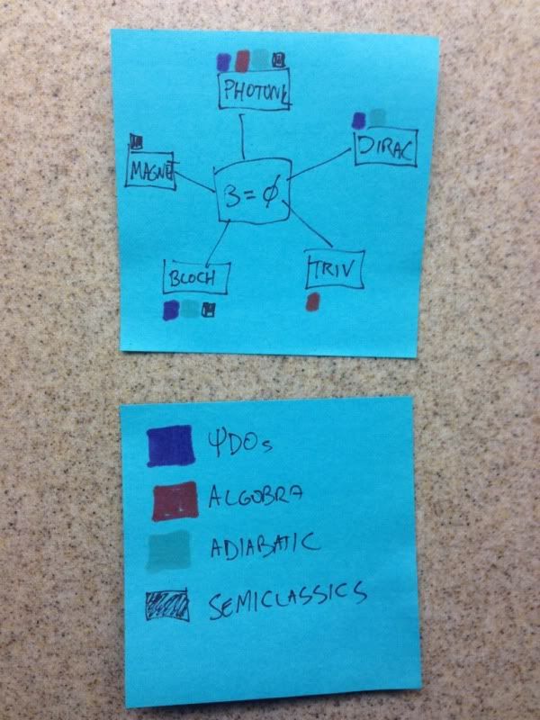
I have important job interviews coming up for positions in academia and I thought it's a good idea to visualize my scientific interests. You don't have to understand what these words mean to understand the diagram. I purposely chose very ugly colors (which maximize contrast), very simple shapes and the arrangement is very rough. I also haven't chosen a font yet (I don't intend to stick with Helvetica).
Here is the explanation to the diagram:
(1) The big red box in the center labeled B ≠ 0 is my main research topic which ties everything together. It should remain the most prominent item.
(2) The items in the white rectangles in the corners are other research topics.
(3) Items in the clouds are publications. I roughly grouped them according to subjective significance: blue are tier 1 (= most significant) publications, orange tier 2 and green tier 3 (= least significant).
(4) The arrows indicate what techniques have been used and/or what topics they concern.
I intend to use this diagram for a Keynote-type presentation, so it has to be readable when projected to a screen. I don't insist that all tiers need to be present at all times during the presentation, perhaps it's better to make 2-3 slides out of it, revealing only publications of certain tiers.
My main messages are:
(1) B ≠ 0 is the main field of interest.
(2) Publications involve two or more distinct techniques.
Here's the current diagram (click in the image for a larger pdf version):

PS I'm using OmniGraffle.
|
|
I don't suffer from insanity, I enjoy every minute of it.
|
| |
|
|
|
|
|
|
|
Clinically Insane
Join Date: Jun 2001
Location: Chicago, Bang! Bang!
Status:
Offline
|
|
Is the arrow going from Dirac to your main subject supposed to be tan?
|
|
|
| |
|
|
|
|
|
|
|
Moderator Join Date: May 2001
Location: Hilbert space
Status:
Offline
|
|
Nope, that's a bug, thank you. I must have missed it when I changed colors. I'll update the diagram now …
Again, I apologize for the ugliness, I hope none of you guys gets eye cancer.  
|
|
I don't suffer from insanity, I enjoy every minute of it.
|
| |
|
|
|
|
|
|
|
Clinically Insane
Join Date: Jun 2001
Location: Chicago, Bang! Bang!
Status:
Offline
|
|
Here's my first idea. I did it as a circle, but it actually may be better as a triangle.
|
|
|
| |
|
|
|
|
|
|
|
Clinically Insane
Join Date: Jun 2001
Location: Chicago, Bang! Bang!
Status:
Offline
|
|
Now I'm leaning towards circle.
I was thinking you could have each level on a separate slide, but you could place them farther out to denote their reduced importance.
|
|
|
| |
|
|
|
|
|
|
|
Clinically Insane
Join Date: Jun 2001
Location: Chicago, Bang! Bang!
Status:
Offline
|
|
Also, QED only uses one technique in your chart.
|
|
|
| |
|
|
|
|
|
|
|
Moderator Join Date: May 2001
Location: Hilbert space
Status:
Offline
|
|
Thanks for your creative input, it's exactly what I need: ideas to simplify presentation. I'll toy around with those tomorrow.
Edit: Yes, QED has only a single link, that's on purpose.
|
|
I don't suffer from insanity, I enjoy every minute of it.
|
| |
|
|
|
|
|
|
|
|
|
|
|
|
 
|
|
|
Forum Rules
|
|
|
|
You may not post new threads
You may not post replies
You may not post attachments
You may not edit your posts
|
HTML code is Off
|
|
|
|
|
|
|
|
|
|
|
|


