 |
 |
Help finding out this font
|
|
|
|
|
Forum Regular
Join Date: Aug 2006
Location: United Kingdom, North London
Status:
Offline
|
|
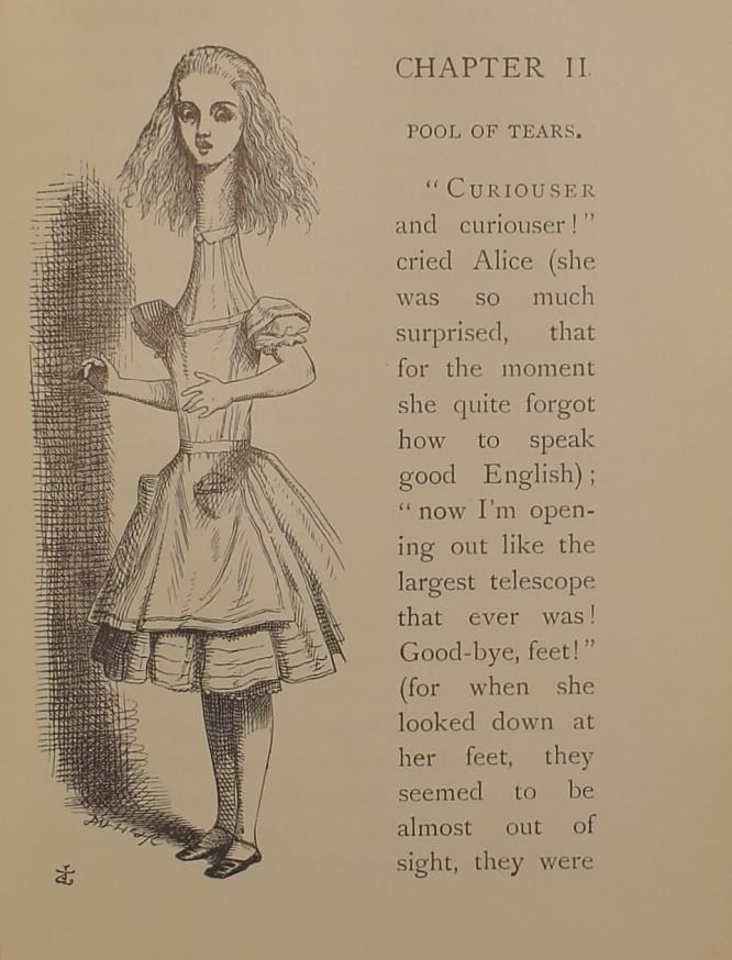
I am currently redesigning alice in wonderland for a project at my uni, and i am trying to find out what font was used for the body text, i think it's baskerville or times, but the w's and e's are different so i thought i'd ask you guys. Also on another note does anyone know any websites or books about conceptual typographic books
|
|
|
| |
|
|
|
|
|
|
|
Moderator  Join Date: Jun 2000
Location: inside 128, north of 90
Status:
Offline
|
|
I highly recomment WhatTheFont! � MyFonts for guessing fonts. Upload a sample and boom.
However, my first guess also put this at baskerville, but then I decided sabon was closer. Depending on how old this book is, that is. This is not Times.
Do you have to spec the type precisely?
|
|
|
| |
|
|
|
|
|
|
|
Forum Regular
Join Date: Aug 2006
Location: United Kingdom, North London
Status:
Offline
|
|
ah cheers i will try it there, i also don't think it's sabon cos the w's are different, the capital ones are anyway. The have asked me if i can find out the original text but since it was originally done in 1865 i can't contact the company that done it because i doubt they will know now. i was wondering if it was by john bell not sure what the font was called but i see it in a typography book.
|
|
|
| |
|
|
|
|
|
|
|
Moderator Emeritus
Join Date: Mar 2004
Location: Copenhagen
Status:
Offline
|
|
No, it’s definitely not Sabon, and it’s not Baskerville either. It’s too rounded for Sabon, and not round enough for Baskerville.
It does look a bit like Bell, but it’s not that either. It does look very familiar, but I can’t place it. Perhaps a custom variant mixture of Baskerville and an Aldine type of sorts? If it’s from 1865, there’s a chance it’s an in-house type made by the setters themselves …
|
|
|
| |
|
|
|
|
|
|
|
Moderator Join Date: Jun 2000
Location: inside 128, north of 90
Status:
Offline
|
|
Sounds like you need to research fonts that were around then. Sabon is a modern reinterpretation of Baskerville.
Also, if you are comparing that scanned sample to modern versions there will be differences.
My new guess, based on A and G, is Janson.
|
|
|
| |
|
|
|
|
|
|
|
Forum Regular
Join Date: Aug 2006
Location: United Kingdom, North London
Status:
Offline
|
|
right checked the font against what's my font and it come up with
-Royal Romain
-Vertrina
-Adobe Jenson Subhead Light
(none of these are close btw)
I have the actually book, with the original text and illustrations, i don't really need to say 'well that's baskerville so i am doing the font in baskerville'. But my tutor does want me to see if i can find a font near it, that's why i thought it might be garamond or baskerville even, cos i checked against my fonts in the font book and it seemed the nearest and was garmond. But the g's and w's are what confuse me. I will probably use sabon or garamond in the version i shall design
|
|
|
| |
|
|
|
|
|
|
|
Moderator Emeritus
Join Date: Mar 2004
Location: Copenhagen
Status:
Offline
|
|
I agree: some variant of Garamond is probably what comes closest. While Baskerville is quite close in many respects, it has a completely different feel to it than this one does.
Your next step is to trawl through the bajillion different variations of Garamond there are, trying to find the best one. 
|
|
|
| |
|
|
|
|
|
|
|
Forum Regular
Join Date: Aug 2006
Location: United Kingdom, North London
Status:
Offline
|
|
oh btw i did find the text it was bookman, but an old style managed to get it off the net, cheers guys <3
|
|
|
| |
|
|
|
|
|
|
|
|
|
|
|
|
 
|
|
|
Forum Rules
|
|
|
|
You may not post new threads
You may not post replies
You may not post attachments
You may not edit your posts
|
HTML code is Off
|
|
|
|
|
|
|
|
|
|
|
|


