|
 |
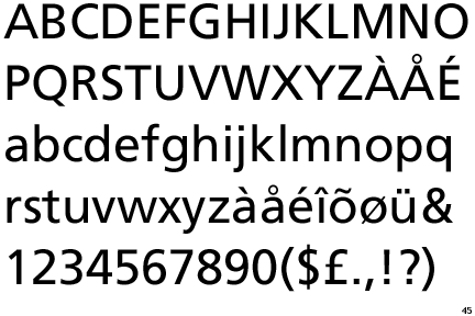
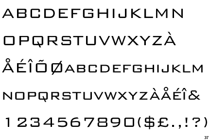
"Helvetica."
|
|
|
|
|
Addicted to MacNN
Join Date: Oct 2002
Location: England | San Francisco
Status:
Offline
|
|
Got my copy today -- anyone else have it / seen it? Its very interesting!
Helvetica is a feature-length independent film about typography, graphic design and global visual culture. It looks at the proliferation of one typeface (which is celebrating its 50th birthday this year) as part of a larger conversation about the way type affects our lives. Helvetica is currently screening at film festivals, museums, design conferences, and cinemas worldwide, followed by the DVD release November 20th.
|
|
we don't have time to stop for gas
|
| |
|
|
|
|
|
|
|
Moderator Emeritus
Join Date: Apr 2001
Location: Fort Lauderdale, FL
Status:
Offline
|
|
neat I think I'll pick it up. I have a love/hate relationship with fonts.
|
|
ice
|
| |
|
|
|
|
|
|
|
Professional Poster
Join Date: Oct 2004
Status:
Offline
|
|
I secretly like Helvetica.
Not heard of the movie.
|
__________________________________________________
My stupid iPhone game: Nesen Probe, it's rather old, annoying and pointless, but it's free.
Was free. Now it's gone. Never to be seen again.
Off to join its brother and sister apps that could not
keep up with the ever updating iOS. RIP Nesen Probe.
|
| |
|
|
|
|
|
|
|
Professional Poster
Join Date: Apr 2007
Location: A House of Ill-Repute in the Sky
Status:
Offline
|
|
Sounds like a nerdy kind of thing I'd enjoy.
|
|
|
| |
|
|
|
|
|
|
|
Addicted to MacNN
Join Date: Aug 2006
Location: The deep backwoods of the PNW
Status:
Offline
|
|
I'm a big Arial fan, myself.
|
|
Sell or send me your vintage Mac things if you don't want them.
|
| |
|
|
|
|
|
|
|
Moderator Emeritus
Join Date: Mar 2004
Location: Copenhagen
Status:
Offline
|
|
Originally Posted by shifuimam 
I'm a big Arial fan, myself.
*gasp*
You just lost any MacNN street cred you may have had, young lady.
That sounds like a movie I’d adore 
|
|
|
| |
|
|
|
|
|
|
|
Addicted to MacNN
Join Date: Sep 2000
Location: Isle of Manhattan
Status:
Offline
|
|
Yep, Arial + Monoco, Nadeem, Hei, Harrington & Snell Roundhand for fun. Helvetica can just go to hell. ha!
|
|
"Faster, faster! 'Till the thrill of speed overcomes the fear of death." - HST
|
| |
|
|
|
|
|
|
|
Mac Enthusiast
Join Date: Jul 2007
Location: hamburg, germany
Status:
Offline
|
|
I had not heard of the movie. I love typography, so I'll get myself a copy. Thanks for bringing it to our attention.
|
|
|
| |
|
|
|
|
|
|
|
Professional Poster
Join Date: Jan 2000
Location: Near Antietam Creek
Status:
Offline
|
|
I saw a screening at a local design school--very good.
|
|
I am stupidest when I try to be funny.
|
| |
|
|
|
|
|
|
|
Professional Poster
Join Date: Dec 2001
Location: somewhere
Status:
Offline
|
|
This is far more geeky than hard drive refrigerator magnets. No need for alcohol - I think this would put me to sleep before I could even get drunk.
|
|
|
| |
|
|
|
|
|
|
|
Addicted to MacNN
Join Date: Feb 2001
Location: Your Anus
Status:
Offline
|
|
These damn people copied my idea!
I'm making a movie about Sand.
|

My sig is 1 pixel too big.
|
| |
|
|
|
|
|
|
|
Professional Poster
Join Date: Apr 2007
Location: A House of Ill-Repute in the Sky
Status:
Offline
|
|
I'd love to make a movie about the infection of Papyrus in the design world.
|
|
|
| |
|
|
|
|
|
|
|
Addicted to MacNN
Join Date: Aug 2006
Location: The deep backwoods of the PNW
Status:
Offline
|
|
Actually, I like the new default fonts with Windows Vista a LOT. Calibri and Corbel are really easy on the eyes.
|
|
Sell or send me your vintage Mac things if you don't want them.
|
| |
|
|
|
|
|
|
|
Posting Junkie
Join Date: Apr 2007
Location: Iowa, how long can this be? Does it really ruin the left column spacing?
Status:
Offline
|
|
Originally Posted by ort888
These damn people copied my idea!
I'm making a movie about Sand.
You do that and I swear I'll kill you.
Unless it's a snuff film, and Sand is the victim.
|
|
|
| |
|
|
|
|
|
|
|
Addicted to MacNN
Join Date: Oct 2002
Location: England | San Francisco
Status:
Offline
|
|
Consolas is a great terminal font too.
Its a great movie btw. Lots of amusing Windows bashing too 
You'd be amazed at who uses Helvetica. In fact, you'd be surprised who doesn't use it!
I found a part discussing Marlboro Cigarettes particularly interesting. Anyone feel like recreating this photo, but using the Helvetica font face as the Marlboro logo? Dont have photoshop on home computer.
|
|
we don't have time to stop for gas
|
| |
|
|
|
|
|
|
|
Posting Junkie
Join Date: Apr 2007
Location: Iowa, how long can this be? Does it really ruin the left column spacing?
Status:
Offline
|
|
Like this?

|
|
|
| |
|
|
|
|
|
|
|
Addicted to MacNN
Join Date: Oct 2002
Location: England | San Francisco
Status:
Offline
|
|
I was lucky enough to get the special edition box set, too. photos
comes with:

this made me chuckle:

ooh signed:

and this is just cool:

|
|
we don't have time to stop for gas
|
| |
|
|
|
|
|
|
|
Addicted to MacNN
Join Date: Sep 2000
Location: Isle of Manhattan
Status:
Offline
|
|
|
|
|
"Faster, faster! 'Till the thrill of speed overcomes the fear of death." - HST
|
| |
|
|
|
|
|
|
|
Professional Poster
Join Date: Apr 2007
Location: A House of Ill-Repute in the Sky
Status:
Offline
|
|
Originally Posted by Peter
Dont have photoshop on home computer.
Too good to steal?
|
|
|
| |
|
|
|
|
|
|
|
Moderator Emeritus
Join Date: Mar 2004
Location: Copenhagen
Status:
Offline
|
|
Originally Posted by Peter
I was lucky enough to get the special edition box set, too. photos
comes with:
WTF? This is a movie about typography, and they mistake a dash for a hyphen in the special edition box set contents themselves?
Nice metal type, though.
|
|
|
| |
|
|
|
|
|
|
|
Posting Junkie
Join Date: Apr 2007
Location: Iowa, how long can this be? Does it really ruin the left column spacing?
Status:
Offline
|
|
Originally Posted by Dakarʒ
Too good to steal?
Or not willing to sink down to Gimp?
|
|
|
| |
|
|
|
|
|
|
|
Professional Poster
Join Date: Apr 2007
Location: A House of Ill-Repute in the Sky
Status:
Offline
|
|
Originally Posted by Laminar
Or not willing to sink down to Gimp?
That's a great statement when taken out of context.
|
|
|
| |
|
|
|
|
|
|
|
Moderator Emeritus
Join Date: Mar 2004
Location: Copenhagen
Status:
Offline
|
|
Crap! They showed this at CPH : DOX just over a week ago. Why didn’t I know about it then?
*grumble*
|
|
|
| |
|
|
|
|
|
|
|
Posting Junkie
Join Date: Mar 2005
Location: Louisiana
Status:
Offline
|
|
The Gimp crippled my PowerBook.
hee hee
|
|
|
| |
|
|
|
|
|
|
|
Moderator  Join Date: Jun 2000
Location: inside 128, north of 90
Status:
Offline
|
|
ooh. sounds interesting.
I'd be interested in watching a film where papyrus and sand duel to the death, only to have the winner be eaten by a lion.
Cooper Black can be the lion.
Then the lion can get the thumbsup from Emperor Univers.
|
|
|
| |
|
|
|
|
|
|
|
Addicted to MacNN
Join Date: Nov 1999
Location: Madison, WI
Status:
Offline
|
|
Originally Posted by ort888
These damn people copied my idea!
I'm making a movie about Sand.
 I hate sand.
|
|
|
| |
|
|
|
|
|
|
|
Mac Elite
Join Date: Aug 2004
Location: ------>
Status:
Offline
|
|
I take it it's no longer hip to diss Comic Sans?
|
|
|
| |
|
|
|
|
|
|
|
Addicted to MacNN
Join Date: Jul 2001
Location: Behind the dryer, looking for a matching sock
Status:
Offline
|
|
Like Helvetica? Wear it with pride.
|
|
|
| |
|
|
|
|
|
|
|
Moderator Emeritus
Join Date: Mar 2004
Location: Copenhagen
Status:
Offline
|
|
Originally Posted by BlueSky
I take it it's no longer hip to diss Comic Sans?
Dissing Comic Sans never goes out of style.
(Side note: I had to seriously explain to one of the girls in my web design group why using Comic Sans for the main font on our project web site was not a good idea)
|
|
|
| |
|
|
|
|
|
|
|
Posting Junkie
Join Date: May 2001
Location: Brisbane, Australia
Status:
Offline
|
|
Originally Posted by BlueSky
I take it it's no longer hip to diss Comic Sans?
Nah. Sand is the new Comic Sans.
|
|
|
| |
|
|
|
|
|
|
|
Posting Junkie
Join Date: Jan 2006
Location: Colorado
Status:
Offline
|
|
I used to use Helvetica Neue for everything until Apple started using it for everything. They copy me. That looks like an interesting doc, maybe I'll pick it up.
|
|
|
| |
|
|
|
|
|
|
|
Mac Elite
Join Date: Nov 2003
Location: The back of the room
Status:
Offline
|
|
|
|
|
|
| |
|
|
|
|
|
|
|
Addicted to MacNN
Join Date: Oct 2001
Location: Automatic
Status:
Offline
|
|
Actually, this is how my desktop looks… 

|
|
|
| |
|
|
|
|
|
|
|
Addicted to MacNN
Join Date: Oct 2002
Location: England | San Francisco
Status:
Offline
|
|
great wallpaper
|
|
we don't have time to stop for gas
|
| |
|
|
|
|
|
|
|
Addicted to MacNN
Join Date: Jan 2001
Location: detroit,mi,usa
Status:
Offline
|
|
Do people still hate frutiger?
|
|
|
| |
|
|
|
|
|
|
|
Addicted to MacNN
Join Date: Aug 2006
Location: The deep backwoods of the PNW
Status:
Offline
|
|
Originally Posted by zro
It is just a font...as long as it's readable in print and screen form, I'm happy.
Although it does amuse me how seriously people take the "competition" between Helvetica and Arial...had Microsoft wanted to pay the royalites, they would have included Helvetica. Instead, they made their own. Usually when a company makes its own whatever (codec, product, application, etc.) to avoid paying royalties to someone, it's considered a good thing (brings more options into the mix)....for some reason this is seen as a typeface travesty.
|
|
Sell or send me your vintage Mac things if you don't want them.
|
| |
|
|
|
|
|
|
|
Posting Junkie
Join Date: Mar 2001
Location: Salamanca, España
Status:
Offline
|
|
Arial isn't a pretty font. Helvetica is very nice. Classic.
Simple as that.
V
|
|
I could take Sean Connery in a fight... I could definitely take him.
|
| |
|
|
|
|
|
|
|
Clinically Insane
Join Date: Jun 2000
Location: Union County, NJ
Status:
Offline
|
|
I've loved fonts since I was a kid. I was interested in type when I read about Egyptian Hieroglyphics in 5th grade. In 6th grade there was this book about computers which had a computer typeface and for some stupid reason, I copied it into my notebook. In college I used to take books about typefaces out of the library. I've since become a self-proclaimed font whore.
Some of my faves:
Friz Quadrata:
Futura:
Swiss 721:
Avant Garde:

Bank Gothic:
Handel Gothic:
Apple Garamond:

|
|
|
| |
|
|
|
|
|
|
|
Professional Poster
Join Date: Apr 2007
Location: A House of Ill-Repute in the Sky
Status:
Offline
|
|
To me, Bank Gothic will forever be the font that the on-screen text in GoldenEye was listed in.
I also enjoy Swiss 911 and its less bold counterparts.
|
|
|
| |
|
|
|
|
|
|
|
Clinically Insane
Join Date: Jun 2000
Location: Union County, NJ
Status:
Offline
|
|
Well, I can't find the limited edition of the movie anywhere. Is there an online store that has it?
|
|
|
| |
|
|
|
|
|
|
|
Professional Poster
Join Date: Apr 2007
Location: A House of Ill-Repute in the Sky
Status:
Offline
|
|
|
|
|
|
| |
|
|
|
|
|
|
|
Posting Junkie
Join Date: Apr 2007
Location: Iowa, how long can this be? Does it really ruin the left column spacing?
Status:
Offline
|
|
Originally Posted by Dakarʒ
To me, Bank Gothic will forever be the font that the on-screen text in GoldenEye was listed in.
Good call on that. Besides Guitar Hero, Goldeneye is the only video game I'm good at. I can kick anyone's ass.
|
|
|
| |
|
|
|
|
|
|
|
Professional Poster
Join Date: Apr 2007
Location: A House of Ill-Repute in the Sky
Status:
Offline
|
|
No one will play me in GoldenEye.
|
|
|
| |
|
|
|
|
|
|
|
Mac Elite
Join Date: Nov 2003
Location: The back of the room
Status:
Offline
|
|
I've found I'm incredibly partial to American Typewriter.
|
|
|
| |
|
|
|
|
|
|
|
Moderator Emeritus
Join Date: Mar 2004
Location: Copenhagen
Status:
Offline
|
|
Arno, Dax, and Eidetic FTW!
FF Dax
Adobe Arno Pro
Eidetic Modern & Eidetic Neo
|
|
|
| |
|
|
|
|
|
|
|
Posting Junkie
Join Date: Apr 2007
Location: Iowa, how long can this be? Does it really ruin the left column spacing?
Status:
Offline
|
|
Originally Posted by Dakarʒ
No one will play me in GoldenEye.
I will. My N64 is sitting in my basement at home. I'm also pretty good at Blitz 2000.
|
|
|
| |
|
|
|
|
|
|
|
Addicted to MacNN
Join Date: Aug 2006
Location: The deep backwoods of the PNW
Status:
Offline
|
|
Originally Posted by voodoo
Arial isn't a pretty font. Helvetica is very nice. Classic.
Simple as that.
V
They look remarkably similar from a distance.
And I am indeed one of the font-obsessed. I have thousands stored in archives on my computer.
I've just never been so obsessed as to lose sleep over the Arial/Helvetica battle. I've used both, and it's just not a big enough difference to warrant worrying about it, or bitching that MS uses Arial (which is being replaced, anyhow).
|
|
Sell or send me your vintage Mac things if you don't want them.
|
| |
|
|
|
|
|
|
|
Moderator Join Date: Jun 2000
Location: inside 128, north of 90
Status:
Offline
|
|
it's a cheap knockoff vs the original kind of question. There are 50 billion helvetica knockoffs out there, enough that it can make you sick of helvetica itself... it's not helvetica's fault. dammit.
|
|
|
| |
|
|
|
|
|
|
|
Moderator Emeritus
Join Date: Mar 2004
Location: Copenhagen
Status:
Offline
|
|
They look remarkably similar from a distance.
When printed, yes. Not on screen.
And from a distance, Garamond and Times look remarkably similar, too. So do a golden retriever and a spotted hyaena, but only one is likely to try to kill you.
|
|
|
| |
|
|
|
|
|
|
|
Clinically Insane
Join Date: Jun 2000
Location: Union County, NJ
Status:
Offline
|
|
Times and Garamond have enough noticable differences to know which is which.
|
|
|
| |
|
|
|
|
|
|
|
|
|
|
|
|
 
|
|
|
Forum Rules
|
|
|
|
You may not post new threads
You may not post replies
You may not post attachments
You may not edit your posts
|
HTML code is Off
|
|
|
|
|
|
|
|
|
|
|
|