 |
 |
Justifing text in cs5
|
|
|
|
|
Forum Regular
Join Date: Aug 2006
Location: United Kingdom, North London
Status:
Offline
|
|
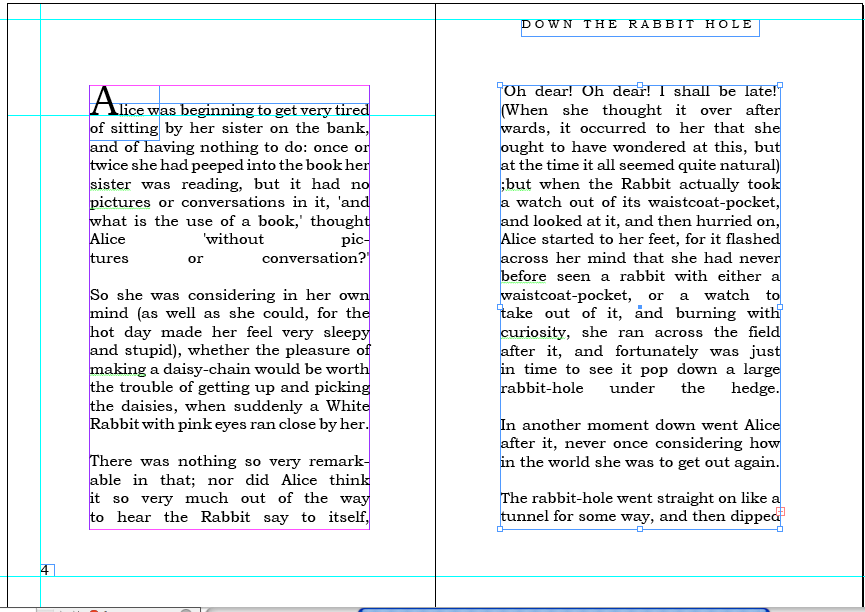
This is a continuation of the alice in wonderland project i am doing for my final major project, and i am using indesign cs5 to justify text but i keep getting these horrible gaps( which is nature). I was just wondering if there was any options or tips you guys could give me on this, or do i have to manually go in adjust it myself and if so what's the best tools to use on that.
|
|
|
| |
|
|
|
|
|
|
|
Moderator  Join Date: Jun 2000
Location: inside 128, north of 90
Status:
Offline
|
|
I don't have CS5 handy, but I imagine it wouldn't have changed much from CS4. You can adjust the hyphenation and widow settings, adjust kerning for the paragraph style, or go in and fix the bad lines by hand. Have a look at line length. It's a little short by word, and that isn't helping your spacing issue.
Do you have to use justified type? Why not rag right?
Also, have you found the drop cap setting? (looks like you've made a manual cap in its own text box, you don't need to. )
|
|
|
| |
|
|
|
|
|
|
|
Forum Regular
Join Date: Aug 2006
Location: United Kingdom, North London
Status:
Offline
|
|
Sorry but i am gonna sound really dumb here, what's the hyphenation setting, as i done a search in the help bar and it give me nothing. Sadly i am used to illustrator and find indesign tool very frustrating. I am not sure on how to used the kerning either, cos i can only go up so far on the kerning until the words all jump and start to bleed in with one another. Also where to i adjust the line length?
Yes it has to be justified as most novels back then were, i originally done it right but then my tutor told me to justify it. I did the drop cap manually cos i wasn't sure how to get the drop cap, on the same line as the rest of the text, cos i didn't want it to drop into the text i just wanted it to sit on the same line as the rest, as that again was done in the original book
Also, have you found the drop cap setting? (looks like you've made a manual cap in its own text box, you don't need to. )
|
|
|
| |
|
|
|
|
|
|
|
Moderator Join Date: Aug 2001
Location: Nobletucky
Status:
Offline
|
|
When you have the Type Tool selected, the drop-cap control is found in the tool bar across the top of the screen. It's the little icon that looks like an american flag, but with an "A" where the stars should be.
|
|
|
| |
|
|
|
|
|
|
|
Moderator Join Date: Jun 2000
Location: inside 128, north of 90
Status:
Offline
|
|
Go to window>type>paragraph and that will bring up the paragraph box. In the top right of the box is an arrow, if you click there are all sorts of drop-downs including hyphenation settings. Are you typesetting a large quantity of pages or just a few spreads? Paragraph styles will make your life easier. If you grab that box you can also access hyphenation controls etc by editing the style.
|
|
|
| |
|
|
|
|
|
|
|
Moderator Join Date: Aug 2001
Location: Nobletucky
Status:
Offline
|
|
You can get to the Justification variables in the same place as the hyphenation settings.
|
|
|
| |
|
|
|
|
|
|
|
Forum Regular
Join Date: Aug 2006
Location: United Kingdom, North London
Status:
Offline
|
|
ok thanks guys that a big help, one last question, under that tab which andi is talking about there's something called justification, i also spoke to my mate on the phone and he says that's pretty helpful. And it is but i don't quite exactly know what it does, can anyone enlighten me?
|
|
|
| |
|
|
|
|
|
|
|
|
|
|
|
|
 
|
|
|
Forum Rules
|
|
|
|
You may not post new threads
You may not post replies
You may not post attachments
You may not edit your posts
|
HTML code is Off
|
|
|
|
|
|
|
|
|
|
|
|


