|
 |
Photo Critique Thread - [JPEG] (Page 7)
|
|
|
|
|
Addicted to MacNN
Join Date: Mar 2006
Location: California
Status:
Offline
|
|
when you say noise... what does that mean??
|
|
|
| |
|
|
|
|
|
|
|
Addicted to MacNN
Join Date: Mar 2001
Location: USA
Status:
Offline
|
|
Basically, since the source image was so dark, there wasn't much "room" to make the pixels that make up the man appear brighter. When you try to, you get a bunch of color noise because the image editor can't do a whole lot to black (or near black pixels) as far as them lighter.
Looking back at my comment I can see how it confused you -- that was a crappy sentence. 
|
|
|
| |
|
|
|
|
|
|
|
Addicted to MacNN
Join Date: Oct 2002
Location: England | San Francisco
Status:
Offline
|
|
|
|
|
we don't have time to stop for gas
|
| |
|
|
|
|
|
|
|
Posting Junkie
Join Date: May 2001
Location: Brisbane, Australia
Status:
Offline
|
|
That would be more effective if the lamp post and the bicycles hadn't obscured the door.
|
|
|
| |
|
|
|
|
|
|
|
Moderator  Join Date: May 2001
Location: Hilbert space
Status:
Offline
|
|
@Arena
The lighting in your first shot is sublime, absolutely great. But I'd prefer to see more of the conductor's face, see the passion in his eyes, etc.
I also like the architecture shot with the kicker, the colors remind me of cross-developed slide films
|
|
I don't suffer from insanity, I enjoy every minute of it.
|
| |
|
|
|
|
|
|
|
Addicted to MacNN
Join Date: Oct 2002
Location: England | San Francisco
Status:
Offline
|
|
Originally Posted by - - e r i k - - 
That would be more effective if the lamp post and the bicycles hadn't obscured the door.
Might go back.
|
|
we don't have time to stop for gas
|
| |
|
|
|
|
|
|
|
Posting Junkie
Join Date: May 2001
Location: Brisbane, Australia
Status:
Offline
|
|
I would. You have a killer motif there, a slight change in angle can make all the difference. Try and get the same lighting conditions as well (same time of day at least).
|
|
|
| |
|
|
|
|
|
|
|
Addicted to MacNN
Join Date: Oct 2002
Location: England | San Francisco
Status:
Offline
|
|
I'll try tonight - thanks for the feedback. I learn lots from this thread!
|
|
we don't have time to stop for gas
|
| |
|
|
|
|
|
|
|
Moderator Join Date: May 2001
Location: Hilbert space
Status:
Offline
|
|
@Peter
I think the composition is rather boring. You've tried to do this by making the door (too brightly) red, but this doesn't help. The view on it is obstructed by both, the bike and the lamp post, so I don't see a reason why this should be the center of attention.
|
|
I don't suffer from insanity, I enjoy every minute of it.
|
| |
|
|
|
|
|
|
|
Posting Junkie
Join Date: May 2001
Location: Brisbane, Australia
Status:
Offline
|
|
Originally Posted by powerbook867
my turn! shot tonight @ 2.8

I missed this one. It's gorgeous!
|
|
|
| |
|
|
|
|
|
|
|
Posting Junkie
Join Date: May 2001
Location: Brisbane, Australia
Status:
Offline
|
|
|
(
Last edited by - - e r i k - -; Apr 1, 2008 at 07:53 AM.
)
|
|
|
| |
|
|
|
|
|
|
|
Administrator  Join Date: Apr 2001
Location: San Antonio TX USA
Status:
Offline
|
|
Peter, your picture is interesting but not compelling. Coloring the door draws the eye, but it doesn't say anything once you notice it. Ideas: nighttime photo instead of day; unobstructed view of door, but off center; the front of the house and the door as "order" with the bikes and fences around the area demonstrating "chaos" in comparison-with a clear view of the door emphasizing the orderliness of it.
Maybe also work on just desaturating everything but the door-the rest of the world is dull compared to the lively red door...
|
 Glenn -----OTR/L, MOT, Tx
|
| |
|
|
|
|
|
|
|
Grizzled Veteran
Join Date: Jan 2003
Location: The midwest...
Status:
Offline
|
|
Thanks Erik! Didn't realize you are in Australia. You have the real deal there for reefs.. Me, all I have is my 110 gallons of salt water in Kansas! 
|
|
Joe
|
| |
|
|
|
|
|
|
|
Grizzled Veteran
Join Date: Jan 2003
Location: The midwest...
Status:
Offline
|
|
This needs a bump..
tired of the "fat girl" thread at the top..

|
|
Joe
|
| |
|
|
|
|
|
|
|
Addicted to MacNN
Join Date: Mar 2001
Location: USA
Status:
Offline
|
|

This is for the Utata Take Two diptych project, something made, something found. To the left are roses my wife made me for Valentines (and they sit in my office), to the right are some dying flowers we just can't bring ourselves to throw out.
|
|
|
| |
|
|
|
|
|
|
|
Posting Junkie
Join Date: Mar 2005
Location: Louisiana
Status:
Offline
|
|
Three of my favorites from this session with a local indie band, Alarm the Arrival.
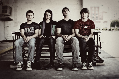
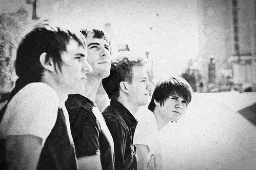
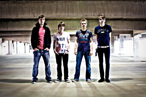
All three look batter at "large" size on Flickr, but there's no way I was posting that in here.
|
|
|
| |
|
|
|
|
|
|
|
Addicted to MacNN
Join Date: Mar 2001
Location: USA
Status:
Offline
|
|
|
|
|
|
| |
|
|
|
|
|
|
|
Posting Junkie
Join Date: Mar 2005
Location: Louisiana
Status:
Offline
|
|
Love that last shot. It looks like they're all standing around, talking about their rough day.
|
|
|
| |
|
|
|
|
|
|
|
Banned
Join Date: Jun 2005
Location: Indy.
Status:
Offline
|
|
Very good Jawbone, they look very "indie band promotional-ish". That's a compliment. The top shot is a little too washed out and the AC unit in the upper left is a bit distracting. The middle shot looks like it was shot on film "old skool style". Nice.
(
Last edited by Railroader; Apr 10, 2008 at 07:46 PM.
)
|
|
|
| |
|
|
|
|
|
|
|
Addicted to MacNN
Join Date: Mar 2006
Location: California
Status:
Offline
|
|
|
|
|
|
| |
|
|
|
|
|
|
|
Posting Junkie
Join Date: May 2001
Location: Brisbane, Australia
Status:
Offline
|
|
Too messy. Goes for the both of them
|
|
|
| |
|
|
|
|
|
|
|
Addicted to MacNN
Join Date: Mar 2006
Location: California
Status:
Offline
|
|
elaboration please
|
|
|
| |
|
|
|
|
|
|
|
Posting Junkie
Join Date: May 2001
Location: Brisbane, Australia
Status:
Offline
|
|
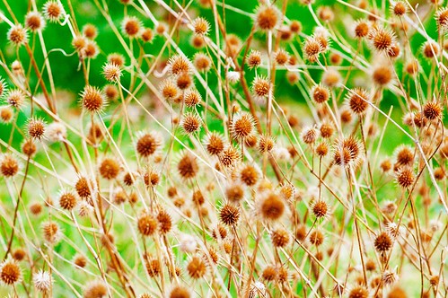
Hella boring or interesting to some?

|
|
|
| |
|
|
|
|
|
|
|
Moderator Emeritus
Join Date: Mar 2004
Location: Copenhagen
Status:
Offline
|
|
Too much going on, there’s nowhere for the eye to focus, and not enough contrast (mostly in colour) to give the eye a hint about what to focus on.
The second one would have been okay if the flower were red or blue—a vibrant colour to contrast with the white-grey cars and street in the background.
Edit: To brass, not to Erik.
|
|
|
| |
|
|
|
|
|
|
|
Posting Junkie
Join Date: May 2001
Location: Brisbane, Australia
Status:
Offline
|
|
@Alex: That flower would stand out if you cropped it a lot closer and had a much blurrier background. A blurred out background should not take up most of the space in the photo. Especially if it's only semi-blurred like here. Takes away too much from the main subject.
As for the first photo there's just too much going on: Branches everywhere, out of focus foreground elements. Needs a much tighter crop and higher contrast if you want to save it.
|
|
|
| |
|
|
|
|
|
|
|
Banned
Join Date: Jun 2005
Location: Indy.
Status:
Offline
|
|
Originally Posted by - - e r i k - -
Hella boring or interesting to some?
I love the DEEP blue, but I think the crop on the sides is a bit too tight.
Here's a close crop of a large marble globe at the community zoo in Lafayette, IN.

And the all too difficult "Up the Tree" shot.

|
|
|
| |
|
|
|
|
|
|
|
Moderator Emeritus
Join Date: Mar 2004
Location: Copenhagen
Status:
Offline
|
|
The ‘up a tree’ shot really is a pain. I don’t think you’ve quite got away with it there, either. I like the enhanced contrast between the almost yellowish light leaves and the dark green leaves in the background, but the stem is—as always in these pictures—too dark and takes too much focus.
|
|
|
| |
|
|
|
|
|
|
|
Banned
Join Date: Jun 2005
Location: Indy.
Status:
Offline
|
|
When I master the "Up the Tree" shot, then I will be a Jedi.
|
|
|
| |
|
|
|
|
|
|
|
Posting Junkie
Join Date: May 2001
Location: Brisbane, Australia
Status:
Offline
|
|
Old and tired:
New hotness:
(
Last edited by - - e r i k - -; Apr 10, 2008 at 11:57 PM.
)
|
|
|
| |
|
|
|
|
|
|
|
Addicted to MacNN
Join Date: Mar 2006
Location: California
Status:
Offline
|
|
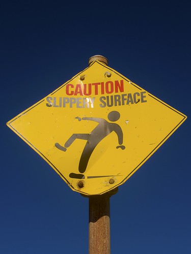
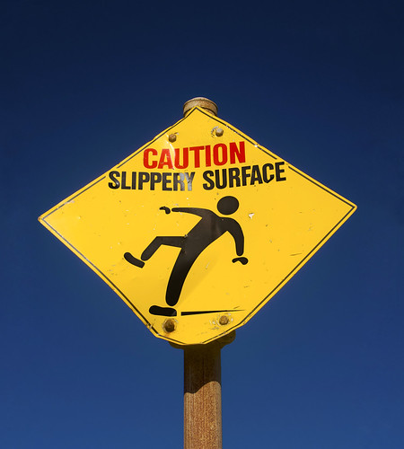
that looks better. now if you make it look as if he's sliding off a skateboard and wearing a helmet
|
|
|
| |
|
|
|
|
|
|
|
Banned
Join Date: Jun 2005
Location: Indy.
Status:
Offline
|
|
Originally Posted by - - e r i k - -
Much better. Removing the reflections improved it quite a bit. But you lost some of the deep blue up top and what is that "goo" in the upper corners?
Needs more lens flare.
More trees:

|
|
|
| |
|
|
|
|
|
|
|
Registered User
Join Date: Sep 2000
Location: Irvine, CA
Status:
Offline
|
|
My first contender:
|
|
|
| |
|
|
|
|
|
|
|
Posting Junkie
Join Date: May 2001
Location: Brisbane, Australia
Status:
Offline
|
|
Originally Posted by Railroader
Much better. Removing the reflections improved it quite a bit. But you lost some of the deep blue up top and what is that "goo" in the upper corners?
Goo is fixed now. Had a hell of a time getting this background right. Lots and lots of cloning, checking with treshold, more cloning and repairing, rinse and repeat.
I'll probably redo it from the original RAW 16-bit when I get home from work anyway. Worked of the JPEG for this one. And there was nothing to uncrop, so the extended background had to be faked.
|
|
|
| |
|
|
|
|
|
|
|
Posting Junkie
Join Date: May 2001
Location: Brisbane, Australia
Status:
Offline
|
|
Originally Posted by mindwaves
My first contender:
I like it. More contrast and saturation would probably make it more interesting though. Perhaps a vignette 
|
|
|
| |
|
|
|
|
|
|
|
Posting Junkie
Join Date: May 2001
Location: Brisbane, Australia
Status:
Offline
|
|
Originally Posted by Railroader
More trees:
Good, but the angle feels like it should be steeper. Perhaps if you had moved a bit to the right. Out of focus foreground objects in the top right also distracts quite a bit.
|
|
|
| |
|
|
|
|
|
|
|
Addicted to MacNN
Join Date: Jul 2001
Status:
Offline
|
|
Originally Posted by - - e r i k - -
New hotness:
Hotter hotness:

|
|
|
| |
|
|
|
|
|
|
|
Senior User
Join Date: Dec 2002
Location: petting the refrigerator.
Status:
Offline
|
|
Bwahah! If I had been drinking something It would have been all over the monitor. 
|
|
|
| |
|
|
|
|
|
|
|
Posting Junkie
Join Date: May 2001
Location: Brisbane, Australia
Status:
Offline
|
|
I approve  
|
|
|
| |
|
|
|
|
|
|
|
Posting Junkie
Join Date: Apr 2007
Location: Iowa, how long can this be? Does it really ruin the left column spacing?
Status:
Offline
|
|
|
|
|
|
| |
|
|
|
|
|
|
|
Banned
Join Date: Jun 2005
Location: Indy.
Status:
Offline
|
|
Wanna have fun? do a google image search for " this is sparta" Warning! NSFW
|
|
|
| |
|
|
|
|
|
|
|
Photo Architect
Join Date: Jun 2003
Location: Bamberg, Germany
Status:
Offline
|
|
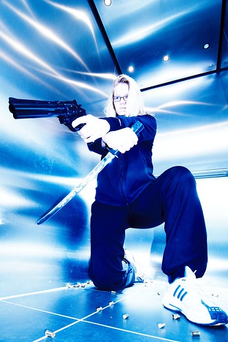
Critique this if you dare ( if she doesn't like what you have to say she will come after you):
|
"Microsoft is a cross between the Borg and the Ferengi. Unfortunately, they use Borg to do their marketing and Ferengi to do their programming." Simon Slavin
Me on Flickr.
|
| |
|
|
|
|
|
|
|
Addicted to MacNN
Join Date: Sep 2001
Location: Toronto
Status:
Offline
|
|
OMG 1980's stock shot.
Sorry, sorry, sorry. I'm sure there is much skill involved, just not my cup of tea.
|
|
|
| |
|
|
|
|
|
|
|
Administrator Join Date: Apr 2001
Location: San Antonio TX USA
Status:
Offline
|
|
Originally Posted by cszar2001
Critique this if you dare ( if she doesn't like what you have to say she will come after you):
I've never seen a revolver that tosses out brass like that. She's going to slip on that stuff for sure-probably poke herself with that letter opener too.
Sarcasm aside, it's not my cup of tea either, and you'll get a lot of feedback about the subject matter and maybe not much at all on composition, post-processing, etc.
|
Glenn -----OTR/L, MOT, Tx
|
| |
|
|
|
|
|
|
|
Professional Poster
Join Date: Nov 2004
Location: Belgium
Status:
Offline
|
|
critique this 
|

iMac 20" C2D 2.16 | Acer Aspire One | Flickr
|
| |
|
|
|
|
|
|
|
Addicted to MacNN
Join Date: Mar 2001
Location: USA
Status:
Offline
|
|
Undersaturated IMHO
Messy with the bag and sweater flaying the way they are
Looks like her left foot is blurred
her expression isn't to attractive
She's not looking at the camera, which would make it more interesting IMHO
The belt doesn't work in this situation IMHO
|
|
|
| |
|
|
|
|
|
|
|
Banned
Join Date: Jun 2005
Location: Indy.
Status:
Offline
|
|
The bag... HAS GOT TO GO!!! Totally ruins the shot.
|
|
|
| |
|
|
|
|
|
|
|
Photo Architect
Join Date: Jun 2003
Location: Bamberg, Germany
Status:
Offline
|
|
Originally Posted by Mastrap
OMG 1980's stock shot.
Sorry, sorry, sorry. I'm sure there is much skill involved, just not my cup of tea.
This is what fascinates me about my own photography:
you either love it or hate it.
I just can't help myself doing stuff like that.
|
"Microsoft is a cross between the Borg and the Ferengi. Unfortunately, they use Borg to do their marketing and Ferengi to do their programming." Simon Slavin
Me on Flickr.
|
| |
|
|
|
|
|
|
|
Photo Architect
Join Date: Jun 2003
Location: Bamberg, Germany
Status:
Offline
|
|
OK - here's another one from today that should be more mainstream:
|
"Microsoft is a cross between the Borg and the Ferengi. Unfortunately, they use Borg to do their marketing and Ferengi to do their programming." Simon Slavin
Me on Flickr.
|
| |
|
|
|
|
|
|
|
Posting Junkie
Join Date: Mar 2005
Location: Louisiana
Status:
Offline
|
|
Originally Posted by cszar2001
OK - here's another one from today that should be more mainstream:
Really, really, really beautiful shot. I have no "critique," just appreciation. I love the colors.
|
|
|
| |
|
|
|
|
|
|
|
Moderator Emeritus
Join Date: Mar 2004
Location: Copenhagen
Status:
Offline
|
|
I have one critique: it’s too small.
|
|
|
| |
|
|
|
|
|
|
|
|
|
|
|
|
 
|
|
|
Forum Rules
|
|
|
|
You may not post new threads
You may not post replies
You may not post attachments
You may not edit your posts
|
HTML code is Off
|
|
|
|
|
|
|
|
|
|
|
|