 |
 |
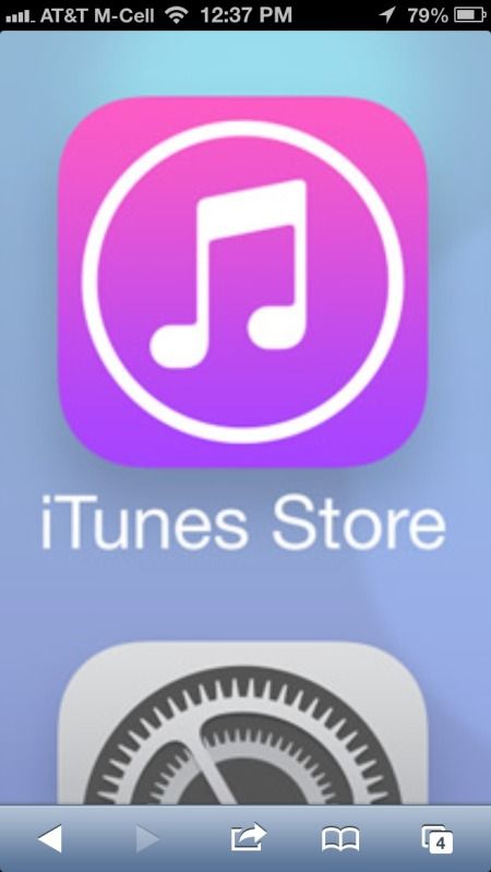
iOS 7 icons (Page 2)
|
|
|
|
|
Mac Elite
Join Date: Jul 2002
Location: Toronto, Canada
Status:
Offline
|
|
|
|
|
|
| |
|
|
|
|
|
|
|
Moderator  Join Date: Jun 2000
Location: inside 128, north of 90
Status:
Offline
|
|
heh. The stock icon was clever.
I actually liked the Creative Cloud icons. ???
|
|
|
| |
|
|
|
|
|
|
|
Registered User
Join Date: Sep 2006
Location: South Korea
Status:
Offline
|
|
Originally Posted by Phileas 
Hahahahahahahaahahahah!!!!!!!!
I love it.
|
|
|
| |
|
|
|
|
|
|
|
Addicted to MacNN
Join Date: Apr 2000
Status:
Offline
|
|
Originally Posted by Laminar
Perhaps they should incorporate some green felt texture to really drive home the "game room" image.
If the alternative looks like something a unicorn would puke out if it ate a rainbow, then yes, i'd prefer green felt. 
EDIT>>I'm not a regular user of Game Center, so i just had a look at the iOS6 icon, and i actually like it a lot.
|
|
|
| |
|
|
|
|
|
|
|
Grizzled Veteran
Join Date: Dec 2001
Location: Land of Enchantment
Status:
Offline
|
|
Originally Posted by Hawkeye_a
If the alternative looks like something a unicorn would puke out if it ate a rainbow, then yes, i'd prefer green felt.
Unicorns, yeah! Your metaphor is delightful! Thanks.
(
Last edited by andi*pandi; Jun 14, 2013 at 07:53 PM.
Reason: fixie)
|
|
|
| |
|
|
|
|
|
|
|
Clinically Insane
Join Date: Jun 2001
Location: Chicago, Bang! Bang!
Status:
Offline
|
|
Hearing on TWiT the iOS team has been collaborating with game developers and wrote a 3D and particle physics engine which the UI runs on.
As ghastly as these icons are, they're may be some nifty stuff for us under the hood.
I did not catch if a rationale was provided for why this wasn't pimped at the conference.
|
|
|
| |
|
|
|
|
|
|
|
Professional Poster
Join Date: Jul 2005
Location: Winnipeg, MB
Status:
Offline
|
|
The whole UI just looks like they let somebody who half knows how to use Illustrator run rampant. Game Centre and Photos are the only icons that I like, but I just wish Game Centre's icon made sense for what it's representing.
I don't mind the bold colors they're trying to accomplish the same unnatural pop you get from some of the other improperly calibrated displays on other phones that make people want to buy them.
My major problem is that in ditching the gloss and bevels they've made some icons look like they have light sources and others don't. Mail looks like shit. Safari looks like shit. Settings ... looks like somebody spent a long time on that and fought really hard to use it instead of the previous good icon.
The part that really bugs me is that if you looked at the designed by Jonny Ive site and see the OS X version, that really is what this would look like on OS X, and if that happened we'd all be crying bloody murder.
|
|
|
| |
|
|
|
|
|
|
|
Addicted to MacNN
Join Date: May 2001
Status:
Offline
|
|
The Safari icon is complete travesty. The Settings icon was better before. In general I prefer the iOS 6 icons, but other than Safari I don't hate the new look.
OAW
|
|
|
| |
|
|
|
|
|
|
|
Addicted to MacNN
Join Date: Apr 2000
Status:
Offline
|
|
Originally Posted by Salty
Game Centre and Photos are the only icons that I like, but I just wish Game Centre's icon made sense for what it's representing.
If i had to pick two icons I DON'T like, those two would be them. Primarily because they fail at their primary function, and aesthetically they just have way too much color. IMHO
I totally agree with your observation about light sources. It could potentially get very messy. IF every developer were to pick a different position/angle of light, it could get ugly fast. (On the flip side, it does alleviate the OS from having to composite multiple layers when rendering (is that how iOS does it now? or does Apple compose the icons with the shiny after submission and before being put onto the app store?).
Beyond the garish use of color, there is a severe lack of consistency. The shading/light sources being one,another being grayscale vs color icons. (In OSX a lot of the system/utilities apps are predominantly grayscale).
I prefer photo-realistic icons,, and in iOS6 and below there is an 'aqua' look to it which gives it a lot more depth.
|
|
|
| |
|
|
|
|
|
|
|
Clinically Insane
Join Date: Jun 2001
Location: Chicago, Bang! Bang!
Status:
Offline
|
|
Someone noticed how jacked these musical notes are. Maybe they're supposed to be feet.
|
|
|
| |
|
|
|
|
|
|
|
Professional Poster
Join Date: Jul 2005
Location: Winnipeg, MB
Status:
Offline
|
|
If Photos was the only icon like it I'd be happy, it's a really pretty icon and it keeps the sunflower shape while moving beyond it. At the same time, the old Photos app was a sun flower, a photo of a sun flower. The sort of thing you'd take a photo of. The new thing is a colour wheel. It'd be great for an App called Paintings or Pictures or Graphics but not for Photos. (Objectively though it is very pretty)
Currently designers have all just gone with a similar aesthetic because they wanted their app to look good on an iPhone. It worked good for a while. These days though lots of companies are doing dumb things. Shaw Cable for example up here in Canada has been doing the lighting on their icons to be consistent with their new ad campaign instead of with Apple's therefore their apps look stupid on my iPhone and I hide them in folders.
What Apple should do in addition to a system wide physics engine is having a system wide light engine that dynamically lights the icons based on the way that you're holding the phone. Have it be nice and slight and barely noticeable unless you're paying attention just like like the parallax effect.
|
|
|
| |
|
|
|
|
|
|
|
Mac Elite
Join Date: Dec 2003
Location: I'll let you know when I get there...
Status:
Offline
|
|
Originally Posted by Salty
---
What Apple should do in addition to a system wide physics engine is having a system wide light engine that dynamically lights the icons based on the way that you're holding the phone. Have it be nice and slight and barely noticeable unless you're paying attention just like like the parallax effect.
Sounds like a waste of processing power and battery life. 
I don't need more shine/floss/swag/glitter from my phone. Make it work.
|
|
|
| |
|
|
|
|
|
|
|
Clinically Insane
Join Date: Nov 1999
Location: 888500128, C3, 2nd soft.
Status:
Offline
|
|
Originally Posted by boy8cookie
Sounds like a waste of processing power and battery life.
I don't need more shine/floss/swag/glitter from my phone. Make it work.
I doubt that it would be more power-draining than the Parallax effect.
However, if you've got two-dimensional icons living in a layer of a three-dimensional interface, there are no "lighting effects" — they're either well-lit or dimly lit, but they won't contour or shadow with shifting light sources.
|
|
|
| |
|
|
|
|
|
|
|
Clinically Insane
Join Date: Jun 2001
Location: Chicago, Bang! Bang!
Status:
Offline
|
|
ARMs sip power. What kills your battery are radios and backlighting the screen.
|
|
|
| |
|
|
|
|
|
|
|
Professional Poster
Join Date: Jul 2005
Location: Winnipeg, MB
Status:
Offline
|
|
I was assuming the effect could be done with minimal resources (which given that the physics engine is already running all the time I imagine I'm right)
I realize that they're headed in the "flat is beautiful" direction, which is sad, it's like Apple has really bad body image problems. The fact is the best way to let somebody know that they should tap on anything is to provide a little bit of visual complexity to draw the eye. With Apple hardware having simple clean line and flat colours and textures was great because it let the OS pop. Now instead of fading away so I can focus on content my phone just fades away ... brightly?
I find that with all the fields of negative space my eyes don't know what to focus on. I'm getting used to the OS slowly and it's bugging me less, but I think part of the problem is that the people who are deciding if it should go to market are also the ones who have worked through so many iterations they're no longer objective about whether it's intuitive anymore. Now I'm not suggesting focus groups, but somebody's gotta just turn to the people doing the iOS 7 interface and remind them that while people young enough to keep learning new things are a huge portion of Apple's user base they also have a LOT of customers who bought their products because iOS previously had been super intuitive, and those people are gonna have a hard time with iOS 7 in it's current form.
Also another big pet peeve after playing with the developer beta. Not all Apple apps consistently use swipe from the side to go back which is a real piss off. In Calendar it would make sense to swipe down to get your month view back but that doesn't work. There are too many places where gestures that should be there aren't and it makes you feel a little foolish every time you get it wrong.
|
|
|
| |
|
|
|
|
|
|
|
Mac Elite
Join Date: Aug 2005
Location: Vancouver, BC
Status:
Offline
|
|
I'm quite pleased that Apple has finally seen the need to put more of me into their iOS icon design. About time.
|
|
|
| |
|
|
|
|
|
|
|
|
|
|
|
|
 
|
|
|
Forum Rules
|
|
|
|
You may not post new threads
You may not post replies
You may not post attachments
You may not edit your posts
|
HTML code is Off
|
|
|
|
|
|
|
|
|
|
|
|


