|
 |
"Helvetica." (Page 2)
|
|
|
|
|
Moderator Emeritus
Join Date: Mar 2004
Location: Copenhagen
Status:
Offline
|
|
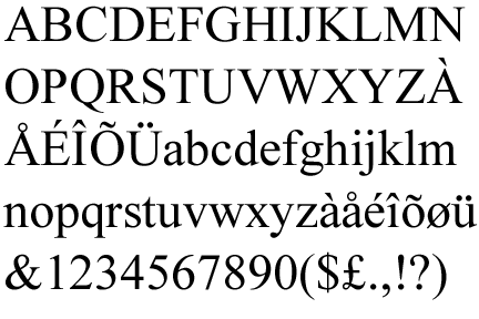
Originally Posted by starman 
Times and Garamond have enough noticable differences to know which is which.
Not if you’re twenty feet away, looking at 20 pt text.
If you’re much closer than that, Arial and Helvetica have enough noticeable differences to be easily distinguished, too.
|
|
|
| |
|
|
|
|
|
|
|
Clinically Insane
Join Date: Jun 2000
Location: Union County, NJ
Status:
Offline
|
|
Dude, seriously...
Notice how some of the characters are plainly different?
|
|
|
| |
|
|
|
|
|
|
|
Moderator Emeritus
Join Date: Mar 2004
Location: Copenhagen
Status:
Offline
|
|
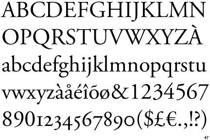
I never claimed they weren’t. I simply said that Arial and Helvetica are similarly different (apart from the part where Garamond has OSF and Times doesn’t). If you can’t tell the difference between Arial and Helvetica, you’d likely be unable to distinguish Times and Garamond from afar, as well.
Try standing about 20 feet from your screen and see how obvious the difference between Times and Garamond is in those two pictures. It’s not all that big from that distance, and if one is not a ‘typographile’, one might easily be hard pressed to distinguish them.
|
|
|
| |
|
|
|
|
|
|
|
Clinically Insane
Join Date: Jun 2000
Location: Union County, NJ
Status:
Offline
|
|
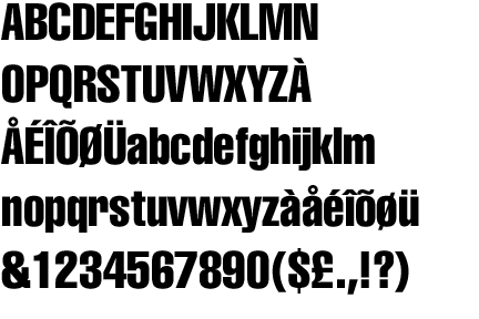
Maybe it's me but at 100 feet I could still tell the difference between them. Look at the numbers and other giveaways like J and W.
|
|
|
| |
|
|
|
|
|
|
|
Moderator Emeritus
Join Date: Mar 2004
Location: Copenhagen
Status:
Offline
|
|
Originally Posted by starman
Maybe it's me but at 100 feet I could still tell the difference between them. Look at the numbers and other giveaways like J and W.
I could tell the difference between them, too, that’s not what I’m saying. I’m just saying that there are lots of people who couldn’t, and to those people, Times and Garamond aren’t a lot easier to distinguish from afar than Arial and Helvetica are.
(I have sat through painful sessions of exasperatedly trying to point out the differences between precisely Times [New Roman, actually] and Garamond to fellow students, and that was up close and with large text on a screen.)
|
|
|
| |
|
|
|
|
|
|
|
Moderator  Join Date: Aug 2001
Location: Nobletucky
Status:
Offline
|
|
Speaking of Helvetica, this bit of information might be interesting, especially if you are a designer and moving to Leopard soon.
|
|
|
| |
|
|
|
|
|
|
|
Posting Junkie
Join Date: May 2001
Location: Brisbane, Australia
Status:
Offline
|
|
Helvetica Neue is my big love at the moment.
And f*ck Bank Gothic. Great font, but overused (yes, even by me).
|
|
|
| |
|
|
|
|
|
|
|
Grizzled Veteran
Join Date: Feb 2000
Location: Dayton, OH
Status:
Offline
|
|
...I've said for as long as I can remember that we need about a 4 year moratorium on the use of Bank Gothic. By then it might be alright again.
And at least ten years on Copperplate. Je-SUS its overused.
The Helvetica director is a supreme douche. You have NO idea. We brought the film here for a screening and it was
the most hellish, ridiculous process I've ever experienced. I've hosted debuts of mainstream Hollywood releases that
involved less ego. In fact, thats the sole reason I didn't buy the limited edition when it was here.
And, only because it's that kind of thread...strictly speaking it's typeface, not font. 
|
|
|
| |
|
|
|
|
|
|
|
Posting Junkie
Join Date: May 2001
Location: Brisbane, Australia
Status:
Offline
|
|
Let us bury copperplate for another fifty if you ask me.
|
|
|
| |
|
|
|
|
|
|
|
Grizzled Veteran
Join Date: Feb 2000
Location: Dayton, OH
Status:
Offline
|
|
Originally Posted by - - e r i k - -
Let us bury copperplate for another fifty if you ask me.
I'm firmly convinced that the main reason that HomePlace, a big Bed, bath & Beyond clone that merged with Waccamaw) went out of business was their use of that godawful typeface.
Since they're all closed I cant find a photo but you can see the "logo" below, which is nothing more than just type. Now imagine that in 9 foot tall backlit letters on the front of a building. Ugh.

|
|
|
| |
|
|
|
|
|
|
|
Posting Junkie
Join Date: May 2001
Location: Brisbane, Australia
Status:
Offline
|
|
That hurts to look at. What the hell where they thinking making the H and the P 1 pt larger than the rest? ;err:
|
|
|
| |
|
|
|
|
|
|
|
Posting Junkie
Join Date: Dec 2000
Status:
Offline
|
|
|
|
|
|
| |
|
|
|
|
|
|
|
Professional Poster
Join Date: Apr 2007
Location: A House of Ill-Repute in the Sky
Status:
Offline
|
|
I like Copperplate, dammit!
(Not on that ad, though)
|
|
|
| |
|
|
|
|
|
|
|
Baninated
Join Date: Oct 2002
Location: In yer threads
Status:
Offline
|
|
Originally Posted by BlueSky
I take it it's no longer hip to diss Comic Sans?
Comic Sans was ok for it's original intended purpose. And that was a MS IRC chat client I believe.
But they started installing it in EVERY application they made.
Originally Posted by shifuimam
It is just a font...as long as it's readable in print and screen form, I'm happy.
Although it does amuse me how seriously people take the "competition" between Helvetica and Arial...had Microsoft wanted to pay the royalites, they would have included Helvetica. Instead, they made their own. Usually when a company makes its own whatever (codec, product, application, etc.) to avoid paying royalties to someone, it's considered a good thing (brings more options into the mix)....for some reason this is seen as a typeface travesty.
I think this is more about respect. Respect for the originators of the idea of said font. MS making Ariel was them lacking respect for Helvetica's designers.
It's like MS copying Apple's GUI and changing it a bit instead of making their own.
I don't use Arial because Helvetica DOES look better.
And example or instance where something like this happened to me. I designed a phonebook ad for a company for one specific Phone book (The phone book company hired me, not the company) Another phonebook company took my design, and artwork and scanned certain things and basically hacked the same ad together using my work instead of contacting me or the other Phone Book competitor to ask permission. I'd have gladly given over said artwork (not the ad layout) to said people had they asked. But they way they did it was disrespectful.
It's about respect for originality. Respect for other people's original work.
(
Last edited by Kevin; Nov 29, 2007 at 10:37 AM.
)
|
|
|
| |
|
|
|
|
|
|
|
Baninated
Join Date: Oct 2002
Location: In yer threads
Status:
Offline
|
|
Originally Posted by Dakarʒ
I also enjoy Swiss 911 and its less bold counterparts.
That reminds me a lot of Impact.
|
|
|
| |
|
|
|
|
|
|
|
Senior User
Join Date: Sep 2002
Status:
Offline
|
|
|
|
|
|
| |
|
|
|
|
|
|
|
Clinically Insane
Join Date: Jun 2000
Location: Union County, NJ
Status:
Offline
|
|
No secret. It's just like anyone else that has a passion for something.
|
|
|
| |
|
|
|
|
|
|
|
Senior User
Join Date: Sep 2002
Status:
Offline
|
|
I guess I mean it feels like there is a deeper kind of understanding or knowledge about fonts. It seems to encompass a knowledge of the history and general usage of fonts. But I'm not sure where this knowledge comes from. I always have a sense that I'm picking fonts for different reasons than a real font person picks them for. That there's a swath of font faux pas lurking out there.
"OMG!! HOW ON EARTH could they use VERDANA!!!!"
that sort of thing.
|
|
|
| |
|
|
|
|
|
|
|
Baninated
Join Date: Oct 2002
Location: In yer threads
Status:
Offline
|
|
It comes from years and years of designing things and noticing trends. It sucks sometimes when I am driving because I critique road signs and billboards as I am driving "Boy that font sure sucked in that.." or "Why did they distort the image?"
When I was a boy I used to LOVE looking at brochures and stuff from the beach promoting amusement parks or wax museums. I love album covers too. Anything with a neat design. I used the word "eye candy" to describe such things that caught my eye and stimulated that part of my brain before that particular Photoshop plugin existed. There is something about the looks of certain fonts, or how you can manipulate the looks of them in documents that really effects a person's mood sometimes.
Don't even get me going on powder washing machine detergent box fronts.. my mother couldn't get me out of that isle. I loved how bright and vibrant and bold they they were. AKA Eye Candy.
I think this same type of obsession or interest is what also drives people to making comments like you are referring to.
It's scary when you can look at a billboard ad at tell your significant other all teh fonts used in said ad.
*sigh*
I am sure she has grown sick of my critiquing these things too. A lot of the time poor font choice, or colors isn't something the artist had in mind. But was something the customer requested.
There are ads etc I've made that I am ashamed to admit to making. But they are ugly because that is what the customer wants. You can try to change their minds in a nice way, but some people are color/taste blind IMHO and simply wont budge.
|
|
|
| |
|
|
|
|
|
|
|
Clinically Insane
Join Date: Jun 2000
Location: Union County, NJ
Status:
Offline
|
|
Trying to write this post, I'm not exactly where where my first impression of type really came from.
One impression came from a room number on a door I saw around 1974. It was a '2' in Helvetica. I have no frickin' idea why that stood out for me. Maybe it was because back then all the text was "groovy" and Helvetica really stood out as something classy.
I'll see if I can remember anything else.
|
|
|
| |
|
|
|
|
|
|
|
Moderator Join Date: Jun 2000
Location: inside 128, north of 90
Status:
Offline
|
|
Originally Posted by hart
So guys, here's a question. Besides loving fonts starting in 5th grade how do you get to a point where you know/care so much about fonts?
Get yourself put in charge of organizing your firm's typeface into a reference book. No really. After you've printed out a reference sheet of every typeface they own, seen 43 helvetica ripoffs and 27 timesFauxRomans, you appreciate all the other fonts for their craft and individuality. It also makes you not rely on the same 4 fonts for your projects.
|
|
|
| |
|
|
|
|
|
|
|
Mac Elite
Join Date: Aug 2001
Location: Capitol City
Status:
Offline
|
|
The film was great. Very entertaining and informative. It is important to make the distinction between "font" and "typeface." We talk about font files (like the OpenType format or TrueType or whatever), but a "typeface" is what we call the form of the letters, numbers, kerning etc. And we don't love "fonts" we love "type."
When they still used metal letters (moveable type), a set of letters that you buy from a foundry to print your own books or fliers or whatever, was called a font. But the design of the letters is the typeface.
Its sort of the typographical equivalent of saying MAC for Mac. Its just wrong, so don't do it.
Also, saying Arial looks "close enough" to Helvetica is like saying Windows looks "close enough" to the Mac. We all know its not true, so lets not say that it is.
|
|
|
| |
|
|
|
|
|
|
|
Mac Elite
Join Date: Aug 2003
Location: Minnesota
Status:
Offline
|
|
Too bad they didn't make it available for download. Then I might watch it. I'm not a big risk taker, and $20 for a move about a font seems a little weird.
EDIT: Nevermind, I'll get it from Netflix.
|
|
|
| |
|
|
|
|
|
|
|
Addicted to MacNN
Join Date: Mar 2006
Location: California
Status:
Offline
|
|
what's the font that has a "?" that looks like a backwards "s" with a "." under it?
edit: not like futura
|
|
|
| |
|
|
|
|
|
|
|
Addicted to MacNN
Join Date: Apr 2001
Location: Landlockinated
Status:
Offline
|
|
Sounds like a movie I'd like to check out sometime.
|
|
[ sig removed - image host changed it to a big ad picture ]
|
| |
|
|
|
|
|
|
|
Forum Regular
Join Date: Sep 2003
Status:
Offline
|
|
You know what I've fallen in love with recently as a very easy to read, yet subtly artistic font?
Gill Sans.
But then again, I like Hoefler Text too, and that's a little too far for some people.
|
|
|
| |
|
|
|
|
|
|
|
Baninated
Join Date: Oct 2002
Location: In yer threads
Status:
Offline
|
|
I'm a fan of Gill Sans as well
|
|
|
| |
|
|
|
|
|
|
|
Posting Junkie
Join Date: May 2001
Location: Brisbane, Australia
Status:
Offline
|
|
Gill Sans is good, but I'm tired of it. Same with Optima.
Oh, and my love for fonts? Came from growing up with my mother running her own advertising agency, and her never ending supply of offset rub-on font sheets. So much fun. I've also done a typography course with the top typographer in Scandinavia, who literally wrote the textbook on (Scandinavian) typography.
|
|
|
| |
|
|
|
|
|
|
|
Senior User
Join Date: Sep 2002
Status:
Offline
|
|
Jeez, what was that stuff, those rub off letters I used to use for presentations? Way back in the dark ages. I totally forgot about that stuff. Hoarding the sheets cause they were so pricey. We are so spoiled these days with computers. ...Chartpak! I wonder what happened to that company.
I guess I just missed the font boat. I gotta start paying more attention. I understand that visual obsessing thing. I obsess about line, color, shape, overall impact but I hardly notice font per se. It's like a blind spot.
Oh Font Mavens! I wish to learn from the font of your knowledge!
|
|
|
| |
|
|
|
|
|
|
|
Posting Junkie
Join Date: May 2001
Location: Brisbane, Australia
Status:
Offline
|
|
|
|
|
|
| |
|
|
|
|
|
|
|
Posting Junkie
Join Date: May 2001
Location: Brisbane, Australia
Status:
Offline
|
|
|
|
|
|
| |
|
|
|
|
|
|
|
Senior User
Join Date: Sep 2002
Status:
Offline
|
|
I looked up chartpak and they had a link to transfers to decorate birthday party bags and that sort of thing. I guess that's a whole market too.
|
|
|
| |
|
|
|
|
|
|
|
Grizzled Veteran
Join Date: Feb 2000
Location: Dayton, OH
Status:
Offline
|
|
Originally Posted by - - e r i k - -
Chartpak? It was Letraset, and they are doing well in the DTP industry last time I checked 
Both, actually. And i had COMPLETELY forgotten about those fun little things. In fact, thats how I first learned to hand-render type, because ti was a lot cheaper than buying those transfers over and over.
Damn, I havent thought about those in so long, but now that I think about it I actually have some in an old portfolio case from school-days.
|
|
|
| |
|
|
|
|
|
|
|
Mac Elite
Join Date: Apr 2005
Location: Las Vegas, NV
Status:
Offline
|
|
Anyone else here like CM? It's overused in scientific/mathematical papers, yeah, but I think it's a very nice break from Times. Garamond is also way prettier than Times, IMO.
|

"In a world without walls or fences, what need have we for windows or gates?"
|
| |
|
|
|
|
|
|
|
Mac Elite
Join Date: Dec 1999
Location: Utah
Status:
Offline
|
|
Sorry to resurrect an old thread, but this movie is now available on Blu-ray.
.....Odd footnote, turns out a old acquaintance of mine was the director of photography for the film. He also was the DP for "Borat". Luke Geissbuhler.... Nice guy, very talented.
|
|
Work: 2008 8x3.2 MacPro, 8800GT, 16GB ram, zillions of HDs. (video editing)
Home: 2008 24" 2.8 iMac, 2TB Int, 4GB ram.
Road: 2009 13" 2.26 Macbook Pro, 8GB ram & 640GB WD blue internal
Retired to BOINC only: My trusty never-gonna-die 12" iBook G4 1.25
|
| |
|
|
|
|
|
|
|
Posting Junkie
Join Date: May 2001
Location: Brisbane, Australia
Status:
Offline
|
|
I have the film, but I have yet to watch it. Funnily, very few of my friends are actually interested in watching a movie about a font 
|
|
|
| |
|
|
|
|
|
|
|
|
|
|
|
|
 
|
|
|
Forum Rules
|
|
|
|
You may not post new threads
You may not post replies
You may not post attachments
You may not edit your posts
|
HTML code is Off
|
|
|
|
|
|
|
|
|
|
|
|