 |
 |
New Finder view idea - !Large image warning!
|
|
|
|
|
Professional Poster
Join Date: Jan 2001
Location: Australia
Status:
Offline
|
|
This is my idea for a new Finder view, it would be in addition to the standard three views and is designed to compliment them. Its best use is to display the contents of single folder/Smart folder which contains multiple file types (e.g. single project).
These are the enhancements over the current Finder
1) Info section permanently placed at the bottom of the side bar in all views, preview size is only limited by window/image size (from Tunes)
2) Blue sidebar (from Tunes, Mail)
3) Updated metal theme + sharper corners and removed borders (from Tunes/UNO)
4) Shadows below image icons (From Aperture)
5) Slider to increase icon size (From Aperture), + option key makes resizes every icon in window
6) Ratings editable in Finder (from iTunes and iPhoto)
7) Reflection below Movies/TV Shows (from iTunes)
8) Selecting items in icon view uses a spotlight to highlight them
9) The Finder automatically decides whether the file name should be on the bottom or on the right of the icon based on the icon and window size
10) The default search option is to search in the current directory, any typing while a window is active goes into the search bar and spotlights results.
11) You can set the window to list by any Meta data type using the "group by" bar at the top, the bar would also be present in column and icon view.
12) Multiple fall back ordering is available , you can add fallback filter by pressing the + button in the "Group by" bar, in the example the items are listed by Group, but sorted within the groups by Alpha channel and then name.
P.S. I will update this image and the list to reflect any good suggestions.

Let me know what you think.
(
Last edited by moonmonkey; Dec 4, 2005 at 12:23 AM.
)
|
|
|
| |
|
|
|
|
|
|
|
Senior User
Join Date: Mar 2004
Status:
Offline
|
|
Nice, slightly complexified...
|
|
|
| |
|
|
|
|
|
|
|
Mac Elite
Join Date: Feb 2001
Location: Sitting in front of computer
Status:
Offline
|
|
So basically its Arrange by type - but with a bit of spotlight thrown in. i like it!
|
|
I free'd my mind... now it won't come back.
|
| |
|
|
|
|
|
|
|
Clinically Insane
Join Date: Oct 2000
Location: Los Angeles
Status:
Offline
|
|
It's a good idea (with a great mockup btw) because it's essentially taking the current Finder search view and making it a normal view. Apple really needs to clean up the UI mess it made of the Finder search anyway.
|

"The natural progress of things is for liberty to yield and government to gain ground." TJ
|
| |
|
|
|
|
|
|
|
Mac Elite
Join Date: Nov 2001
Status:
Offline
|
|
Even a standard icon view implemented with the sidebar/preview pane and spotlight highlight would be nice. I also like the way you implemented icon scaling, what with the slider and all.
I'm not so sure about dividing it into type subgroups though.
v.nice mockup though.
|
|
|
| |
|
|
|
|
|
|
|
Professional Poster
Join Date: Jan 2001
Location: Australia
Status:
Offline
|
|
Originally Posted by ShotgunEd
Even a standard icon view implemented with the sidebar/preview pane and spotlight highlight would be nice. I also like the way you implemented icon scaling, what with the slider and all.
I'm not so sure about dividing it into type subgroups though.
v.nice mockup though.
The idea was the new preview pane in the sidebar would be present in all views and the spotlight highlighting would be in the icon view too.
That slider is taken from Aperture, it would be great to be able to scale different file types independently.
|
|
|
| |
|
|
|
|
|
|
|
Mac Elite
Join Date: Nov 2001
Status:
Offline
|
|
animations to support the spotlight analogy would be sweet too, to see the spotlight moving across the icons to reach the one you click.
|
|
|
| |
|
|
|
|
|
|
|
Professional Poster
Join Date: Jan 2001
Location: Australia
Status:
Offline
|
|
What about this change to the sidebar?
I ditched the "source" bar at the top and made the separator plastic style like mail.
.....image edited to reflect changes.....
(
Last edited by moonmonkey; Dec 2, 2005 at 11:48 AM.
)
|
|
|
| |
|
|
|
|
|
|
|
Clinically Insane
Join Date: Oct 2000
Location: Los Angeles
Status:
Offline
|
|
I actually like the Source label. Interface consistency is A Good Thing.
|
"The natural progress of things is for liberty to yield and government to gain ground." TJ
|
| |
|
|
|
|
|
|
|
Professional Poster
Join Date: Jan 2001
Location: Australia
Status:
Offline
|
|
Originally Posted by Big Mac
I actually like the Source label. Interface consistency is A Good Thing.
I don't know if I really agree, but I have been drinking (we are a 8 hours ahead here).
What about the plastic instead of metal on the dividers?
|
|
|
| |
|
|
|
|
|
|
|
Junior Member
Join Date: Oct 2005
Location: London, UK
Status:
Offline
|
|
That looks very good. I'd actually set up a few smart folders that just point to regularly used places on my HD so that I could get the view divided by type. Being able to independently scale icons so that thumbnails are large but other files small would also be very welcome.
Personally I would love the Finder to have a two-panel (orthodox) view ... applications like Total Commander for Windows are VERY efficient for moving lots of files around, but I've not found a mac implementation that I like (currently using mc in terminal.app).
I just hope Apple is listening. The Finder has long been neglected and now feels prehistoric ... yet I (and probably many other users too) spend a large part of my computing time performing basic operations on files.
|
|
|
| |
|
|
|
|
|
|
|
Professional Poster
Join Date: Jan 2002
Location: London, UK
Status:
Offline
|
|
The spotlighting would look ugly and confusing if you selected more than one item at once.
There are some good ideas in your mock up though - the always there preview, the separation of file kinds and the ability to scale things easily and separately depending on kind, especially so.
However, I really dislike the absence of some form of separation between the sidebar and the content window, other than the thin line ala iTunes. It allows for greater potential for user confusion between the two distinct functions of the sidebar versus the main content IMO.
Also, sharper corners? Bleh. I prefer them as they are (that is personal taste of course).
|
|
|
| |
|
|
|
|
|
|
|
Mac Elite
Join Date: Nov 2001
Status:
Offline
|
|
Originally Posted by JKT
The spotlighting would look ugly and confusing if you selected more than one item at once.
Multiple spotlights for multiple focus?
Its no more confusing than the current implementation and 100x more attractive if you ask me.
|
|
|
| |
|
|
|
|
|
|
|
Professional Poster
Join Date: Jan 2001
Location: Australia
Status:
Offline
|
|
Originally Posted by ShotgunEd
Multiple spotlights for multiple focus?
Its no more confusing than the current implementation and 100x more attractive if you ask me.
Exactly, It would look great;
a) When nothing is selected the background would be clean white
b) When an item is selected it gets a single spotlight, and everything else dims (like the image)
c) When multiple items are selected, multiple items would be spotlighted
d) When the selection changes, the spotlight would fly to the new selection/selections
Its easy and elegant.
|
|
|
| |
|
|
|
|
|
|
|
Professional Poster
Join Date: Jan 2002
Location: London, UK
Status:
Offline
|
|
...and if you had all the items in view in the window selected - the background would be completely white and it wouldn't look as though you had anything selected at all...
...and two items next to each other would give you a "booby" effect... IMO not a visual improvement in any, way, shape or form compared to what we have now.
Where it would be potentially valid would be for when you performed a search in the window - akin to the Spotlight effect in Sys Prefs, now.
|
|
|
| |
|
|
|
|
|
|
|
Mac Elite
Join Date: Nov 2001
Status:
Offline
|
|
Originally Posted by JKT
...and if you had all the items in view in the window selected - the background would be completely white and it wouldn't look as though you had anything selected at all...
No, the background would still be slightly dimmed, but each item would have an individual spotlight on it.
Regarding the booby effect, get your mind out of the gutter 
|
|
|
| |
|
|
|
|
|
|
|
Professional Poster
Join Date: Jan 2001
Location: Australia
Status:
Offline
|
|
Originally Posted by ShotgunEd
No, the background would still be slightly dimmed, but each item would have an individual spotlight on it.
Regarding the booby effect, get your mind out of the gutter
Exactly.
|
|
|
| |
|
|
|
|
|
|
|
Mac Elite
Join Date: Jan 2002
Location: Durham, NC
Status:
Offline
|
|
Overall, I like the idea of sorting by type with inline previews and collapsible sections. I gotta jump in with another anti-spotlight vote, though. I think it's too busy and doesn't add any functionality. I don't think you should be arbitrarily changing people's window backgrounds. Now the aesthetics are a matter of opinion, but here's the important bit: it breaks the spotlight-as-search metaphor.
On the other hand, it would make sense for that spotlight style to work like System Preferences' does. Light stuff up as you type, then if you hit return, change the window to include only the results, like the current Finder.
|
|
|
| |
|
|
|
|
|
|
|
Mac Elite
Join Date: Nov 2001
Location: Dark Side of the Moon
Status:
Offline
|
|
Hey I like it - come on let's see more mockups everybody! (Maybe I'll think something up myself, but actually something like this is what I've been thinking about).
I love the little preview section, very handy, especially for quickly getting a file size.
But the spotlight select - don't like that. I like the current one quite a lot actually and that spotlight one just looks a bit clunky and inconsistent.
Maybe we can update labels too while we're at it?
|
|
|
| |
|
|
|
|
|
|
|
Mac Elite
Join Date: May 2001
Location: Aiken, South Carolina, USA
Status:
Offline
|
|
I like this. THIS I something I'd expect from 10.5.
|
|
|
| |
|
|
|
|
|
|
|
Addicted to MacNN
Join Date: Jan 2001
Location: The Sar Chasm
Status:
Offline
|
|
Gotta say, I'd prefer the static preview pane, myself. I use column view most of the time, and the one thing that really drives me nuts is the column sliding around to show a preview when I'm trying to do something, and it makes me miss. I tried runing with previews off for a while, but that was lacking. The other aspect I like the most is the slider at the top of each section. I hate having to bring up the window prefs to change icon sizes.
And yes, for the love of god, please, Apple, scrap the old-school brushed metal. Please.
|
 When a true genius appears in the world you may know him by this sign, that the dunces are all in confederacy against him.
 -- Jonathan Swift.
|
| |
|
|
|
|
|
|
|
Mac Enthusiast
Join Date: Oct 2004
Status:
Offline
|
|
I could see it working if you only have 20 or so files but if you have 100,000 or more, I don't see how it would work. I just don't lump all my stuff into well defined categories. I have porn movies and funny clips, work documents and ebooks, music files and sound samples and parts of those in their own various categories.
All I really want from the Finder is for it to be attached to the menu bar beside Spotlight so that I can access my files from any program without putting the current program in the background.
This window would expand out and would stay there until I closed it and would support tabs, which would really just be links to directories that I wanted open so I could flip between them quickly. Essentially, the tabbed Finder is almost possible since the sidebar supports links but they don't update automatically with your current directory. I guess if you got into the habit of dragging and dropping folders it would work.
Ultimately, I don't want the Finder linked to Spotlight. It's not reliable enough. Obscure analogy time: There's a difference between looking up a phone book and remembering where you left a note of someone's number. The phone book is organised so you can find stuff quickly but you know where the note is so it's quicker. Spotlight is quick but it is returning a whole load of data you don't need. The Finder let's you gets to files where you know you left them. They need to be separate.
|
|
|
| |
|
|
|
|
|
|
|
Professional Poster
Join Date: Jul 2005
Location: Winnipeg, MB
Status:
Offline
|
|
I would love this sort of icon view if I were just browsing some photos. The unfortunate thing is that Apple seems to expect us all to use iPhoto all the time when some of us like to keep our graphics organized the way we want to. Frankly for graphics and custom stuff like that this would be great. As well if Apps were able to make previews of things like Vector files or page lay out files. I'd love to have a better idea of what each pages document looks like. Perhaps not just a square with text, but rather actually the layout of the first page, with a slider that'd let you scale it bigger so if say you had a title page you could make it out (though you should have the document labeled) but then mask that inside a standard document style icon or something. Meh whatever
All I know is that anything that makes the user experience just that much more impressive than Windows is a great way to help people switch. That said I also find it annoying that Icon view is the only view that will let me put my own background on a folder.
|
|
|
| |
|
|
|
|
|
|
|
Mac Elite
Join Date: Nov 2001
Status:
Offline
|
|
Originally Posted by osxrules
I could see it working if you only have 20 or so files but if you have 100,000 or more, I don't see how it would work. I just don't lump all my stuff into well defined categories. I have porn movies and funny clips, work documents and ebooks, music files and sound samples and parts of those in their own various categories.
Metadata could allow you to add your own category to each file. Maybe this view could allow you to view by category rather than kind. Then you'd have separate parts for funny clips, or pRon or home movies.
|
|
|
| |
|
|
|
|
|
|
|
Posting Junkie
Join Date: Sep 2001
Status:
Offline
|
|
I hate that something has to be actually selected in column view to get the "Open" contextual item to pop up. If the file is not selected, you only get "Open With," and that's irritating as hell when you're trying to browse a folders contents but only want to open a few things, or while looking at another file's information. Or even when you're in Photoshop and want to right-click from there—you have to enter the Finder, select the file, and then right-click to accomplish that (in which case you may as well just double-click it). Silly that this has been in Tiger's Finder for so long now.
|
|
|
| |
|
|
|
|
|
|
|
Grizzled Veteran
Join Date: Sep 2000
Location: Menands, NY
Status:
Offline
|
|
I'm wouldn't be interested in this or any other variation of icon view. I turned on column view as soon as I found it in the Public Beta and haven't used anything else since then.
|
|
|
| |
|
|
|
|
|
|
|
Mac Elite
Join Date: Jan 2001
Location: Kansas City, Mo
Status:
Offline
|
|
Same as Ron.
This is good for the icon people out there. When I am looking for something, I want a compressed list. Column view is it for me.
|
|
|
| |
|
|
|
|
|
|
|
Dedicated MacNNer
Join Date: Jul 2002
Location: Calgary, Alberta
Status:
Offline
|
|
I like the Ideas, but I think i like the iTunes interface a little better.... The Finder, now without borders.
(
Last edited by Telusman; Dec 5, 2005 at 11:36 PM.
)
|
|
"No ma'am i'm not angry at you, I'm angry at the cruel twist of fate that directed your call to my extension..."
|
| |
|
|
|
|
|
|
|
Professional Poster
Join Date: Jan 2001
Location: Australia
Status:
Offline
|
|
Originally Posted by Telusman
I like the Ideas, but I think i like the iTunes interface a little better.... The Finder, now without borders.
good idea, I have rolled the changes into the original.
|
|
|
| |
|
|
|
|
|
|
|
Posting Junkie
Join Date: May 2001
Location: Brisbane, Australia
Status:
Offline
|
|
That is one awesome mockup! Good ideas all around!
|
|
|
| |
|
|
|
|
|
|
|
Senior User
Join Date: Feb 2001
Location: macsterdam
Status:
Offline
|
|
|
|
|
|
| |
|
|
|
|
|
|
|
Senior User
Join Date: Dec 2001
Location: England, UK
Status:
Offline
|
|
|
|
|
|
| |
|
|
|
|
|
|
|
Addicted to MacNN
Join Date: Jan 2001
Location: The Sar Chasm
Status:
Offline
|
|
Originally Posted by Macanoid
Whoa.
|
When a true genius appears in the world you may know him by this sign, that the dunces are all in confederacy against him. -- Jonathan Swift.
|
| |
|
|
|
|
|
|
|
Mac Elite
Join Date: Nov 2001
Location: Dark Side of the Moon
Status:
Offline
|
|
I wonder if PF4 will finally be the Finder replacement they've always wanted it to be? If they have overcome the problem of using it in conjunction with the Finder (i.e. being able to turn off the Finder and use PF exclusively without any problems) they might have a winner on their hands.
|
|
|
| |
|
|
|
|
|
|
|
Forum Regular
Join Date: Jan 2003
Status:
Offline
|
|
Path Finder never bills itself as a Finder replacement, but as an alternative or enhancement. Although I always quit the Finder while running PF I sometimes have some app making a call to the Finder which restarts it. In the PF forums people have written about how to replace the FInder with PF, but the Path Finder developers in general don't think it's such a good idea.
What I like is that at least you can choose to make the interface small so that you're not stuck with the Apple look of everything being so freaking huge and spaced out!
(
Last edited by delete; Dec 4, 2005 at 11:52 AM.
)
|
|
|
| |
|
|
|
|
|
|
|
Dedicated MacNNer
Join Date: May 2004
Status:
Offline
|
|
I want to see the progression of ideas in this thread -- did you keep the intermediate mockups?
|
╭1.5GHz G4 15" PB, 2.0GB RAM, 128MB VRAM, 100GB 7200rpm HD, AEBS, BT kbd
╰2.0GHz T2500 20" iMac, 1.5GB RAM, 128MB VRAM, 250GB 7200rpm HD
http://www.DogLikeNature.com/
|
| |
|
|
|
|
|
|
|
Professional Poster
Join Date: Jan 2001
Location: Australia
Status:
Offline
|
|
Originally Posted by Dog Like Nature
I want to see the progression of ideas in this thread -- did you keep the intermediate mockups?
Afraid not. Actually it would be nice if Telusman removed his image, it was so good I added the improvements into the original.
(
Last edited by moonmonkey; Dec 5, 2005 at 09:14 AM.
)
|
|
|
| |
|
|
|
|
|
|
|
Dedicated MacNNer
Join Date: Jul 2002
Location: Calgary, Alberta
Status:
Offline
|
|
Image removed I actually meant to do it earlier but i got distracted by other things... I really really am starting to like this borderless window thing.
|
|
"No ma'am i'm not angry at you, I'm angry at the cruel twist of fate that directed your call to my extension..."
|
| |
|
|
|
|
|
|
|
Addicted to MacNN
Join Date: Apr 2001
Location: The bottom of Cloud City
Status:
Offline
|
|
So so, I think it should be a full screen window, look more like iTunes/Aperture and not be allowed to have more than one window open than once.
|

"Ahhhhhhhhhhhhhhhh"
|
| |
|
|
|
|
|
|
|
Mac Elite
Join Date: Jan 2001
Status:
Offline
|
|
If no more than one window, does that mean no easy drag/drop of two directories? Or comparison of files in different windows?
|
|
|
| |
|
|
|
|
|
|
|
Professional Poster
Join Date: Jan 2001
Location: Australia
Status:
Offline
|
|
I think there is absolutely zero chance of Apple using a single window interface for the finder, but I would love to see a mockup!
|
|
|
| |
|
|
|
|
|
|
|
Mac Elite
Join Date: Nov 2001
Status:
Offline
|
|
Originally Posted by Severed Hand of Skywalker
So so, I think it should be a full screen window, look more like iTunes/Aperture and not be allowed to have more than one window open than once.
iTunes allows more than one window.
You don't have to use it, but its there as an option.
|
|
|
| |
|
|
|
|
|
|
|
Addicted to MacNN
Join Date: Apr 2001
Location: The bottom of Cloud City
Status:
Offline
|
|
Originally Posted by PurpleGiant
If no more than one window, does that mean no easy drag/drop of two directories? Or comparison of files in different windows?
In aperture the window can be divided into several parts sorta like frames.
I also remember in the 7.5ish days that you can set it so the Finder is always hidden when not in the forground, it would be awesome to have that now.
|
"Ahhhhhhhhhhhhhhhh"
|
| |
|
|
|
|
|
|
|
Addicted to MacNN
Join Date: May 2001
Status:
Offline
|
|
I really like the mockup and the ideas contained therein. My only question is why do you propose this as a fourth view? It seems to me that this is what icon view should be! I really like the idea of placing the info panel permanently in the bottom left across all views, as well as having the Group/Sort By bar visible in all views. This would eliminate my main complaint about column view which is the inability to display files by type. And now that I think about it some more, this could actually consolidate list view and icon view. In your mockup you have a control that can toggle between list and icon view on each grouping. This IMO is a good idea. Why be limited to one view for a whole folder? Why not be able to, for instance, list all Word documents in list view and all JPGs in icon view? The UI in your mockup supports it and it is very usable and intuitive IMO. If this were implemented I would use Column view for quick navigation and this consolidated Icon/List view for detailed browsing of a folder's contents.
OAW
|
|
|
| |
|
|
|
|
|
|
|
Professional Poster
Join Date: Nov 2000
Location: Tasmania, Australia
Status:
Offline
|
|
Very nice. I like having the preview in the side panel, instead of in a column of its own.
However, I'd prefer to have the full "Get Info" panel, rather than just the preview (it would probably need to be scrollable though).
|
|
|
| |
|
|
|
|
|
|
|
Professional Poster
Join Date: Nov 2000
Location: Tasmania, Australia
Status:
Offline
|
|
|
|
|
|
| |
|
|
|
|
|
|
|
Professional Poster
Join Date: Jan 2001
Location: Australia
Status:
Offline
|
|
Originally Posted by Brass
Very nice. I like having the preview in the side panel, instead of in a column of its own.
However, I'd prefer to have the full "Get Info" panel, rather than just the preview (it would probably need to be scrollable though).
Thats what the "more info..." button does!
|
|
|
| |
|
|
|
|
|
|
|
Professional Poster
Join Date: Mar 2002
Location: Brantford, ON. Canada
Status:
Offline
|
|
 Cool.
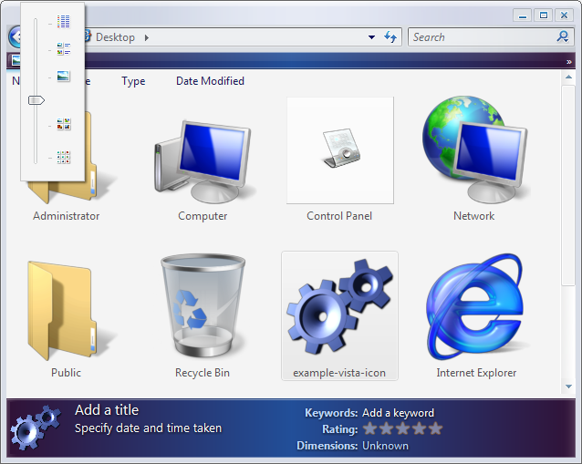
Your icon slider is sort of like Vistas new implementation, which I really like. It allows tile, icon, thumbnail, list, etc.. but also various icons sizes for each view, just by sliding.
|
|
|
| |
|
|
|
|
|
|
|
Professional Poster
Join Date: Nov 2000
Location: Tasmania, Australia
Status:
Offline
|
|
Originally Posted by moonmonkey
Thats what the "more info..." button does!
OK, but I don't want to have to click "More Info...". If there was a spot in the left panel for this, I would want all the info there by default, without having to bring up the Get Info panel, or switch to it in place.
|
|
|
| |
|
|
|
|
|
|
|
Professional Poster
Join Date: Nov 2000
Location: Tasmania, Australia
Status:
Offline
|
|
Originally Posted by kmkkid
Cool.
Your icon slider is sort of like Vistas new implementation, which I really like. It allows tile, icon, thumbnail, list, etc.. but also various icons sizes for each view, just by sliding.
ew! A slider that changes sizes AND completely changes layout? Don't like that idea.
(
Last edited by Brass; Dec 6, 2005 at 09:47 PM.
)
|
|
|
| |
|
|
|
|
|
|
|
|
|
|
|
|
 
|
|
|
Forum Rules
|
|
|
|
You may not post new threads
You may not post replies
You may not post attachments
You may not edit your posts
|
HTML code is Off
|
|
|
|
|
|
|
|
|
|
|
|


