|
 |
The official Apple HIG and usability thread
|
|
|
|
|
Clinically Insane
Join Date: Mar 2001
Location: yes
Status:
Offline
|
|
This thread is for discussing Apple's human interface guidelines (HIG), and OS X usability in general. Please leave conversation about cosmetic issues and what interface widgets you think look best for one of the other threads.
To get the ball rolling, what do you think Apple should do about the green maximize widget that is pretty much useless? Do we need a functional maximize button that makes a window take up the entire screen like Windows users are accustomed to? Should we be able to resize a window by dragging an edge? What about the toolbar hide widget? Is it necessary? Does it need a mouseover state?
|
|
|
| |
|
|
|
|
|
|
|
Addicted to MacNN
Join Date: Feb 2003
Location: NY²
Status:
Offline
|
|
I don't know what OS X looks for inside of a window when you press the green button because sometimes (not too often) I press it (mainly in safari) and the window does not do what I'd expect. Not because of this, but I find myself hardly ever use it and resizing windows manually to the size I want them.
To answer your questions I think Windows users should get accustomed to using the green button but if they feel that they have to have a window the entire size of their screen then they should have to do it manually. I think maximizing windows to the entire screen is a very silly concept in most applications (in Final Cut, Motion and stuff like that it makes sense though).
On Windows you can resize a window with any edge but I find it is counter productive to moving a window to the position you want the top left corner and then resizing from the bottom right corner (OS X way). To me it takes longer because of a few factors.
1. I have to move the cursor to 2 edges and drag each
2. The size of the resize target you have to hit is a lot smaller when it's a window edge, rather than a resize square in the bottom right hand corner of a window.
I think Microsoft agrees with point two because in Internet Explorer (I know for a fact IE7) and Office (again, for sure 2007) the bottom right hand corner is the same thing as OS X windows.
I like the toolbar widget, think it should stay where it is, and have never noticed it doesn't have a rollover state.
I have some windows that I like without the toolbar, but most windows I show with the calendar.
Here's my question: Am I the only one who thinks that applications that look like this should be forced to use the default OS X window 'chrome'? Then apps will be consistent but the contents can be different for different apps.
|
|
|
| |
|
|
|
|
|
|
|
Mac Enthusiast
Join Date: Jan 2007
Location: Amsterdam, NL
Status:
Offline
|
|
My main complaint at this moment is that Apple never really updated the HIGs to Mac OS X 10.4 Tiger standards. It provides no answers for the usage of Unified title/toolbar windows compared to normal Aqua ones and the glossy bar used at the bottom of many applications.
On top of that Mac OS X 10.4 Tiger has been a testing area for GUI styles. Aqua, Brushed, Unified title/toolbar look (Light), Unified title/toolbar look ((Dark), which comes with a enormous variety of button styles and other alien elements absent in normal applications).
Hopefully they bring out a completely updated set of rules once Mac OS X Leopard is released.
|
|
|
| |
|
|
|
|
|
|
|
Addicted to MacNN
Join Date: Mar 2006
Status:
Offline
|
|
Originally Posted by besson3c 
To get the ball rolling, what do you think Apple should do about the green maximize widget that is pretty much useless? Do we need a functional maximize button that makes a window take up the entire screen like Windows users are accustomed to?
The problem is the green button does not resize the window in any predictable way.
|
|
|
| |
|
|
|
|
|
|
|
Professional Poster
Join Date: May 2007
Status:
Offline
|
|
Well, it is supposed to resize it to fit the content of the window, but sometimes it does a bad job of it. In the iLife Apps, it resizes to full screen like in Windows.
And about window look... it might work if every app looked different, like GarageBand. If every App looked like what it represented, then it would be easy to tell what was what. It would look like hell though. So don't do it Apple. I'm just thinking out loud.
|
|
|
| |
|
|
|
|
|
|
|
Professional Poster
Join Date: Jun 2007
Status:
Offline
|
|
The use of the green button is not consistent and I think that's the confusing part. Some applications it does maximize the window to the entire screen. Other applications it only to the very top and bottom of the screen. Still others it sets the window size to a predetermined size and finally there's iTunes that does something completely different. It shrinks it down to the mini player or restores is back to the "normal" size.
|
|
|
| |
|
|
|
|
|
|
|
Posting Junkie
Join Date: Dec 2000
Status:
Offline
|
|
The funny thing about that is that iTunes is the one app in which I actually use the green button.
|
|
|
| |
|
|
|
|
|
|
|
Professional Poster
Join Date: Nov 2000
Location: Tasmania, Australia
Status:
Offline
|
|
The green button is a great idea (ie, resize window to optimum size, as defined by the application - not the OS). Unfortunately, it's poorly implemented in some applications.
Even if it was implemented well in all applications, some people still want their window to fill the entire screen (I've no idea why, but they just do).
Perhaps we need a fourth (blue?) widget for maximise, and keep the green one for the current zoom feature the way it is?
|
|
|
| |
|
|
|
|
|
|
|
Professional Poster
Join Date: May 2007
Status:
Offline
|
|
Ew... no. If people can't handle dragging their window to unnecessary full size, I'm not sure they are taking advantage of anything in OS X.
|
|
|
| |
|
|
|
|
|
|
|
Clinically Insane
Join Date: Oct 2000
Location: Los Angeles
Status:
Offline
|
|
Full screen window zooming should always be available by option clicking the zoom button, but I don't know if anyone ever implemented that feature. Developers should have recognized a while ago that Windows users are used to single tasking and usually like their windows full screen.
|

"The natural progress of things is for liberty to yield and government to gain ground." TJ
|
| |
|
|
|
|
|
|
|
Addicted to MacNN
Join Date: Jul 2004
Location: Toronto
Status:
Offline
|
|
Originally Posted by besson3c
What do you think Apple should do about the green maximize widget that is pretty much useless? Do we need a functional maximize button that makes a window take up the entire screen like Windows users are accustomed to?
There should be two buttons: green to maximize, blue to optimize.
I love optimize (or "zoom-to-fit") when it works. For instance, optimize in Safari makes the window as thin as possible without needing scrollbars.
Apple shouldn't be using the zoom button to change iTunes' state. A completely different button should be used.
Should we be able to resize a window by dragging an edge?
Yes, absolutely. I can't understand Apple's reluctance here.
What about the toolbar hide widget? Is it necessary? Does it need a mouseover state?
I almost never hide toolbars, but I occasionally cmd-opt-click on the toolbar button to open the toolbar config sheet. It's handy.
I'd like to see some of the current interface options expanded:
For instance, I'd like double-clicking on the title bar to be configurable:
1) double-click on the left of the title to "push to the back of all windows"
2) double-click on the right to "push to the back of this app's windows."
3) double-click on the empty space between the menus and menu extras to hide the front app.
I'd like to use hot corners to activate more than just Expose, Dashboard, or Screen Savers. Like activate a menu item or open a file/app.
Bring back the old Apple menu!
Using Finder labels on folders should change the color of the folder.
Customizing menu shortcuts should be easier. Say, cmd-clicking on a menu item should activate the pref pane with the menu name entered.
|
|
|
| |
|
|
|
|
|
|
|
Senior User
Join Date: Aug 2002
Location: Auckland, NZ
Status:
Offline
|
|
The green widget discussion is always an interesting one. Its equivalent used to work nicely in System 7 and such days, in the spatial Finder, because it allowed you to arrange a bunch of windows quite nicely on the screen. OS X's Finder has never quite "got it"; its zoom fails to take account of the annoying grid-spacing and tends to leave one with a scrollbar where there is no need for one with a proper zoom.
Safari's zoom is most unpredictable, as I find Preview's to be most of the time, even though I feel it has the least excuse to be like that. iTunes and Calculator seem to me to use the green widget best, as they have specific views that one might want to switch between, and maybe it is best for it to stay as a "special" zoom where appropriate, but the inconsistency is definitely to be frowned upon. I'm pretty sure the original release of iTunes for Windows had the restore widget switch to mini-player, but that departed in favour of the much less useful Windows default ... interesting times.
The toolbar hide widget also has inconsistency issues, especially since Tiger's Finder came along; and then there's inconsistency with toolbars like in Safari that don't even offer the feature via a widget; and then there are carbon/cocoa/consistency/slack programming issues, especially among preferences windows - in Mail the preferences window has a toolbar and a widget to show/hide, but how do you navigate the preferences without it? Command-clicking the widget changes the display type for the toolbar, and that setting sticks on quit! iCal has the same options but doesn't save that setting. iTunes and iPhoto have toolbars in their preferences windows but no show/hide widget; Preview's preferences window uses the since-panther-style button-like tabs instead of a toolbar, as does TextEdit's. So much inconsistency  .
(
Last edited by MartiNZ; Oct 9, 2007 at 12:05 AM.
)
|
|
|
| |
|
|
|
|
|
|
|
Addicted to MacNN
Join Date: Jul 2004
Location: Toronto
Status:
Offline
|
|
Originally Posted by adamfishercox
And about window look... it might work if every app looked different, like GarageBand. If every App looked like what it represented, then it would be easy to tell what was what.
Apple could provide an option to apply a tint to app windows. For instance, the user could make Mail "bluer" or Calculator "greener." But only the gray background would be tinted, not the content or controls, and the tint would be subtle, not garish. I would probably use this feature.
|
|
|
| |
|
|
|
|
|
|
|
Clinically Insane
Join Date: Mar 2001
Location: yes
Status:
Offline
|
|
lpkmckenna and others,
Four buttons on the windows? Isn't that creating more complexity and creating extra widgets that many users won't take advantage of? Perhaps these features might be good as user options, but there is definitely a tradeoff in cluttering up windows by default with more doodads...
One of the things that HCI designers wrestle with is the general correlation of add features -> increase complexity.
|
|
|
| |
|
|
|
|
|
|
|
Clinically Insane
Join Date: Mar 2001
Location: yes
Status:
Offline
|
|
I also disagreed with Apple's decision to get rid of the OK button in the Mail preferences dialog once they moved to Tiger. That OK button is very clear and provides cues that "if you click this you will change something". It is annoying to have to save something in the Mail preferences dialog by clicking somewhere else and then clicking save, as if the preference dialog is a text document or something...
In my opinion, when you type stuff in and there is room for error, there should be an OK button to indicate that you are done typing in stuff and you want to save/accept the change. If the window is just checkboxes and such (like the Firefox preferences dialog), an OK button is not necessary. Dialogs should never have window close buttons - they need to be dismissed either with an "OK" or "cancel" IMHO.
As much as I hate to say it, when I work in Linux I sometimes like having the "apply" button as well to test a preferences change without having to close the window. This convention is something that Windows does too.
|
|
|
| |
|
|
|
|
|
|
|
Addicted to MacNN
Join Date: Jul 2004
Location: Toronto
Status:
Offline
|
|
Originally Posted by besson3c
Four buttons on the windows? Isn't that creating more complexity and creating extra widgets that many users won't take advantage of?
A window would only have four buttons if the app does both optimize and maximize. If it only maximizes or optimizes, then it would only have a single green or blue button. Right now, I can't think of a single app that would require all four buttons.
|
|
|
| |
|
|
|
|
|
|
|
Professional Poster
Join Date: Nov 2000
Location: Tasmania, Australia
Status:
Offline
|
|
Originally Posted by besson3c
lpkmckenna and others,
Four buttons on the windows? Isn't that creating more complexity and creating extra widgets that many users won't take advantage of? Perhaps these features might be good as user options, but there is definitely a tradeoff in cluttering up windows by default with more doodads...
One of the things that HCI designers wrestle with is the general correlation of add features -> increase complexity.
Perhaps the idea that was posted by somebody else is more appropriate then. Have the function of the green button toggle between maximise and zoom, depending on if the Option key is down or not (and make the default user customisable via preferences).
|
|
|
| |
|
|
|
|
|
|
|
Addicted to MacNN
Join Date: Feb 2003
Location: NY²
Status:
Offline
|
|
Originally Posted by besson3c
I also disagreed with Apple's decision to get rid of the OK button in the Mail preferences dialog once they moved to Tiger. That OK button is very clear and provides cues that "if you click this you will change something". It is annoying to have to save something in the Mail preferences dialog by clicking somewhere else and then clicking save, as if the preference dialog is a text document or something...
In my opinion, when you type stuff in and there is room for error, there should be an OK button to indicate that you are done typing in stuff and you want to save/accept the change. If the window is just checkboxes and such (like the Firefox preferences dialog), an OK button is not necessary. Dialogs should never have window close buttons - they need to be dismissed either with an "OK" or "cancel" IMHO.
I'm the opposite. I wish Mail's preferences worked like other app's preferences in OS X. No OK/Cancel buttons or anything. Make your changes and then close the window, done. iTunes has OK/Cancel doesn't it? I never understood why that was there, except maybe because of the Windows version.
Originally Posted by besson3c
As much as I hate to say it, when I work in Linux I sometimes like having the "apply" button as well to test a preferences change without having to close the window. This convention is something that Windows does too.
I think the OK/Cancel/Apply idea is silly. So often I see people clicking Apple and then OK because they think that that is what they have to do. They think that Apply sets the preferences and then OK closes the window.
I think that is the problem with having OK/Cancel buttons. You have to click something else to see your changes. If you want to change your desktop picture you have to choose one, click Apply, and repeat until you find one you're happy with. On OS X you click through your pictures and the preference change is made in real time. If you're not happy with the change, then change it back.
|
|
|
| |
|
|
|
|
|
|
|
Professional Poster
Join Date: Jun 2007
Status:
Offline
|
|
Originally Posted by mdc
I think the OK/Cancel/Apply idea is silly. So often I see people clicking Apply and then OK because they think that that is what they have to do
In some instances in windows you have to hit apply and then ok. I found out the hard way after making some configuration changes to a server. Those changes were lost if I only hit ok - I had to "apply" them before hitting OK.
From a usability standpoint having OK or Apply is fine by me, having both can lead to some confusion. Of course the confusion is rather small as it only causes the user to click twice if he's (or she) not sure.
To be honest I didn't even miss the ok button was missing in mail until Besson mentioned it.
|
|
|
| |
|
|
|
|
|
|
|
Clinically Insane
Join Date: Mar 2001
Location: yes
Status:
Offline
|
|
Originally Posted by mdc
I'm the opposite. I wish Mail's preferences worked like other app's preferences in OS X. No OK/Cancel buttons or anything. Make your changes and then close the window, done. iTunes has OK/Cancel doesn't it? I never understood why that was there, except maybe because of the Windows version.
I think the OK/Cancel/Apply idea is silly. So often I see people clicking Apple and then OK because they think that that is what they have to do. They think that Apply sets the preferences and then OK closes the window.
I think that is the problem with having OK/Cancel buttons. You have to click something else to see your changes. If you want to change your desktop picture you have to choose one, click Apply, and repeat until you find one you're happy with. On OS X you click through your pictures and the preference change is made in real time. If you're not happy with the change, then change it back.
I'm not unconditionally a fan of the apply button, I just think that in *some* instances it can be useful, and is a convention that Apple ought to consider adopting for these very instances.
|
|
|
| |
|
|
|
|
|
|
|
Clinically Insane
Join Date: Mar 2001
Location: yes
Status:
Offline
|
|
Originally Posted by MacosNerd
In some instances in windows you have to hit apply and then ok. I found out the hard way after making some configuration changes to a server. Those changes were lost if I only hit ok - I had to "apply" them before hitting OK.
From a usability standpoint having OK or Apply is fine by me, having both can lead to some confusion. Of course the confusion is rather small as it only causes the user to click twice if he's (or she) not sure.
To be honest I didn't even miss the ok button was missing in mail until Besson mentioned it.
You'll notice it missing if you do a lot of configuration changing or have to guide somebody through making a configuration change.
I agree that being forced to click apply is not at all ideal.
|
|
|
| |
|
|
|
|
|
|
|
Addicted to MacNN
Join Date: Mar 2006
Status:
Offline
|
|
Originally Posted by MacosNerd
The use of the green button is not consistent and I think that's the confusing part. Some applications it does maximize the window to the entire screen. Other applications it only to the very top and bottom of the screen. Still others it sets the window size to a predetermined size and finally there's iTunes that does something completely different. It shrinks it down to the mini player or restores is back to the "normal" size.
That's my point entirely - Apple's apps should set the standard for others on the HIG - I never use optimize any more, since it so rarely does what I want it to do.
|
|
|
| |
|
|
|
|
|
|
|
Mac Elite
Join Date: Jan 2001
Location: Helsinki, Finland
Status:
Offline
|
|
(originally posted here)
The green button could take on new directions.
Zooming to show more content is just one way to focus the user on a particular window's contents. I would love a smart zoom combined with a fade-to-dark-translucent of the background windows- this would be more in line with the Mac tradition of working with multiple documents than an all out 'fit screen'. Especially, as contemporary display sizes allow for so much (nice) clutter that needs a bit of cooling down sometimes.
A bit like the 'lights out'- feature in Adobe Lightroom, and of course the way Apple's own Dashboard brings widgets into the front.
|
|
|
| |
|
|
|
|
|
|
|
Fresh-Faced Recruit
Join Date: Nov 2006
Location: London
Status:
Offline
|
|
How about the the OS resizing the columns for you so you can see the whole filename. This drives me mental every single day.  
|
|
--wake up--
|
| |
|
|
|
|
|
|
|
Addicted to MacNN
Join Date: Mar 2006
Status:
Offline
|
|
How about showing the path on directory viewers - if you have two directories on different drives called the same thing, it's impossible to tell which is which!
|
|
|
| |
|
|
|
|
|
|
|
Professional Poster
Join Date: Nov 2000
Location: Tasmania, Australia
Status:
Offline
|
|
Originally Posted by peeb
How about showing the path on directory viewers - if you have two directories on different drives called the same thing, it's impossible to tell which is which!
Would be nice to have the full path displayed somewhere (at least optionally). You can always command-click on the title bar (Finder, and most document-centric applications), but sometimes that's a bit inconvenient.
|
|
|
| |
|
|
|
|
|
|
|
Professional Poster
Join Date: Jan 2002
Location: London, UK
Status:
Offline
|
|
Originally Posted by Big Mac
Full screen window zooming should always be available by option clicking the zoom button, but I don't know if anyone ever implemented that feature. Developers should have recognized a while ago that Windows users are used to single tasking and usually like their windows full screen.
Shift-clicking the zoom button in OmniWeb makes it toggle between last view and full screen. It would be nice if that was system wide. Note, it shouldn't be option-click as that should be reserved for applying the same zoom to all open windows in the same app (as option-close and option-minimise do for their respective buttons).
Wrt to the OK/Cancel debate... there shouldn't be a single OK button in any app anywhere in the Mac OS and anyone that includes them in their apps should be shot. The text on the button should tell you want clicking it will do, such as Save, Don't Save, Open, Delete, Cancel, etc. No one should have to read text in a dialogue to know the consequences of what a click does. Unfortunately, Mail is a prime example of where idiots have written the app (OK and Cancel in the Erase Junk Mail dialogue, etc) and there are others too.
|
|
|
| |
|
|
|
|
|
|
|
Professional Poster
Join Date: Jan 2002
Location: London, UK
Status:
Offline
|
|
Originally Posted by Brass
Would be nice to have the full path displayed somewhere (at least optionally). You can always command-click on the title bar (Finder, and most document-centric applications), but sometimes that's a bit inconvenient.
You can add a path button to the toolbar.
|
|
|
| |
|
|
|
|
|
|
|
Clinically Insane
Join Date: Oct 2000
Location: Los Angeles
Status:
Offline
|
|
Originally Posted by JKT
Shift-clicking the zoom button in OmniWeb makes it toggle between last view and full screen. It would be nice if that was system wide. Note, it shouldn't be option-click as that should be reserved for applying the same zoom to all open windows in the same app (as option-close and option-minimise do for their respective buttons).
Fair enough.
Wrt to the OK/Cancel debate... there shouldn't be a single OK button in any app anywhere in the Mac OS and anyone that includes them in their apps should be shot. The text on the button should tell you want clicking it will do, such as Save, Don't Save, Open, Delete, Cancel, etc. No one should have to read text in a dialogue to know the consequences of what a click does. Unfortunately, Mail is a prime example of where idiots have written the app (OK and Cancel in the Erase Junk Mail dialogue, etc) and there are others too.
Agreed. FCE is currently at the top of my list for strange dialog box choices - it has a Yes and No pair.
|
"The natural progress of things is for liberty to yield and government to gain ground." TJ
|
| |
|
|
|
|
|
|
|
Addicted to MacNN
Join Date: Mar 2006
Status:
Offline
|
|
|
|
|
|
| |
|
|
|
|
|
|
|
Professional Poster
Join Date: May 2007
Status:
Offline
|
|
Originally Posted by Brass
Would be nice to have the full path displayed somewhere (at least optionally). You can always command-click on the title bar (Finder, and most document-centric applications), but sometimes that's a bit inconvenient.
In Leopard.
|
|
|
| |
|
|
|
|
|
|
|
Baninated
Join Date: Oct 2002
Location: In yer threads
Status:
Offline
|
|
I am glad to see so many people care about the GUI and HIG. Apple should and needs to be listening.
Apple also needs to follow it's rules it sets for 3rd party developers.
|
|
|
| |
|
|
|
|
|
|
|
Professional Poster
Join Date: Jan 2002
Location: London, UK
Status:
Offline
|
|
Originally Posted by peeb
How?
If that is aimed at my path button in the toolbar - Finder>View>Customise Toolbar...
Note, it'll only save you a command keypress - the display is identical to that of command-clicking the titlebar name.
|
|
|
| |
|
|
|
|
|
|
|
Addicted to MacNN
Join Date: Feb 2003
Location: NY²
Status:
Offline
|
|
The path button is already in 10.4
|
|
|
| |
|
|
|
|
|
|
|
Professional Poster
Join Date: May 2007
Status:
Offline
|
|
Yes it is. That's what we've been talking about. My in Leopard comment was the fact that Leopard can actually display the path in the bottom of the finder window if you want.
|
|
|
| |
|
|
|
|
|
|
|
Addicted to MacNN
Join Date: Mar 2006
Status:
Offline
|
|
Originally Posted by JKT
If that is aimed at my path button in the toolbar - Finder>View>Customise Toolbar...
Note, it'll only save you a command keypress - the display is identical to that of command-clicking the titlebar name.
Thanks - if I understand right, this does not automatically display the path?
|
|
|
| |
|
|
|
|
|
|
|
Professional Poster
Join Date: May 2007
Status:
Offline
|
|
Why not try it and see?
It's a button in the toolbar. All it does is the same thing as command clicking on the title bar.
|
|
|
| |
|
|
|
|
|
|
|
Posting Junkie
Join Date: May 2001
Location: Brisbane, Australia
Status:
Offline
|
|
Originally Posted by JKT
Wrt to the OK/Cancel debate... there shouldn't be a single OK button in any app anywhere in the Mac OS and anyone that includes them in their apps should be shot.
Quoted for f*cking truth. Anyone who does not get why should be disqualified from even discussing HIG, usability or HCI.
|
|
|
| |
|
|
|
|
|
|
|
Posting Junkie
Join Date: Feb 2005
Location: 888500128
Status:
Offline
|
|
Originally Posted by besson3c
I'm not unconditionally a fan of the apply button, I just think that in *some* instances it can be useful, and is a convention that Apple ought to consider adopting for these very instances.
They already have, vis: Network System Preference.
|
|
|
| |
|
|
|
|
|
|
|
Addicted to MacNN
Join Date: Feb 2003
Location: NY²
Status:
Offline
|
|
Originally Posted by JKT
Wrt to the OK/Cancel debate... there shouldn't be a single OK button in any app anywhere in the Mac OS and anyone that includes them in their apps should be shot. The text on the button should tell you want clicking it will do, such as Save, Don't Save, Open, Delete, Cancel, etc. No one should have to read text in a dialogue to know the consequences of what a click does. Unfortunately, Mail is a prime example of where idiots have written the app (OK and Cancel in the Erase Junk Mail dialogue, etc) and there are others too.
I couldn't agree more.
|
|
|
| |
|
|
|
|
|
|
|
Posting Junkie
Join Date: Dec 2000
Status:
Offline
|
|
Originally Posted by JKT
Wrt to the OK/Cancel debate... there shouldn't be a single OK button in any app anywhere in the Mac OS and anyone that includes them in their apps should be shot.
Uhm, not a single OK button anywhere? And anyone who uses one, anywhere, should be shot? Okay...
So what do you suggest the default button be named in an informational dialog box, such as an error message, where there's only one button, and there isn't any action caused by that button, other than dismissing the dialog?
|
|
|
| |
|
|
|
|
|
|
|
Posting Junkie
Join Date: Feb 2005
Location: 888500128
Status:
Offline
|
|
Originally Posted by CharlesS
Uhm, not a single OK button anywhere? And anyone who uses one, anywhere, should be shot? Okay...
So what do you suggest the default button be named in an informational dialog box, such as an error message, where there's only one button, and there isn't any action caused by that button, other than dismissing the dialog?
Those should hardly ever come up at all, no?
I can't remember the last time I saw such a non-interactive "dialog" box on the Mac...?
|
|
|
| |
|
|
|
|
|
|
|
Posting Junkie
Join Date: Dec 2000
Status:
Offline
|
|
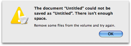
So you've never had any app fail to do something you asked it to because of unfavorable conditions? You must live in a perfect world.
What would you suggest the default button for this dialog box, which only dismisses the dialog, be named?
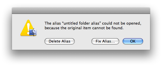
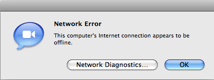
Or, perhaps, this one?
Here's one that's common enough if you have a slightly flaky Internet connection:
(
Last edited by CharlesS; Oct 11, 2007 at 12:25 PM.
)
|
|
|
| |
|
|
|
|
|
|
|
Mac Enthusiast
Join Date: Jan 2007
Location: Amsterdam, NL
Status:
Offline
|
|
Don't forget this one:

I do agree however that there shouldn't be any OK/Cancel confirmation buttons in normal application preference windows.
|
|
|
| |
|
|
|
|
|
|
|
Professional Poster
Join Date: Jun 2007
Status:
Offline
|
|
Originally Posted by JKT
No one should have to read text in a dialogue to know the consequences of what a click does. .
That's kind of silly, having a dialog box and not expect people to read it. Why have dialog boxes at all then?
While its helpful to have the text on the button, having ok, and the consequences described in the dialog box is just as good.
|
|
|
| |
|
|
|
|
|
|
|
Addicted to MacNN
Join Date: Feb 2003
Location: NY²
Status:
Offline
|
|
I don't think it's just as good to have dialog text and OK/Cancel. In that case dialog boxes are all the same and people start to see them as something obstruction them from doing what they need to, and not a box with an important question they should answer.
If there are Save/Don't Save buttons and people don't read the text they'll still know what they're about to do when they click that button.
|
|
|
| |
|
|
|
|
|
|
|
Banned
Join Date: Jun 2003
Status:
Offline
|
|
Originally Posted by CharlesS
So you've never had any app fail to do something you asked it to because of unfavorable conditions? You must live in a perfect world.
What would you suggest the default button for this dialog box, which only dismisses the dialog, be named?
How about "Dismiss" or "Do nothing".
"Ok" should never be used...ever! It's akin to some Windows dialog boxes that have an Ok, Cancel and X close button widget in the upper-right corner. How the **** is someone supposed to know what Ok and the close button will do?
Thankfully, Apple is slowly getting rid of these types of uninformative dialog windows. You can find these types of dialog windows *everywhere* in Windows. There are dozens upon dozens of examples.
I'm currently writing a memoir on UI problems such as this and how giving too many choice conditions hinders user performance as it often leads to mistakes or unintended behaviors. I'll gladly post the results of my research and tests here once it's done.
|
|
|
| |
|
|
|
|
|
|
|
Banned
Join Date: Jun 2003
Status:
Offline
|
|
Originally Posted by mdc
If there are Save/Don't Save buttons and people don't read the text they'll still know what they're about to do when they click that button.
Precisely.
Someone mentioned there shouldn't be an 'Ok' and 'Cancel' button in a preference window. This type of behavior is mostly exhibited in Carbon apps. Often enough, Carbon apps are apps ported from Mac OS 9 which didn't necessarly reflect changes dynamically. So hitting the 'Cancel' button would cancel any changes made within the preference window. This is still the case today with iTunes. You can make changes and none of the changes are saved unless you hit 'Ok'...in fact iTunes and DVD Player are probably the only remaining Apple apps that have this Carbonesque behavior...even the Finder has shed this inconsistant and confusing behavior (at least in Leopard).
At the very least, these apps should display 'Save changes' and 'Don't save changes' instead of 'Ok' and 'Cancel'...or 'Apply changes' and 'Don't apply changes' and since these preference windows act as dialog boxes in Carbon apps, the user knows that hitting any of these buttons will close the window.
In Windows 95 to XP (haven't checked Vista yet), the situation is almost ridiculous...they often have a 'Cancel', 'Ok', and 'Apply' button...and to make matter worse the little close button in the top-right is active. Unless you experiment and learn the behaviors of these buttons, it's almost impossible to tell at first glance if the
'Ok' button will act as an 'Apply' button and close the window or if the 'X' close button will act as an 'Apply' button, or an 'Ok' button or a 'Cancel' button.
Someone might say that it's obvious that the close button acts as a 'Cancel' button but it really isn't. In fact, I often did that very mistake because I was used to closing preference windows in Mac OS X without losing an preference changes. I'd click the 'X' close box and then realize later that the changes we're simply ignored. Am I stupid? Perhaps...but there are a lot of stupid people in the world and minimizing the options to 2 or 3 (at most) very clear choices would go a long way.
I'm glad someone brought this subject up because this is a huge one in terms of potential usability and performance increase.
|
|
|
| |
|
|
|
|
|
|
|
Mac Enthusiast
Join Date: Jan 2007
Location: Amsterdam, NL
Status:
Offline
|
|
From my experience it's quite clear what those three buttons will, or at least are meant to, do on Windows:
OK: Close the settings window, changes are saved.
Cancel: Close the settings window, no changes are saved.
Apply: Leave the settings window open, but save changes. (Basically what a normal Mac OS X preferences window does automatically)
The close button or "X" is basically the same as "Cancel" from what I know. I figured that all out by trying it once. Just as I did with many things on Mac OS X.
That said, I prefer the Mac OS X-way default way of preferences being saved on-the-fly. No confirmation buttons needed.
|
|
|
| |
|
|
|
|
|
|
|
Posting Junkie
Join Date: Dec 2000
Status:
Offline
|
|
Originally Posted by Horsepoo!!!
How about "Dismiss" or "Do nothing".
I had a long response typed out to this, and the server ate it, so I'm instead just going to dare you to find an example of one application where an error box of this type:
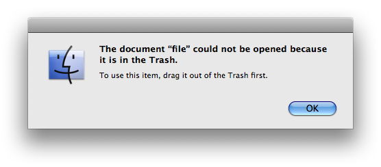
has a default button labeled "Dismiss" or "Do Nothing."
Basically, having "OK" as a response to that simulates human interaction more closely. Suppose you have an underling who has to obey your orders:
You: "Bob, look up this company's phone number on Switchboard."
Bob: "I can't, the network is down."
You: "Okay, look it up in the phone book instead."
The "Okay" indicates acknowledgement of what Bob said, usually followed by the next request. This makes more sense than:
You: "Bob, look up this company's phone number on Switchboard."
Bob: "I can't, the network is down."
You: "DISMISS!"
Bob: 
or even better:
You: "Bob, look up this company's phone number on Switchboard."
Bob: "I can't, the network is down."
You: "Do nothing! Look it up in the phone book!"
Bob: 
The other thing is that an action verb like "Dismiss" in a dialog box could give the user the impression that the button actually will perform some potentially scary operation on the file - especially if they're novices and don't know that "Dismiss" is the terminology we use to refer to making a dialog go away. In the Trash screenshot I provided above, the user might think that "Dismiss" means to "dismiss" the file by deleting it outright.
Don't get me wrong - I thoroughly agree that action verbs that describe what will happen are far preferable when those buttons are linked to some action like "Save" or "Don't Save". However, when the button is not linked to any action at all, I think "OK" is clearer and less confusing, not to mention that it's what 99% of applications use for such dialogs (excepting apps that try to be cute by naming the button something like "Groovy" or "$@#%!"), so users will generally already know what it does.
Oh look, I ended up retyping that long reply anyway. Well, I'm going to copy it to the clipboard this time before pressing the "Submit" button...
|
|
|
| |
|
|
|
|
|
|
|
|
|
|
|
|
 
|
|
|
Forum Rules
|
|
|
|
You may not post new threads
You may not post replies
You may not post attachments
You may not edit your posts
|
HTML code is Off
|
|
|
|
|
|
|
|
|
|
|
|