 |
 |
Mike's Free Toolbar Icons
|
|
|
|
|
Dedicated MacNNer
Join Date: Jan 2001
Location: Seattle, WA
Status:
Offline
|
|
I just put up a set of 18 toolbar icons developers can use to help make their applications look and feel even better on Mac OS X. The icon set is similar to The Iconfactory's $349 "Stock Icon" sets, including an add button, pencil, document, paintbrush, folders, and more � but is of a higher quality and totally free. Developers can use the icons in their applications completely free of charge and as long as they would like. I hope some people find a good home for these!
 Download Mike's Toolbar Icons
More Info
Download Mike's Toolbar Icons
More Info
|
|
|
| |
|
|
|
|
|
|
|
Mac Enthusiast
Join Date: Dec 2003
Location: Vermont
Status:
Offline
|
|
Those NEED to be a theme.
|
|
|
| |
|
|
|
|
|
|
|
Professional Poster
Join Date: Jul 2003
Status:
Offline
|
|
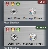
As nice as there are, it would be preferable to have the shadow on the back instead like this example from Adam Betts.
|
|
|
| |
|
|
|
|
|
|
|
Junior Member
Join Date: Dec 2003
Location: Canada
Status:
Offline
|
|
|
(
Last edited by Mac_Guy15; Jul 20, 2004 at 07:49 PM.
)
|
|
|
| |
|
|
|
|
|
|
|
Dedicated MacNNer
Join Date: Dec 2003
Location: Space.
Status:
Offline
|
|
Originally posted by Michaelm8000:
I just put up a set of 18 toolbar icons developers can use to help make their applications look and feel even better on Mac OS X. The icon set is similar to The Iconfactory's $349 "Stock Icon" sets, including an add button, pencil, document, paintbrush, folders, and more � but is of a higher quality and totally free. Developers can use the icons in their applications completely free of charge and as long as they would like. I hope some people find a good home for these!
Higher quality is your opinion -- do I detect a bit of animosity toward commercial iconsets?  That said, thank-you for this. I like them and will use them, although the other fellow's suggestion about the alternate shadow type is a good point. Perhaps a second variation? I will definitely find uses for these.
|
Septuple post! Quadruple word score!

|
| |
|
|
|
|
|
|
|
Dedicated MacNNer
Join Date: Jan 2001
Location: Seattle, WA
Status:
Offline
|
|
Originally posted by demograph68:
As nice as there are, it would be preferable to have the shadow on the back instead like this example from Adam Betts.
Drop shadows like those kill the depth of an icon. if you really want them to be storng you can just stroke them in photoshop with a nice big fat black line, although I would not recommend it.
|
|
|
| |
|
|
|
|
|
|
|
Professional Poster
Join Date: Jul 2003
Status:
Offline
|
|
Drop shadows like those kill the depth of an icon. if you really want them to be strong you can just stroke them in photoshop with a nice big fat black line, although I would not recommend it.
I think I'll stick with Adam Betts on this one. 
|
|
|
| |
|
|
|
|
|
|
|
Mac Elite
Join Date: Aug 2002
Location: Connecticut
Status:
Offline
|
|
The point of Adam Betts's special shadows was for icons on metal windows. I think his shadows make sense on Metal windows, but I'm pretty sure even he recommended the regular shadows for Aqua.
|
|
|
| |
|
|
|
|
|
|
|
Dedicated MacNNer
Join Date: Jan 2001
Location: Seattle, WA
Status:
Offline
|
|
Originally posted by phillryu:
The point of Adam Betts's special shadows was for icons on metal windows. I think his shadows make sense on Metal windows, but I'm pretty sure even he recommended the regular shadows for Aqua.
I agree, but I think you should not use icons like this on metal windows but instead use things like buttons and other things that look like part of the metal.
|
|
|
| |
|
|
|
|
|
|
|
Professional Poster
Join Date: Jul 2003
Status:
Offline
|
|
Sorry for the confusion. I like the icons, though I personally wouldn't use them.
|
|
|
| |
|
|
|
|
|
|
|
Professional Poster
Join Date: Jun 2002
Location: Southern California
Status:
Offline
|
|
Those look good. Nice job.
|
|
|
| |
|
|
|
|
|
|
|
Mac Elite
Join Date: May 2001
Location: Cambridge UK
Status:
Offline
|
|
Originally posted by Michaelm8000:
I just put up a set of 18 toolbar icons developers can use to help make their applications look and feel even better on Mac OS X. The icon set is similar to The Iconfactory's $349 "Stock Icon" sets, including an add button, pencil, document, paintbrush, folders, and more � but is of a higher quality and totally free. Developers can use the icons in their applications completely free of charge and as long as they would like. I hope some people find a good home for these!
<snip>
Download Mike's Toolbar Icons
More Info
Those are great! Any chance you could produce a step by step guide on how you make toolbar icons (like your desktop icons one)? I would like to see how the 'pros' do it
|
|
|
| |
|
|
|
|
|
|
|
Banned
Join Date: Apr 2002
Location: -
Status:
Offline
|
|
|
|
|
|
| |
|
|
|
|
|
|
|
|
|
|
|
|
 
|
|
|
Forum Rules
|
|
|
|
You may not post new threads
You may not post replies
You may not post attachments
You may not edit your posts
|
HTML code is Off
|
|
|
|
|
|
|
|
|
|
|
|


