|
 |
Mac OS X 10.5 Leopard interface
|
|
|
|
|
Fresh-Faced Recruit
Join Date: Dec 2008
Status:
Offline
|
|
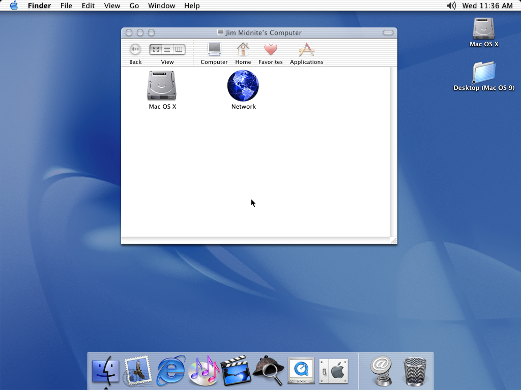
Well, Im sure all of you out there are familiar with Mac OS Leopards interface.. and I just want to know who likes it.. because I absolutely hate it..I believe that Mac OS X Tiger and such had better interfaces they looked better. HERE is some comparison pictures.

|
|
|
| |
|
|
|
|
|
|
|
Professional Poster
Join Date: Jan 2001
Location: brooklyn ny
Status:
Offline
|
|
google a bit, lots of ways to customize things. the only thing i hated out-of-the-box was that sci-fi desktop pic (so i changed it, plus replaced it as startup pic).
overall, 10.5 feels better to me (and looks fine). customize that sucker!
(
Last edited by fisherKing; Dec 7, 2008 at 03:41 PM.
)
|
|
"At first, there was Nothing. Then Nothing inverted itself and became Something.
And that is what you all are: inverted Nothings...with potential" (Sun Ra)
|
| |
|
|
|
|
|
|
|
Moderator Emeritus
Join Date: Apr 2005
Location: Cambridge, UK
Status:
Offline
|
|
That first screenshot is 10.2. It was NASTY to navigate around compared to Panther.
Do you not like the sidebar in Leopard? I like it, gives quick access to useful things.
|
|
|
| |
|
|
|
|
|
|
|
Admin Emeritus  Join Date: Oct 1999
Location: Zurich, Switzerland
Status:
Offline
|
|
Well, are you talking about aesthetics or actual operation? The first is largely personal taste, but in terms of usability, each version of OS X has been a solid improvement over its predecessors (with few small exceptions).
|
|
|
| |
|
|
|
|
|
|
|
Clinically Insane
Join Date: Oct 2000
Location: Los Angeles
Status:
Offline
|
|
Tiger's interface feels weird when I use it on my mini now.
|

"The natural progress of things is for liberty to yield and government to gain ground." TJ
|
| |
|
|
|
|
|
|
|
Professional Poster
Join Date: May 2007
Status:
Offline
|
|
That top one is ugly 
|
|
|
| |
|
|
|
|
|
|
|
Fresh-Faced Recruit
Join Date: Feb 2007
Status:
Offline
|
|
Oh god the pinstripes!!! Thank god those damn things are gone. Frankly you're insane if you think that 10.2 UI looks anywhere as good as 10.5.
|
|
|
| |
|
|
|
|
|
|
|
Addicted to MacNN
Join Date: Jul 2004
Location: Toronto
Status:
Offline
|
|
Leopard is the first time I've been satisfied with the look of OS X. I hated the metal versus pinstripes duality, especially since pinstripe windows were way too bright. And I do like the shelf-like Dock; it just looks cool. And I'm glad Spotlight is integrated better into the Finder, except for the lousy sorting options. But I quickly dumped the spacy Desktop and transluscent menubar.
|
|
|
| |
|
|
|
|
|
|
|
Fresh-Faced Recruit
Join Date: Dec 2008
Status:
Offline
|
|
|
|
|
|
| |
|
|
|
|
|
|
|
Forum Regular
Join Date: Jan 2004
Location: Little Rock, Arkansas
Status:
Offline
|
|
One can always change the interface the way one likes. My new macbook 13" has some glare but I make sure there are no lights on behind me.
|
|
|
| |
|
|
|
|
|
|
|
Senior User
Join Date: Sep 2007
Location: NY
Status:
Offline
|
|
I think things just look more unified on Leopard. I miss the customization though, it takes some jumping through hoops. But I won't open up that can of worms.
|
|
|
| |
|
|
|
|
|
|
|
Fresh-Faced Recruit
Join Date: Sep 2008
Status:
Offline
|
|
I love the Leopard look but I actually liked the brushed metal look too. (BTW, I think that only myself and 3 other people in the world actually liked brushed metal, if forum opinions are any indication.) But change is good and the gray gradient does looks nice and presents a more unified appearance, as @pplejaxkz mentioned.
Other Leopard changes were more subtle but do make for a more refined and unified experience. I prefer the Leopard Dock's more 3D-ish look, too. But that spacey wallpaper in Leopard ...good grief. Although I know people who love that wallpaper - which just goes to show how different preferences can be. Thank goodness Mac OS X is easy to customize.
|
|
|
| |
|
|
|
|
|
|
|
Moderator  Join Date: Jan 2001
Location: Polwaristan
Status:
Offline
|
|
To me all the old OS X versions look crude in comparison to Leopard.
|
|
|
| |
|
|
|
|
|
|
|
Moderator Join Date: Apr 2000
Location: Gothenburg, Sweden
Status:
Offline
|
|
Leopard is mostly an improvement. There are a few things worse - by default, View settings are global and not by window, and if you drop an open folder in the trash, the window doesn't close but instead picks some other random folder to point to - but mostly it's the same as Tiger. The menubar and desktop pic are ugly, but it's OK - they're easily changed. The stacks in the Dock are so-so, but at least they're springloaded now. I still can't set how I want discs created by burnable folders to look - they all default to icon view and sidebar on, which is the least useful mode for a disc - and many of defaults are spooky, but it's a price worth paying for finally being able to tighten the icon spacing in the Finder and that the old metal/Aqua schizophrenia is gone.
|
|
|
| |
|
|
|
|
|
|
|
Clinically Insane
Join Date: Jun 2001
Location: planning a comeback !
Status:
Offline
|
|
Pff, WhoIsBillyTapWaters, anyways
-t
|
|
|
| |
|
|
|
|
|
|
|
Senior User
Join Date: Dec 2005
Status:
Offline
|
|
Well I finally made the jump to Leopard. The interface is definitely a personal preference issue. I think the overall design of Leopard is nice but I don't like the color scheme and the 3D dock is rather distracting. The dark and dull gray along with the dull blue folders look rather depressing in my opinion. Tiger used more of a silverly white shade and brighter blue folders which was lighter and more inviting to me. I didn't like the brush metal from previous generations of OS X so that's definitely an improvement.
I also do prefer the 2D dock from Tiger and previous gen but when I resize the dock to a much smaller size it doesn't become too much of an issue anymore. The cast shadow on the 3D dock makes me feel like I have double vision which makes it a little harder to look at compared to a 2D dock. If Apple would just drop the cast shadow effect then I wouldn't have a problem with it.
But overall Leopard is pretty nice. Everyone has their own opinions so there isn't a right or wrong answer. Although it would be great if Apple would add more advanced customization to the look in their system preferences. It's something I miss from Windows.
|
|
|
| |
|
|
|
|
|
|
|
Clinically Insane
Join Date: Oct 2001
Location: San Diego, CA, USA
Status:
Offline
|
|
You can get a 2D dock — a different one, mind you, but you're not stuck with that awful, warped-perspective 3D thing.
|
|
Chuck
___
"Instead of either 'multi-talented' or 'multitalented' use 'bisexual'."
|
| |
|
|
|
|
|
|
|
Senior User
Join Date: Dec 2005
Status:
Offline
|
|
Originally Posted by Chuckit 
You can get a 2D dock — a different one, mind you, but you're not stuck with that awful, warped-perspective 3D thing.
How do you do that? I'm assuming I have to install some kind of third party software. Do you have a link?
|
|
|
| |
|
|
|
|
|
|
|
Addicted to MacNN
Join Date: Oct 2001
Location: Automatic
Status:
Offline
|
|
Originally Posted by EndlessMac
How do you do that? I'm assuming I have to install some kind of third party software. Do you have a link?
From some random website…
launch your terminal and type the following commands:
defaults write com.apple.dock no-glass -boolean YES
then you will want to kill the Dock to relaunch it without the glass effect:
killall Dock
To get the reflective 3D Dock back, simply type the following:
defaults write com.apple.dock no-glass -boolean NO
Again, you will want to kill the Dock to relaunch it.
|
|
|
| |
|
|
|
|
|
|
|
Moderator Join Date: Oct 2001
Location: San Jose, CA
Status:
Offline
|
|
I have to wonder why people keep the default position of the dock at the bottom of the screen. Put it on the left or right to automatically get rid of the 3D effect. Put it on the left (as I do) to avoid interfering with scroll bars. Easy as pi (3.14159...)!
Steve
|
|
Celebrating 10 years and 4000 posts on MacNN!
|
| |
|
|
|
|
|
|
|
Professional Poster
Join Date: Jan 2001
Location: brooklyn ny
Status:
Offline
|
|
 no border, no background etc= sex.
|
|
"At first, there was Nothing. Then Nothing inverted itself and became Something.
And that is what you all are: inverted Nothings...with potential" (Sun Ra)
|
| |
|
|
|
|
|
|
|
Fresh-Faced Recruit
Join Date: Jul 2005
Location: A Wonderful Place
Status:
Offline
|
|
Originally Posted by ibook_steve
I have to wonder why people keep the default position of the dock at the bottom of the screen. Put it on the left or right to automatically get rid of the 3D effect. Put it on the left (as I do) to avoid interfering with scroll bars. Easy as pi (3.14159...)!
Steve
I've tried putting the dock on the left, but Im too used to having it on the bottom. It is ingrained in my muscle memory. It just causes me to puzzle when I automatically drag the mouse to the bottom of the screen and nothing happens.
I find that there is more screen real estate along the bottom for icons, plus I can use magnification easily. I don't like magnification enabled on the vertical docks.
I might try again on the side, but I'm curious what people find beneficial about changing the location of the dock.
|
|
|
| |
|
|
|
|
|
|
|
Professional Poster
Join Date: Jan 2001
Location: brooklyn ny
Status:
Offline
|
|
Originally Posted by elrah
I've tried putting the dock on the left, but Im too used to having it on the bottom. It is ingrained in my muscle memory. It just causes me to puzzle when I automatically drag the mouse to the bottom of the screen and nothing happens.
I find that there is more screen real estate along the bottom for icons, plus I can use magnification easily. I don't like magnification enabled on the vertical docks.
I might try again on the side, but I'm curious what people find beneficial about changing the location of the dock.
i find i prefer having the full depth of the screen, and a small space on the side for the dock; ie a longer page in safari, etc... but it's all a matter of personal preference, isn't it? (i turned off bouncing when apps load for instance)...
|
|
"At first, there was Nothing. Then Nothing inverted itself and became Something.
And that is what you all are: inverted Nothings...with potential" (Sun Ra)
|
| |
|
|
|
|
|
|
|
Moderator Join Date: Apr 2000
Location: Gothenburg, Sweden
Status:
Offline
|
|
Originally Posted by elrah
I've tried putting the dock on the left, but Im too used to having it on the bottom. It is ingrained in my muscle memory. It just causes me to puzzle when I automatically drag the mouse to the bottom of the screen and nothing happens.
I find that there is more screen real estate along the bottom for icons, plus I can use magnification easily. I don't like magnification enabled on the vertical docks.
I might try again on the side, but I'm curious what people find beneficial about changing the location of the dock.
Main reason is that the screen is wider than it is high. With Apple's current widescreen displays, this is even more pronounced. If you put the Dock on the side, you can disable the autohiding (you seem to have that on) which improves your action time significantly as you can aim directly for the icon you want instead of the two-step movement. I also feel that the text label that shows up when you scrub aims better for the icon I want.
|
|
|
| |
|
|
|
|
|
|
|
Senior User
Join Date: Dec 2005
Status:
Offline
|
|
Originally Posted by P
Main reason is that the screen is wider than it is high. With Apple's current widescreen displays, this is even more pronounced.
I don't have a wide screen display so there isn't too much benefit for me to place it on the side. With a square format monitor the dock gets in my way no matter where I place it and I've gotten used to having the dock on the bottom.
I'm sure I can get used to having the dock on the side but I don't think that's really a solution when you force your users to change the way they work to solve a problem. If some people like the dock on the bottom then they should also get the option to not have the 3D look.
It doesn't bother me that much but it would be nice to have the option to choose which one I want though. We don't all have the same personal preferences.
|
|
|
| |
|
|
|
|
|
|
|
Moderator Join Date: Apr 2000
Location: Gothenburg, Sweden
Status:
Offline
|
|
Originally Posted by EndlessMac
It doesn't bother me that much but it would be nice to have the option to choose which one I want though. We don't all have the same personal preferences.
Agreed. Does anyone know if I can make my side-Dock be glassy? Just for kicks.
|
|
|
| |
|
|
|
|
|
|
|
Mac Elite
Join Date: Sep 2005
Status:
Offline
|
|
Your eyes and brain are most accustomed to reading text horizontally rather than vertically. Try scanning your Dock icons and reading things fast while it's horizontal, and do it when it's vertical.
Reading vertically feels awkward and unnatural.
|
|
|
| |
|
|
|
|
|
|
|
formerly crazyreaper
Senior User
Join Date: Jul 2007
Location: York, UK
Status:
Offline
|
|
just flicked about with the dock position, actually really like it on the right of my dual monitor set up (left in portrait, right in landscape) but i know if i switch it and keep it that way, whatever mac i go onto from now on at uni or a friends, i will get frustrated cause ill dive for the dock in the position... actually i dont use other people macs that much.... will do when i go into industry.... sorry thinking aloud there
fisherKing how did u create those spaces?
|
|
The Spammer Formally Known As Crazyreaper
Mac Book Pro 15", 2.66 Ghz C2D, 4GB DDR3 / iPhone 4 16GB
|
| |
|
|
|
|
|
|
|
Professional Poster
Join Date: Jan 2001
Location: brooklyn ny
Status:
Offline
|
|
Originally Posted by crazyreaper
just flicked about with the dock position, actually really like it on the right of my dual monitor set up (left in portrait, right in landscape) but i know if i switch it and keep it that way, whatever mac i go onto from now on at uni or a friends, i will get frustrated cause ill dive for the dock in the position... actually i dont use other people macs that much.... will do when i go into industry.... sorry thinking aloud there
fisherKing how did u create those spaces?
there are a number of ways to do it, but...i already use onyx, which gives me a LOT of customizing options (tinkertool is good for this as well)...
|
|
"At first, there was Nothing. Then Nothing inverted itself and became Something.
And that is what you all are: inverted Nothings...with potential" (Sun Ra)
|
| |
|
|
|
|
|
|
|
Clinically Insane
Join Date: Nov 1999
Location: 888500128, C3, 2nd soft.
Status:
Offline
|
|
Originally Posted by Tomchu
Your eyes and brain are most accustomed to reading text horizontally rather than vertically. Try scanning your Dock icons and reading things fast while it's horizontal, and do it when it's vertical.
Reading vertically feels awkward and unnatural.
a) That's not true for all cultural backgrounds.
b) The only Dock icons I ever read the label for are the quick-linked webpages. Otherwise, that's what the little pictures are for.
|
|
|
| |
|
|
|
|
|
|
|
Fresh-Faced Recruit
Join Date: Dec 2008
Status:
Offline
|
|
does anyone think it looks better or not? 
|
|
|
| |
|
|
|
|
|
|
|
Professional Poster
Join Date: May 2007
Status:
Offline
|
|
Leopard looks craploads better. I thought that had been established.
|
|
|
| |
|
|
|
|
|
|
|
Clinically Insane
Join Date: Mar 2001
Location: yes
Status:
Offline
|
|
Why do people conflate an interface with how it looks? These are NOT the same thing, I repeat, these are NOT the same thing. When you use the word "interface" you bring into the discussion usability, user-friendliness, accessibility, etc. when you discuss the aesthetics you are discussing user experience. I wish people would be more precise so that we could actually agree upon definitions for these terms.
At any rate, it looks like the original poster is speaking to the aesthetics of Leopard vs. earlier versions, which I don't really care about personally... But if there is room in this thread for actual interface discussion I'm wondering if any of you have any opinions on the direction Apple has taken OS X from a usability perspective? Has it gotten easier to use?
I think it's a mixed bag. I'm not really sure what role iSync plays now. I'm not really sure Apple's whole backup approach with Time Machine has really solved the problem Apple set out to solve with making backup easy and accessible, as those with laptops do not make it a regular habit to tether themselves to an external drive, and many do not want to shell out for Time Capsule. I wish that the Finder would auto mount shares like it does in Windows. I'm sure I can think of some more things if I thought about it, but let's see whether this spawns enough interest and if the original poster even minds this taking place simultaneously in this thread...
|
|
|
| |
|
|
|
|
|
|
|
Clinically Insane
Join Date: Nov 1999
Location: 888500128, C3, 2nd soft.
Status:
Offline
|
|
Originally Posted by besson3c
I think it's a mixed bag. I'm not really sure what role iSync plays now.
iSync is the front end for synchronising address book and calendar info with mobile devices not handled by MobileMe. It interacts with MobileMe, but the latter is a behind-the-scenes thing.
It's become slightly *less* confusing in Leopard than it was in the last days of Tiger, but I agree it's not quite clear...
Originally Posted by besson3c
I'm not really sure Apple's whole backup approach with Time Machine has really solved the problem Apple set out to solve with making backup easy and accessible, as those with laptops do not make it a regular habit to tether themselves to an external drive, and many do not want to shell out for Time Capsule.
There is no "solution" for obstinacy.
Apple has made keeping regular backups as accessible and natural as possible (and feasible), save the single aspect of using a network drive other than a Time Capsule. I'm still not sure whether there aren't real, technical reasons behind this decision.
Originally Posted by besson3c
I wish that the Finder would auto mount shares like it does in Windows
The Finder *does* auto-mount shares the second you, for example, double-click an alias linking to a folder on a network volume.
You might be able to AppleScript something when connecting to a network - Time Capsules are automatically recognized and mounted as soon as you join a network...
|
|
|
| |
|
|
|
|
|
|
|
Professional Poster
Join Date: Mar 2002
Location: Boston
Status:
Offline
|
|
Originally Posted by besson3c
When you use the word "interface" you bring into the discussion usability, user-friendliness, accessibility, etc. when you discuss the aesthetics you are discussing user experience. I wish people would be more precise so that we could actually agree upon definitions for these terms.
Yeah but people tie them together because they are intertwined with each other. An improper or poorly defined interface will impact one's user experience just as much as a poorly chosen window border color. The interface and theme, if you will, are combined to give the user what one hopes is a great user experience and ease of use.
As for the OP's comments, I feel that Apple has refined and improved the interface and aesthetics (that's for you besson  ) The look of Leopard is much more polished and the interface improvements have made interacting with the OS better then prior versions
|
~Mike

|
| |
|
|
|
|
|
|
|
Moderator  Join Date: May 2001
Location: Hilbert space
Status:
Offline
|
|
@besson
You're right that aesthetics is not the same as usability, but IMO aesthetics can be a big part of it. Of course, in the Windows and Linux world, the two are rather separate, because you can `skin' your apps and your window manager. And yes, different skins of, say, Winamp, do look very different indeed. But they do not change the basic apps. Arguably, Apple's approach is different, for them aesthetics is part of a good UI. They don't like people theming and skinning, so this is discouraged A nice design makes machines more approachable and more likable. If you have the choice between two cars that both will get the job done, but one of them looks so-so while the other one is sexy and good-looking, I'd wager that most people would go for the good-looking car. Ditto with clothes and everything.
Regarding backups specifically, I am with Spheric here: it's the first time my parents and my professor (whose Mac I administer) do regular backups. My parents have had backup software before, I've set up a FreeBSD server (which worked until my brother yanked the harddrive, formatted it to do an emergency backup and there was no way for me to set up another one remotely from Japan). It's as easy as it gets. All things are complicated: if you have a car, you also have to put gas in the tank, have it inspected every now and then and refill the oil at regular intervals. You don't need to know what a camshaft is, but you need to know how to service it. Computers are no different, they're complex machines.
|
|
I don't suffer from insanity, I enjoy every minute of it.
|
| |
|
|
|
|
|
|
|
Clinically Insane
Join Date: Mar 2001
Location: yes
Status:
Offline
|
|
Originally Posted by Maflynn
Yeah but people tie them together because they are intertwined with each other. An improper or poorly defined interface will impact one's user experience just as much as a poorly chosen window border color. The interface and theme, if you will, are combined to give the user what one hopes is a great user experience and ease of use.
A poorly defined interface will impact one's user experience, but in order to fix a poorly designed interface you need to look at usability issues, because an interface without glaring usability issues is a prerequisite to a good user experience. My perception is that user experience deals more with working with a functional, usable interface and taking it the next step to making it enjoyable for people to use.
|
|
|
| |
|
|
|
|
|
|
|
Clinically Insane
Join Date: Mar 2001
Location: yes
Status:
Offline
|
|
Originally Posted by OreoCookie
@besson
You're right that aesthetics is not the same as usability, but IMO aesthetics can be a big part of it. Of course, in the Windows and Linux world, the two are rather separate, because you can `skin' your apps and your window manager. And yes, different skins of, say, Winamp, do look very different indeed. But they do not change the basic apps. Arguably, Apple's approach is different, for them aesthetics is part of a good UI. They don't like people theming and skinning, so this is discouraged A nice design makes machines more approachable and more likable. If you have the choice between two cars that both will get the job done, but one of them looks so-so while the other one is sexy and good-looking, I'd wager that most people would go for the good-looking car. Ditto with clothes and everything.
A nice design does provide a better experience, but it is possible to have a perfectly manageable, functional interface that is boring to use. Aesthetics is about user experience, but a good user experience is dependent on a functional, accessible, usable interface, whereas the study of what makes an interface functional, accessible, and usable usually doesn't necessarily involve the aesthetics of the interface a whole lot unless the aesthetics are used to provide visual cues (such as high contrast UI elements).
Regarding backups specifically, I am with Spheric here: it's the first time my parents and my professor (whose Mac I administer) do regular backups. My parents have had backup software before, I've set up a FreeBSD server (which worked until my brother yanked the harddrive, formatted it to do an emergency backup and there was no way for me to set up another one remotely from Japan). It's as easy as it gets. All things are complicated: if you have a car, you also have to put gas in the tank, have it inspected every now and then and refill the oil at regular intervals. You don't need to know what a camshaft is, but you need to know how to service it. Computers are no different, they're complex machines.
It's a step in the right direction, but it seems to fall short of their goal. All Apple has to do is permit other forms of wireless backup rather than trying to lock people into Time Capsule.
(
Last edited by besson3c; Dec 27, 2008 at 03:14 PM.
)
|
|
|
| |
|
|
|
|
|
|
|
Clinically Insane
Join Date: Oct 2001
Location: San Diego, CA, USA
Status:
Offline
|
|
Originally Posted by besson3c
A nice design does provide a better experience, but it is possible to have a perfectly manageable, functional interface that is boring to use. Aesthetics is about user experience, but a good user experience is dependent on a functional, accessible, usable interface, whereas the study of what makes an interface functional, accessible, and usable usually doesn't necessarily involve the aesthetics of the interface a whole lot unless the aesthetics are used to provide visual cues (such as high contrast UI elements).
What you call "aesthetics" is an important part of user experience. For example, we've all read some "functional" but deadly boring user manual. I've had to practically hold my eyes at gunpoint in order to get them to stay on the page. If your interface turns people away for any reason, can you really say it's usable?
|
|
Chuck
___
"Instead of either 'multi-talented' or 'multitalented' use 'bisexual'."
|
| |
|
|
|
|
|
|
|
Clinically Insane
Join Date: Mar 2001
Location: yes
Status:
Offline
|
|
Originally Posted by Chuckit
What you call "aesthetics" is an important part of user experience. For example, we've all read some "informationally complete" but deadly boring user manual. I've had to practically hold my eyes at gunpoint in order to get them to stay on the page. If your interface turns people away for any reason, can you really say it's usable?
I think we're just in dispute about what language to use, because it doesn't seem like you're really contradicting what I'm saying...
Aesthetics is a huge part of user experience, but the term "usable" has a different connotation than user experience, and it doesn't necessarily involve a measurement of productivity (enhanced by a positive user experience). The raw form of studying usability delves into whether an interface element communicates its intended meaning accurately, what kind of learning curve it requires, and whether what is communicated is consistent across different populations of usability testers (e.g. the elderly, people from different cultures, etc.). It also can get into accessibility to the disabled and others with special needs.
You can do usability studies on your CD player, your washing machine, or even your front door to your house. All of the talk in the world of user experience is for naught if you can't figure out how to play CDs in your CD player, start a load in your washing machine, or whether you need to push/pull your front door, whether you can figure out how to lock it, which way it swings open, etc. A product of any kind that is not usable fails usability testing before you can even get into user experience.
Once you have a usable product (and it is possible to have that usable washing machine that is boring to use), then user experience relates to taking it to the next level - in making your product actually fun to use. The effects of a positive user experience are fairly clear: productivity, better sales, loyalty, attachment, etc.
The point of all of this is that user experience and usability, while sometimes related, are not really the same thing.
|
|
|
| |
|
|
|
|
|
|
|
Professional Poster
Join Date: Mar 2000
Location: New York, NY, USA
Status:
Offline
|
|
Originally Posted by fisherKing
no border, no background etc= sex.
How'd you do that?
|
|
The era of anthropomorphizing hardware is over.
|
| |
|
|
|
|
|
|
|
Professional Poster
Join Date: Jan 2001
Location: brooklyn ny
Status:
Offline
|
|
Originally Posted by Don Pickett
How'd you do that?
lol... i had deleted the border files from the dock, but... the best way (and what i used to make the dock clear), is mirage. the spaces can be done in the terminal; i used onyx, which does a lot of things (and offers a number of customization options). also, look for candybar (to change icons, ie the finder & trash dock icons)
have fun!
|
|
"At first, there was Nothing. Then Nothing inverted itself and became Something.
And that is what you all are: inverted Nothings...with potential" (Sun Ra)
|
| |
|
|
|
|
|
|
|
Professional Poster
Join Date: Mar 2000
Location: New York, NY, USA
Status:
Offline
|
|
Originally Posted by fisherKing
lol... i had deleted the border files from the dock, but... the best way (and what i used to make the dock clear), is mirage. the spaces can be done in the terminal; i used onyx, which does a lot of things (and offers a number of customization options). also, look for candybar (to change icons, ie the finder & trash dock icons)
have fun!
Fantastic: I've been missing my transparent dock since 10.4!
|
|
The era of anthropomorphizing hardware is over.
|
| |
|
|
|
|
|
|
|
Addicted to MacNN
Join Date: Oct 2001
Location: Automatic
Status:
Offline
|
|
BTW, I wonder… does make sense for the Dashboard icon to lack the running app indicator?, I know it is not running 'in your face' so to speak but I find it such a floccinaucinihilipilification (weird english word of the day).
|
|
|
| |
|
|
|
|
|
|
|
Clinically Insane
Join Date: Oct 2001
Location: San Diego, CA, USA
Status:
Offline
|
|
I don't think it makes sense for Dashboard to be in your dock at all.
|
|
Chuck
___
"Instead of either 'multi-talented' or 'multitalented' use 'bisexual'."
|
| |
|
|
|
|
|
|
|
Fresh-Faced Recruit
Join Date: Jan 2009
Status:
Offline
|
|
I like it very much
I have already install kalyway 10.52 on my PC
but I Encounter a problem about intel 865G graphics
could someone help me?
|
|
|
| |
|
|
|
|
|
|
|
Moderator Emeritus
Join Date: Apr 2005
Location: Cambridge, UK
Status:
Offline
|
|
Unfortunately, we can't help with that here but if you do some more Google searching you'll find some other sites that can.
|
|
|
| |
|
|
|
|
|
|
|
|
|
|
|
|
 
|
|
|
Forum Rules
|
|
|
|
You may not post new threads
You may not post replies
You may not post attachments
You may not edit your posts
|
HTML code is Off
|
|
|
|
|
|
|
|
|
|
|
|