|
 |
Are these screenshots of Longhorn Or Tiger?
|
|
|
|
|
Forum Regular
Join Date: Apr 2003
Location: Birmingham, UK
Status:
Offline
|
|
|
|
|
AlBook G4 15", iMac 20"
|
| |
|
|
|
|
|
|
|
Professional Poster
Join Date: Jul 2001
Location: New York, NY
Status:
Offline
|
|
eh? The interface doesn't look much like Tiger at all, and in terms of functionality, well, Apple doesn't have a patent on searching.
|
|
cpac
|
| |
|
|
|
|
|
|
|
Mac Enthusiast
Join Date: Dec 2002
Location: Amsterdam, Netherlands
Status:
Offline
|
|
Well, I see his point: aquafied close, mini-/maximize buttons and the second screenshot reminds me very much of spotlight...
|
I'm Appleless and unhappy: tiBook is dead and iPod stolen 
|
| |
|
|
|
|
|
|
|
Addicted to MacNN
Join Date: Aug 2004
Location: Outfield - #24
Status:
Offline
|
|
|
|
|
|
| |
|
|
|
|
|
|
|
Grizzled Veteran
Join Date: Aug 2002
Location: Springfield, Oregon
Status:
Offline
|
|
This is definitely windows. The widgets are totally Inspiriat (inspirit?). This could also be a screenshot of Windows' new longhorn.
R 
|
Live Victoriously. Live Virtuously. Hale the Old Gods!
Odin, Thor, Freya, Freyr, Sif, Balder, Frigga, Loki, Ran, Njord, Aegir, Bragi, Forseti, Gefion, Heimdall, Hermod, Hulda, Idhunn, Mimir, Sigyn, Skadi, Tyr, Ull, Nanna.
Hale All!
|
| |
|
|
|
|
|
|
|
Addicted to MacNN
Join Date: Jan 2001
Location: The Sar Chasm
Status:
Offline
|
|
Take OS X, hit it with an ugly stick until its eyes swell shut, presto! Longhorn. Blech.
|
 When a true genius appears in the world you may know him by this sign, that the dunces are all in confederacy against him.
 -- Jonathan Swift.
|
| |
|
|
|
|
|
|
|
Grizzled Veteran
Join Date: Oct 2001
Location: Over there
Status:
Offline
|
|
|
(
Last edited by Simon X; Feb 12, 2017 at 01:21 PM.
)
|
|
|
| |
|
|
|
|
|
|
|
Grizzled Veteran
Join Date: Aug 2002
Location: Springfield, Oregon
Status:
Offline
|
|
Originally posted by Simon X:
Good ol' MS. Still trying to polish a turd.
ooooooh, shiny!
|
Live Victoriously. Live Virtuously. Hale the Old Gods!
Odin, Thor, Freya, Freyr, Sif, Balder, Frigga, Loki, Ran, Njord, Aegir, Bragi, Forseti, Gefion, Heimdall, Hermod, Hulda, Idhunn, Mimir, Sigyn, Skadi, Tyr, Ull, Nanna.
Hale All!
|
| |
|
|
|
|
|
|
|
Mac Enthusiast
Join Date: Jan 2002
Status:
Offline
|
|
That is indeed an ugly interface.
While Apple seem to be trying to leave all of the Aqua nonsense behind, MS have managed to take all what was wrong of it to a new level of ugliness. Good job.
|
|
|
| |
|
|
|
|
|
|
|
Clinically Insane
Join Date: Oct 2001
Location: San Diego, CA, USA
Status:
Offline
|
|
Originally posted by jocker:
Seriously - how the f*ck can microsoft get away with such blatant interface copying?
I don't see it at all...
|
|
Chuck
___
"Instead of either 'multi-talented' or 'multitalented' use 'bisexual'."
|
| |
|
|
|
|
|
|
|
Senior User
Join Date: Aug 2003
Location: united states empire
Status:
Offline
|
|
That's not very blatant at all. Gosh, I pity anyone who has to stare at that interface.
|
|
|
| |
|
|
|
|
|
|
|
Clinically Insane
Join Date: Oct 2000
Location: Los Angeles
Status:
Offline
|
|
Originally posted by mAxximo:
That is indeed an ugly interface.
While Apple seem to be trying to leave all of the Aqua nonsense behind, MS have managed to take all what was wrong of it to a new level of ugliness. Good job.
Huh? OS X's interface is still for the most part Aqua - a refined Aqua, but Aqua nevertheless.
I don't think this is Longhorn we're seeing, but if it is that's really great. That interface looks a smidgen worse than even XP's.
|

"The natural progress of things is for liberty to yield and government to gain ground." TJ
|
| |
|
|
|
|
|
|
|
Mac Enthusiast
Join Date: Nov 2002
Location: Atlanta, GA
Status:
Offline
|
|
There's a definate similarity between the 2nd screenshot and spotlight.... but a lot of it is becasue it makes sense to lay it out that way.
|
|
|
| |
|
|
|
|
|
|
|
Clinically Insane
Join Date: Oct 2001
Location: San Diego, CA, USA
Status:
Offline
|
|
Originally posted by wtmcgee:
There's a definate similarity between the 2nd screenshot and spotlight.... but a lot of it is becasue it makes sense to lay it out that way.
Yeah. Unless I'm just really think, I'd say it looks about as much like a Xfactor with the field names switched up as it does like Spotlight.
|
|
Chuck
___
"Instead of either 'multi-talented' or 'multitalented' use 'bisexual'."
|
| |
|
|
|
|
|
|
|
Fresh-Faced Recruit
Join Date: Jan 2005
Status:
Offline
|
|
That is Longhorn without question and its as ugly as ever.
|
|
|
| |
|
|
|
|
|
|
|
Dedicated MacNNer
Join Date: Oct 2002
Location: the end of the world
Status:
Offline
|
|
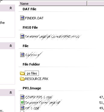
Windows XP already organises list views like this. It could be very useful. But true to MS abilities, the setting never sticks.
|
|
|
| |
|
|
|
|
|
|
|
Posting Junkie
Join Date: Jun 2002
Location: Calgary
Status:
Offline
|
|
Originally posted by Chuckit:
I don't see it at all...
Please .... look at the blatant use of English in those screenshots!
|
|
|
| |
|
|
|
|
|
|
|
Dedicated MacNNer
Join Date: Nov 2004
Location: Stockholm, Sweden
Status:
Offline
|
|
Originally posted by Wiskedjak:
Please .... look at the blatant use of English in those screenshots!
yeah, American English, too. psh, fools.
|
|
|
| |
|
|
|
|
|
|
|
Posting Junkie
Join Date: Jun 2002
Location: Calgary
Status:
Offline
|
|
Originally posted by Phil Sherry:
yeah, American English, too. psh, fools.
Well, Apple is using American English, so obviously MS must as well.
|
|
|
| |
|
|
|
|
|
|
|
Addicted to MacNN
Join Date: Jan 2003
Location: ~/
Status:
Offline
|
|
Originally posted by G0Ducks:
ooooooh, shiny!
"Sh!t. Shinola."
|
|
|
| |
|
|
|
|
|
|
|
Mac Elite
Join Date: Oct 2004
Location: Downtown Austin, TX
Status:
Offline
|
|
I don't think Microsoft is trying to copy Aqua per se, but it is definitely trying to copy the "concept" of OS X. This means translucent menus/windows, more integration between system apps, etc. Basically Microsoft is trying to copy that feeling you get when you use OS X, but instead Windows XP (and Longhorn too) ends up looking non-professional, unintelligent (ie not a "smart" OS), and generally just like a toy.
It's kind of like OS X uses deeper sub-conscious features that work similar to the way our mind does, while Windows is nothing like this and is just more "shallow". It's hard to describe.
Anyway, I still have to use Windows at my school for coding, and fortunately it doesn't get in the way too much. Times I wish I had OS X were:
-When I had a lot of windows open and wanted to switch between them efficiently
-When I wanted to open a bash shell to do everything, instead of opening this program, clicking there, open that folder, viewing file properties, etc. The Command Prompt in Windows Sucks.
-When the reboot/login takes forever.
-When I wanted to open an Application and have to search around in the Programs folder because it isn't in the start menu. Then, once I find it, dragging it to the Start menu doesn't exaclty do what I want
-When all those little balloons are popping up in the bottom right corner of the screen saying things like "You have xx days left to activate Windows" and "Click here to see updates" and "New hardware detected" and "MSN messenger is still running down here" and "Take a tour of Windows XP". You get the idea. Annoying as hell when I'm trying to concentrate.
The worst is whenever I let Windows automatically download critical updates and install them (it seemed like it REALLY wanted to do this after a bunch of "are you sure?" dialogs when I went to turn it off). So I'm working on Ultimately Hard Java Program and Windows decides to download and install updates. OK, I think, it's not getting in the way of anything. All of a sudden this window pops up while I'm typing asking me to restart the computer. Geez, that was annoying, I thought. So I click restart later and I get back to my Java work. Literally 5 minutes later the same dialog popped up again and once I again it interrupted my train of thought and I clicked "Go AWAY!". The dialog kept popping up every five minutes. Finally I surrendered to the Dictator that is Windows and saved my work and restarted.
The next day Windows found more critical updates.
This story has not been exaggerated at all. It actually happened like this. This is a perfect example of the OS "getting in the way" and controlling you rather than you controlling the OS. Here's what Microsoft should have done differently:
-display the dialog ONCE, at the most
-if you refuse to restart, a little colored icon will remain motionless (this is key) somewhere on the taskbar, reminding you to do so.
-in the unlikely event that Windows crashes because I mess with System Option A or Random Driver File B, I'll at least know that it was partly my fault because I didn't restart prior to doing so.
I'm done. I just had to get that off my chest.
|
|
|
| |
|
|
|
|
|
|
|
Junior Member
Join Date: Oct 2000
Location: Sydney, NSW, Australia
Status:
Offline
|
|
|
|
|
|
| |
|
|
|
|
|
|
|
Grizzled Veteran
Join Date: Apr 2004
Location: Nagoya, Japan • 日本 名古屋市
Status:
Offline
|
|


PS If I were a Windows user, I'd have lots to complain about. The size of the close button is a good point. And why are those three buttons so squished up like that? Look how much room there is below them. And who doesn't think that thick Longhorn sidebar (I've seen it in other screenshots) isn't ugly as heck?
|
|
|
| |
|
|
|
|
|
|
|
Registered User
Join Date: Feb 2005
Location: A far away place.
Status:
Offline
|
|
Windows had a per-window search tool long before OS X came out. All they've done is move it up to the top. Perhaps the style is akin to OS X's, but certainly not copying the concept of a search tool in a window.
|
|
|
| |
|
|
|
|
|
|
|
Registered User
Join Date: Jun 2004
Status:
Offline
|
|
By rearranging elements to resemble OS X in some way Microsoft is helping to ease the transition of future Longhorn users to OS X. Good job 
|
|
|
| |
|
|
|
|
|
|
|
Registered User
Join Date: Feb 2005
Location: A far away place.
Status:
Offline
|
|
Originally posted by RonnieoftheRose:
By rearranging elements to resemble OS X in some way Microsoft is helping to ease the transition of future Longhorn users to OS X. Good job
Why migrate when you can have both?
|
|
|
| |
|
|
|
|
|
|
|
Clinically Insane
Join Date: Oct 2001
Location: San Diego, CA, USA
Status:
Offline
|
|
Originally posted by Deimos:
Why migrate when you can have both?
Because having both means you have to have Windows.
|
|
Chuck
___
"Instead of either 'multi-talented' or 'multitalented' use 'bisexual'."
|
| |
|
|
|
|
|
|
|
Registered User
Join Date: Feb 2005
Location: A far away place.
Status:
Offline
|
|
Originally posted by Chuckit:
Because having both means you have to have Windows.
It's like having 2 women at the same time... fabulous.
|
|
|
| |
|
|
|
|
|
|
|
Professional Poster
Join Date: Jan 2000
Location: Columbus, OH
Status:
Offline
|
|
Originally posted by Deimos:
It's like having 2 women at the same time... fabulous.
Yeah. If you like one of them to be a skanky broad that you picked up at 2:30am at the local bar.
|
|
|
| |
|
|
|
|
|
|
|
Clinically Insane
Join Date: Oct 2001
Location: San Diego, CA, USA
Status:
Offline
|
|
Originally posted by Deimos:
It's like having 2 women at the same time... fabulous.
Given a choice of having Catherine Zeta-Jones alone or having both Catherine Zeta-Jones and Gloria Stuart at the same time, I'll take the former, thanks.
|
|
Chuck
___
"Instead of either 'multi-talented' or 'multitalented' use 'bisexual'."
|
| |
|
|
|
|
|
|
|
Registered User
Join Date: Feb 2005
Location: A far away place.
Status:
Offline
|
|
Originally posted by msuper69:
Yeah. If you like one of them to be a skanky broad that you picked up at 2:30am at the local bar.
Nothing wrong with a bit of variation. 
|
|
|
| |
|
|
|
|
|
|
|
Registered User
Join Date: Feb 2005
Location: A far away place.
Status:
Offline
|
|
Originally posted by Chuckit:
Given a choice of having Catherine Zeta-Jones alone or having both Catherine Zeta-Jones and Gloria Stuart at the same time, I'll take the former, thanks.
Poor choice of women, on both accounts.
|
|
|
| |
|
|
|
|
|
|
|
Posting Junkie
Join Date: Nov 2000
Location: in front of my Mac
Status:
Offline
|
|
Originally posted by Deimos:
Poor choice of women, on both accounts.
Just like Windows... poor choice. 
If you really need some variation from Mac OS X, find a nice and heavy armored door and bang your head against it a couple of times. There's no need to pay MS for the experience. 
|
|
•
|
| |
|
|
|
|
|
|
|
Clinically Insane
Join Date: Oct 2001
Location: San Diego, CA, USA
Status:
Offline
|
|
Just so you know, Deimos, we're not really bashing you. There's just not a lot of Windows love round these parts.
(I'm sure you knew that, but I noticed you were new, so I just wanted to point it out.)
(
Last edited by Chuckit; Mar 26, 2005 at 05:53 PM.
)
|
|
Chuck
___
"Instead of either 'multi-talented' or 'multitalented' use 'bisexual'."
|
| |
|
|
|
|
|
|
|
Registered User
Join Date: Feb 2005
Location: A far away place.
Status:
Offline
|
|
|
|
|
|
| |
|
|
|
|
|
|
|
Registered User
Join Date: Feb 2005
Location: A far away place.
Status:
Offline
|
|
Originally posted by Chuckit:
Just so you know, Deimos, we're not really bashing you. There's just not a lot of Windows love round these parts.
(I'm sure you knew that, but I noticed you were new, so I just wanted to point it out.)
I know, nothing like a bit of online mickey taking, all in good fun.
|
|
|
| |
|
|
|
|
|
|
|
Mac Elite
Join Date: Dec 2001
Location: Chicago
Status:
Offline
|
|
I love Windows. I just hate spyware.
|
|
|
| |
|
|
|
|
|
|
|
Grizzled Veteran
Join Date: Apr 2004
Location: Nagoya, Japan • 日本 名古屋市
Status:
Offline
|
|
Heheh, I thought this might belong in this thread. Look at this supposed screenshot from Longhorn (the one that copies Tiger's Spotlight):
http://www.winsupersite.com/images/s...ch_demo_01.jpg
Someone at Slashdot pointed this out. Look at the file-sizes and dates of the documents. Then look at the file-sizes and dates of the e-mails. They're the same! Why? Because whoever made that "screenshot" was actually doing it in Photoshop. They copied the document text layers to re-use for the e-mails, and forgot to change the numbers and dates.
In other words, maybe Longhorn will eventually look like that, and maybe it won't. But they don't even have screenshots of a working example yet.
|
|
|
| |
|
|
|
|
|
|
|
Addicted to MacNN
Join Date: Oct 2001
Location: Automatic
Status:
Offline
|
|
Originally posted by CaptainHaddock:
Heheh, I thought this might belong in this thread. Look at this supposed screenshot from Longhorn (the one that copies Tiger's Spotlight):
http://www.winsupersite.com/images/s...ch_demo_01.jpg
Someone at Slashdot pointed this out. Look at the file-sizes and dates of the documents. Then look at the file-sizes and dates of the e-mails. They're the same! Why? Because whoever made that "screenshot" was actually doing it in Photoshop. They copied the document text layers to re-use for the e-mails, and forgot to change the numbers and dates.
In other words, maybe Longhorn will eventually look like that, and maybe it won't. But they don't even have screenshots of a working example yet.
Not to mention that there are six references to only five documents LOL
|
|
|
| |
|
|
|
|
|
|
|
Mac Elite
Join Date: Jan 2001
Location: Kansas City, Mo
Status:
Offline
|
|
That really is embarrassing. Funny how Thurrott seems to miss this.
|
|
|
| |
|
|
|
|
|
|
|
Junior Member
Join Date: Jun 2004
Location: Toronto
Status:
Offline
|
|
Heh heh, that's a funny story Jamil, and I believe it too. The popup balloons in the notification area are a constant irritant to me too.
As for the interface itself. The one good thing I can say is that I think their new font is better. But I agree with others who criticized the maximize/minimize/close buttons. Why are they so small, why is the close button bigger than the other two, why are they so non-descript? It looks like they ran out of room and had to squeeze them awkardly up against the top edge of the window, except there's TONS of room below them. Also, it's just inconsistent and unaesthetic when all the other elements of the window are given relatively huge amounts of screen real estate, to make that single exception for these three, most commonly-used buttons. Also I find the reflection bisecting all three buttons to be rather ugly, cheesy-looking, and distracting.
Also, as usual the window as a whole is too busy. I'm looking at http://www.winsupersite.com/images/s...ch_demo_01.jpg and seeing along the top an inconsistent use of words and icons. E.g., "File" spelled out, then an icon that I think changes the display options, then another icon whose purpose I don't know, then both an icon (a checkbox), AND the word "Options" to set options. Maybe I'm being nitpicky but wouldn't either icons OR words but not a mixture be better?
Then there's the skin itself, which is kinda cheesy and amateurish to me. Oh, and the file folder icons in http://www.picmate.co.uk/lh_explorer_demo_01.jpg have been so simplified and stylized that they don't even look like file folders to me anymore. If they were going to turn them on their side like that (presumably to make them the same width as the other icons so all the columns would line up), then I think they should have made them look a bit more realistic so that they are instantly recognizable as folders. When I first looked at them I wasn't sure what they were.
This sounds like a Windows bash, and I guess it is kind of. Actually though I'm looking forward to Longhorn, because I'm an OS junkie who loves trying out anything new. Some of the Longhorn stuff sounds neat and cool, but I just hope the UI is a little more refined and elegant than what we've been seing so far...
|
|
|
| |
|
|
|
|
|
|
|
Grizzled Veteran
Join Date: Mar 2003
Location: Shipped to another country by the US to be tortured so they can avoid Int. law.
Status:
Offline
|
|
You guys get yourselves into such a tizzy that it's embarrassing.
The screenshots were just mockups for a new variation of the "look" of the interface, the actual functionality has been there for ages! All they did was present the sane "working" features in a new look.
|
|
sanathana sarathi
si tacuisses philosophus mansisses
|
| |
|
|
|
|
|
|
|
Fresh-Faced Recruit
Join Date: Feb 2004
Status:
Offline
|
|
I actually like many of the things Windows (the shell not the OS, too bad they are one in the same, mistake #1) offers like being able to do file operations in the open/save dialogs. I think it's a pain to go back to Finder to reorganize files and folders when I go to save something. Windows lets you rename, delete, create folders, etc from the save dialog and I like that feature. If you know of anything for my Mac that extends file management operations to the system open/save dialogs I'd appreciate hearing about it.
Both GUI shells have their good and bad points but which you prefer is largely a matter of personal preference. There are no substantial gaps in the functionality or usefulness of either. If Windows had the underpinnings of Darwin instead of the crap they do have lurking under there it would be a tougher choice to make IMHO of course...
|
|
|
| |
|
|
|
|
|
|
|
Addicted to MacNN
Join Date: Oct 2001
Location: Automatic
Status:
Offline
|
|
Originally posted by cthree:
...If you know of anything for my Mac that extends file management operations to the system open/save dialogs I'd appreciate hearing about it...
Check Default Folder X Hope that helps
|
|
|
| |
|
|
|
|
|
|
|
Mac Elite
Join Date: Jan 2004
Location: Berkeley, CA
Status:
Offline
|
|
We weren't imagining things:
Winsupersite had pictures of SyncManager, etc. I looked at their website again, and look:
"On March 18, 2005, I updated the showcase with new images of Longhorn security, unresponsive application alerts, and SyncManager.
On March 23, 2005, I removed the previously added images at Microsoft's request."
Those were all the things that were essentially ripped straight from Panther and Tiger.
Wow.
|
|
"Give me a lever long enough and a fulcrum on which to place it, and I shall move the world." -Archimedes
|
| |
|
|
|
|
|
|
|
Mac Elite
Join Date: Sep 2000
Location: in front of the keyboard
Status:
Offline
|
|
Originally posted by Chuckit:
Given a choice of having Catherine Zeta-Jones alone or having both Catherine Zeta-Jones and Gloria Stuart at the same time, I'll take the former, thanks.
Now Gloria Stuart circa 1935:
 
I'd hit that. In a second.
There was never a time that Windows ever looked anywhere near as Gloria did in her prime. (You should have picked someone else, like Rosanne or something)
|
|
signatures are a waste of bandwidth
especially ones with political tripe in them.
|
| |
|
|
|
|
|
|
|
Posting Junkie
Join Date: Nov 2000
Location: in front of my Mac
Status:
Offline
|
|
Originally posted by Kristoff:
There was never a time that Windows ever looked anywhere near as Gloria did in her prime. (You should have picked someone else, like Rosanne or something)
|
|
•
|
| |
|
|
|
|
|
|
|
Senior User
Join Date: Oct 2004
Location: Portugal
Status:
Offline
|
|
windows looks like the bastard child...
|
|
|
| |
|
|
|
|
|
|
|
|
|
|
|
|
 
|
|
|
Forum Rules
|
|
|
|
You may not post new threads
You may not post replies
You may not post attachments
You may not edit your posts
|
HTML code is Off
|
|
|
|
|
|
|
|
|
|
|
|