|
 |
Official Leopard GUI discussion thread (Page 8)
|
|
|
|
|
Baninated
Join Date: Oct 2002
Location: In yer threads
Status:
Offline
|
|
Originally Posted by Jasoco 
I just want the customization we HAD BACK!
Since OS 9. 
|
|
|
| |
|
|
|
|
|
|
|
Addicted to MacNN
Join Date: Feb 2003
Location: NY²
Status:
Offline
|
|
Originally Posted by .Neo
Great! Any thoughts if those cursors are used systemwide or just in Safari? The spinning beach ball isn't there for example.
I only change the linkCursor.png image and that changes in Safari, Dashboard and other apps that use WebKit. I just checked now and it changes it in Mail. If I remember correct, Mail in 10.4 did not use the changed linkCursor.
|
|
|
| |
|
|
|
|
|
|
|
Mac Elite
Join Date: May 2002
Location: Home in front of my computer
Status:
Offline
|
|
They switched to WebKit and HTML powered emails for Mail, so that would explain why the cursor changes there.
|
|
|
| |
|
|
|
|
|
|
|
Addicted to MacNN
Join Date: Feb 2003
Location: NY²
Status:
Offline
|
|
What did Mail.app used to use?
|
|
|
| |
|
|
|
|
|
|
|
Addicted to MacNN
Join Date: Aug 2004
Location: FFM
Status:
Offline
|
|

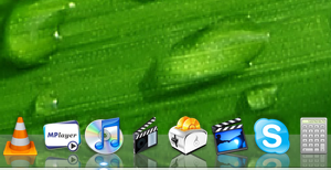
Can it be that WebArchives don't have icon preview and quick look? And not even an updated high resolution icon?
|
|
|
| |
|
|
|
|
|
|
|
Mac Enthusiast
Join Date: Jan 2007
Location: Amsterdam, NL
Status:
Offline
|
|
Wow that's pretty bad. None of the Safari document icons have 512x512 pixel states. They haven't updated the Apple Remote Desktop icon either with the Leopard-compatible update. Nor have the document icons of Automator, iCal, some of iChat, some of the iLife '08 applications, Quick Time Player and Text Edit. The ones from Quick Time and Text Edit are understandable because the document icon itself won't show up in Quick Look.
Is there a place where we can give Apple feedback of this stuff? Can't seem to find it.
(
Last edited by .Neo; Oct 27, 2007 at 10:40 AM.
)
|
|
|
| |
|
|
|
|
|
|
|
Mac Elite
Join Date: May 2002
Location: Home in front of my computer
Status:
Offline
|
|
|
|
|
|
| |
|
|
|
|
|
|
|
Baninated
Join Date: Oct 2002
Location: In yer threads
Status:
Offline
|
|
Yeah I have put a perm bookmark in my drawer for that ever since I got 10.5 installed.
|
|
|
| |
|
|
|
|
|
|
|
Posting Junkie
Join Date: Dec 2000
Status:
Offline
|
|
Originally Posted by Jasoco
Actually, I think this page is better (although it requires a free ADC account):
http://bugreport.apple.com/
|
|
|
| |
|
|
|
|
|
|
|
Posting Junkie
Join Date: Sep 2001
Status:
Offline
|
|
OK, I LIKE the brighter stoplight buttons. What I don't like is the rollover state for the zoom button. The (X) of the close button and (–) of the minimize button look like they are behind the light reflecting off the top of the glassy color (or "inside" the glass), whereas the (+) just looks like it's sitting on top of the glass. It's much more bold than the other two. Not that I'm complaining, but it's one of the first things that I noticed.

That and my "Computer" icon in the sidebar magically turns into a G4 tower when I use the open dialogue in Photoshop CS. (I'm on a MacBook Pro.) Dunno if this is the case in all Rosetta apps.
|
|
|
| |
|
|
|
|
|
|
|
Forum Regular
Join Date: Dec 2006
Status:
Offline
|
|
I've been tooling around with the Dock's resources, and I've managed to change a few things.
First, I made the dock dark by darkening the Dock.app>Resources>scurve-x.png files. Then, I made the indicators bright white, and darkened the little white line that appears at the bottom of the dock. Now, the Dock is as a whole much less distracting, and It's much easier to tell what applications are running. Take a look:

Next, I figured out how to totally eliminate the reflections on the dock - both application icons, and windows that are near the dock. The scurve.png files are actually semi-transparent, and if you eliminate the transparency (by placing, say, an opaque black layer underneath it), reflections don't show up:

It seems that the reflections are drawn underneath the dock, and the dock is layered on top.
|
|
15" MacBook Pro C2D, 2.16 GHz, 2 GB RAM, Matte Display.
|
| |
|
|
|
|
|
|
|
Mac Elite
Join Date: May 2002
Location: Home in front of my computer
Status:
Offline
|
|
Interesting. Exploring around it seems that you can also edit the "street lines" separator if you want. And there are 4 different S-Curves. Plus you can edit how the non-3D (aka the black and white Dock styles) look. With creativity, you CAN make it look like it used to.
Browsing the Finder, it seems Time Machine's "Vortex" is stored in there as a bunch of PNG's. Stars, a sun, everything is a different image. Go wild!
|
|
|
| |
|
|
|
|
|
|
|
Mac Elite
Join Date: May 2002
Location: Home in front of my computer
Status:
Offline
|
|
The Dock in 3D form seems to be made up of a few elements.
S-Curve (Of course this is the reflection effect.)
Indicators (The LED's)
Front Line (This is a white line that appears as the frontmost bottommost white 2 pixel thick line at the bottom of the Dock. Supposedly to give it a 3D front of shelf feel.)
Separator (What else)
Open in Finder (The arrow for showing the Stack's contents in the Finder)
Magic Carpet (This is the black rounded text background shown under tooltips and "Fan" titles.)
Magic Carped (Another one used for the non Fan version of Stacks.)
|
|
|
| |
|
|
|
|
|
|
|
Professional Poster
Join Date: May 2007
Status:
Offline
|
|
Interesting. Exploring around it seems that you can also edit the "street lines" separator if you want. And there are 4 different S-Curves. Plus you can edit how the non-3D (aka the black and white Dock styles) look. With creativity, you CAN make it look like it used to.
Browsing the Finder, it seems Time Machine's "Vortex" is stored in there as a bunch of PNG's. Stars, a sun, everything is a different image. Go wild!
YES! UFOs in the Time Machine Window!!!
|
|
|
| |
|
|
|
|
|
|
|
Posting Junkie
Join Date: May 2001
Location: Brisbane, Australia
Status:
Offline
|
|
Originally Posted by Jasoco
Separator (What else)
It's not called AbbeyRoad anymore? 
|
|
|
| |
|
|
|
|
|
|
|
Mac Elite
Join Date: May 2002
Location: Home in front of my computer
Status:
Offline
|
|
|
|
|
|
| |
|
|
|
|
|
|
|
Senior User
Join Date: Mar 2007
Location: San Jose
Status:
Offline
|
|
John Siracusa's AppleInsider | Apple Insider News and Analysis is up on Ars Technica. He covers all of Apple's GUI WTF moments. All I can say is that Apple's penchant for breaking perfectly good interfaces is approaching Microsoftesque. All the more aggravating since they're obviously competent enough to do a good job.
|
|
|
| |
|
|
|
|
|
|
|
Posting Junkie
Join Date: May 2001
Location: Brisbane, Australia
Status:
Offline
|
|
Originally Posted by Jasoco
Was it ever?

|
|
|
| |
|
|
|
|
|
|
|
Mac Elite
Join Date: May 2002
Location: Home in front of my computer
Status:
Offline
|
|
Disappointing. It's now called "separator". Booooring. 
Also, let me once again bring up how much I HATE those white borders they put on EVERY IMAGE. Not only does it make the thumbnail smaller, but transparent images look like crap. WTF? Please tell me that this is an option hidden in the OS that will be disabled with the next version of Onyx.
I didn't want borders on my portraits. Send them back to Kodak and have them done again, please!
|
|
|
| |
|
|
|
|
|
|
|
Posting Junkie
Join Date: Dec 2000
Status:
Offline
|
|
Originally Posted by Jasoco
Disappointing. It's now called "separator". Booooring.
I'd guess Apple is probably sick of getting sued by the Beatles by now.
|
|
|
| |
|
|
|
|
|
|
|
Mac Elite
Join Date: May 2002
Location: Home in front of my computer
Status:
Offline
|
|
My thoughts exactly. 
|
|
|
| |
|
|
|
|
|
|
|
Posting Junkie
Join Date: May 2001
Location: Brisbane, Australia
Status:
Offline
|
|
Seeing as Apple now owns all right to the Apple trademark and is licensing it to Apple Corps it would seem the tables have turned...
|
|
|
| |
|
|
|
|
|
|
|
Posting Junkie
Join Date: Dec 2000
Status:
Offline
|
|
Yeah, but do they have the rights to the name "Abbey Road"? I doubt it.
|
|
|
| |
|
|
|
|
|
|
|
Forum Regular
Join Date: Feb 2005
Location: Paris, Fr
Status:
Offline
|
|
Has anyone found how to enable menubar translucency on G4? It was on in 5a559 and it's now off in the GM. And it looks really bad...
|
|
|
| |
|
|
|
|
|
|
|
Posting Junkie
Join Date: May 2001
Location: Brisbane, Australia
Status:
Offline
|
|
Originally Posted by CharlesS
Yeah, but do they have the rights to the name "Abbey Road"? I doubt it.
Does anyone but the Westminster City Council? 
|
|
|
| |
|
|
|
|
|
|
|
Forum Regular
Join Date: Nov 2002
Location: Winnipeg
Status:
Offline
|
|
I just installed Leopard today, and I have to say, I'm VERY disappointed with how the GUI turned out. I appreciate the move towards a unified GUI, but the dock is horrible, the menu bar is terrible on light backgrounds (not to mention with any non-standard icon in it ie: google notifier), and everything is still horribly inconsistent. Aw well...maybe they'll come to their senses for 10.6.
|
|
|
| |
|
|
|
|
|
|
|
Posting Junkie
Join Date: May 2001
Location: Brisbane, Australia
Status:
Offline
|
|
I swear I was seeing things, but no... Pro apps now have different menus from non-pro apps:
 
|
|
|
| |
|
|
|
|
|
|
|
Senior User
Join Date: Oct 2001
Status:
Offline
|
|
Originally Posted by MindFad
That and my "Computer" icon in the sidebar magically turns into a G4 tower when I use the open dialogue in Photoshop CS. (I'm on a MacBook Pro.) Dunno if this is the case in all Rosetta apps.
After reading the HIToolbox release notes, it might be that it's the Carbon file dialog you see instead of the Cocoa dialog (beats me why the two have to look different to begin with). While 10.5 tries to use the Cocoa dialogs everywhere (= in Carbon apps too), it can only do this when the dialog is called from the main thread. Since the Cocoa file dialog is not safe to be called from a background thread, it has to use Carbon in those cases. (Yes, Cocoa is so much better and modern and what not. NSOpenPanel/NSSavePanel are there since the NeXT days and still not thread safe.  )
|

Stink different.
|
| |
|
|
|
|
|
|
|
Addicted to MacNN
Join Date: Jul 2004
Location: Toronto
Status:
Offline
|
|
Originally Posted by - - e r i k - -
I swear I was seeing things, but no... Pro apps now have different menus from non-pro apps
Sweet Jeebus. ")
|
|
|
| |
|
|
|
|
|
|
|
Mac Elite
Join Date: May 2002
Location: Home in front of my computer
Status:
Offline
|
|
Well, at least they're close.
It's a lot less different then GarageBand's radically different wooden interface.
|
|
|
| |
|
|
|
|
|
|
|
Posting Junkie
Join Date: Dec 2000
Status:
Offline
|
|
Originally Posted by stew
After reading the HIToolbox release notes, it might be that it's the Carbon file dialog you see instead of the Cocoa dialog (beats me why the two have to look different to begin with). While 10.5 tries to use the Cocoa dialogs everywhere (= in Carbon apps too), it can only do this when the dialog is called from the main thread. Since the Cocoa file dialog is not safe to be called from a background thread, it has to use Carbon in those cases. (Yes, Cocoa is so much better and modern and what not. NSOpenPanel/NSSavePanel are there since the NeXT days and still not thread safe. )
Huh? All you have to do is use -[NSObject performSelectorOnMainThread:withObject:waitUntilDo ne:] to have it open the dialog box on the main thread, and get the result when it finishes.
|
|
|
| |
|
|
|
|
|
|
|
Mac Elite
Join Date: Apr 2000
Location: Los Angeles, CA
Status:
Offline
|
|
The "pro menus" remind me a lot of Copland (Platinum-esque theme), only more modern looking.
|
|
|
| |
|
|
|
|
|
|
|
Fresh-Faced Recruit
Join Date: Jun 2007
Status:
Offline
|
|
Pro Apps also change the menu bar to opaque. Apple's professional applications have never followed the standard UI conventions under OS X, though.
|
|
15" MacBook Pro - 2.16GHz Core 2 Duo - 2GB - 7200RPM 160GB HD
20" iMac - 2.16GHz Core 2 Duo - 1 GB - 250GB
8GB iPhone
|
| |
|
|
|
|
|
|
|
Professional Poster
Join Date: May 2007
Status:
Offline
|
|
But they haven't edited the menu bar... But I do like that, it allows for focus on the task at hand. Does it change for non- Apple pro apps, like CS3?
|
|
|
| |
|
|
|
|
|
|
|
Posting Junkie
Join Date: May 2001
Location: Brisbane, Australia
Status:
Offline
|
|
Originally Posted by adamfishercox
But they haven't edited the menu bar... But I do like that, it allows for focus on the task at hand. Does it change for non- Apple pro apps, like CS3?
No. Of course not. How would Apple know which other applications consider themselves "pro"?
|
|
|
| |
|
|
|
|
|
|
|
Professional Poster
Join Date: May 2007
Status:
Offline
|
|
Dunno, but they could have added common ones like CS3.
|
|
|
| |
|
|
|
|
|
|
|
Senior User
Join Date: Oct 2001
Status:
Offline
|
|
Originally Posted by CharlesS
Huh? All you have to do is use -[NSObject performSelectorOnMainThread:withObject:waitUntilDo ne:] to have it open the dialog box on the main thread, and get the result when it finishes.
Precisely - you have to do it in the main thread (which may be busy at the time). If it were thread safe, you could do it from any thread.
|
Stink different.
|
| |
|
|
|
|
|
|
|
Baninated
Join Date: Oct 2002
Location: In yer threads
Status:
Offline
|
|
Originally Posted by MindFad
OK, I LIKE the brighter stoplight buttons. What I don't like is the rollover state for the zoom button. The (X) of the close button and (–) of the minimize button look like they are behind the light reflecting off the top of the glassy color (or "inside" the glass), whereas the (+) just looks like it's sitting on top of the glass. It's much more bold than the other two. Not that I'm complaining, but it's one of the first things that I noticed.
That and my "Computer" icon in the sidebar magically turns into a G4 tower when I use the open dialogue in Photoshop CS. (I'm on a MacBook Pro.) Dunno if this is the case in all Rosetta apps.
Heh

Someone flubbed up.
|
|
|
| |
|
|
|
|
|
|
|
Addicted to MacNN
Join Date: Jul 2004
Location: Toronto
Status:
Offline
|
|
|
|
|
|
| |
|
|
|
|
|
|
|
Professional Poster
Join Date: May 2007
Status:
Offline
|
|
And one that I doubt they'll fix too soon.
|
|
|
| |
|
|
|
|
|
|
|
Baninated
Join Date: Oct 2002
Location: In yer threads
Status:
Offline
|
|
Like I said, you don't even see shoddiness like that in the professionally done themes made by forum members. You shouldn't see them from Apple either.
Someone isn't paying attention/checking their work.
|
|
|
| |
|
|
|
|
|
|
|
Addicted to MacNN
Join Date: Aug 2004
Location: FFM
Status:
Offline
|
|
iTunes 7.5 updated the window widgets and now has a light window colour in the background, but it still has the new style scroll bars. Weird.
iPhoto also has the new style scroll bars, but I noticed that it switches to Aqua scroll bars when it is running within Time Machine. Weirder.
|
|
|
| |
|
|
|
|
|
|
|
Baninated
Join Date: Oct 2002
Location: In yer threads
Status:
Offline
|
|
Not weird. Just inconsistent. Obviously Apple's consistency isn't what it once was.
10.5 is the first OS X release since 10.0 that has "felt" like a beta.
BTW I've already hacked 10.5's scrollbars and thumbs to match iTunes's. Working on the rest. My goal is to make the 10.5 Finder look like iTunes.
(
Last edited by Kevin; Nov 6, 2007 at 01:52 PM.
)
|
|
|
| |
|
|
|
|
|
|
|
Fresh-Faced Recruit
Join Date: Nov 2007
Status:
Offline
|
|
I've made a version of the dock that works for me, a "Glass Dock". In my view, the two shades of grey used in Apple's original are too dark, the icons get blurred, especially if you use small(ish) icons/dock. That S-curve didn't really add much either (well, confusion perhaps).
So I did a really simple one designed to stay out of the way as much as possible.
It's available for download here: daniel.fallman.org | glass dock
|
|
|
| |
|
|
|
|
|
|
|
Forum Regular
Join Date: Oct 2007
Location: Pensacola, FL
Status:
Offline
|
|
That's because it is. On close examination the + is darker than the X and -
Someone effed up.
Also in aperture the traffic graphite lights haven't been updated. WOOHOO APPLE! GO TEAM! WOOT WOOT!
|
|
Bla Bla Bla
|
| |
|
|
|
|
|
|
|
Forum Regular
Join Date: Oct 2007
Location: Pensacola, FL
Status:
Offline
|
|
Are you going to indulge us in how to do this? Referring to the man who hacked the scrollbars.
also sorry for the double post.
(
Last edited by sogbrightlight; Nov 6, 2007 at 09:04 PM.
Reason: apology)
|
|
Bla Bla Bla
|
| |
|
|
|
|
|
|
|
Professional Poster
Join Date: May 2007
Status:
Offline
|
|
read the thread...
he said after he gets it working well he'll release instructions.
|
|
|
| |
|
|
|
|
|
|
|
Forum Regular
Join Date: Oct 2007
Location: Pensacola, FL
Status:
Offline
|
|
there are 8 pages to this thread. I just skimmed. SORRY.
|
|
Bla Bla Bla
|
| |
|
|
|
|
|
|
|
Baninated
Join Date: Oct 2002
Location: In yer threads
Status:
Offline
|
|
Originally Posted by sogbrightlight
Are you going to indulge us in how to do this? Referring to the man who hacked the scrollbars.
also sorry for the double post.
Try the GUI modifications page.
|
|
|
| |
|
|
|
|
|
|
|
Posting Junkie
Join Date: Sep 2001
Status:
Offline
|
|
Sloppy Safari tabs!

|
|
|
| |
|
|
|
|
|
|
|
|
|
|
|
|
 
|
|
|
Forum Rules
|
|
|
|
You may not post new threads
You may not post replies
You may not post attachments
You may not edit your posts
|
HTML code is Off
|
|
|
|
|
|
|
|
|
|
|
|